About Progress Cards
Showcase your agency’s process with this interactive 3-step progress card component. Designed for design and development studios, it visually represents your workflow from discovery to launch.
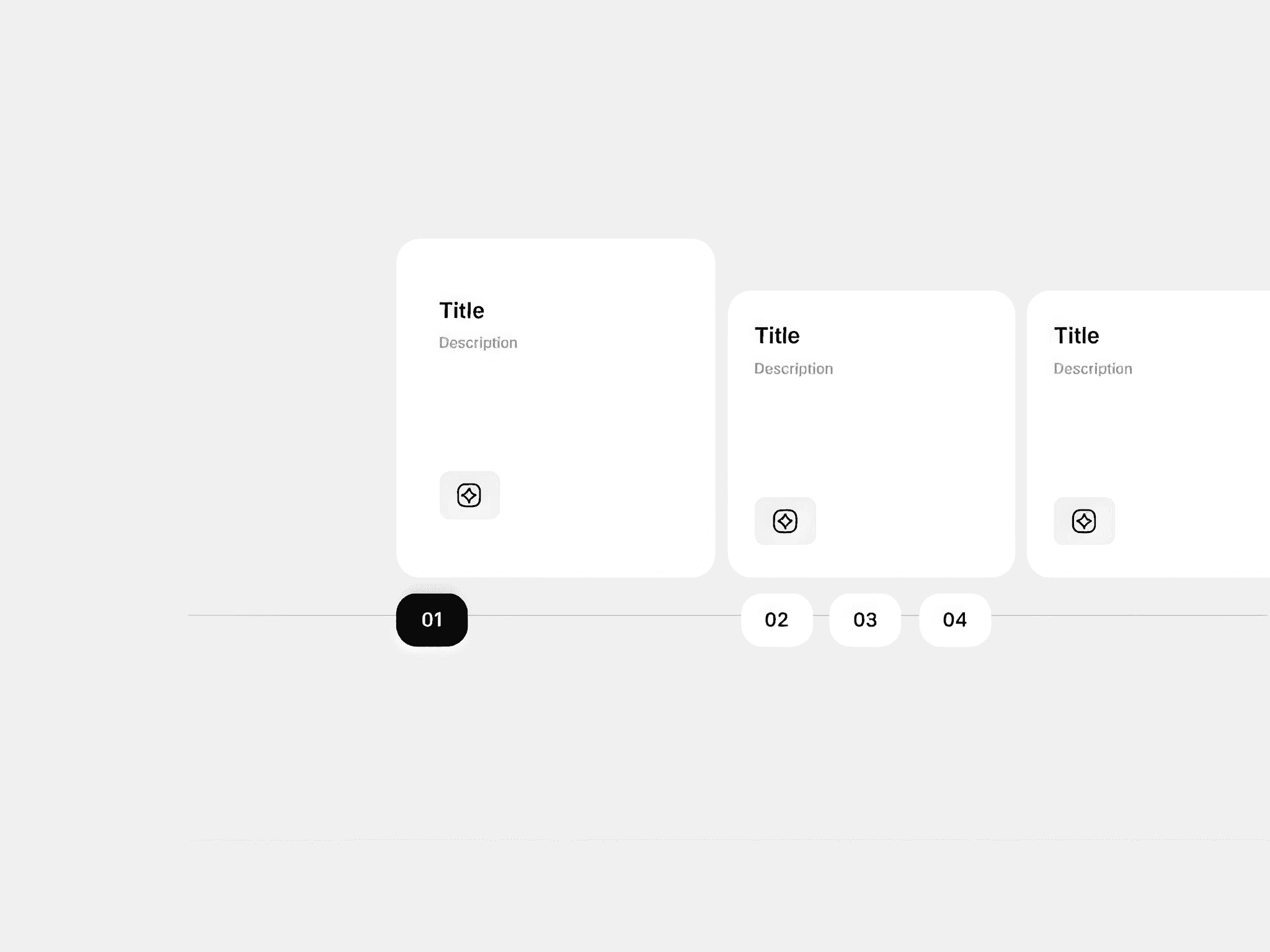
On desktop and tablet, three horizontal cards animate sequentially with a vertical progress bar. As each card completes, the next card automatically expands while the previous collapses, creating a smooth, story-like transition through your process.
Each card includes:
Step number (01, 02, 03)
Card title
Short description text
Optional tag or subtext
Image placeholder (project preview, mockup, or icon)
Once the third card completes, the loop restarts seamlessly from the first step.
On mobile, all three cards are displayed vertically, fully expanded, and without progress animation for an easy scroll experience.
Design or development agency process section
Project timeline or workflow showcase
Product or service journey visualization
Customizable Controls:
Card titles, descriptions, and images
Progress color and animation speed
Loop toggle
Text and background colors
Layout spacing and radius
Responsive Behavior:
Desktop & Tablet: 3 cards aligned horizontally with auto progress and expansion
Mobile: Cards stacked vertically, fully expanded