About Responsive Card Deck
Responsive layouts
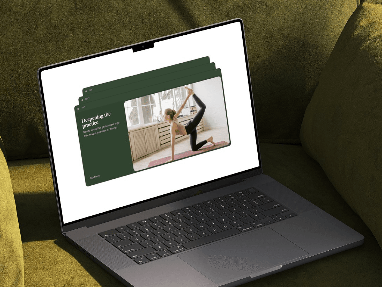
Card Deck Tabs now has Desktop, Tablet and Phone variants: 9 states in total, 3 per breakpoint.
On tablet and phone, the cards stretch to the screen width instead of using fixed sizes.
Tablet: the image takes about half of the card.
Phone: the title, description and button sit above the image so they’re easier to read.
The deck picks the right layout automatically: Desktop at 1200px and up, Tablet from 810 to 1199px, and Phone below 810px. A tap always moves between states for the current screen size
Edit everything from one place
All three cards are now controlled by properties on the Card Deck Tabs component itself, so you don’t need a CMS collection.
Each card has a Title, Tab Label, Description, Image, Button Text and Link.
Card improvements
New Tab Label property: the top strip of each card now shows a real label, such as Beginner, Intermediate or Advanced, instead of placeholder text.
New Link property on the call-to-action. It has a clean cream style that underlines on hover, with no default blue link styling.
Updated demo page
Added Tablet (810px) and Phone (390px) layouts.
The intro stacks vertically on phone. The heading scales to 40px on tablet and 34px on phone.
The “Click here” hint and arrow are repositioned at each breakpoint so they still point at the back card.
How it works Three cards are stacked like a deck. The front card is fully visible, and the two behind it show only their tab label. Click or tap any back card to bring it to the front with a smooth spring animation. You can switch cards in any order, at any time.
How to edit
Select the Card Deck Tabs element on your page.
In the right panel, edit the Title, Tab Label, Description, Image, Button Text and Link for Cards 1 to 3.
Publish.