About Rotate Cards
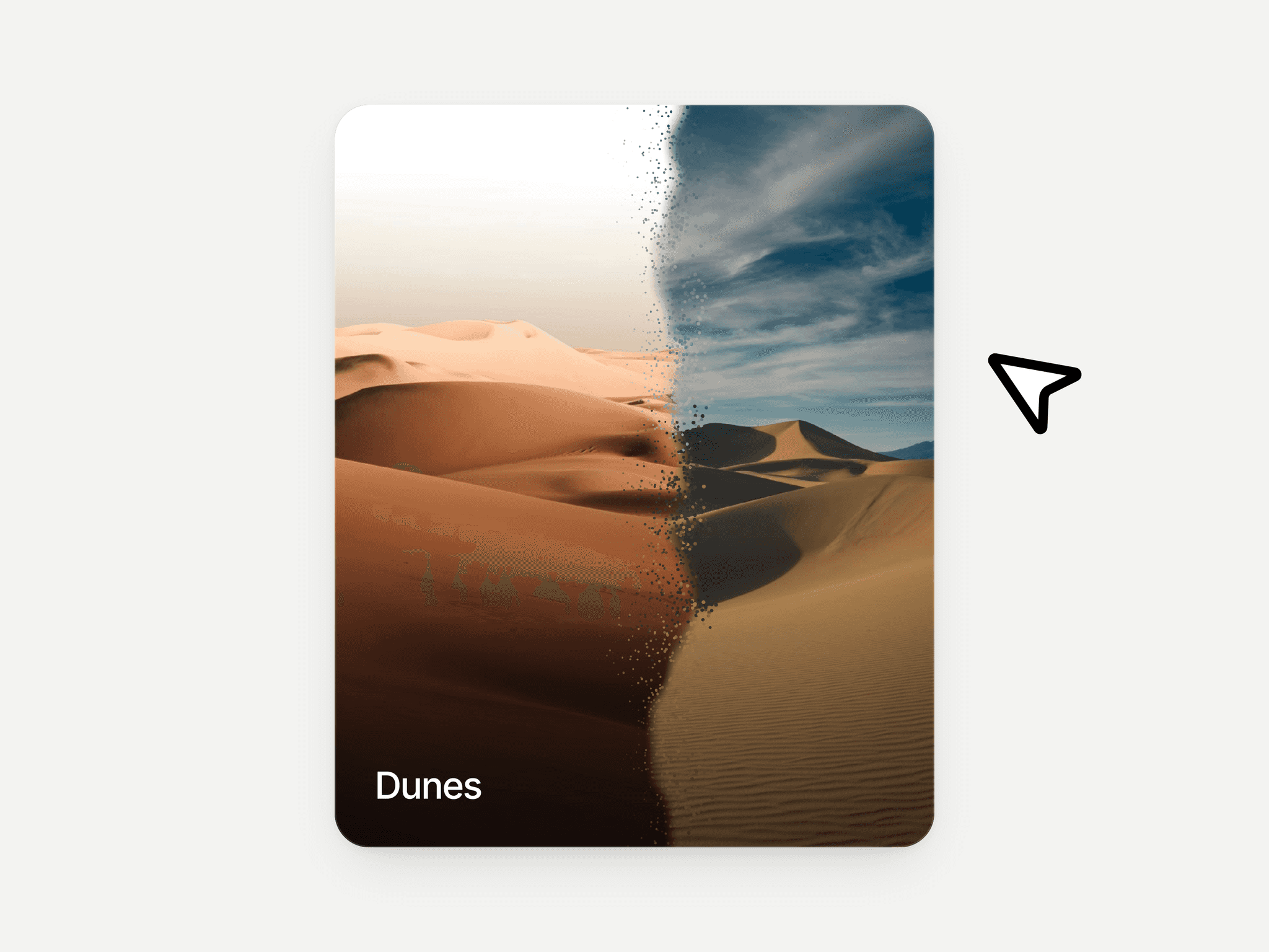
Rotate Cards is designed to create a dynamic visual presentation where content cards rotate continuously or respond to user interaction. Instead of static grids or sliders, the component arranges items in a rotating stack that brings different cards into focus over time.
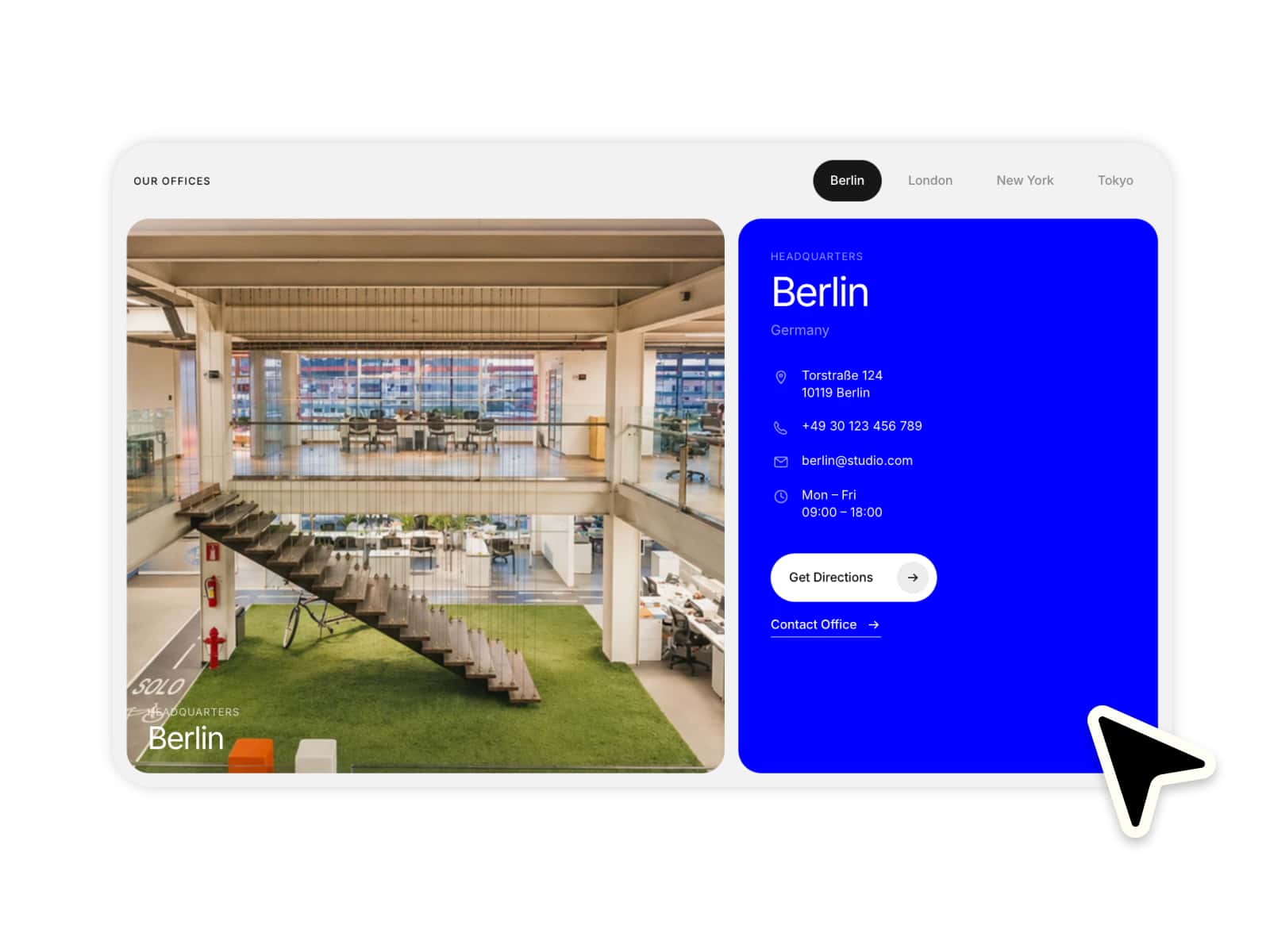
Each card can contain structured content including an image, title, description, metadata, and an optional call-to-action button with a link. As the cards rotate, the focused card becomes the primary visual element while other cards remain visible in the background.
The component includes multiple interaction triggers that allow the rotation to behave differently depending on the desired user experience. Cards can rotate automatically or respond to actions such as scrolling, hovering, clicking, or dragging.
Additional layout controls allow designers to adjust card orientation, rotation direction, text positioning, and scaling. Out-of-focus cards can also be clipped or masked to maintain visual focus on the active card.
This component works well for showcasing products, featured content, case studies, or interactive portfolios.
How It Works
1. Add Card Content
Inside the settings panel, you can create cards by adding:
Image
Title
Description
Meta information
Button text
Button link
Each entry becomes an individual rotating card.
2. Choose Rotation Trigger
The rotation behavior can be controlled using different triggers:
None – cards remain static
Auto – cards rotate automatically
Click – rotation changes when clicked
Scroll – cards rotate based on page scroll
Hover – rotation responds to cursor hover
Drag – users can manually drag through cards
3. Customize Card Layout
You can control how content appears within each card by adjusting the text position:
Center
Left
Right
Top
Bottom
4. Control Rotation Behavior
The component includes rotation controls such as:
Rotation direction
Clockwise
Anti-clockwise
Start position
Set the initial card position
Angle mode
Angled layout
Upright layout
5. Visual Styling Options
Additional styling options allow you to refine the presentation:
Adjust card scale
Enable clipping for out-of-focus cards
Control spacing and visual hierarchy within the card stack
Use Cases
Product showcases
Portfolio highlights
Featured case studies
Service highlights
Interactive landing sections
Creative content galleries
Need help with this component or looking for custom components? Feel free to reach out for support, customization, or new builds.