About Scroll Card Stack
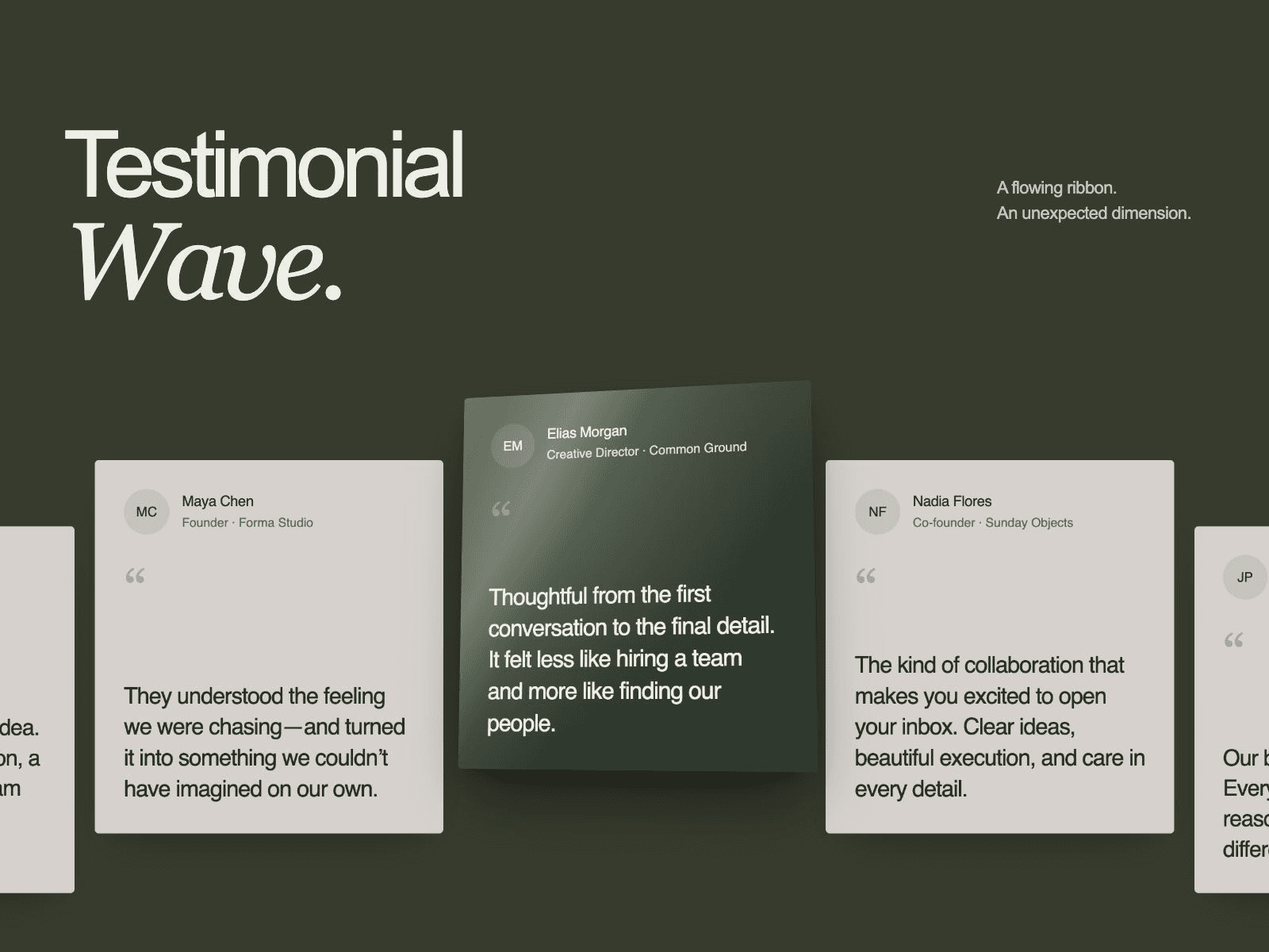
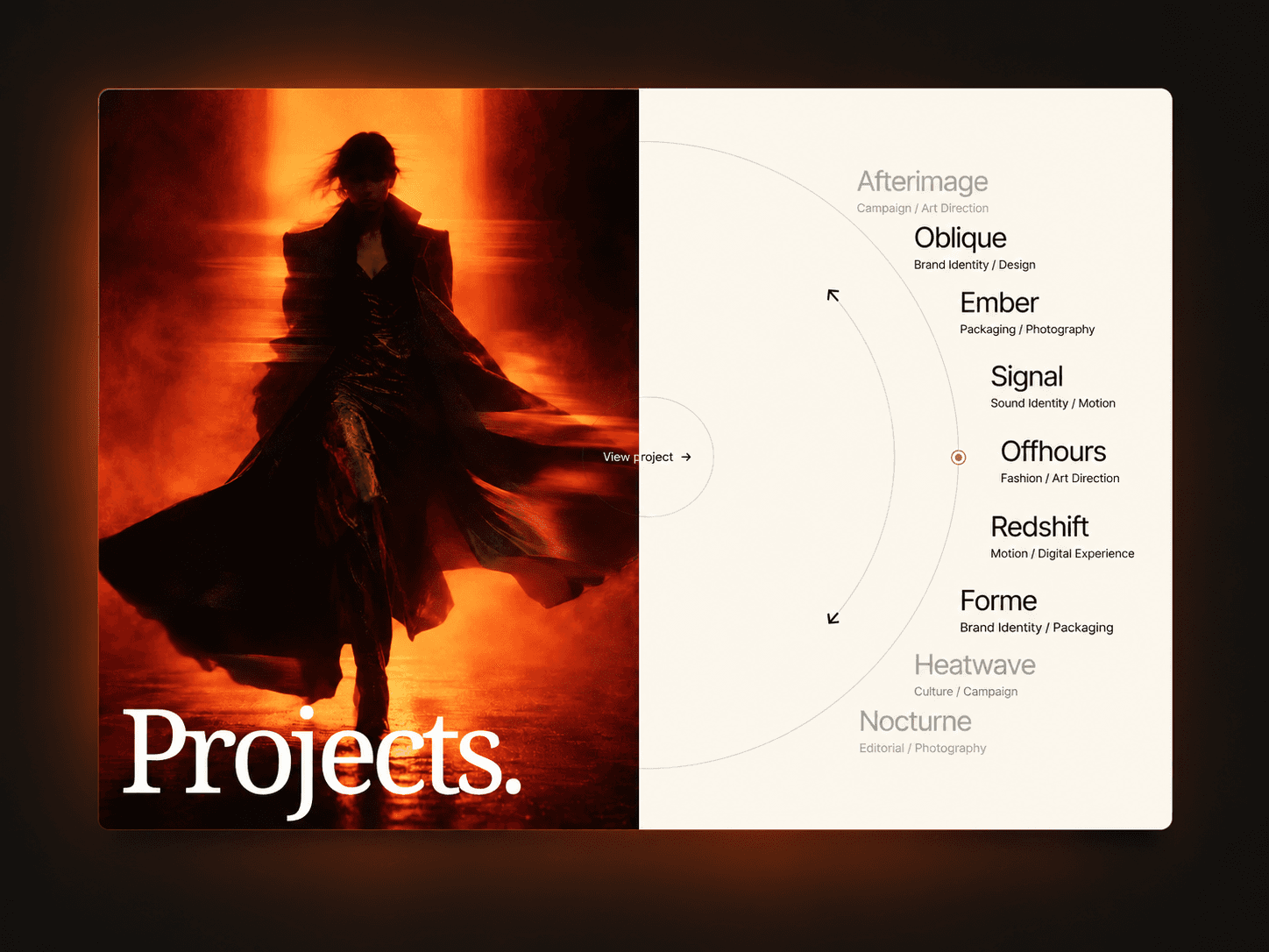
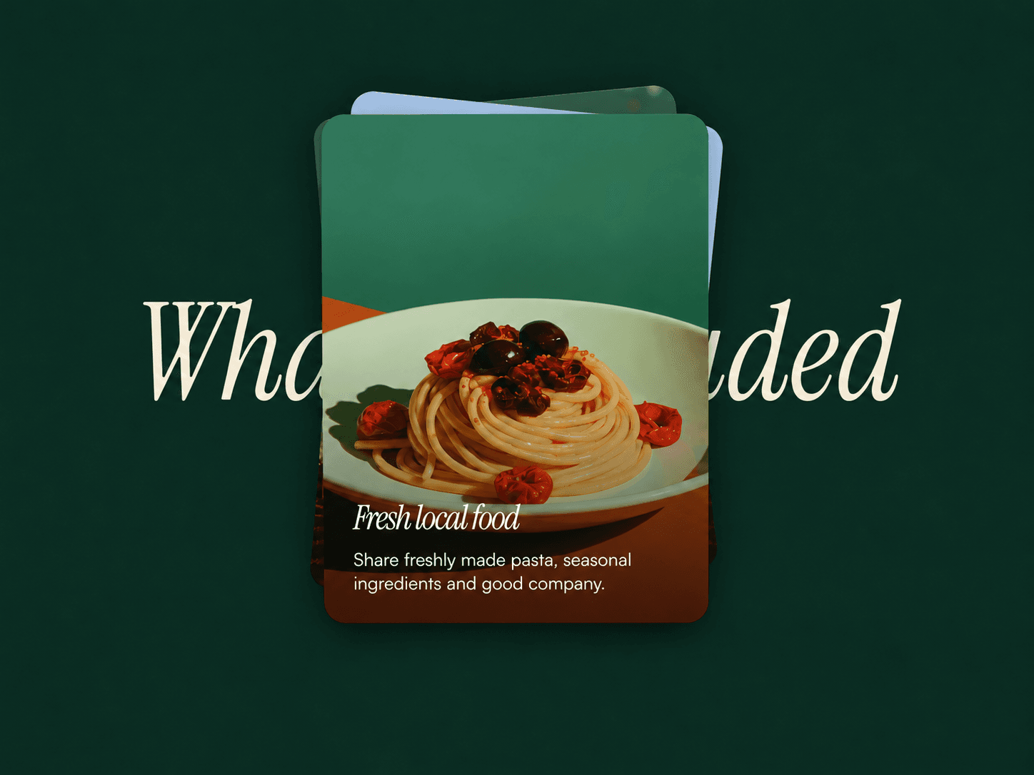
Scroll Card Stack is a Framer scroll animation component for revealing image cards one by one. Present services, package inclusions or selected work in an overlapping stack, without arranging each card on the canvas.
This is a free code component we created for our Framer template. See how it looks like in real project here: https://framer.link/GFuMmo6
Features
Scroll-driven card reveals with rotation and layered depth
Optional background heading with an appear animation
Responsive card sizing and a reduced-motion list
Black fallback for missing images
What you can customize
Add, remove and reorder cards; edit images, alt text, titles and descriptions
Heading text, font, color, entrance distance, duration and delay
Card width, aspect ratio, corners, padding and image shade
Text fonts and color, scroll distance, rotation and stack depth
Use a Fit-height parent with visible vertical overflow. Set the component to viewport or fixed height; reveal space is reserved automatically.
Best for
Service pages explaining what each package includes
Retreat and workshop pages presenting the experience
Portfolios revealing selected projects in sequence
Product landing pages introducing visual features
Share your work
Tag me on X when you launch. I'd love to see it.
Need help?
Email hello@struxent.com with questions or feedback.
Need a matching component?
Extend the editorial imagery and type:
Hero Image Reveal adds a textured photographic reveal.
Text Block Reveal adds graphic heading sweeps; match its block color to your palette.