About Shinny Button
Shinny Button
What it is
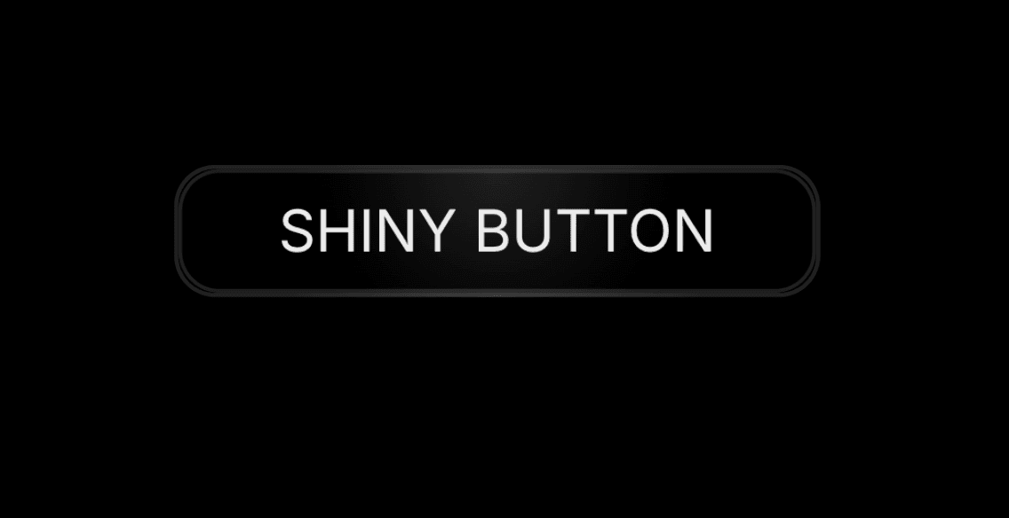
A minimal uppercase button with a soft 1px border and backdrop blur, for Framer. A band of light sweeps across the label and border on a spring loop, the button springs in on load and squishes on tap.
Why you need it
Quiet polish for the one thing you want people to click. A plain CTA blends in. A slow sweep of light across the label and border pulls the eye without shouting, so the button feels crafted rather than default.
Light or Dark, or your own colours. Pick the Light theme for soft grey borders, or Dark for a subtle top glow and hover halo. Turn on Custom Colors to set the text, shine, border and background yourself.
Tuned to your design. Set radius, padding X and Y, shine delay and font in the properties panel, so it drops into any layout instead of fighting it.
Wire it to anything. Add an On Click event to send visitors to a waitlist, a checkout, a booking page or the next section.
Where to use it
Hero CTAs, waitlist sign-ups, pricing cards, or any call to action that needs quiet polish.
Accessible and calm by default. It's a real button, so keyboard focus is visible and screen readers announce it. Visitors who ask their system to reduce motion get a still button with no sweep.
How to use it
In Framer, go to Assets → Code → + New code file.
Name it ShinyButton, paste the code below and save.
Drag the Shiny Button component onto your canvas from the Assets panel.
Set the text, theme, custom colours, radius, padding, shine delay and font in the properties panel.
Publish your site.
Need help?
Email me at wailelmachti6@gmail.com and I'll help you get set up.
Built something with it?
Share it and tag me on X: https://x.com/Waeldesignz. I'd love to see it.
Made by Wael