About Showcase Accordion
Showcase Accordion: Animated Image Accordion with CMS Support
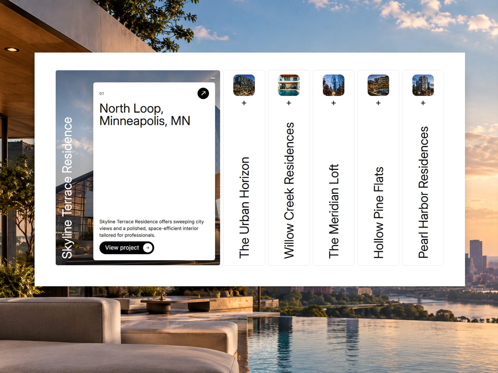
Turn projects, services or products into a smooth, interactive accordion. Panels start as slim strips and expand into full-bleed images with a floating info card, animated with GSAP.
Features
Row or column layout, for horizontal strips or stacked headers
Add panels manually or pull them from the Framer CMS
Autoplay with a progress bar that pauses on hover and focus and stops after a click
Thumbnail previews on closed panels, with adjustable size and radius
Info card with label, heading, text and link, with adjustable width, height and position
Built-in pill button with four hover effects (fill, roll, arrow swap, fade), or connect your own button component
Separate font and text-transform controls for titles, labels, headings, body text and buttons
Full color control for accent, panels, borders, card and button
Adjustable open size, gap and panel radius
Built for production
Keyboard navigation (arrows, Home, End, Enter, Space) and ARIA roles
Respects reduced-motion preferences
Animations are disabled on the Framer canvas and in exports
Fills any width and height you set
Great for
Portfolios, case studies, agency services, menus, product showcases, galleries and landing page sections.