About Smarter Hover Effect
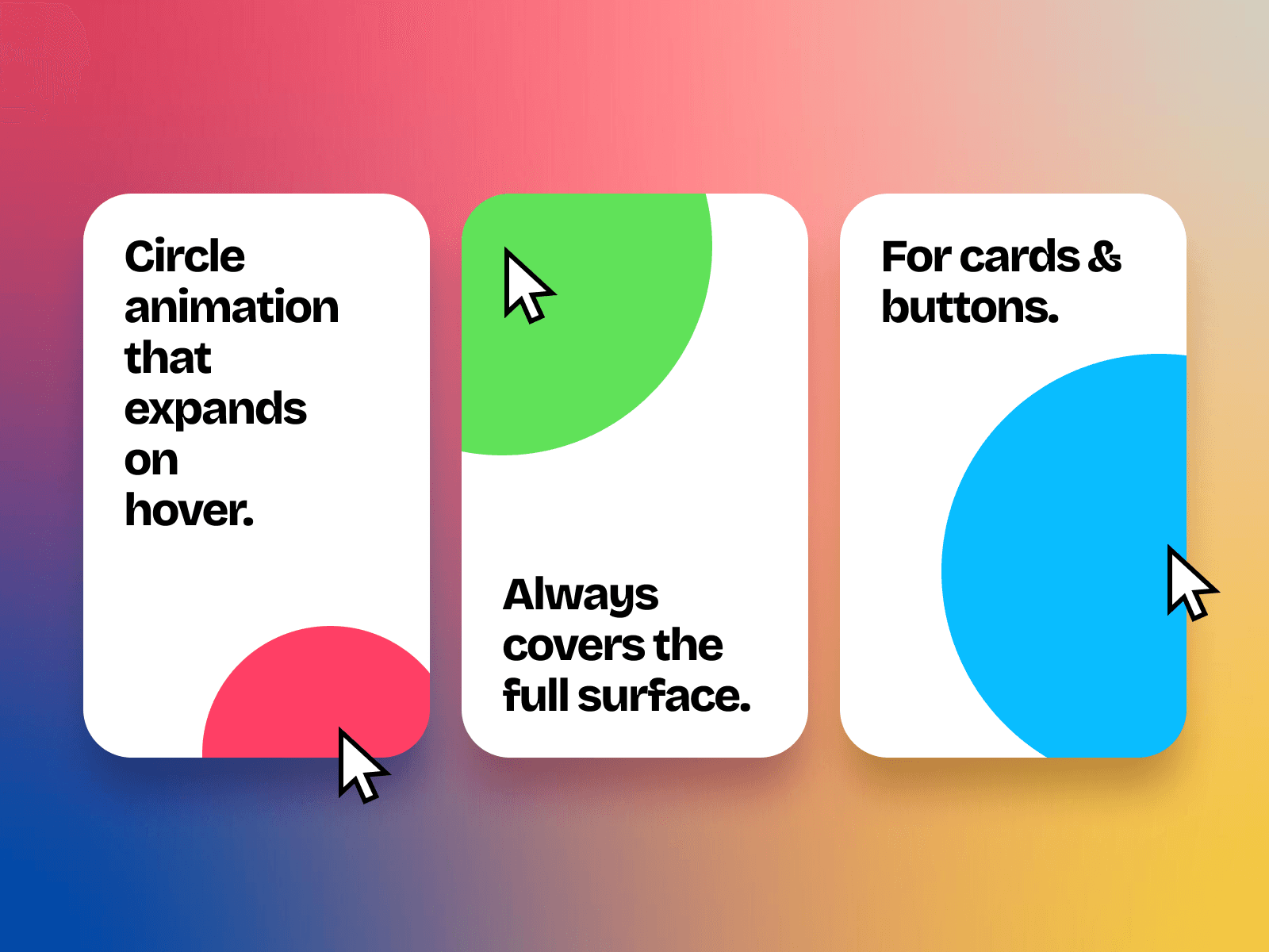
This component adds a smooth, expanding circle to any card, button, or frame when hovered. The circle starts where the cursor enters, grows to fill the area, and fades out where the cursor leaves.
It’s ideal for adding subtle delight and premium interaction without heavy setup.
Features
Designed specifically for Framer
Lightweight and performance friendly
Always covers the full surface, no matter the dimensions
Cursor based hover expansion from entry point
Smooth collapse toward cursor exit position
Multiple animation types, spring, linear, ease options
Adjustable animation duration
Natural fade in and fade out timing
Use case ideas
Premium brand websites
Marketing call-to-action highlights
SaaS feature grids with subtle motion
Unique interactive buttons
Card hover effects for modern websites
How to use it
Make your card design frame and name it "Card". Don't add background or border yet.
Wrap it inside another frame and name it "Card holder". Add background color, border, etc.
Add "Smarter Hover Effect" inside "Card Holder", set it to absolute position and pin it to all edges.
Make sure the "Card" frame inside "Card Holder" has a higher Z index than "Smarter Hover Effect".
Now select your "Card" frame and go to Styles then set Pointer to None.
In the "Smart Hover Effect" control panel, set up your hover color, animation style and duration.
Click Preview to see it in action.
---
If you purchase Smarter Hover Effect, check out the Remix link for usage examples.
---