About Sparkle Dashed
About
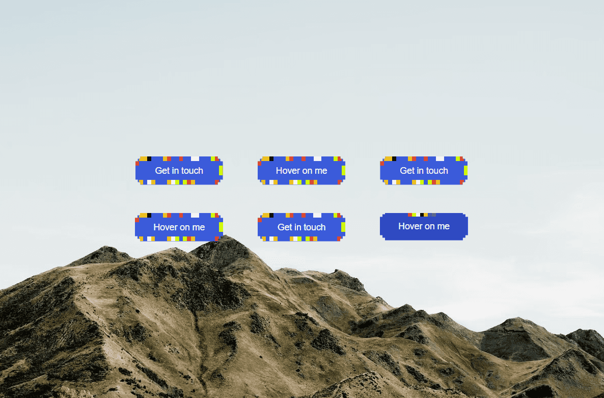
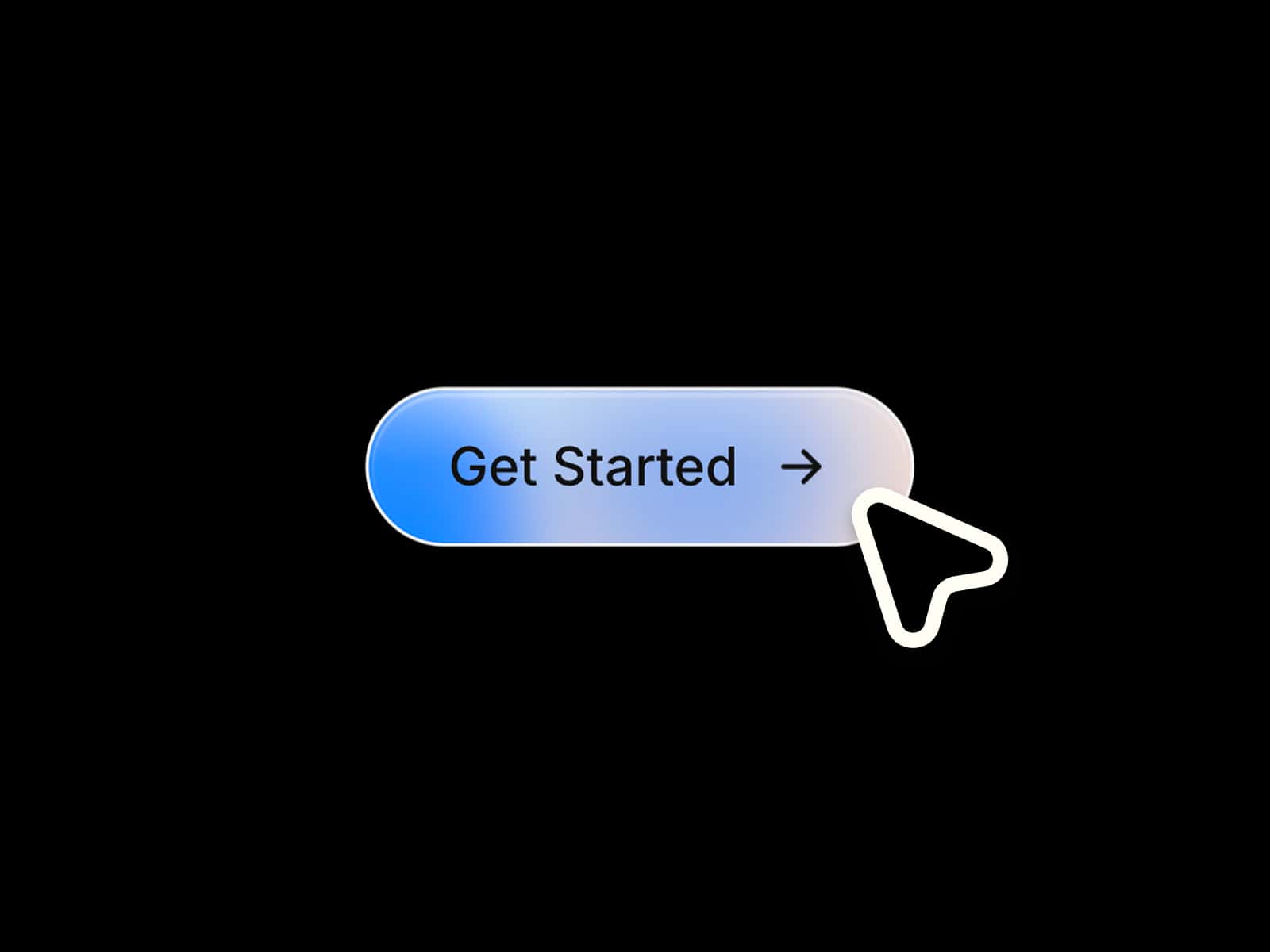
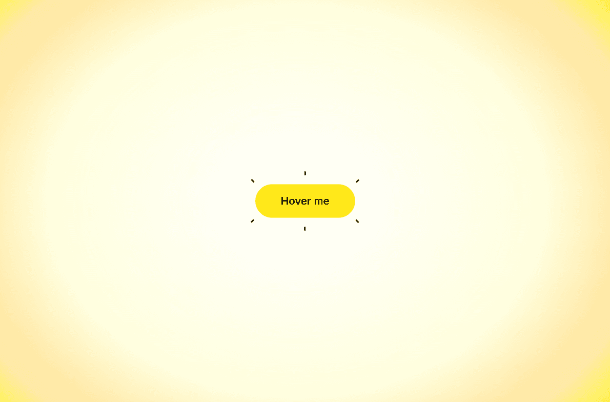
Sparkle Button is a playful, high-energy call-to-action component featuring an animated burst effect on hover. When visitors hover over the pill-shaped button, colorful tick accents shoot outward in a springy starburst pattern, giving your page an instant pop of personality and joy.
What it does
Dynamic Burst Animation: Hovering triggers six directional accent lines to scale out and expand around the button perimeter with a snappy spring timing.
Micro-Scale Easing: The button itself gently expands (
scale 1.02) on hover to create depth and a tactile feel.Staggered Motion: Sparkle lines shoot out with micro-delays, giving the burst a natural, organic feel rather than a stiff simultaneous pop.
Canvas Friendly: Cleanly handles Framer canvas editing and static preview modes without erratic animation loops.
What you can customize
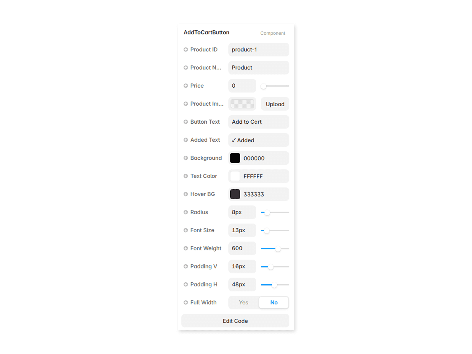
Full control directly from Framer’s right-hand property panel — no code needed:
Text — Button label (e.g., "Explore Features", "Get Started", "Claim Offer")
Link — Destination page or external link (supports opening in a new tab)
Font — Select any typography family, weight, or style
Font Size — Adjustable text sizing in pixels (default:
20px)Text Color — Custom color for the button label (default:
#000000)Button Bg — Default resting pill background color (default:
#FFE81A)Hover Bg — Optional color swap when visitors hover over the button
Burst Color — Color of the surrounding animated sparkle lines (default:
#000000)Padding H & V — Fine-tune horizontal and vertical internal button spacing
Need help?
Questions or feedback? Reach out anytime at karimsaif010@gmail.com or on X @karimsaif0.