About Spotlight Carousel
Details
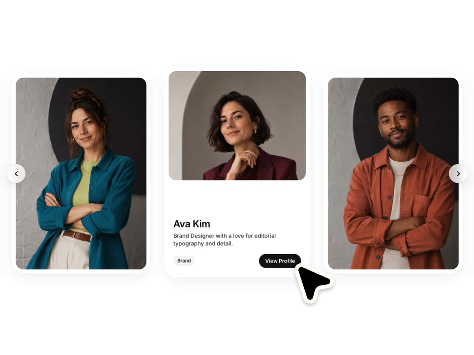
Built to present visuals in a refined and flexible way. The component focuses on clarity and smooth interaction while staying extremely easy to customize.
The carousel supports up to six images out of the box. Only images that are set will appear automatically, allowing the component to adapt to your content without additional setup.
All key styling options are controlled through variables. Adjust border radius, spacing, borders and shadows directly to match your design system without touching the structure of the component.
The layout is designed to scale smoothly across different screen sizes, making it suitable for both desktop and mobile layouts.
Features
Variable based styling for radius, gaps, borders and shadows
Supports up to 6 images out of the box
Automatically hides unused image slots
Clean thumbnail preview navigation
Scales well for mobile layouts
Link support