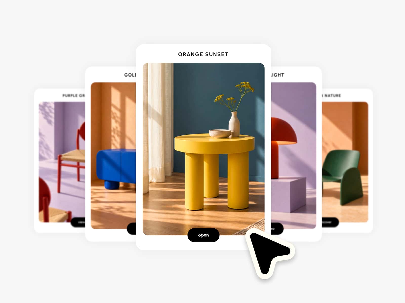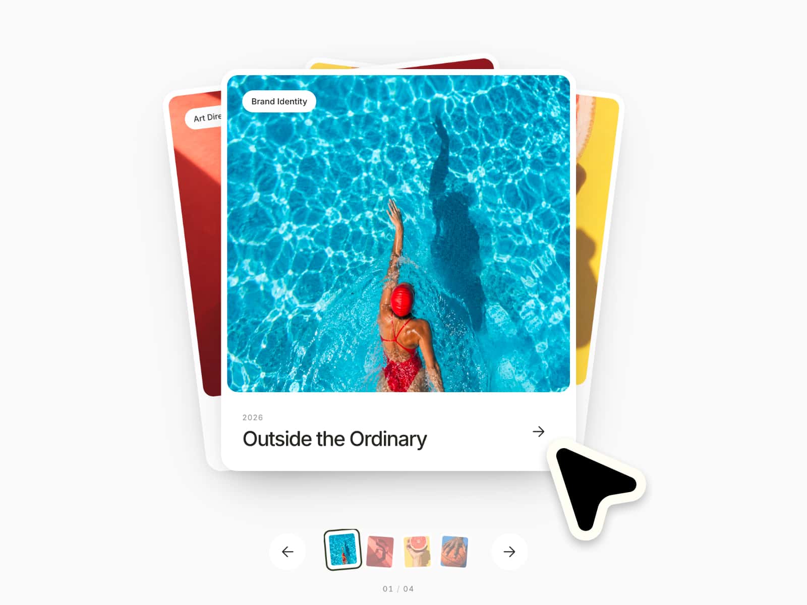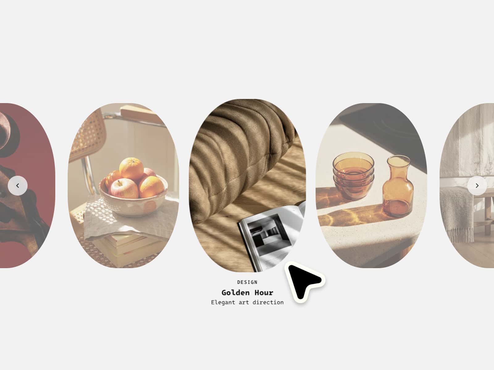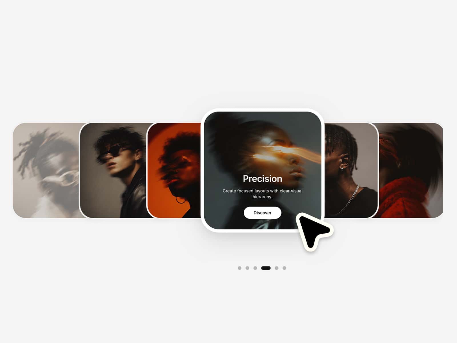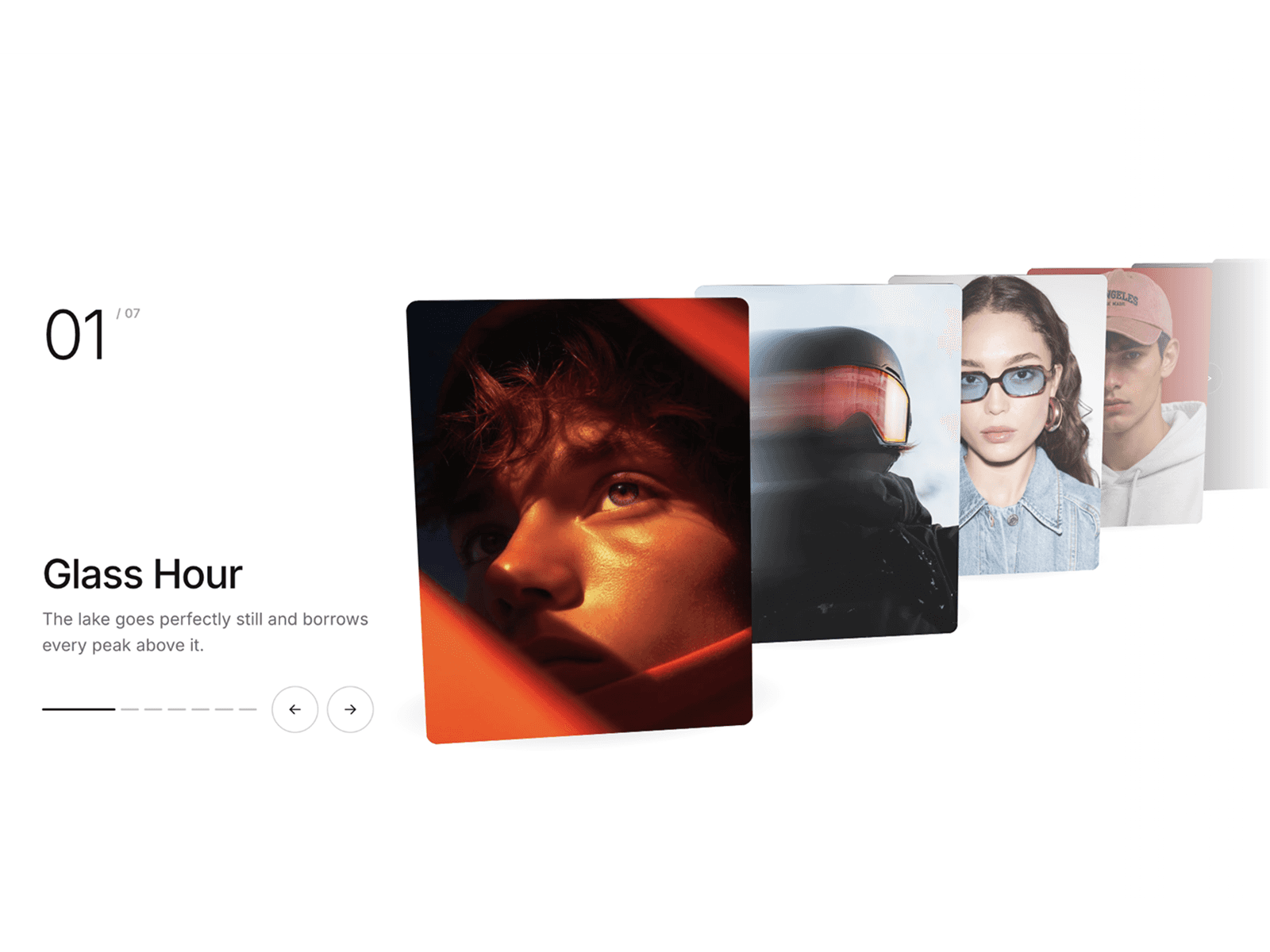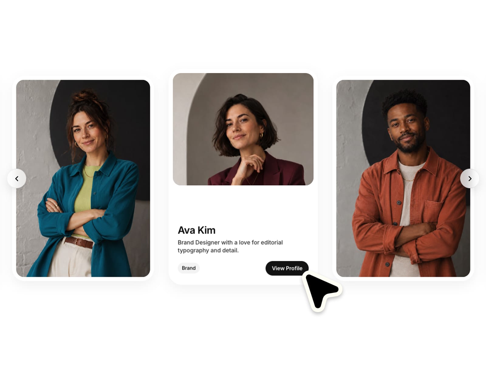
About Team Member Carousel
✦ Introduce your team with personality.
Showcase your team with interactive profile cards, smooth animations and a clean editorial layout. Fully responsive, easy to customize and ready to use in seconds. Make it completely your own with flexible controls for layout, styling and motion :)
⚙ What you can customize
Easily adapt every part of the component to match your own brand and style.
Portraits ✦ Names ✦ Descriptions ✦ Role tags ✦ Button labels ✦ Card background ✦ Page background ✦ Text colors ✦ Tag colors ✦ Button colors ✦ Typography ✦ Border radius ✦ Card shadows ✦ Card gap ✦ Section padding ✦ Image margin ✦ Card sizing ✦ Arrow styling
🎯 Perfect for
Team sections ✦ Agency websites ✦ Studio portfolios ✦ Startup landing pages ✦ About pages ✦ Founder showcases ✦ Employee profiles ✦ Speaker lineups ✦ Creator teams ✦ Advisory boards
📱 Responsive by default
Optimized layouts for Desktop, Tablet and Mobile with touch-friendly interactions and beautifully centered profile cards.
🖱 Included interactions
Drag & swipe ✦ Click to focus ✦ Arrow controls ✦ Keyboard navigation ✦ Animated profile reveal ✦ CTA buttons
🔗 Live Preview
https://teammembercarousel.framer.website/
––––––––
❤ Thank you so much for your support! I genuinely appreciate every download. I hope you have fun customizing this component and making it your own. Happy building!