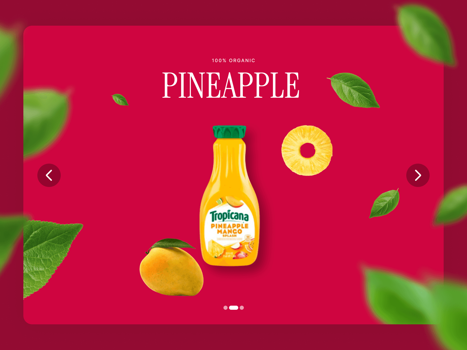
About Stacked Slider
Stacking Slider Component
A premium carousel component with an elegant card-stacking effect. Cards slide left and stack with customizable visible offsets, creating a sophisticated layered appearance perfect for portfolios, galleries, and featured content.
What it is
A professional stacking slider that creates a unique visual experience where cards elegantly slide and stack on top of each other as users navigate. Unlike traditional carousels, this component shows stacked cards with adjustable visible offsets, adding depth and visual interest to your designs.
Features
- Elegant Stacking Effect: Cards stack with customizable offset (0-100px visible edge)
- Smooth Navigation: Bi-directional sliding with Framer Motion transitions
- Custom Arrow Buttons: Upload icons or style built-in arrows (color, background, hover, radius)
- Responsive Controls: Separate desktop/mobile offset settings (auto-detects <992px)
- Flexible Layout: Adjustable card gaps and button positioning (left/center/right)
- Native Integration: Works like Framer's carousel - connect any components as slides
- 15+ Controls: Complete customization without code
What you get
- Production-ready Framer component
- Native Framer property controls (no code files needed)
- Responsive design with mobile/desktop settings
- Hover states and smooth transitions
- Professional default styling
Setup
1. Add component to your canvas
2. Connect components or layers as slides (click + to add more)
3. Customize card gap, stack offset, and arrow styling
4. Adjust button position and spacing
5. Done!
Key Settings
Layout:
- Card Gap: Space between cards (0-100px)
- Stack Offset: Visible edge of stacked cards (desktop)
- Mobile Stack Offset: Separate control for mobile devices
Arrow Styling:
- Upload custom icons or use built-in arrows
- Background color, hover color, and border radius
- Size control (20-80px)
- Position: Left, Center, or Right alignment
Animation:
- Framer Transition control for timing/easing
- Smooth forward and backward navigation
- Disabled state opacity control
Use Cases
- Portfolio showcases
- Product galleries
- Testimonial carousels
- Featured content sections
- Case study highlights
- Team member profiles
- Service offerings
- Blog post highlights
Technical Notes
- Z-index automatically managed (first card = highest)
- Edge case handling (arrows disable at start/end)
- Smooth bi-directional navigation
- Responsive breakpoint at 992px
- Works with any connected components
Best Practices
- Use consistent card sizes for best effect
- Stack offset of 20-40px works well for most designs
- Card gap of 20-30px provides good breathing room
- Mobile offset of 0px creates seamless stacking on small screens
Need Complete Site Templates?
Love this component? Check out our premium Framer templates at oma-kase.com/templates
Get fully designed, production-ready websites featuring this component and more:
Portfolio templates with advanced interactions
Agency sites with scroll-driven animations
SaaS landing pages optimized for conversion
E-commerce templates with cart functionality
Creative showcases with unique layouts
Created with ❤️ by Omakase Design for the Framer community