About StaggerButton
About this Component
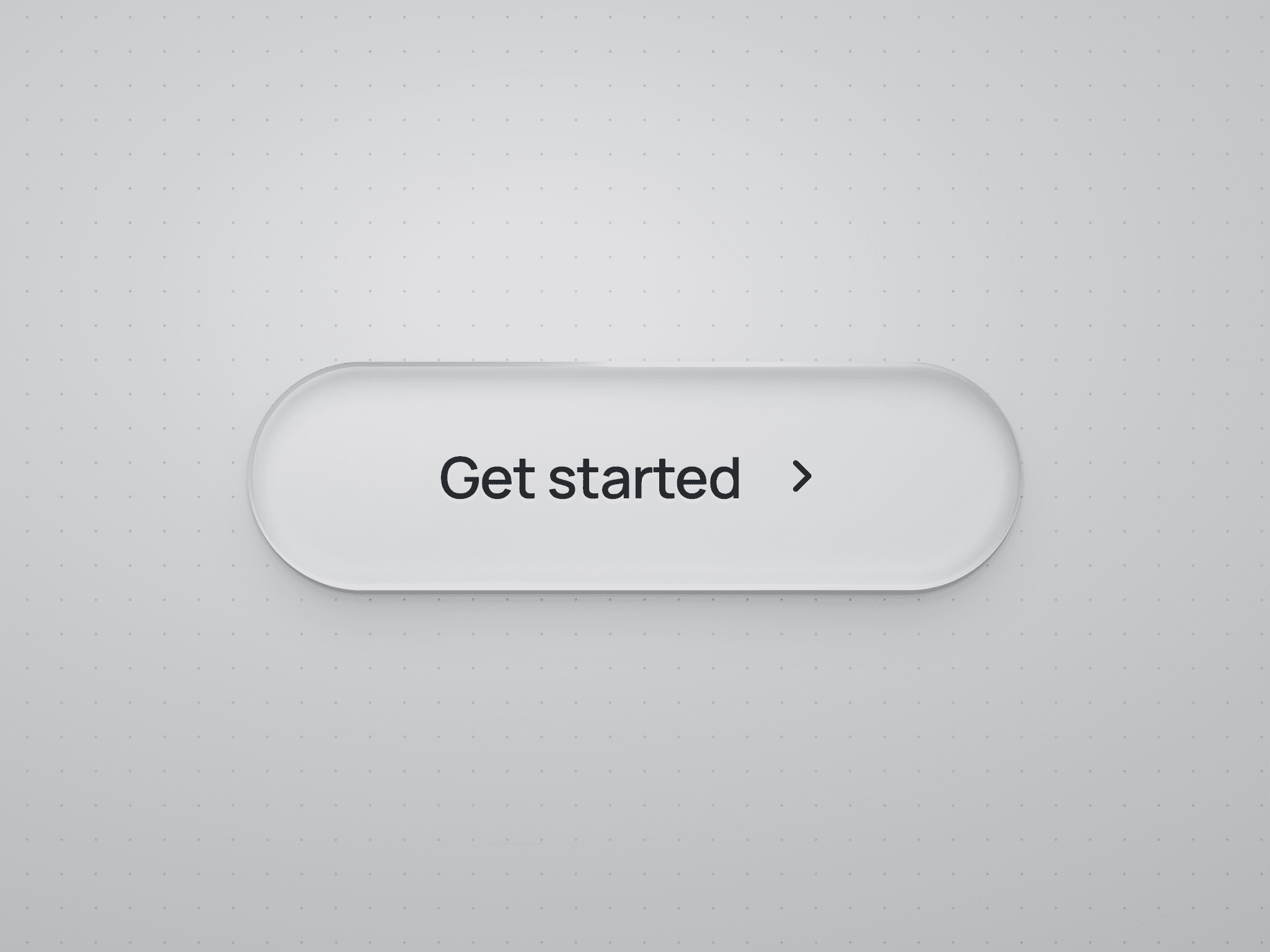
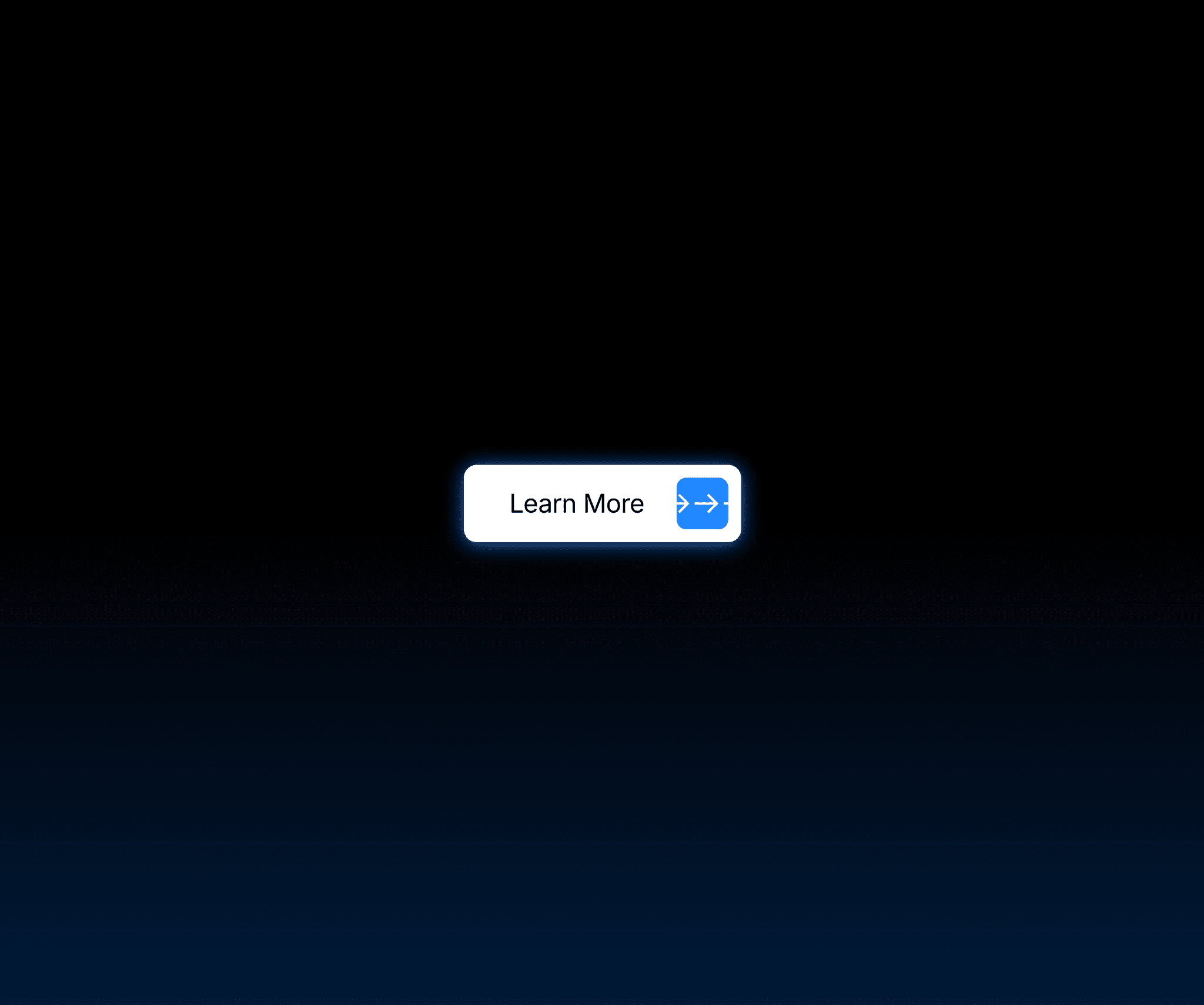
StaggerButton is a highly polished call-to-action button that brings refined motion to your Framer projects. On hover, the label animates one character at a time — each letter slides up and is instantly replaced by a duplicate rising from below, creating a crisp, cascading text-reveal effect. At the same time, the arrow icon gives a subtle nudge and the background eases into your hover color, all happening in one fluid, satisfying interaction.
Built as a native Framer code component with zero external dependencies, it supports Framer's built-in page transitions out of the box. Pick any page from the Link To field and the button navigates with your project's transition animation, no extra configuration needed. External URLs, mailto, and tel links are supported too.
The component is fully resizable on the canvas and adapts to any layout. Drop it in, resize to fit, and control everything from the properties panel.
Customizable Properties
Label: Edit the button text
Font: Full font control including family, size, weight, style, and letter spacing
Background: Set the default button background color
Background Hover: Set the color the button eases into on hover
Text Color: Set the label color
Icon Background: Set the color of the arrow box
Icon Color: Set the arrow color
Padding: Independent top, bottom, left, and right spacing
Gap: Control the space between the label and the arrow box
Radius: Control button corner roundness
Icon Size: Set the size of the arrow box
Link To: Native Framer link picker supporting internal pages, external URLs, mailto, and tel