About TestimonialDeck
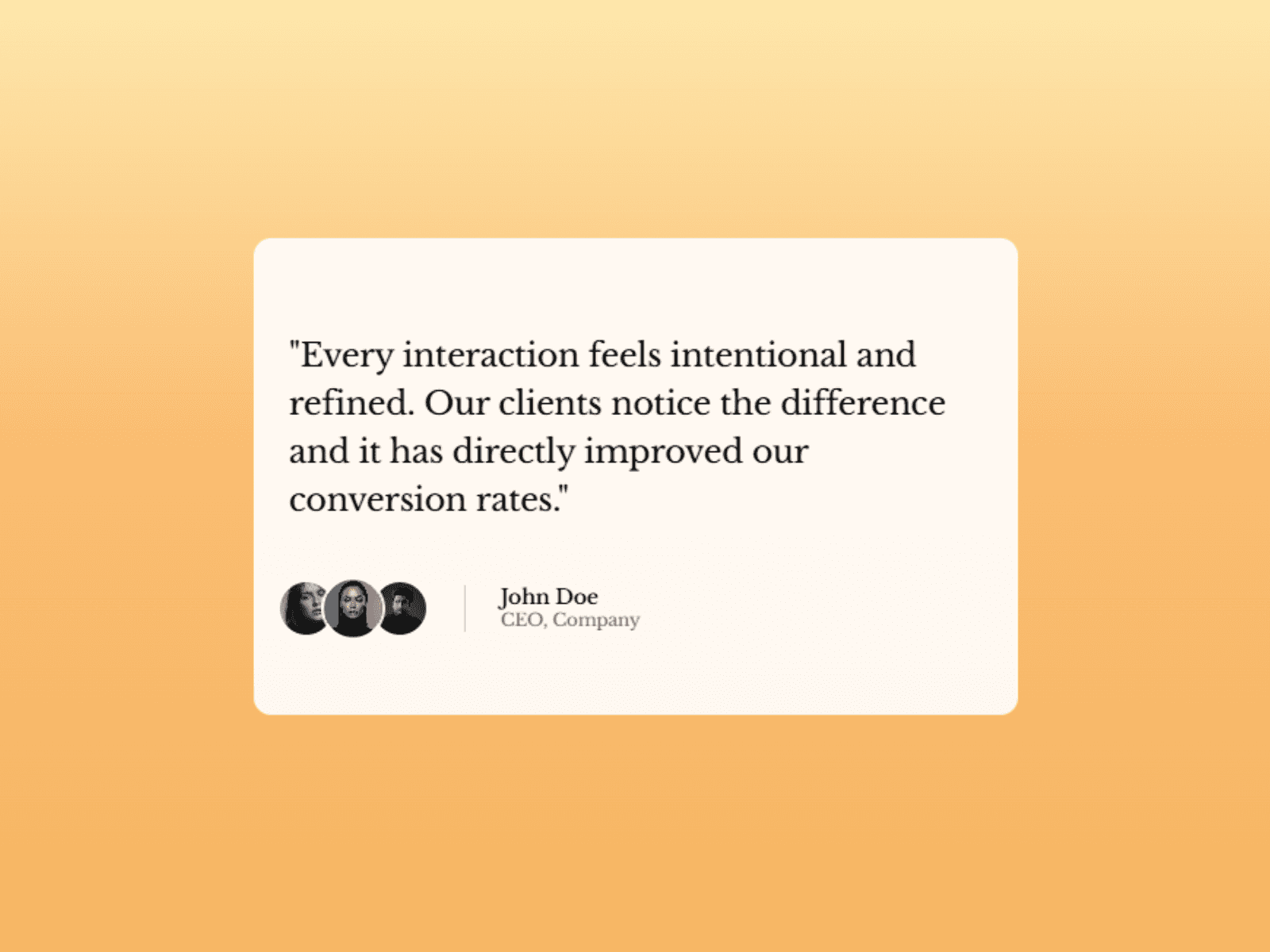
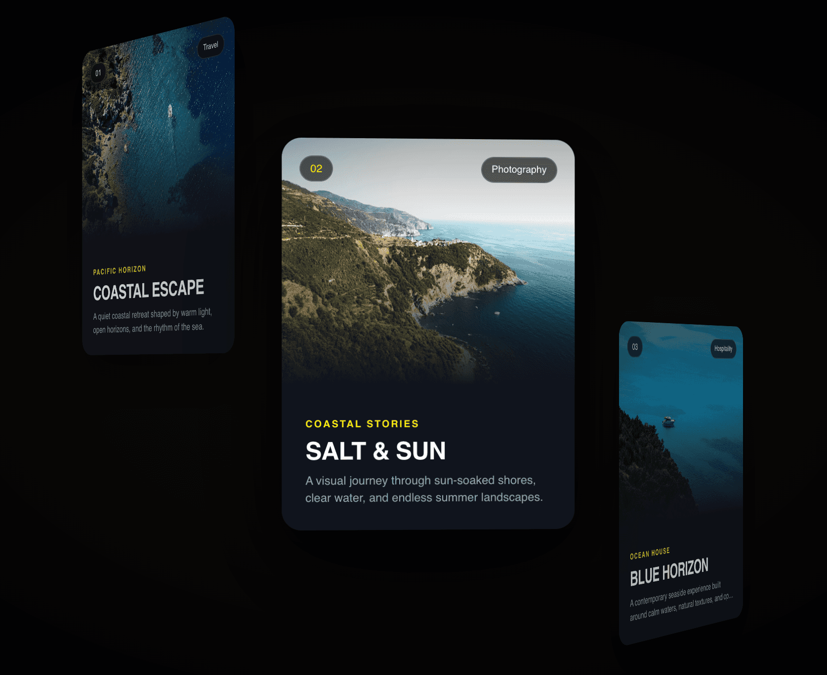
A staggered testimonial carousel where cards are arranged horizontally with alternating vertical offsets and rotations. The center card elevates with a drop shadow and primary color background. Click any card to bring it to focus or use arrow navigation. Built for landing pages, hero sections, and testimonial showcases that need a visually dynamic social proof section.
Features
Staggered horizontal card layout with alternating vertical offsets (±15px)
Inactive cards have subtle rotations (±2.5 degrees) for dynamic depth
Center card elevated with drop shadow and primary color background
Clipped polygon card shape with 50px chamfered corner design
Diagonal accent line in top-right corner of each card
Click any card to bring it to center focus instantly
Left and right arrow navigation at the bottom
Smooth 500ms transitions on all card movements and transformations
Unlimited testimonials via array control
Each testimonial — text, author attribution and image upload
48×56px portrait image crop with top alignment
Responsive — reduces to 290px minimum card width below 640px
Font sizes scale appropriately with card dimensions
Configurable card size (250–500px)
Full color controls — primary, background, border, text, muted text
No dependencies
Property Controls
Content
Testimonials — unlimited items · text, author name, title, image per item
Layout
Card Size — width of each card (250–500px)
Colors
Primary — center card background and accent color
Background — card background color
Border — card border color
Text Color — testimonial text color
Muted Text — author attribution color
Technical Details
React useState for active card index tracking
startTransition for smooth non-blocking state updates
CSS transforms for card positioning, rotation and offset
Window resize listener for responsive breakpoint detection
Responsive at 640px breakpoint — minimum 290px card width
Proper cleanup of resize event listeners on unmount
Default Settings
6 pre-configured testimonials with portrait images
1200×600px default canvas
Smooth 500ms card transition duration
Use Cases
Landing pages · Hero testimonial sections · SaaS homepages · Agency websites · Product review showcases · Client testimonial displays · E-commerce social proof sections · Portfolio client feedback
SEO Keywords
framer testimonial carousel · framer staggered cards · framer testimonial component · framer card carousel · framer social proof · framer review carousel · framer testimonial deck · framer animated testimonials · framer customer reviews · framer testimonial design · framer card stack · framer quote carousel · framer landing page component · framer code component · framer testimonial slider