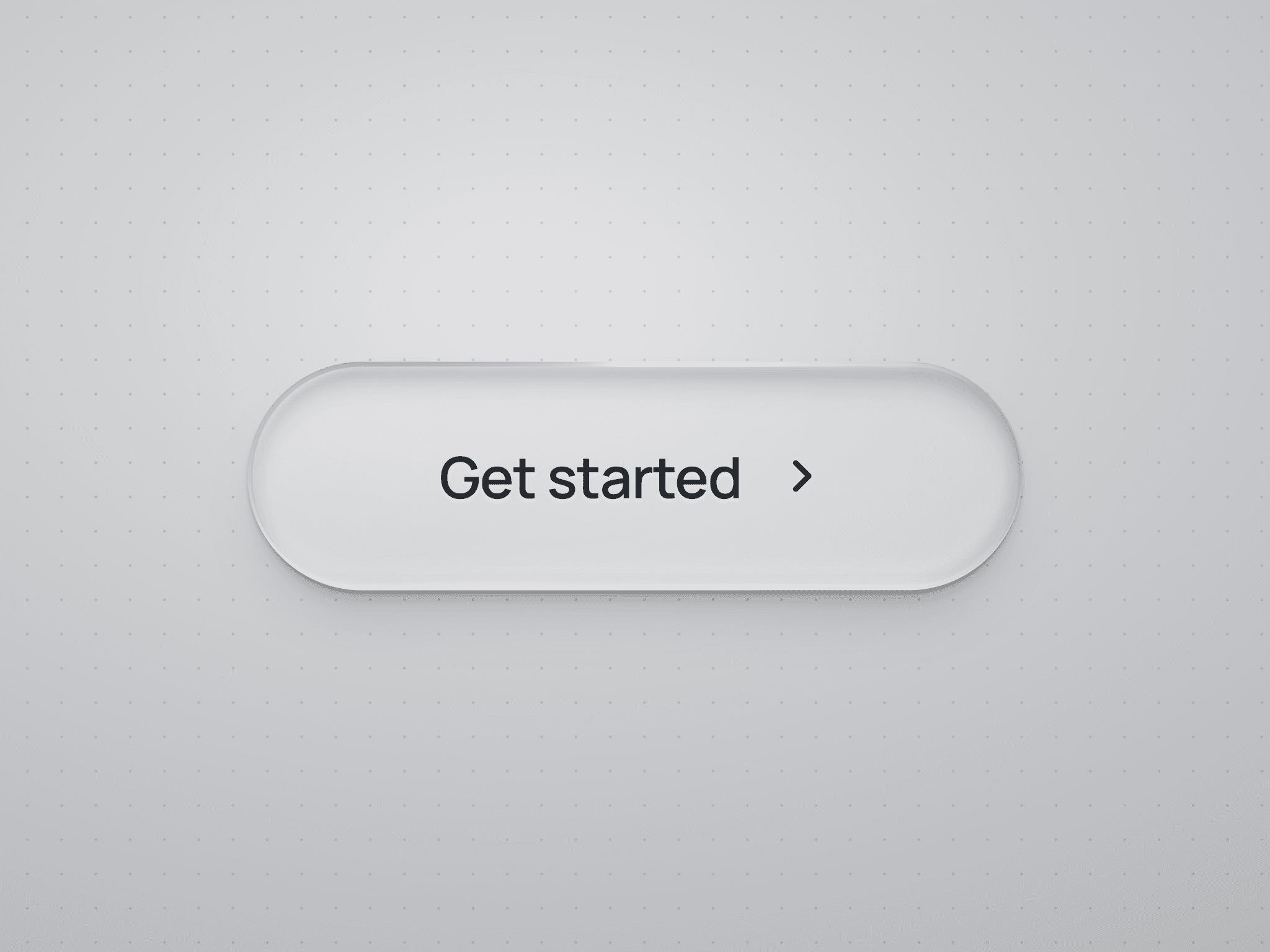
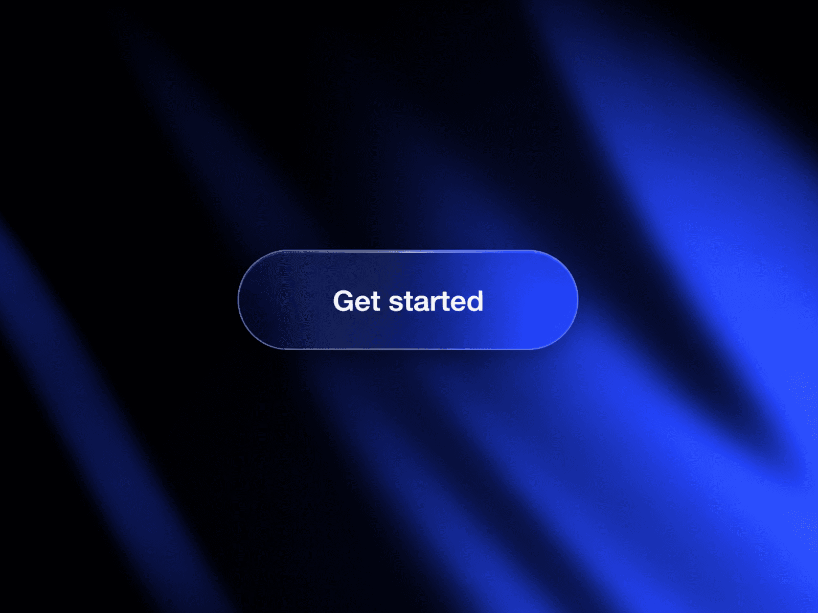
About Theme Toggler
Copy it into your project, add light and dark color styles, choose how it behaves — and you’re done.
No styling. No setup headaches. It just works.
Why this is different
This isn’t a pre-styled toggle or animated gimmick.
Theme Toggler is a lightweight, invisible theme controller that adapts to your existing design.
You design the UI.
What you get
Zero styling required — works with any button, icon, or custom design
Global control — one component updates light & dark mode across the entire site
Two powerful modes — click to toggle or automatic scroll-based themes
Remembers user preferences — visitors don’t need to toggle again
Feels native — instant switching with no awkward flashes or behavior
Setup in under a minute
Copy the component into your Framer project
Drag it onto the page
Choose Toggle or Scroll in the properties
Pick your initial theme
That’s it. Your site now supports light and dark mode.
Toggle mode (click to switch)
Perfect for a switch, button, icon, or any custom theme control.
Drop the component into the same frame as your custom toggle or icon
The entire area becomes clickable
One click switches the theme instantly
The user’s choice is remembered automatically
You design the button — the component handles everything else.
Scroll trigger mode (automatic by section)
Perfect for sites where the mood changes as users scroll — without adding any UI.
Dark hero → light content → dark footer
The theme updates automatically while scrolling
Smooth, polished transitions between sections
No visible controls required
Once placed on the page, it quietly runs the experience in the background.
One small requirement
Your project needs light and dark Color Styles for the theme change to be visible.
If you already use Framer styles — you’re good to go.
Support
Have questions or need help? Reach out at hi@aleksihuusko.com