How many restaurants lose a booking because their site is just a photo and a phone number?
Restro is live and free: full CMS menu, dish pages, real reservation page.
Grab it free: https://framer.link/XP0oVcP

Your Growth Partner For SaaS, AI & Startup Founders. Framer Certified Partner & Expert. Open to Collab. DM me at gr8rstudio@gmail.com
How many restaurants lose a booking because their site is just a photo and a phone number?
Restro is live and free: full CMS menu, dish pages, real reservation page.
Grab it free: https://framer.link/XP0oVcP
CureAI is live. An AI healthcare template for telehealth platforms, clinics, and diagnostics startups.
Free. Duplicate it and make it yours - https://framer.link/iY8IOO0
New template for health tech founders: CureAI. Built for telehealth platforms and diagnostics products with an eight-card feature grid, ten testimonials, and a CMS blog.
Free Framer portfolio template → https://framer.link/KKnuLNt
Your Framer portfolio is losing clients in the first 3 seconds - because "available for work" is hidden in the footer.
Frederock puts an availability badge in the hero. The first thing a client sees is that you can start. That one badge books more calls than any project you'll show.
Norell is in second place in the free template category!
Here is the free remix link: https://framer.link/CVlmpWG
Most portfolio sites lose the client in the first 3 seconds.
Not because the work is weak.
Because the page is too loud.
Three fonts. Five colors. A hero that talks about "passion" before it shows a single project. The visitor can't tell what matters, so they leave.
I built Norell on the opposite bet:
→ One bold wordmark. Say who you are, once.
→ One quiet line. Say what you do.
→ Then get out of the way and let the work carry the page.
Big type isn't decoration here. It's hierarchy doing a job: telling the eye where to go first.
When you cut everything that isn't pulling weight, the work starts to look more expensive. Same projects. Better frame.
Restraint isn't the safe choice. It's the confident one.
Norell is in second place in the free template category!
Here is the free remix link: https://framer.link/CVlmpWG
Most portfolio sites lose the client in the first 3 seconds.
Not because the work is weak.
Because the page is too loud.
Three fonts. Five colors. A hero that talks about "passion" before it shows a single project. The visitor can't tell what matters, so they leave.
I built Norell on the opposite bet:
→ One bold wordmark. Say who you are, once.
→ One quiet line. Say what you do.
→ Then get out of the way and let the work carry the page.
Big type isn't decoration here. It's hierarchy doing a job: telling the eye where to go first.
When you cut everything that isn't pulling weight, the work starts to look more expensive. Same projects. Better frame.
Restraint isn't the safe choice. It's the confident one.
Most SaaS templates fight over the pricing table. This enterprise AI template has no pricing page, on purpose.
Anchorr: free Framer template for B2B and enterprise AI platforms.
Dark, minimal, demo-first. Every CTA books a call, not a checkout.
Free AI SaaS template: 12 pages, CMS blog, changelog, careers. Not a landing page, a full site.
Dark and light modes, both built out. Remix it, rename it, ship it.
Myniq is a free Framer template for AI SaaS startups, automation platforms, and AI agent products. Light professional design with a purple-orange palette, dashboard mockups, and 11 pages ready to launch.
What's inside:
→ Conversion-focused homepage with hero, social proof, and multi-CTA flow
→ Features, Integrations, and Pricing pages with tiered plan comparison
→ Dashboard mockups and analytics displays that make the product feel real
→ CMS-powered blog and careers pages
→ About, Contact, Legal, and 404 — the full site, not just a landing page
Pages: Home · About · Features · Pricing · Integrations · Blog (CMS) · Careers · Contact · Privacy · Terms · 404
Built for AI and SaaS founders who need a complete product website — not another one-page template.
The rest of the Gr8r Themes catalog goes deeper.
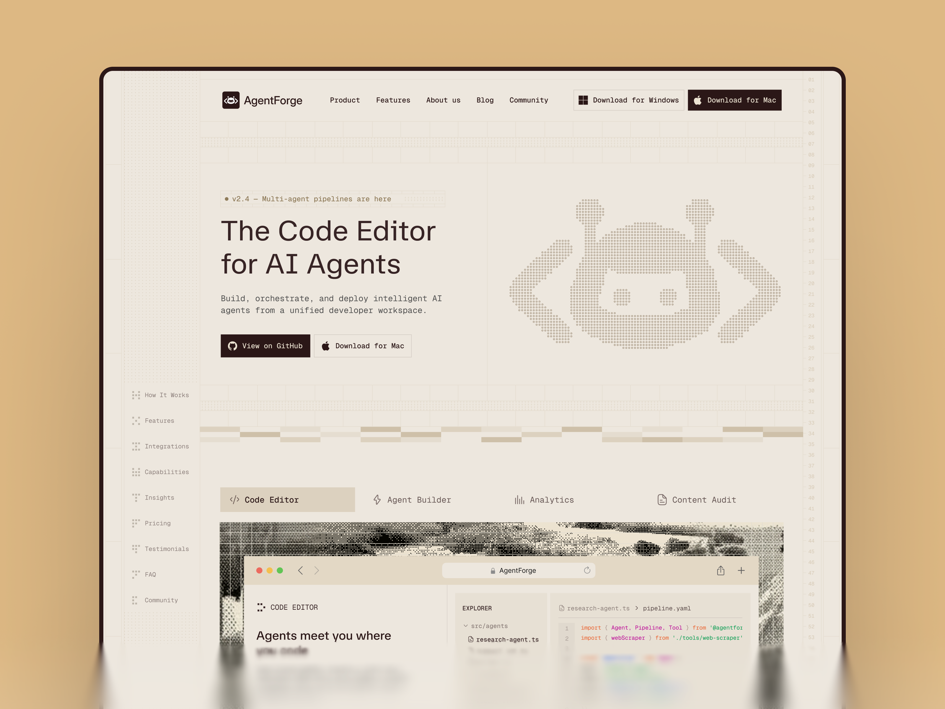
AgentForge - a new Framer template for AI dev tools, code editors, and agent platforms.
Warm retro-terminal design in a category full of dark neon templates. Monospace type, ASCII art, tabbed product showcase, pricing, FAQ, and a realistic in-editor mockup.
Built for developer tools and technical founders who want a product site that speaks fluent developer.
Publishing soon on the Framer marketplace.
Skyroket is a free Framer template for AI agents, SaaS startups, and automation platforms. Dashboard-first design with demo data that looks like a real product, not a placeholder.
What's inside:
→ Dashboard hero with realistic metrics and trust logos
→ Solutions grid: Task Automation, Smart Chat, Live Insights, AI Security, Agent Marketplace
→ Integration cards — Slack, Trello, HubSpot, Mailchimp, Zoom
→ Testimonials, three-tier pricing, FAQ
→ CMS blog, features, and careers pages
Pages: Home · About · Features · Pricing · Blog (CMS) · Careers · Contact · Legal · 404
Built for AI startups, automation agencies, and B2B SaaS founders who want a dashboard-first site live today.
Free to remix. The rest of the Gr8r Themes catalog goes deeper.
Every creator is building AI chatbot templates right now.
So I built one for ERP software instead. Less exciting, less competition, more real buyers.
I named my free template after my own studio.
Gr8r template. Gr8r Studio. Same name, on purpose.
Here's the logic:
A free template gets remixed far more than a paid one ever gets bought.
Every remix is someone spending hours inside something with your name on it.
98 remixes so far. That's 98 designers who now know the brand without seeing a single ad.
→ Paid templates make revenue.
→ Free templates make reputation.
Most creators give away their weakest work for free.
Do the opposite. Your free template is your business card; make it the one thing you'd be proud to be known by.
I removed GPT-4.0 is here" from an AI website today.
Not because it's wrong.
Because it expires.
Model names age in months. The page ages with them.
So I replaced it:
→ Before: "GPT-4.0 is here"
→ After: "New models added as they're released"
One version needs updating every release.
The other stays true forever.
Quick test for your own copy:
Read every headline and ask whether this sentence will still be true in one year?
If not, you didn't write copy.
You wrote a deadline.
I found a $64/month plan offering the same features as the free plan.
On a real SaaS website.
The designer copy-pasted the feature list between pricing cards and forgot to update it.
Nobody caught it. Everyone reviewed the design — nobody read the table.
The test I use now:
→ Cover the prices.
→ Read only the features.
→ You should still know which plan is which.
A pricing table is not a layout. It's an argument.
Cooking something new. ☕
A coffee shop website but not the kind you've seen 100 times on the marketplace.
Every café template looks the same:
→ Big latte photo
→ Menu screenshot
→ Footer
None of them answer the only 2 questions customers actually have.
I'm building the one that does.
Dropping soon.
200 followers!!!
Small number. Real people.
Every one of you followed because of the work, not the noise.
That's the only way I want to grow.
More builds, more breakdowns, more shipping. Thank you.
Your pricing page isn't a price list.
It's a path. And most founders design it backwards.
Here's what I mean:
A pricing page with 3 plans has one job:
make the middle plan feel like the obvious choice.
That only works when the ladder makes sense.
→ $29 → $59 → $99: the middle feels safe. Most pick it.
→ $29 → $299 → $899: the middle feels like a different product. Most freeze.
When the jump is 10x, buyers don't upgrade.
They stop and ask, "Wait, what am I actually comparing?"
And a confused buyer never buys. They "come back later."
The design rule:
Each tier should feel like the next step.
Not a different staircase.
Founders: what's the gap between your first and second plan?
"One CTA per page" is advice that costs SaaS founders money.
Every landing page guide repeats it.
And for most pages, it's right.
But a SaaS hero has two visitors, not one:
→ The ready buyer. They want to start free, right now.
→ The careful buyer. They want a human before a signup form.
Give them one button, and you force a choice:
One CTA for the ready buyer? The careful one bounces.
One CTA for the careful buyer? The ready one loses momentum.
The fix is simple:
Primary button: start free.
Secondary button: book a demo.
Different weight, same row. No competition, just two doors.
One CTA is a rule for focus.
Two CTAs is a decision about who you serve.
Know the difference.
One CTA or two on your hero- which side are you on?