Asterix22h
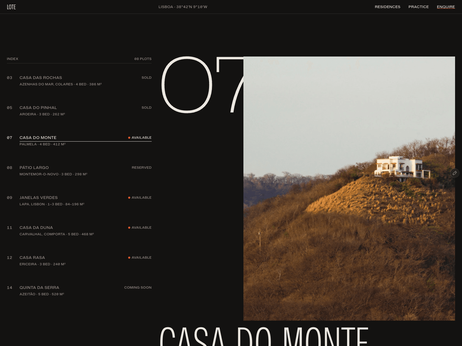
A closer look at the type in Lote’s residence index.
Oversized plot numbers beside the smaller property details, with plenty of space for the photography.
https://excellent-favorites-639729.framer.app/
A closer look at the type in Lote’s residence index.
Oversized plot numbers beside the smaller property details, with plenty of space for the photography.
https://excellent-favorites-639729.framer.app/
The last stretch of Lote’s homepage.
From the homes to “Where we build”, then a big invitation to arrange a viewing. A small tour of how the page comes together ↓
https://excellent-favorites-639729.framer.app/
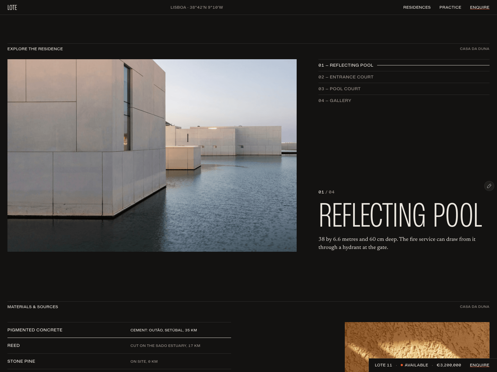
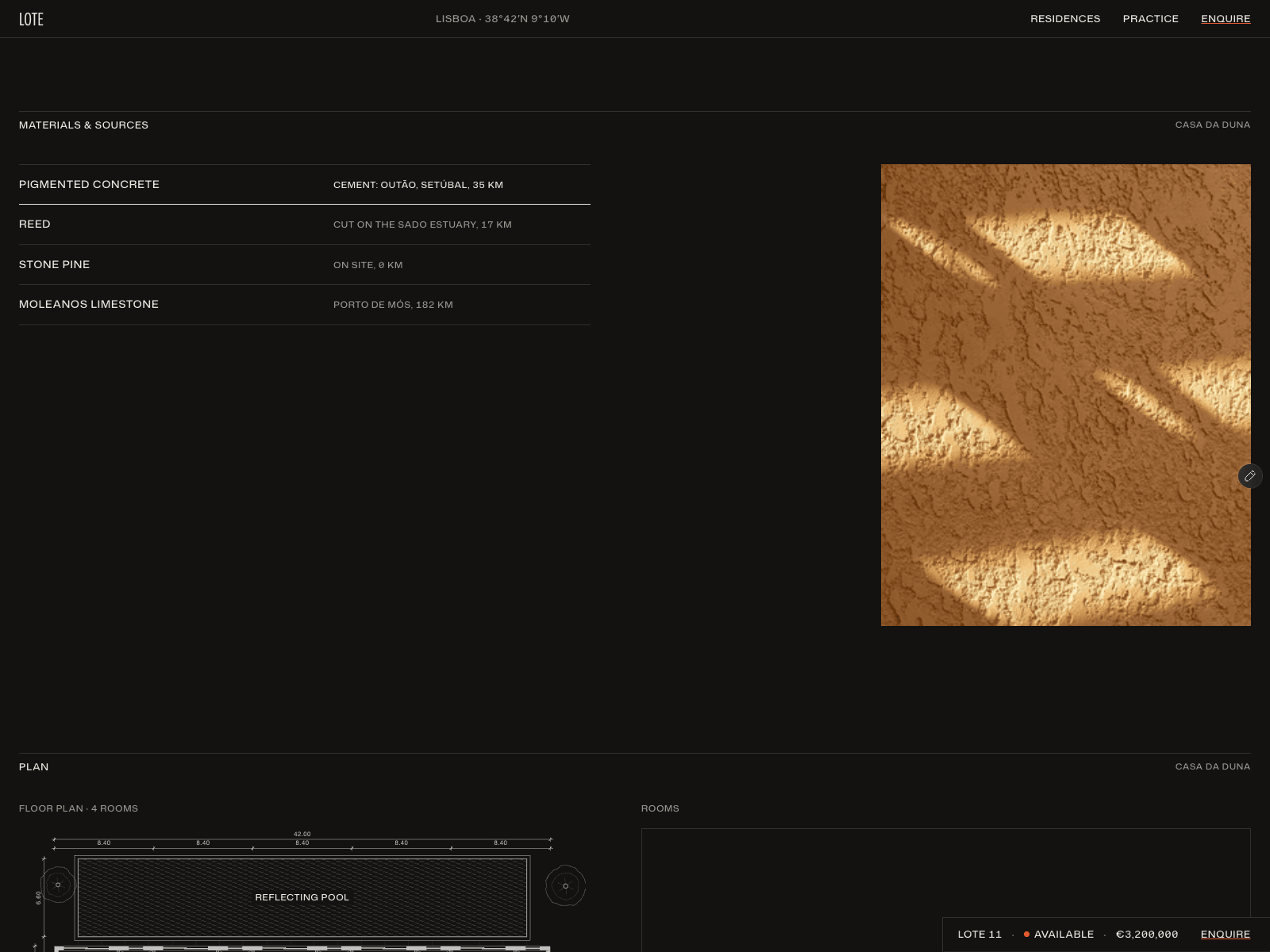
From the reflecting pool to the floor plan.
Lote’s residence pages mix large photographs with numbered details, material notes and architectural drawings. A closer look at Casa da Duna ↓
Lote on a smaller screen.
Tall residence names, full-width photos, and tiny status markers in the plot index. A quick mobile scroll ↓
https://excellent-favorites-639729.framer.app/
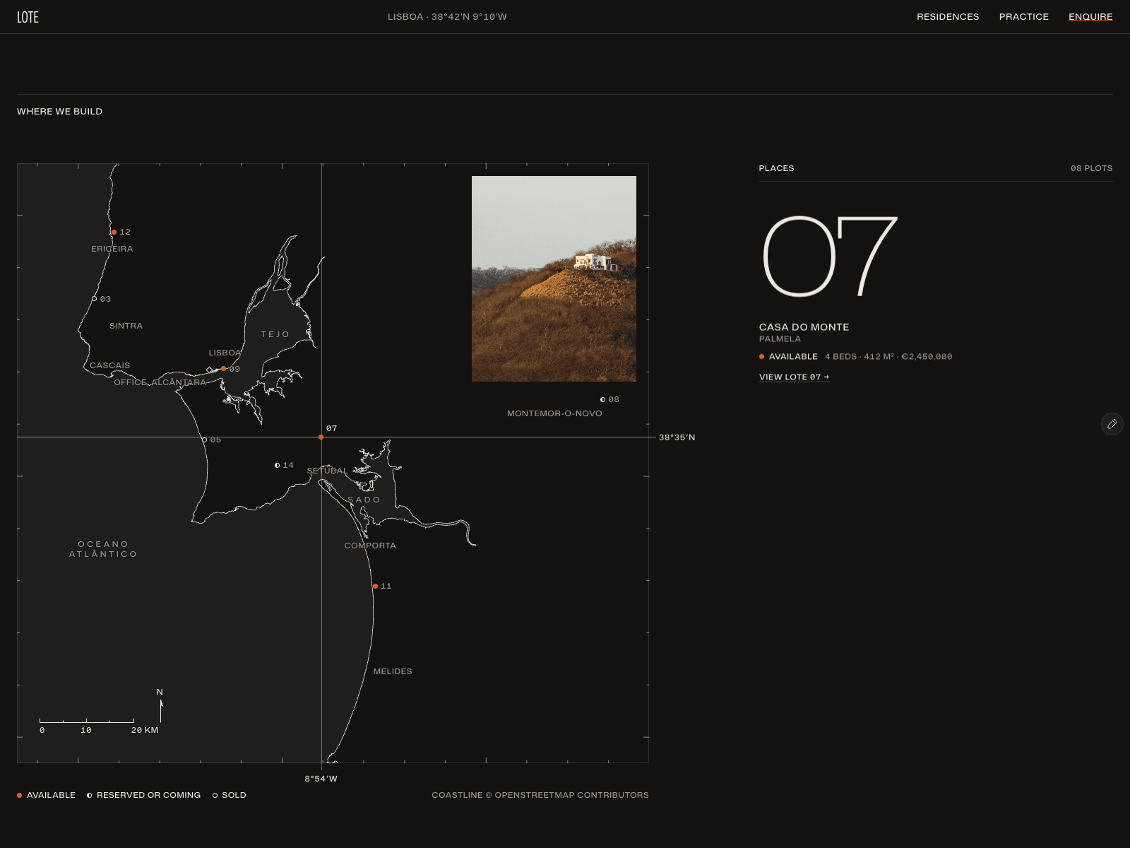
A little cartography in Lote.
Numbered plots, a distance scale and a small status key give the coastal map its own visual language. Kept it spare: fine lines, dark ground, red markers.
Lote’s residence index keeps the full picture in one place: available homes, reserved and upcoming plots, and a sold archive.
Big plot numbers, small details, and a map just below the list.
https://excellent-favorites-639729.framer.app/
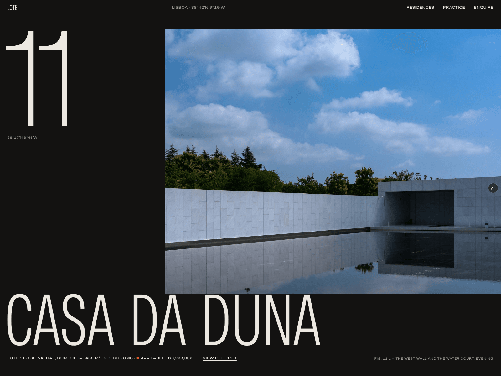
A closer look at the photo layouts on Lote’s homepage.
Casa da Duna gets a wide frame, while Casa Rasa uses a taller crop beside the residence index. The big plot numbers tie the two sections together.
https://excellent-favorites-639729.framer.app/
A small detail on Lote’s residence pages.
After the viewing form, the next house gets a full-width introduction. Casa da Duna flows into Casa Rasa with oversized type and a glimpse of the next photograph.
A closer look at Lote’s mobile footer.
After the map and viewing details, the homes appear again in a simple list by plot number. Even the bottom of the page keeps the residences in view.
https://excellent-favorites-639729.framer.app/
The last stretch of Lote’s map page.
The fine coastline and tiny plot labels give way to a big “Arrange a viewing” link, with a thin orange underline tying it back to the map markers. A quieter detail from my Framer property template.
https://excellent-favorites-639729.framer.app/
A small detail in Lote's residence index: the property photo stays beside the list as you scroll.
The rows keep the location, bedrooms and price lined up, while the larger image gives the home a little more room. A closer look at the desktop layout.
https://excellent-favorites-639729.framer.app/
A scroll through Lote’s homepage.
The house names get almost as much space as the photographs, with small coordinates and availability labels around them. Then the page opens out into the property index and coastal map.
My Framer template for residential projects, built around a fictional development near Lisbon.
https://excellent-favorites-639729.framer.app/
Inside a residence page in Lote.
A full-width photograph opens Casa da Duna, then the page moves through the house, floor plan and viewing enquiry. The small bar with price and availability stays in view while you scroll.
A closer look at my property template for Framer.
Lote on a smaller screen.
The oversized plot numbers and photography still get their space. Scroll through the homes, check availability, then find them along the coast.
A quick mobile tour of my Framer template.
https://excellent-favorites-639729.framer.app/
The coastal map in Lote.
Numbered plots, orange availability markers and a home's photo and details alongside. The page ends with a direct invitation to arrange a viewing.
A closer look at the residence index in Lote.
Big plot numbers, the details in one row, and a photograph alongside. Available homes come first; reserved, upcoming and sold homes each have their own space further down.
A small tour of how the properties come together in my Framer template.
Lote — a property developer that doesn't exist. Eight residences, coordinates on every plot, and a hand-drawn map of the coast they build on.
A Framer collection list repeats one template, so every card comes out the same size. That's the reason most CMS pages end up looking like grids.
The way around it: several lists on the same filter, each with its own limit and offset. One list takes item 1 at full bleed, the next takes items 2–3 narrow, the next takes 4.
Same collection, composed like a spread instead of a feed. This is the intended pattern, not a workaround — it's how you get art direction out of a CMS.
The whole site is a free Framer template → https://www.framer.com/marketplace/templates/stillroom/
Every image on Stillroom goes through one code component.
A masked reveal on entry, a slow drift within its own crop as you scroll, and a restrained zoom on hover. Three small behaviours, one component, used everywhere.
That's what stops fifteen object pages from feeling like fifteen different websites. The consistency isn't discipline — it's a single component I couldn't get wrong twice.
The whole site is a free Framer template → https://www.framer.com/marketplace/templates/stillroom/
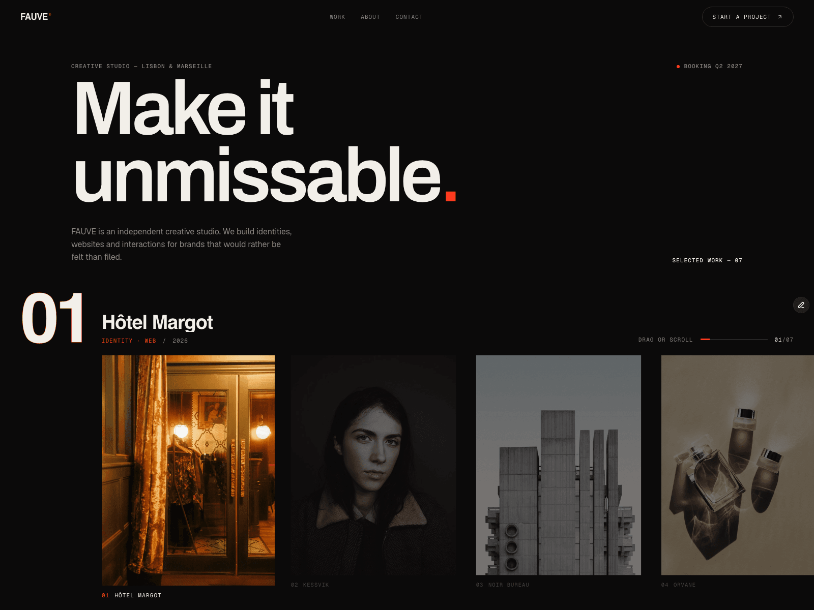
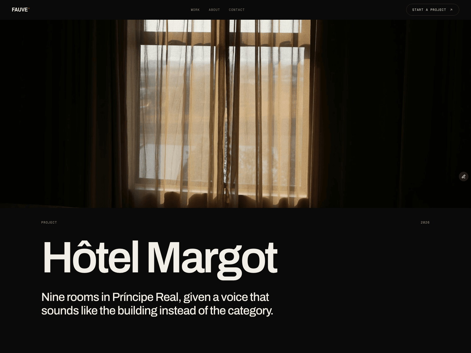
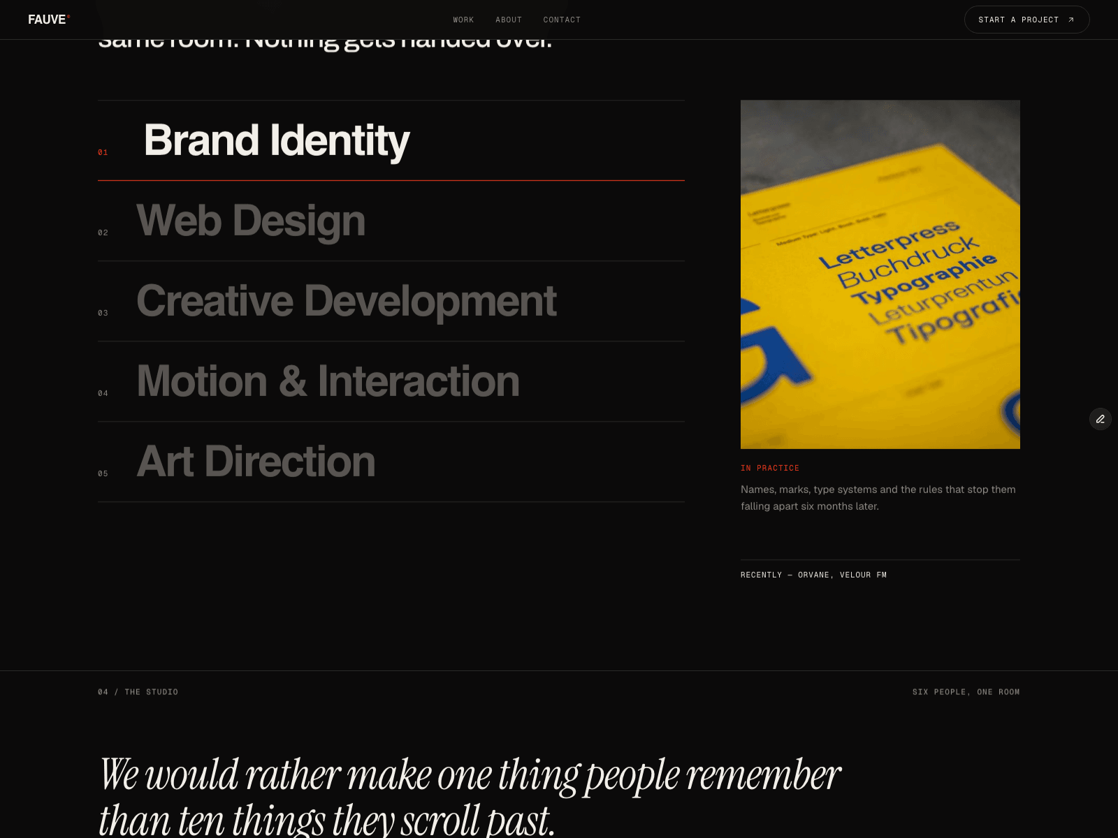
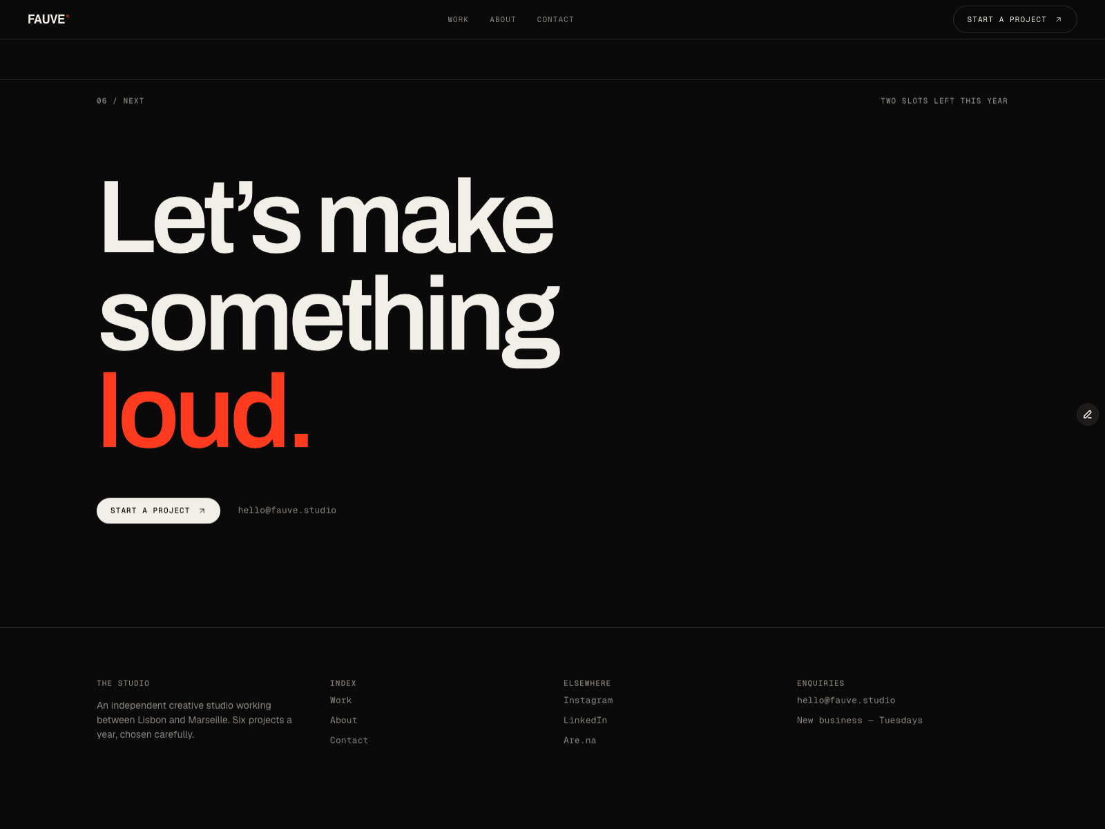
FAUVE — a free template for creative studios.
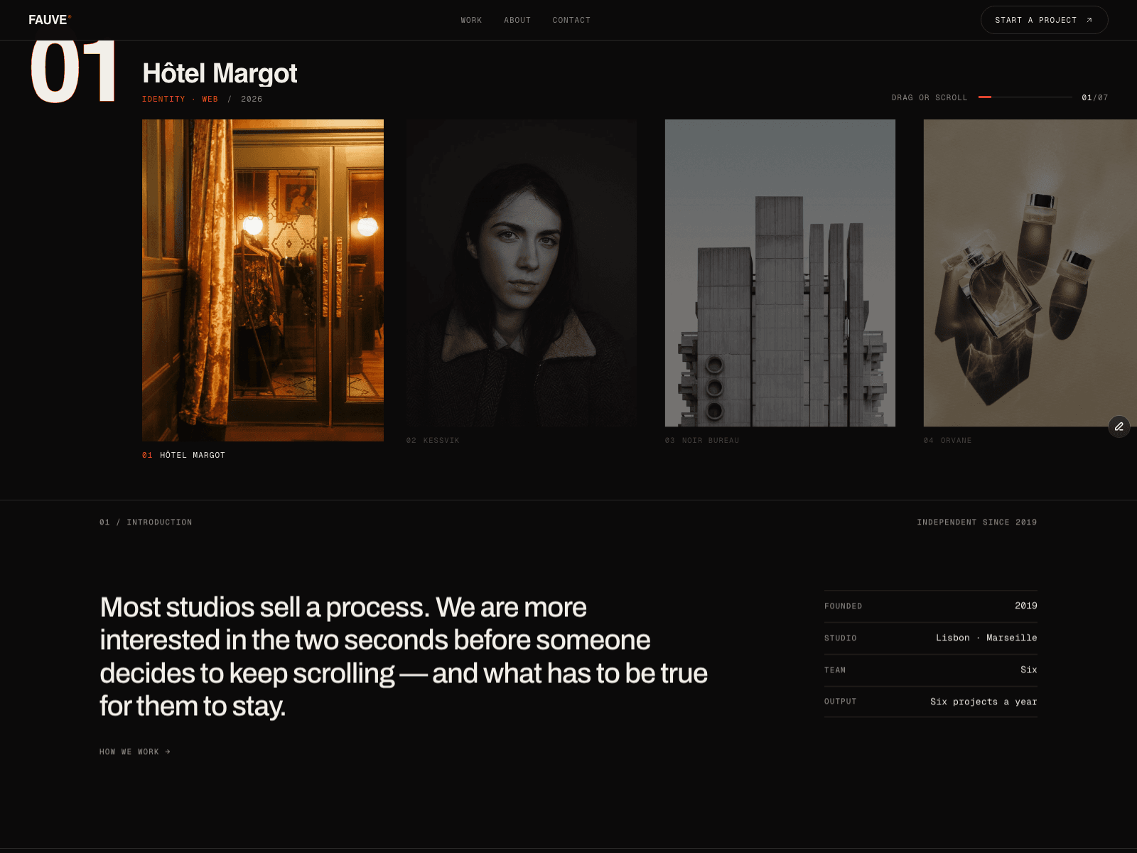
Most agency sites open with a headline nobody reads. This one opens with a claim and then gets out of the way: a draggable reel of seven projects, each with its own CMS case study.
Under it, a numbered spine — introduction, work index, five disciplines, a three-step process, a client list by sector, and one slot left for new business.
The process copy is the part I enjoyed most. "Draw it badly, fast. Three directions in week three, rough enough to argue with. The one you dislike usually tells us the most."
Archivo for display, Geist Mono for every label, Instrument Serif for one flourish. Near-black ground, a single hot orange used as punctuation.
Free to remix ↓