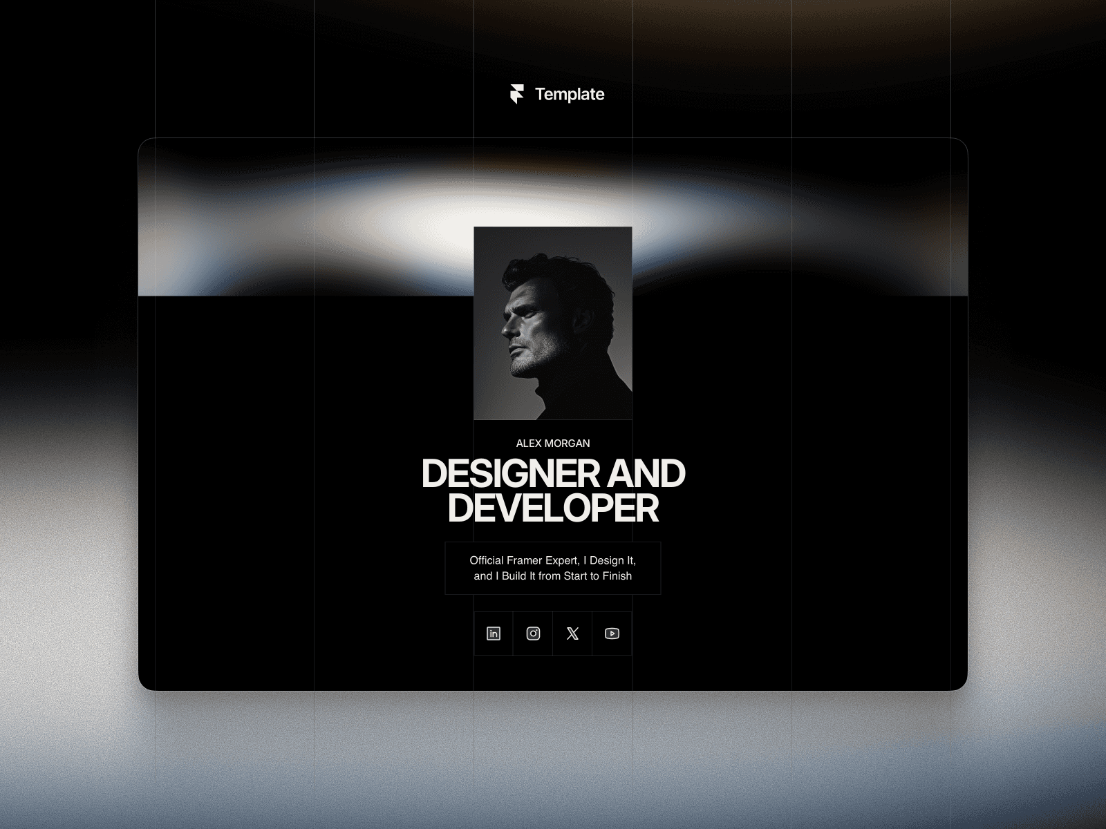
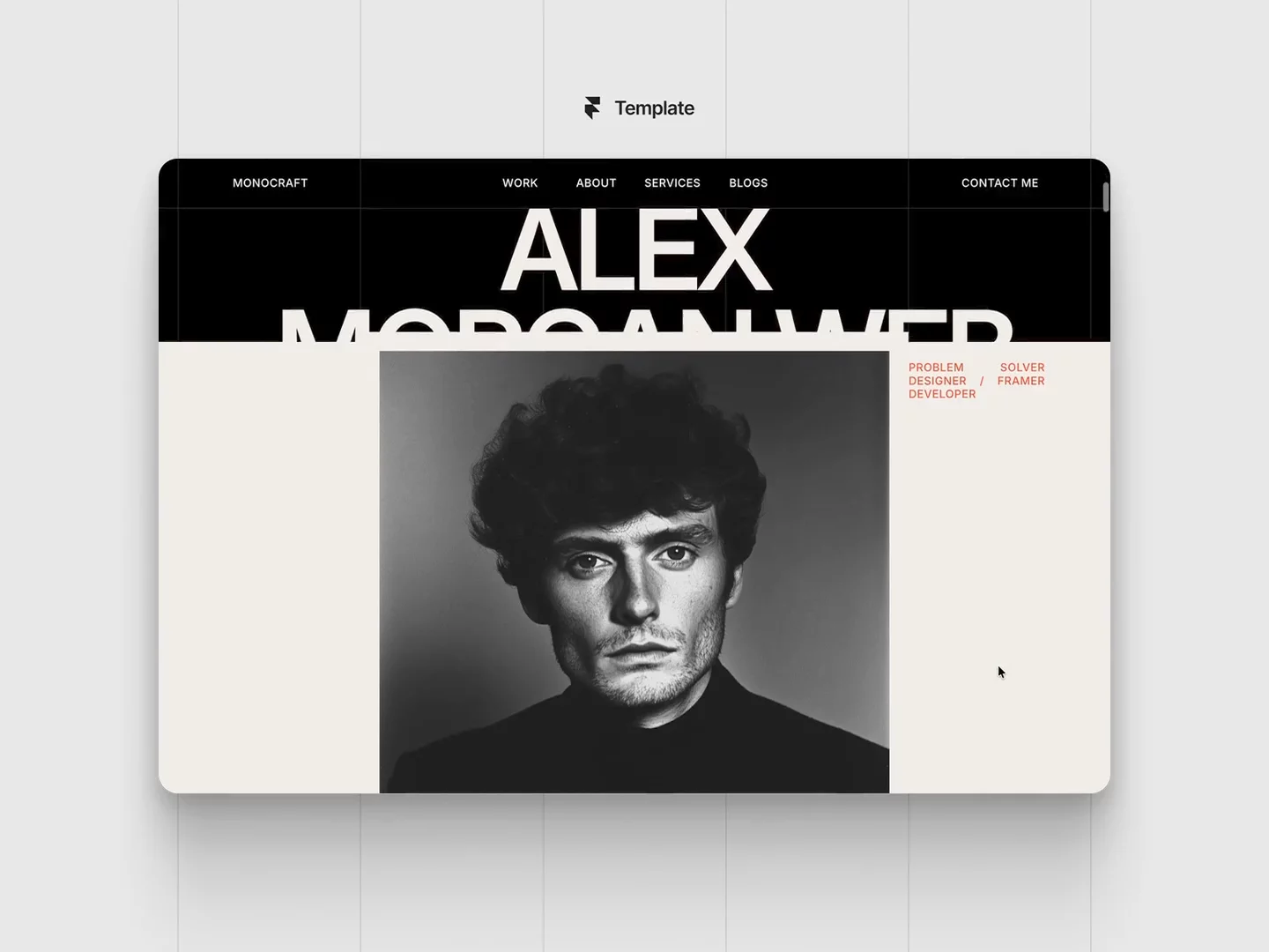
Just pushed a few updates to my Coolest Link in Bio Framer template.
The desktop and tablet versions were looking good, but the main use case for a link-in-bio page is still mobile.
So I went back and improved the mobile UX:
• Added icons to each link to make them easier to scan
• Improved spacing and layout across smaller screens
• Reworked the hero section to work better on mobile
• Locked layers that could accidentally break the template
The previous hero looked cleaner, but adding a few more elements made the mobile experience much better. I chose UX over making it look “prettier” on desktop.
I’m also regularly updating Coolest Link in Bio and MonoCraft to make both more useful, easier to use, and still visually strong.
One tip for anyone using the templates: duplicate the original before editing. That way, you always have a safe copy.
What would you add or change in these templates?