madebrux4d
This Agency and Studio Portfolio template turned out super crisp and it's free!
Grab it here: https://framer.link/AXK84Am
madebrux5d
Always love finding new ways to present my templates. I created this presentation in claude.
Take a look at the template for Interior Design and Architecture Studios: https://framer.link/xpTVuT4
madebrux1w
Interactions that adds so much personality to the site.
What are your thoughts?: https://framer.link/xpTVuT4
madebrux1w
So many interesting interactions that are meaningful and have earned their place the right way!
Thoughts? https://framer.link/xpTVuT4
madebrux1w
The most intuitive UX you can have for projects on portfolio. Every project has it's place in the navigation and you can switch with just one click.
You can make it yours by using the free template: https://framer.link/AXK84Am
madebrux2w
It's custom three.js carousel that's cursor interactive and I love how it turned out.
Thoughts?: https://framer.link/AXK84Am
madebrux2w
Started this new AI focused template and I'm already enjoying how it's coming together. Spent a decent amount of time on the bento grid illustration and it's worth the effort!!
madebrux2w
I created this custom page transition by modifying default framer page transitions until it felt right for Pietra: https://framer.link/xpTVuT4
madebrux2w
Molaco ranking improved by 919 (from 2084 to 1165)!
It's a very well designed template that I just made free to test the affiliate revenue and I wondered if that was the right choice as it was buried since Sep 5 when I published. Great work always finds its way!
Feedback?: https://framer.link/AXK84Am
madebrux2w
Such little details make a huge difference and everything is intentional. Architecture and the sketch effect goes hand in hand!
Thoughts?: https://framer.link/xpTVuT4
madebrux1mo
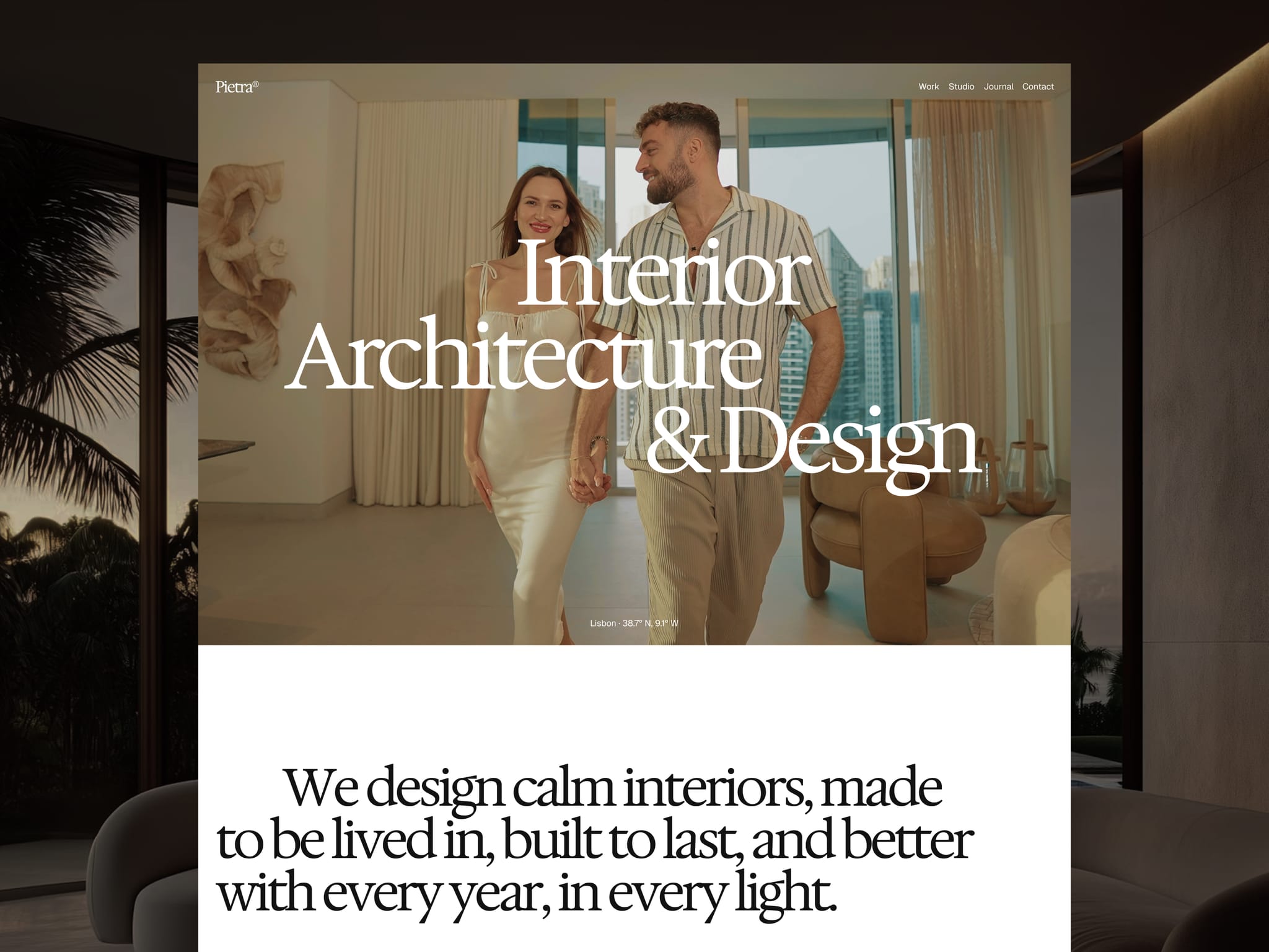
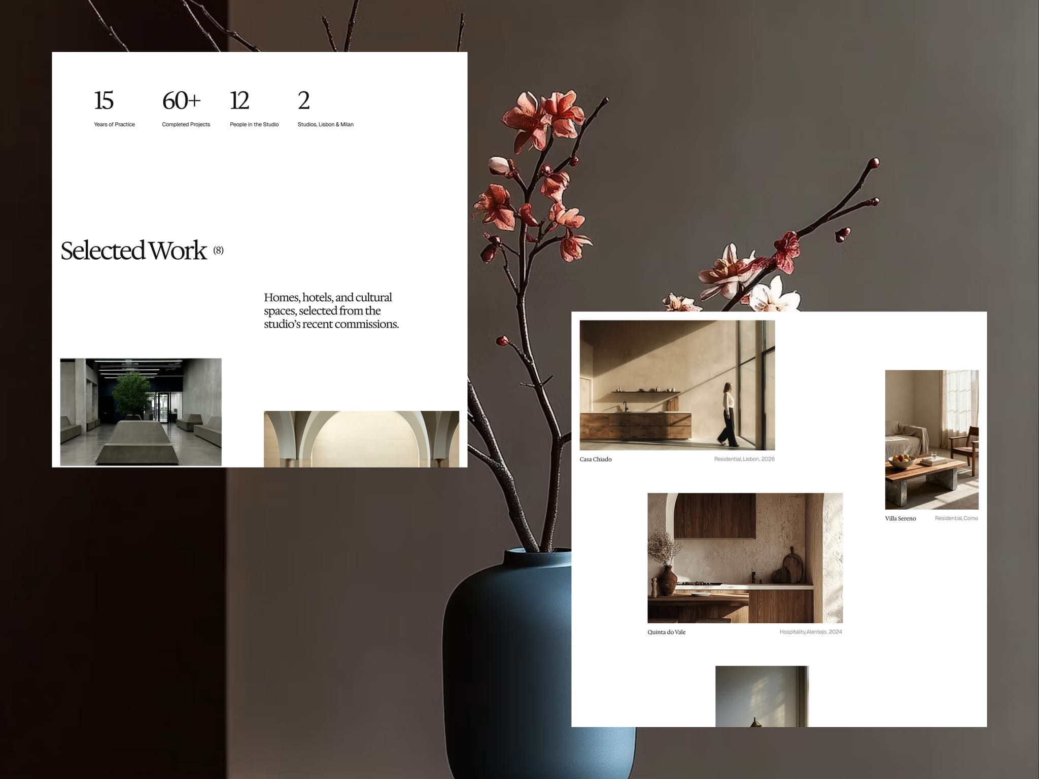
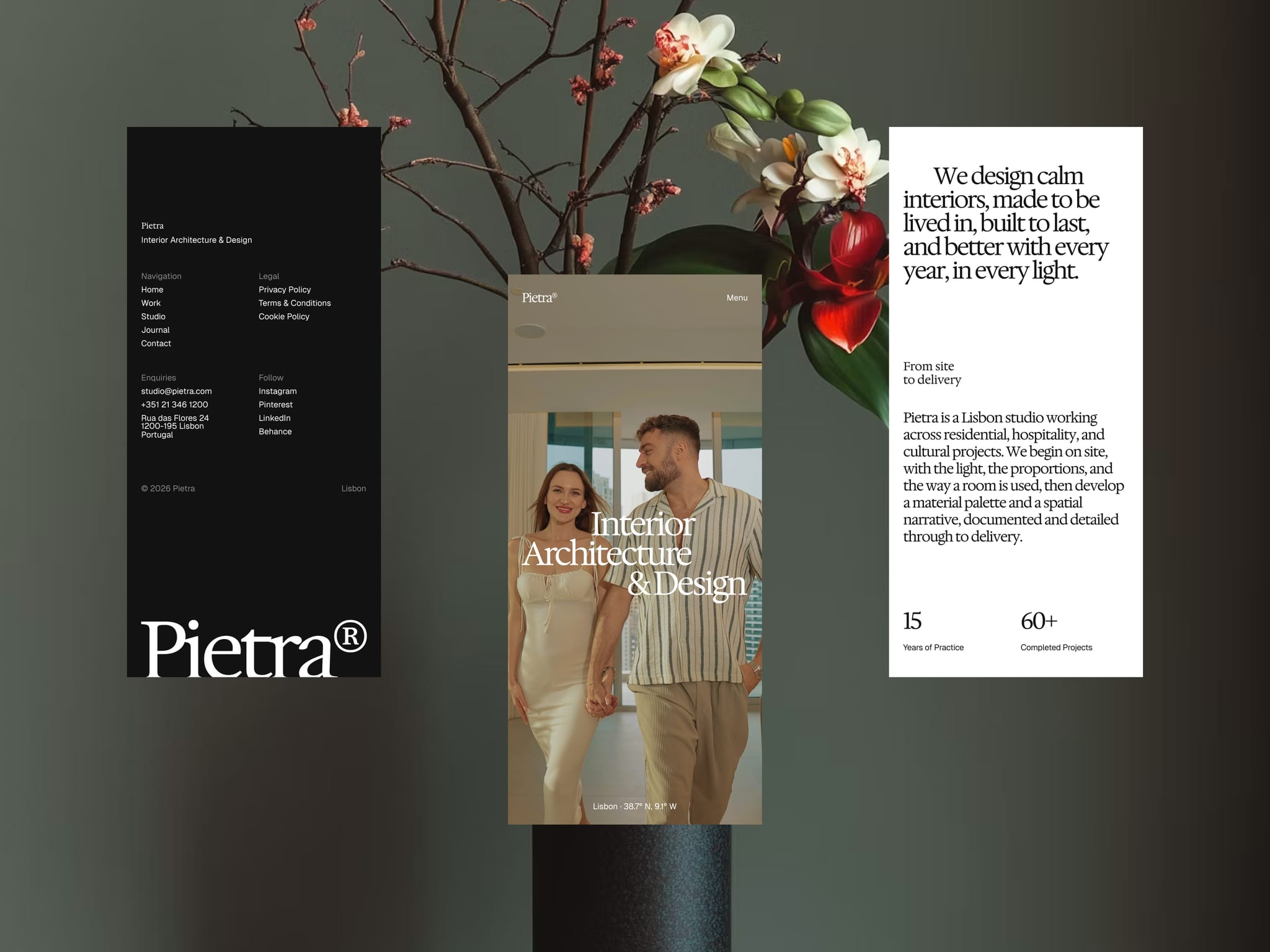
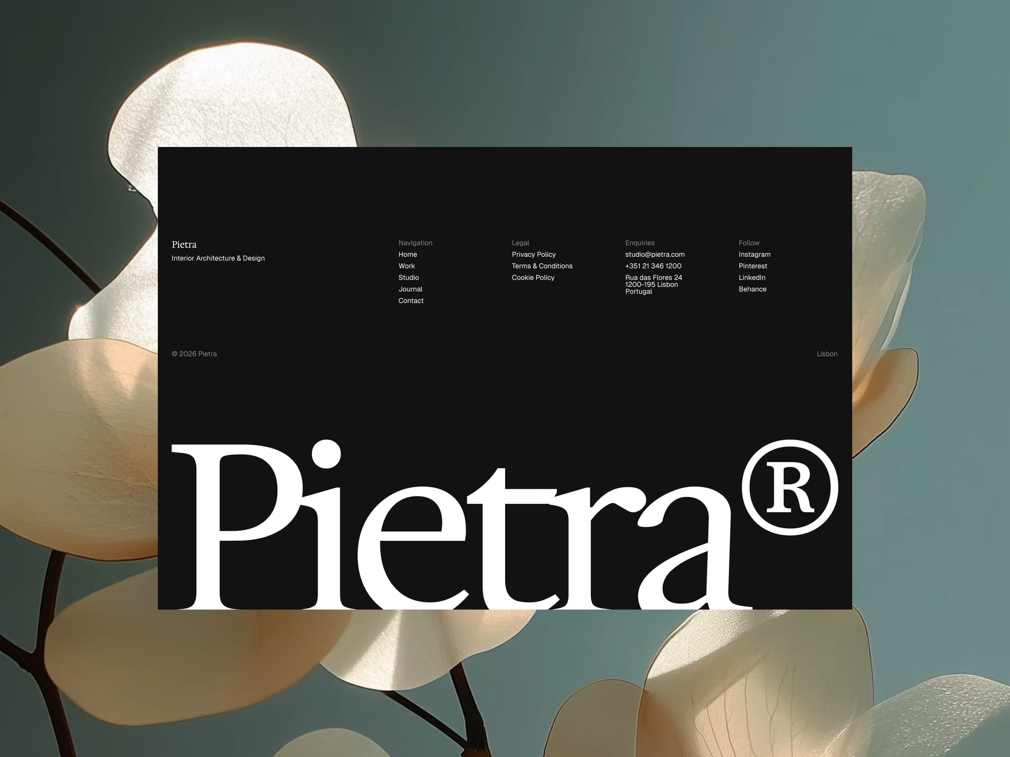
New one. Pietra, for interior architecture studios.
Kept it to two typefaces and a real grid and let the photography do the work.
madebrux3w
Pietra made it top 5 of Architecture for a reason!
Support it & Make it yours: https://framer.link/hV3rMPz
madebrux3w
Such quality available free for few days!
Template Link: https://framer.link/AXK84Am
madebrux3w
This boy made it to top 5 in Architecture and made a couple of sales. It's a nice feeling to see this in these trying times!
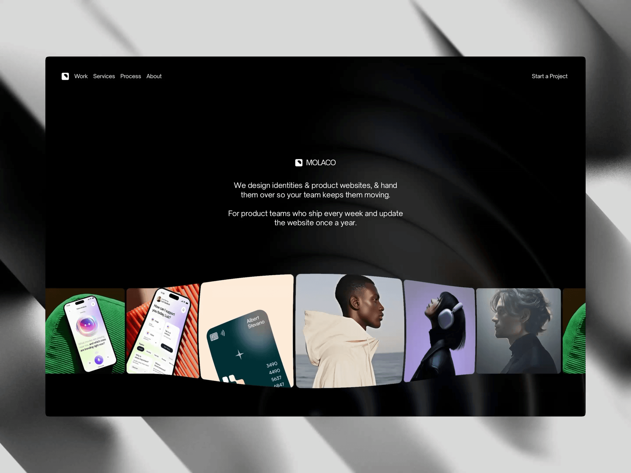
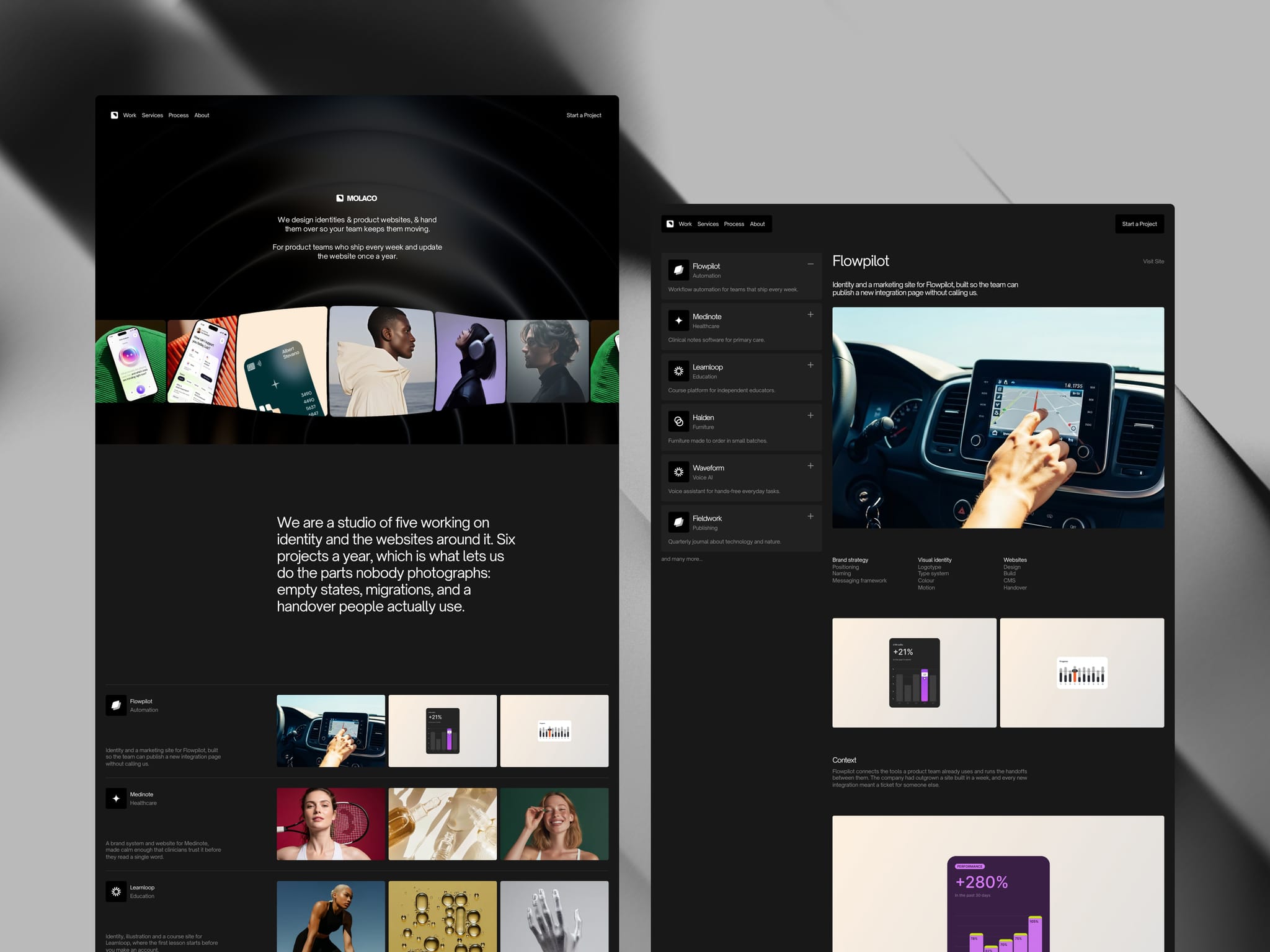
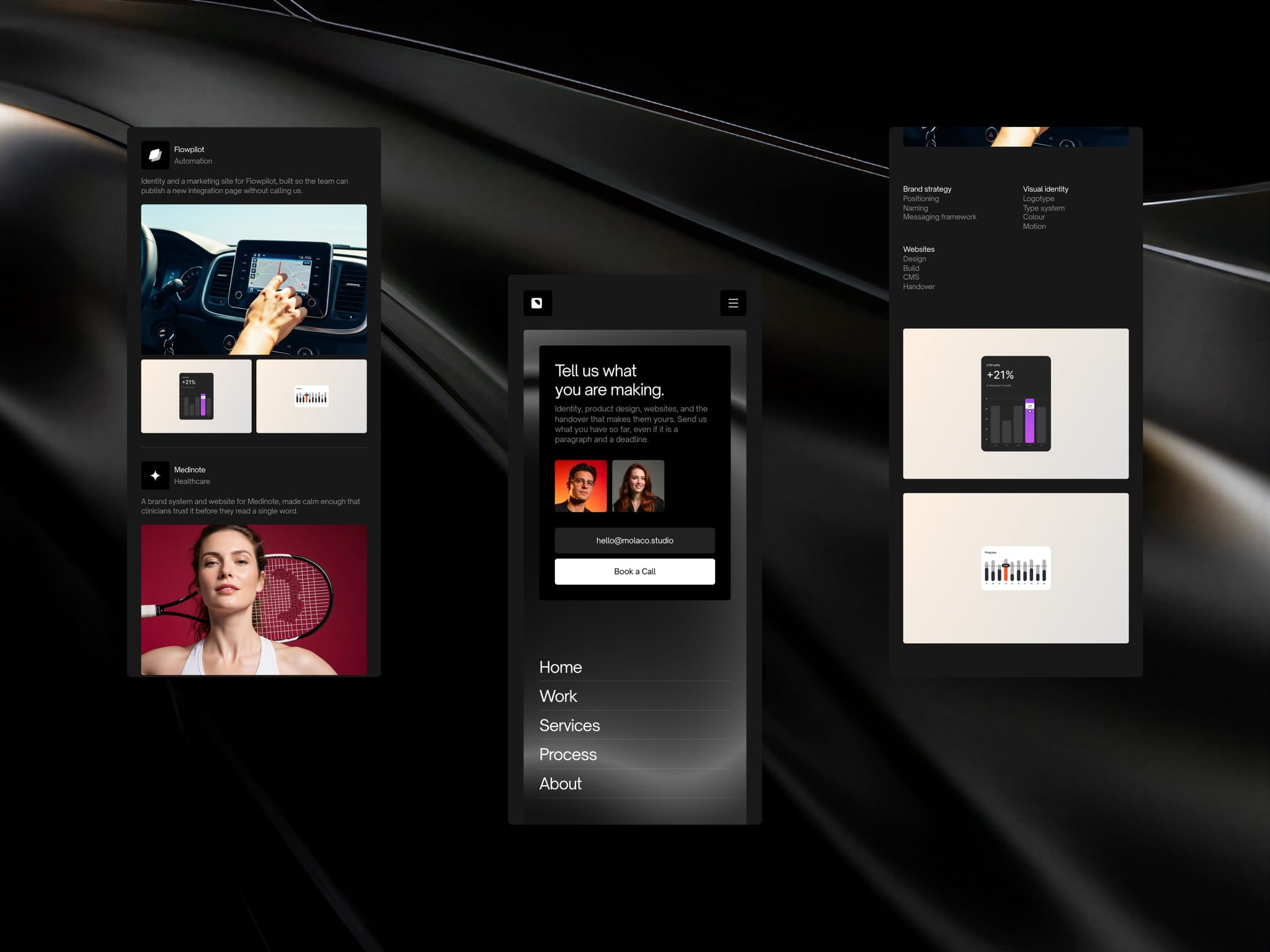
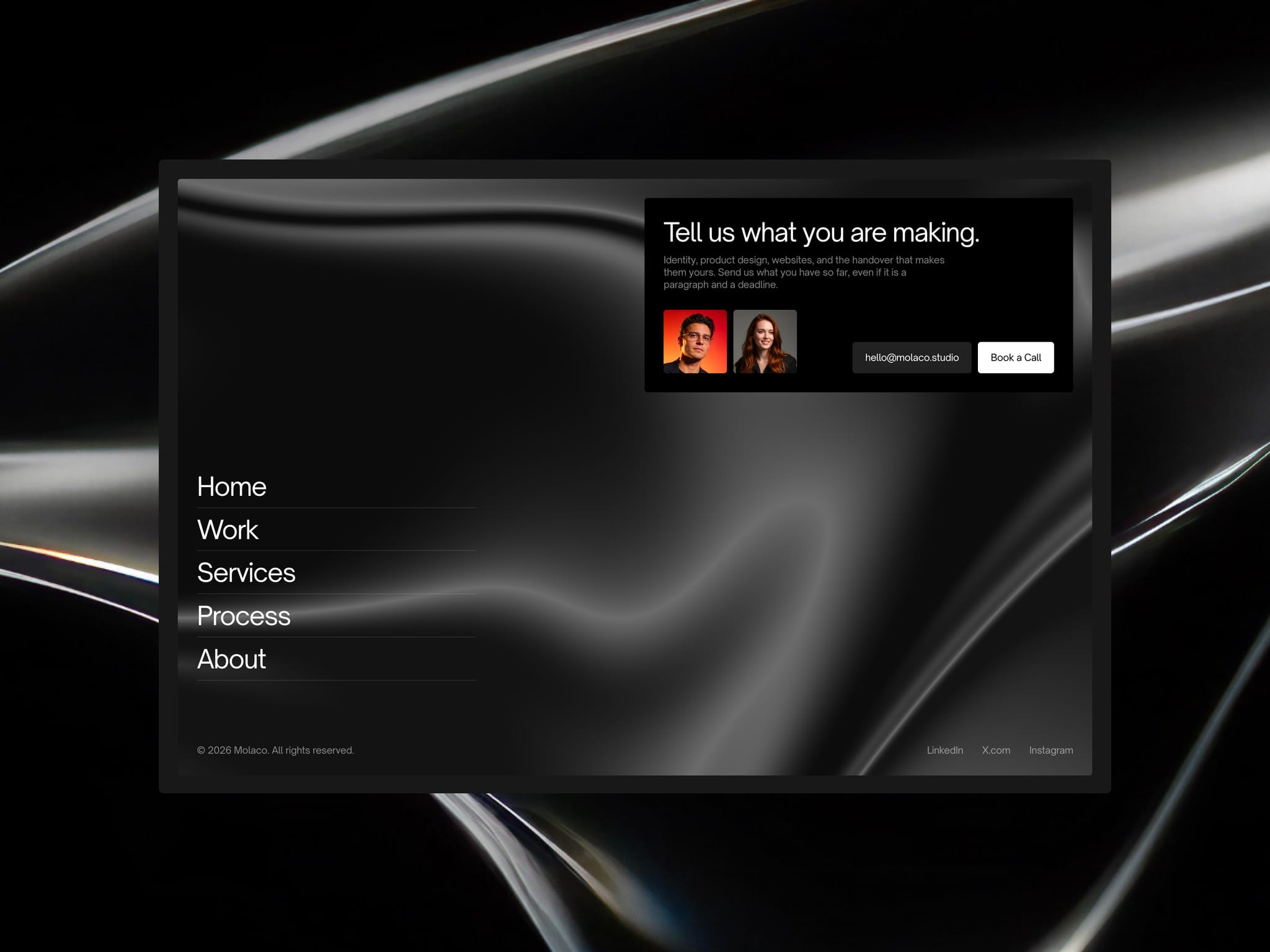
A studio site that does not look like a template.
Molaco. Dark, editorial, six pages, built for studios doing brand, product design and websites. Free.

madebrux1mo
I built Pietra, a complete @Framer template, with Claude Code driving it.
I designed and refined the same page 3 times. Claude Code for the skeleton in HTML, Figma for my design preferences, and Framer for shipping.
The part I wasn't sure would work: I moved the homepage over with the "Figma to HTML with Framer" plugin, then connected Claude Code to Framer and asked it to convert the static, absolutely positioned page into a functional website. It did.
After that I had it think in systems first. Color styles, text styles, layout template, components. That became the foundation for the other 10 pages.
Motion last. Reveal effects, smooth scroll, custom page transitions, a cursor that draws a line under links.
Anyone else driving Framer from an external agent? Curious what's working for you.
madebrux1mo
New one. Pietra, for interior architecture studios.
Kept it to two typefaces and a real grid and let the photography do the work.
Pietra is live.
An interior architecture template built on a true-neutral system: two typefaces, a real twelve column grid, and restraint everywhere else.
The part I spent longest on is the page transition. Framer's page effects are the View Transitions API, and the wipe is a mask with no color of its own. Once that clicked, I could paint the band it opens and let the wordmark ride the ink as it travels. Every page change became one gesture instead of a fade.
Also in there: a cursor that draws the same line as the nav underline and reads the surface beneath it, a footer revealed rather than scrolled to, and architecture grade project data on every project.
11 pages, 5 CMS collections.
Happy to answer anything about how the transition works.