Your next portfolio could cost $0.
We’re making Rick Brown free until Monday, October 5. 🎁
Built for photographers who want their work to stand out. Bring your best shots, make it yours, and give your portfolio a fresh start this weekend.


We speak fluent design.
Your next portfolio could cost $0.
We’re making Rick Brown free until Monday, October 5. 🎁
Built for photographers who want their work to stand out. Bring your best shots, make it yours, and give your portfolio a fresh start this weekend.
✦ $1K earned on Contra
A small milestone that means a lot to us. Thanks to everyone who’s supported our work so far.
60+ Framer templates later, we still enjoy the part where an idea starts to feel like a real brand. ✨
We’ve worked across portfolios, hospitality, finance, retail and plenty of spaces in between. Each project has taught us something new about what a good website needs to say – and how it should feel when you use it.
Thanks to everyone who’s followed along, shared our work or made one of these templates their own. ❤️
Vibe-coded an app?
Fortix gives it a complete website where people can see how it works, what makes it useful and why they should try it.
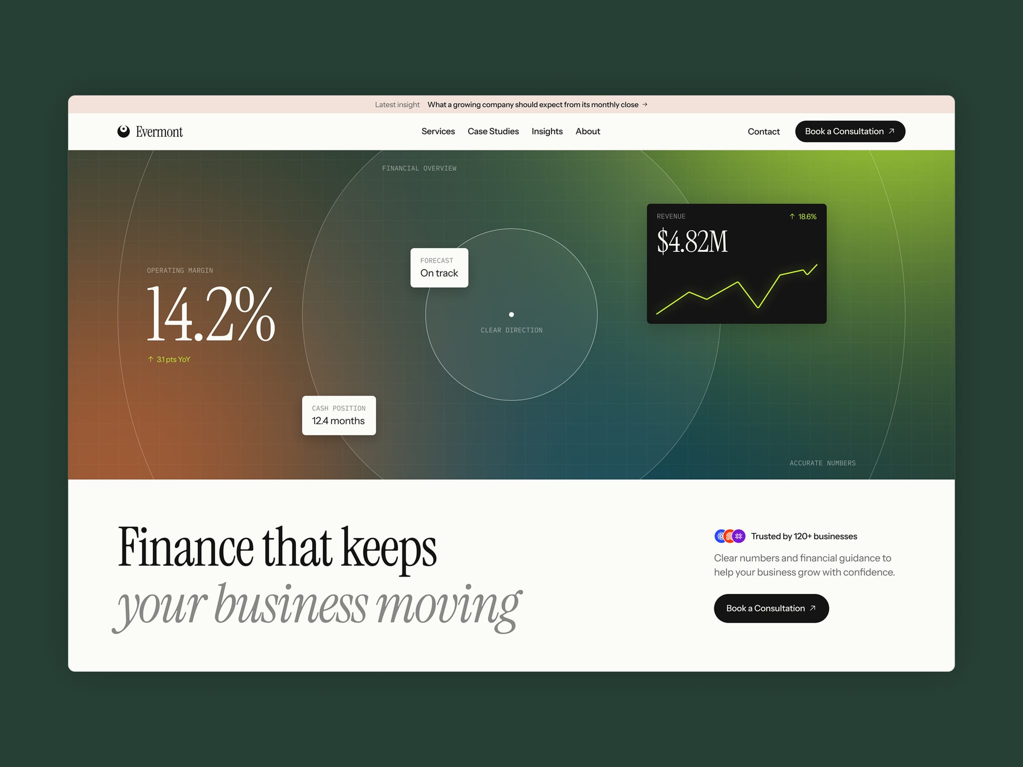
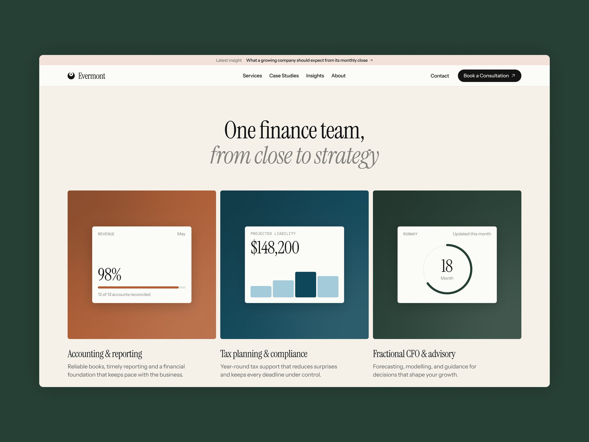
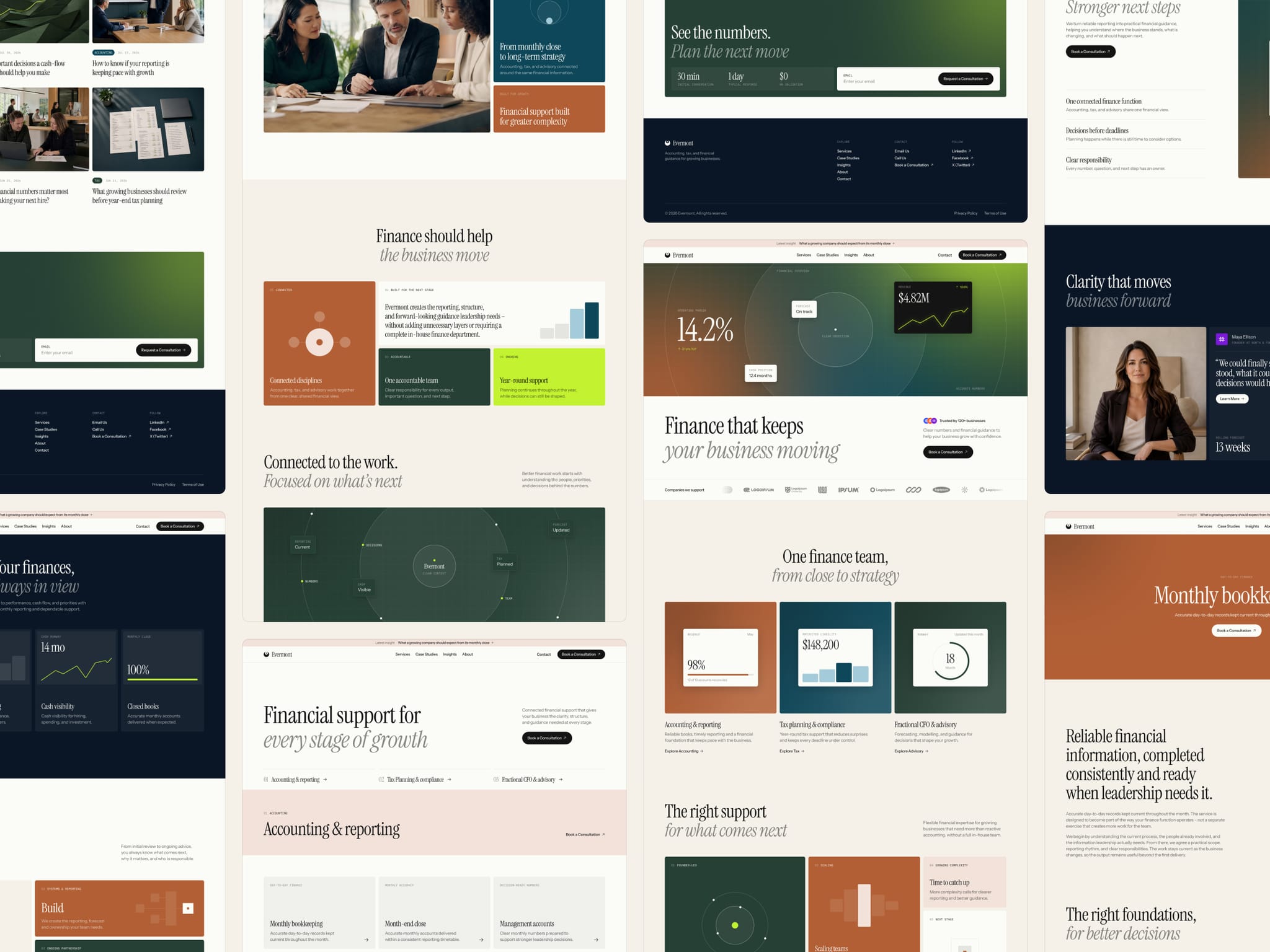
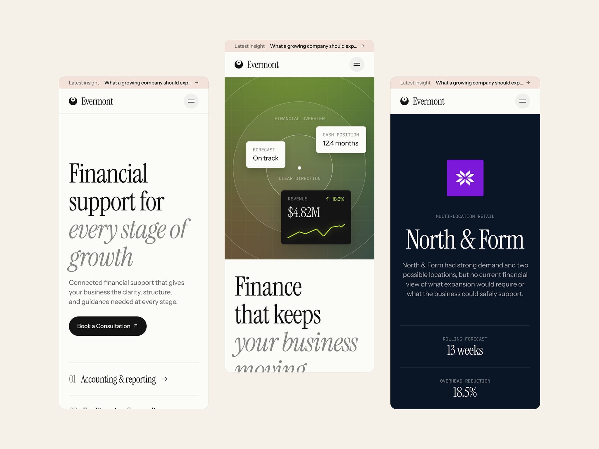
Finance websites often bury the message beneath numbers, jargon, and familiar corporate layouts. Evermont takes a different route – clear questions, focused data, and case studies that show the decisions behind the results.
A structured editorial design gives accounting, tax, and advisory services the clarity and presence they deserve.
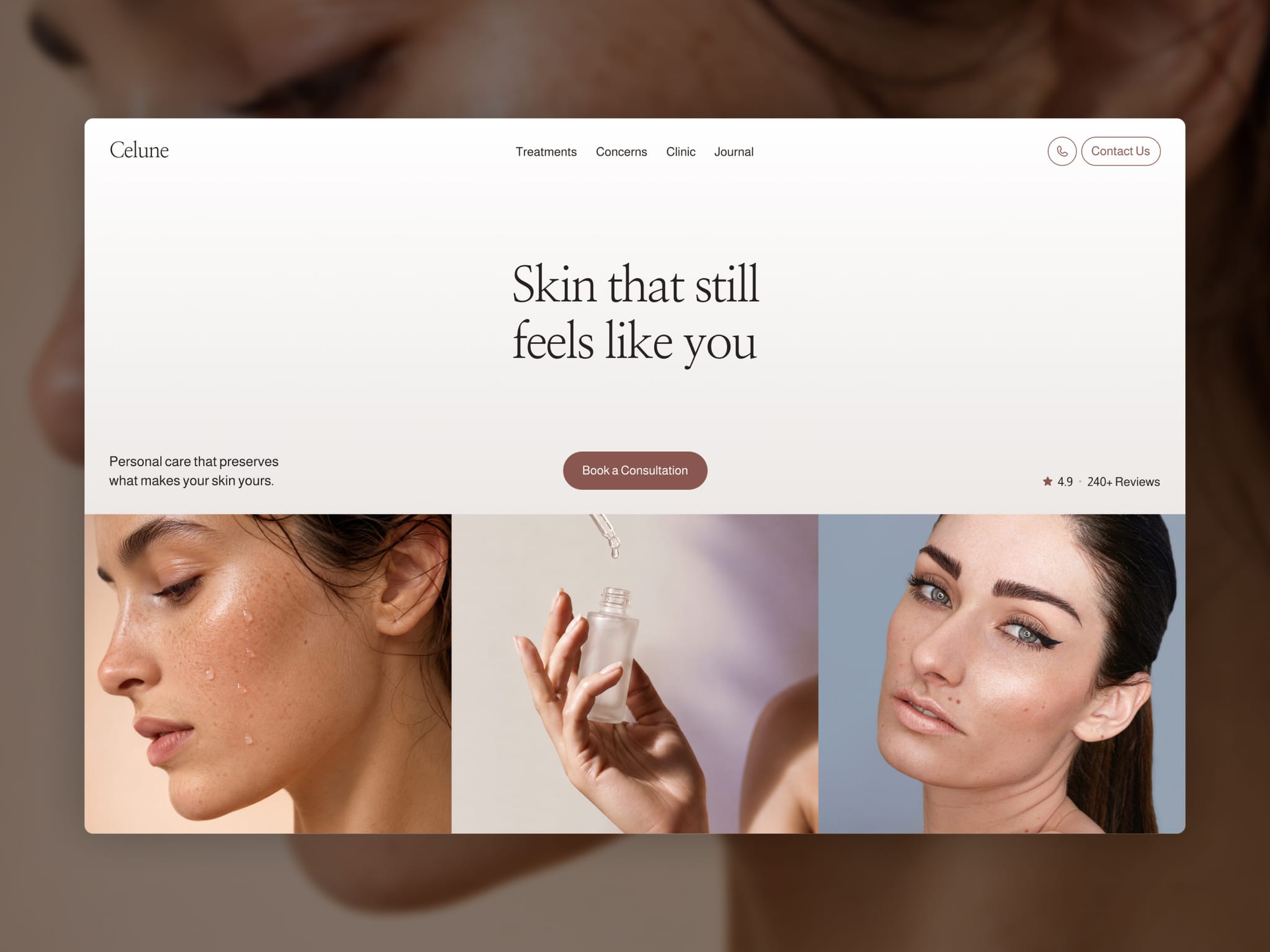
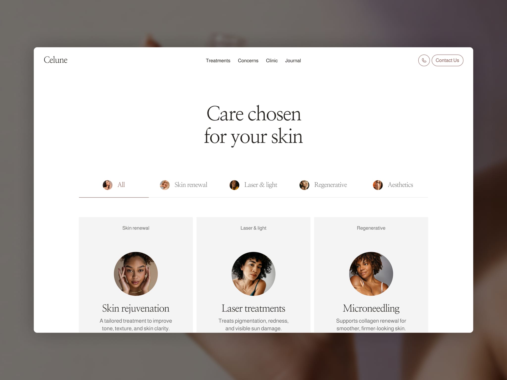
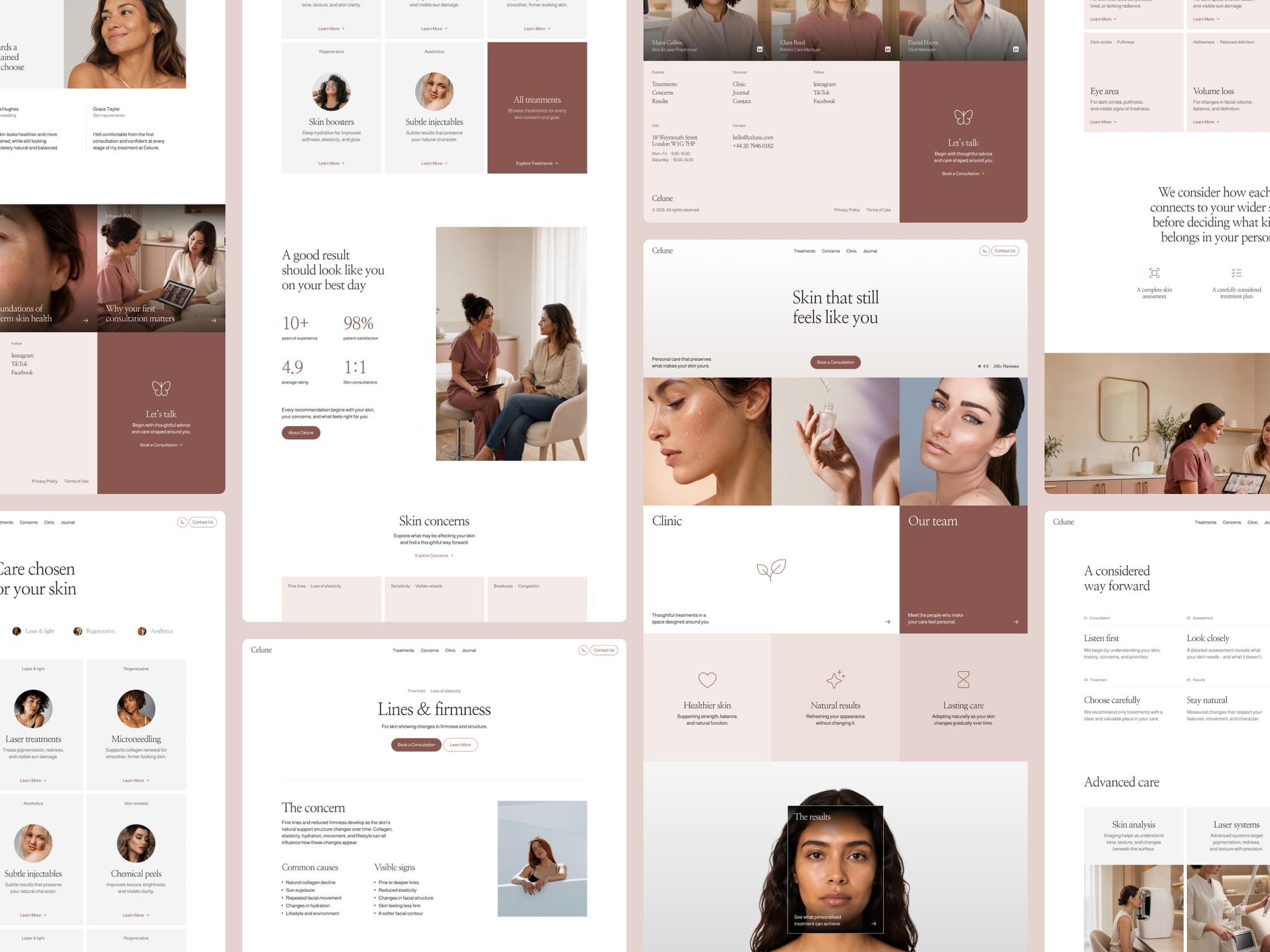
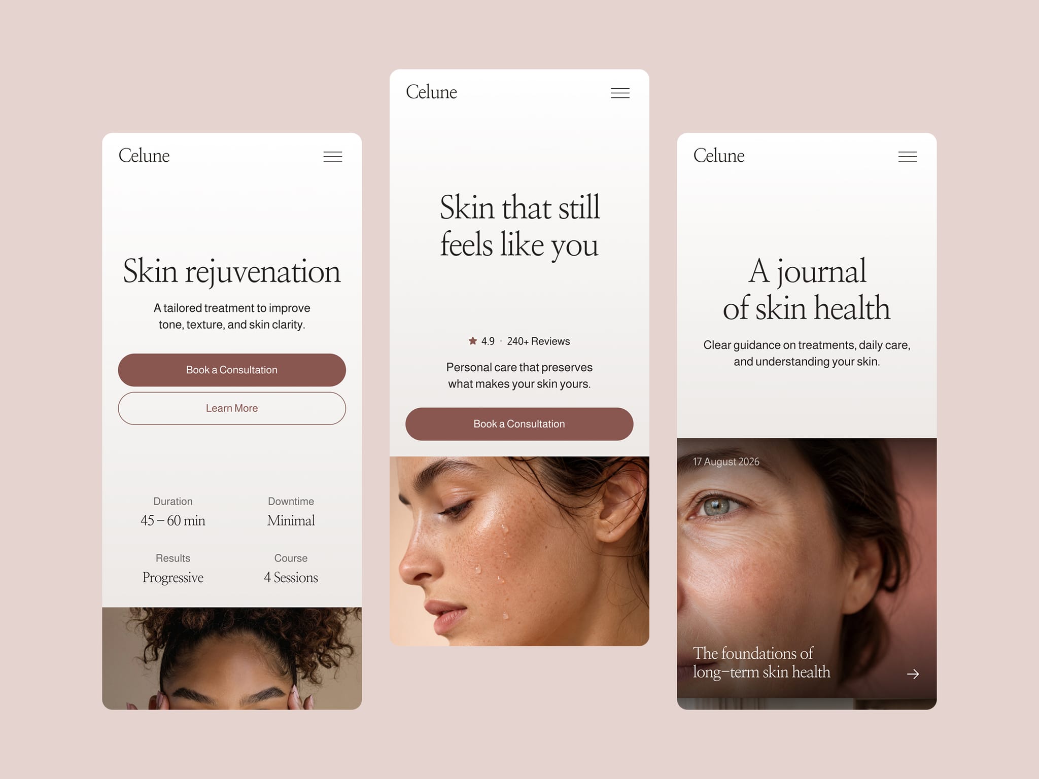
Just launched Celune — a minimal website template for modern skin clinics and aesthetic practices.
Warm editorial design, detailed CMS pages, and a clear journey through treatments, concerns, results, and expert care. Built to help clinics earn trust and turn more visitors into consultations.
Still sharing brand guidelines as a PDF?
Cipherly puts logos, colors, typography, imagery, and downloadable assets into one easy-to-share website.
A great website should perform as well as it looks.
Google found that 53% of mobile visits are abandoned when loading takes over three seconds. A Deloitte study also found that improving mobile speed by just 0.1 seconds increased retail conversions by 8.4%.
In Mello, we gave performance the same attention as the design – checking speed, accessibility, SEO, and best practices before release.
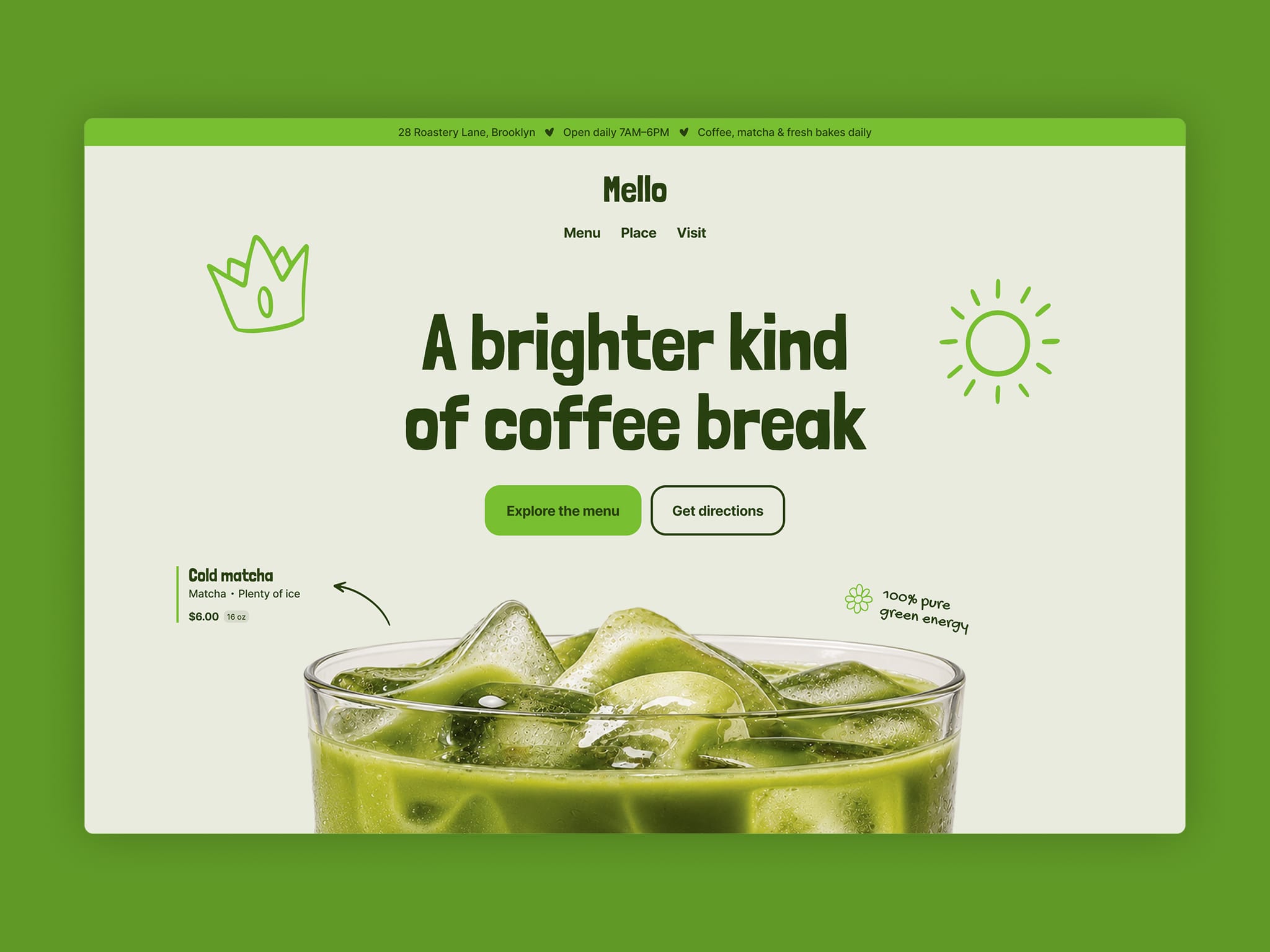
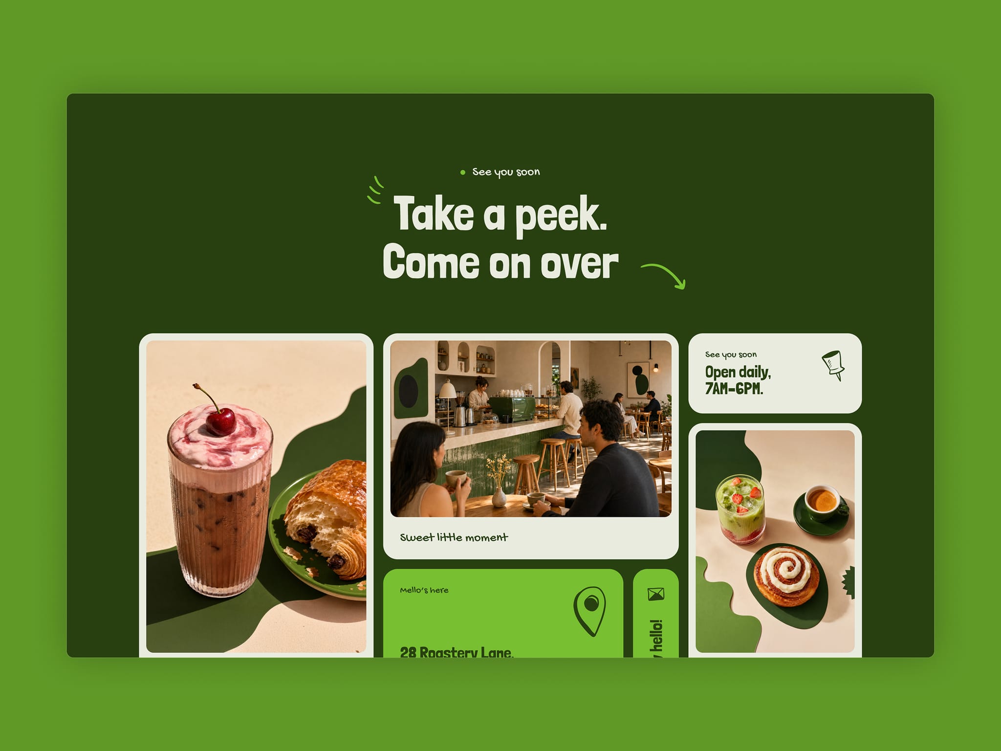
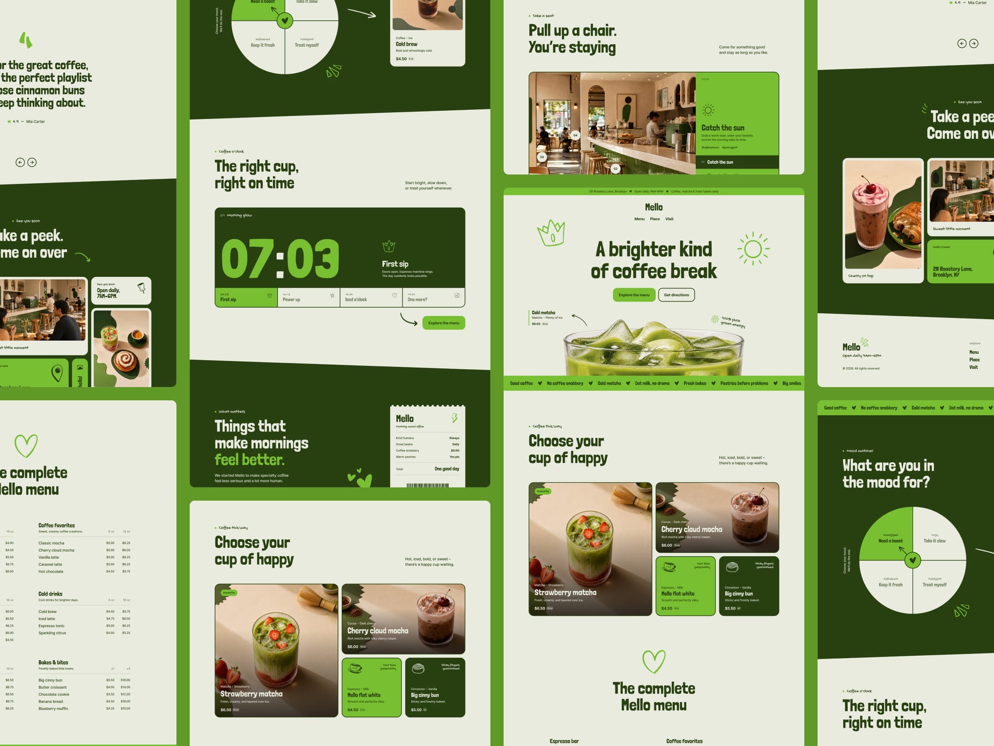
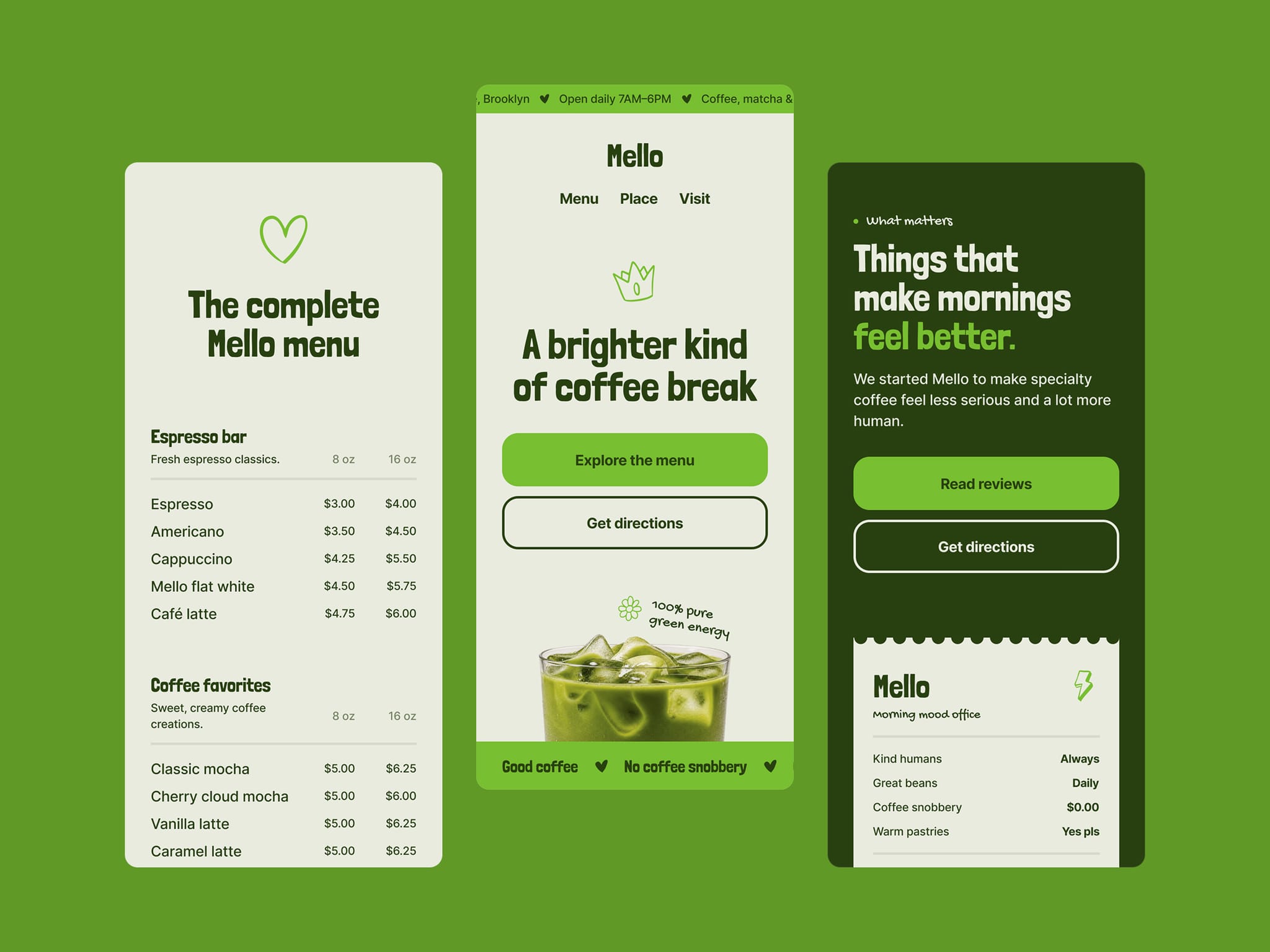
Okay, coffee people – this one’s for you ☕
Mello is live, bright, and ready to improve your coffee break. Explore the menu, match a drink to your mood, and find the best seat in the house.
Explore the full experience and tell me your favorite part ✨
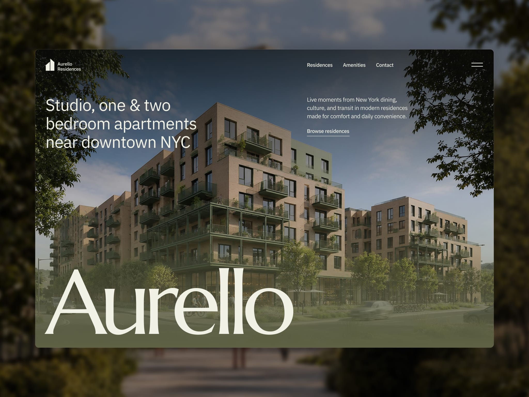
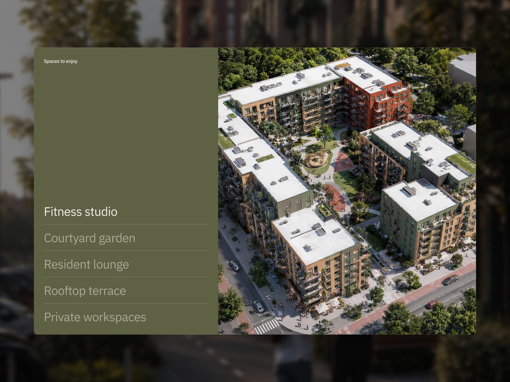
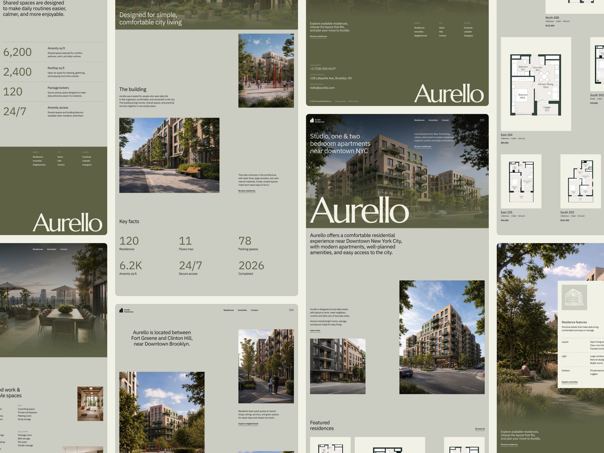
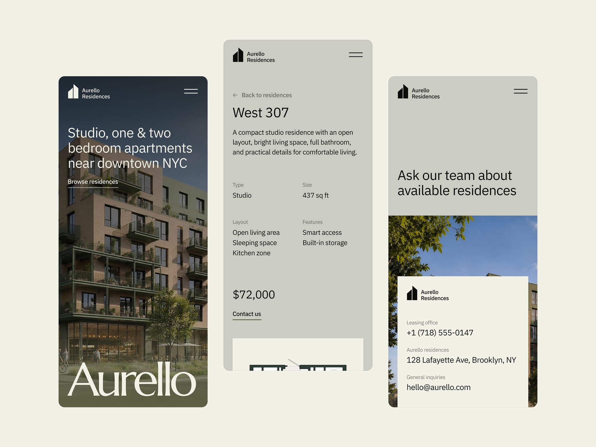
Aurello was designed around how people actually search for a place to live.
First they want the building. Then the layouts. Then amenities, location, FAQs, and contact. That flow shapes the whole template – helping visitors understand the property faster and move from interest to inquiry with less friction.
Take a look: https://framer.link/l43sYDO
Sound on 🔊
We added subtle sound effects to Weiss, making every click feel a little more tactile, responsive, and satisfying.
Turn up the volume and click around: https://framer.link/6uzzC0O
Crypto has reached more than 560 million people worldwide. The experience around it should feel just as advanced.
That’s why we created Fortix – a bold Framer template that brings clarity, confidence, and serious visual impact to crypto products.
Get Fortix: https://framer.link/FRi44q9
We speak fluent design.
Your next portfolio could cost $0.
We’re making Rick Brown free until Monday, October 5. 🎁
Built for photographers who want their work to stand out. Bring your best shots, make it yours, and give your portfolio a fresh start this weekend.
✦ $1K earned on Contra
A small milestone that means a lot to us. Thanks to everyone who’s supported our work so far.
60+ Framer templates later, we still enjoy the part where an idea starts to feel like a real brand. ✨
We’ve worked across portfolios, hospitality, finance, retail and plenty of spaces in between. Each project has taught us something new about what a good website needs to say – and how it should feel when you use it.
Thanks to everyone who’s followed along, shared our work or made one of these templates their own. ❤️
Vibe-coded an app?
Fortix gives it a complete website where people can see how it works, what makes it useful and why they should try it.
Finance websites often bury the message beneath numbers, jargon, and familiar corporate layouts. Evermont takes a different route – clear questions, focused data, and case studies that show the decisions behind the results.
A structured editorial design gives accounting, tax, and advisory services the clarity and presence they deserve.
Just launched Celune — a minimal website template for modern skin clinics and aesthetic practices.
Warm editorial design, detailed CMS pages, and a clear journey through treatments, concerns, results, and expert care. Built to help clinics earn trust and turn more visitors into consultations.
Still sharing brand guidelines as a PDF?
Cipherly puts logos, colors, typography, imagery, and downloadable assets into one easy-to-share website.
A great website should perform as well as it looks.
Google found that 53% of mobile visits are abandoned when loading takes over three seconds. A Deloitte study also found that improving mobile speed by just 0.1 seconds increased retail conversions by 8.4%.
In Mello, we gave performance the same attention as the design – checking speed, accessibility, SEO, and best practices before release.
Okay, coffee people – this one’s for you ☕
Mello is live, bright, and ready to improve your coffee break. Explore the menu, match a drink to your mood, and find the best seat in the house.
Explore the full experience and tell me your favorite part ✨
Aurello was designed around how people actually search for a place to live.
First they want the building. Then the layouts. Then amenities, location, FAQs, and contact. That flow shapes the whole template – helping visitors understand the property faster and move from interest to inquiry with less friction.
Take a look: https://framer.link/l43sYDO
Sound on 🔊
We added subtle sound effects to Weiss, making every click feel a little more tactile, responsive, and satisfying.
Turn up the volume and click around: https://framer.link/6uzzC0O
Crypto has reached more than 560 million people worldwide. The experience around it should feel just as advanced.
That’s why we created Fortix – a bold Framer template that brings clarity, confidence, and serious visual impact to crypto products.
Get Fortix: https://framer.link/FRi44q9
Your next portfolio could cost $0.
We’re making Rick Brown free until Monday, October 5. 🎁
Built for photographers who want their work to stand out. Bring your best shots, make it yours, and give your portfolio a fresh start this weekend.
✦ $1K earned on Contra
A small milestone that means a lot to us. Thanks to everyone who’s supported our work so far.
60+ Framer templates later, we still enjoy the part where an idea starts to feel like a real brand. ✨
We’ve worked across portfolios, hospitality, finance, retail and plenty of spaces in between. Each project has taught us something new about what a good website needs to say – and how it should feel when you use it.
Thanks to everyone who’s followed along, shared our work or made one of these templates their own. ❤️
Vibe-coded an app?
Fortix gives it a complete website where people can see how it works, what makes it useful and why they should try it.
Finance websites often bury the message beneath numbers, jargon, and familiar corporate layouts. Evermont takes a different route – clear questions, focused data, and case studies that show the decisions behind the results.
A structured editorial design gives accounting, tax, and advisory services the clarity and presence they deserve.
Just launched Celune — a minimal website template for modern skin clinics and aesthetic practices.
Warm editorial design, detailed CMS pages, and a clear journey through treatments, concerns, results, and expert care. Built to help clinics earn trust and turn more visitors into consultations.
Still sharing brand guidelines as a PDF?
Cipherly puts logos, colors, typography, imagery, and downloadable assets into one easy-to-share website.
A great website should perform as well as it looks.
Google found that 53% of mobile visits are abandoned when loading takes over three seconds. A Deloitte study also found that improving mobile speed by just 0.1 seconds increased retail conversions by 8.4%.
In Mello, we gave performance the same attention as the design – checking speed, accessibility, SEO, and best practices before release.
Okay, coffee people – this one’s for you ☕
Mello is live, bright, and ready to improve your coffee break. Explore the menu, match a drink to your mood, and find the best seat in the house.
Explore the full experience and tell me your favorite part ✨
Aurello was designed around how people actually search for a place to live.
First they want the building. Then the layouts. Then amenities, location, FAQs, and contact. That flow shapes the whole template – helping visitors understand the property faster and move from interest to inquiry with less friction.
Take a look: https://framer.link/l43sYDO
Sound on 🔊
We added subtle sound effects to Weiss, making every click feel a little more tactile, responsive, and satisfying.
Turn up the volume and click around: https://framer.link/6uzzC0O
Crypto has reached more than 560 million people worldwide. The experience around it should feel just as advanced.
That’s why we created Fortix – a bold Framer template that brings clarity, confidence, and serious visual impact to crypto products.
Get Fortix: https://framer.link/FRi44q9