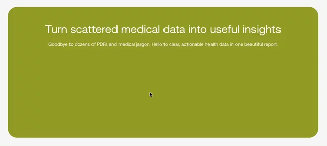
Using simplified, abstracted UI elements helps users understand features without needing to interpret a full product interface, keeping the page easy to scan and the message clear.
Design Engineer
Using simplified, abstracted UI elements helps users understand features without needing to interpret a full product interface, keeping the page easy to scan and the message clear.
Showing a person makes an abstract product feel more relatable by helping users picture it in a real working context, rather than as a list of features. That emotional connection makes the product feel more relevant and approachable.
Agent time-saver #17: When migrating a site from an old platform like WordPress or SquareSpace or even an older Framer build, ask it compare the two sitemaps.xml files and then add all the relevant redirects from the old pages to the new pages. I did this recently for 80+ URLs in under 5 minutes.
A staggered reveal shows how different pieces of health information are gathered, connected and translated into an actionable plan. The subtle motion adds visual interest, guides attention and makes an abstract service feel easier to understand.
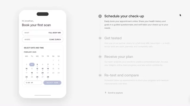
Scroll-linked animation that focuses attention on one step at a time, syncing the phone preview to each stage of the journey. This makes a multi-stage process feel simple and approachable.
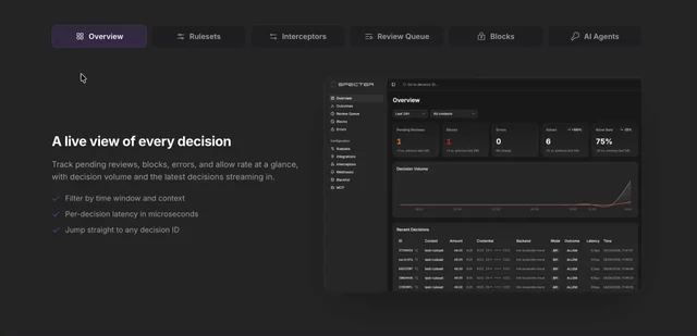
A tabbed feature showcase that turns product details into a more interactive, guided experience. Subtle transitions make the component feel smooth and premium.
Hackathon entry:
Every Framer video, one searchable library
Browse the complete official Framer YouTube catalogue by topic, concept and searchable transcript — built for learning, not just watching.
Pricing cards
Homepage hero concept for Kallaway
Bentos and branding are a powerful combo
Fun little micro-animation combining two SVGs and animating the heart SVG on hover.
Colorful card explorations
Hero section explorations
Yooooooo my name is.... Tristan. Stoked to be here and to see this epic new community take shape!