
Jalal Eddine
I build and sell web templates.
I build and sell web templates.
Building the strategies section for template #6
(VC/PE, Tenet Capital).
Three cards. One hover state. Zero decoration.
The maroon fill on hover does all the work
no icons, no borders, no gradients needed.
Building something new for the firms behind long-term capital.
Tenet Capital is a new investment management template I'm working on for firms that need their strategy, capabilities, and track record to feel as considered as the capital they manage.
Dark. Editorial. Deliberate.
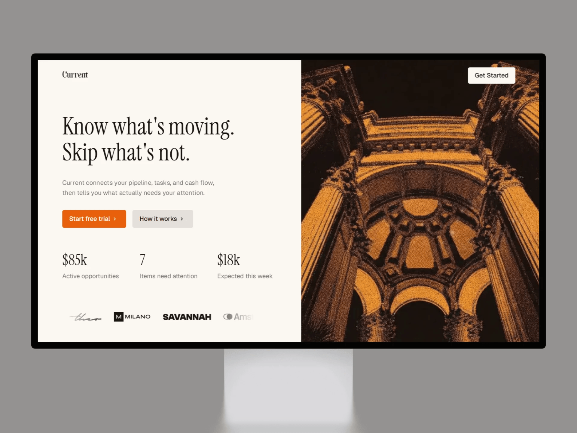
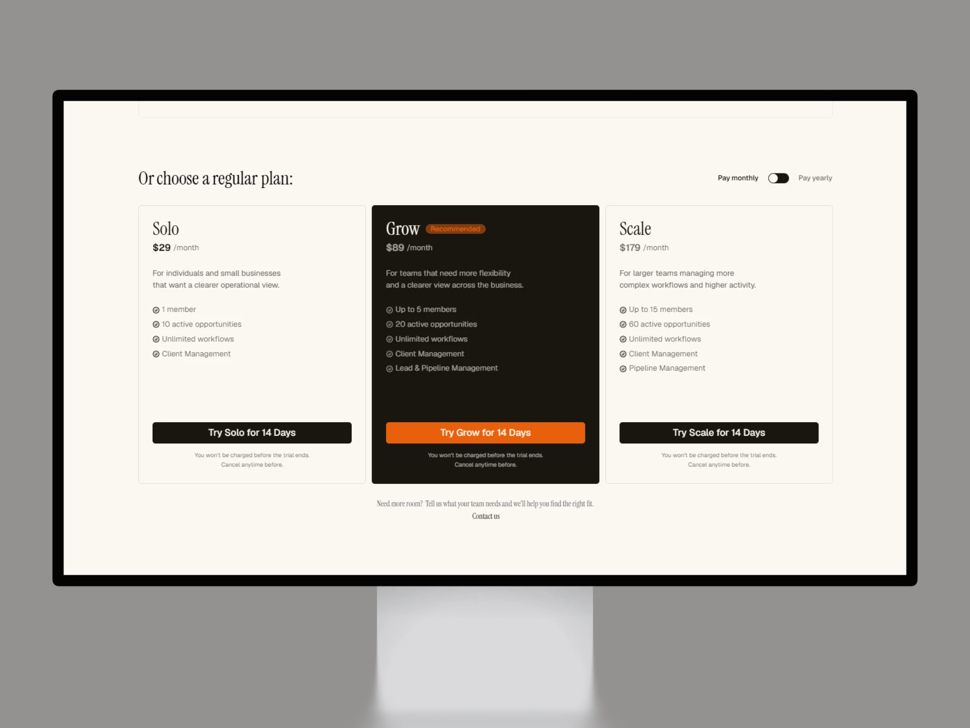
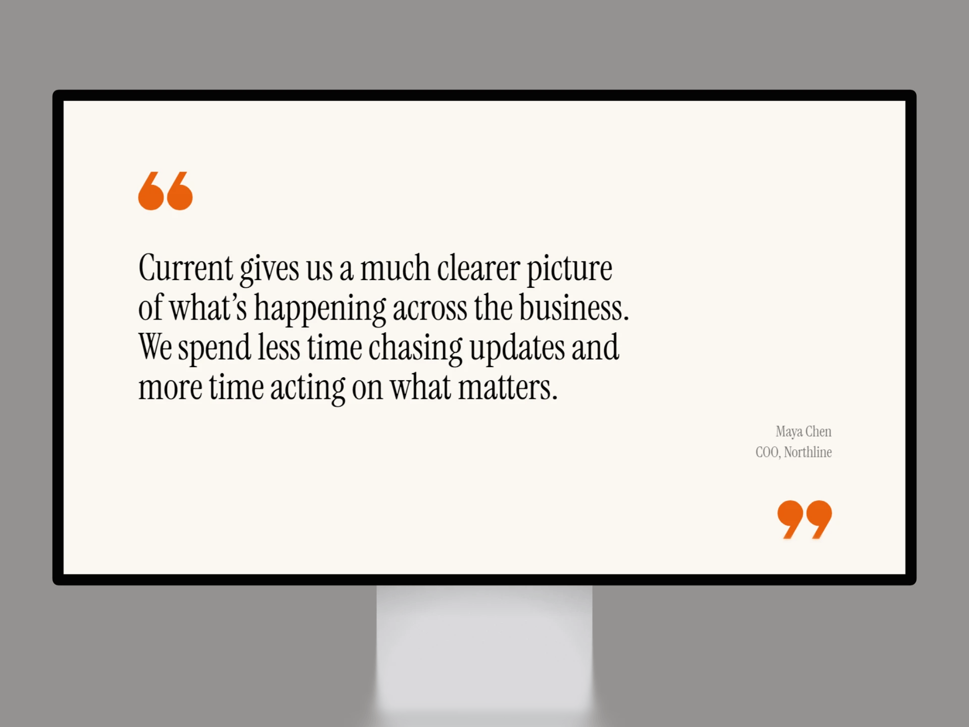
Introducing Current™.
A premium @Framer web template for SaaS, AI, software, and technology products that want to make complex products easier to understand, trust, and choose.
Introducing Current™.
A premium @Framer web template for SaaS, AI, software, and technology products that want to make complex products easier to understand, trust, and choose.
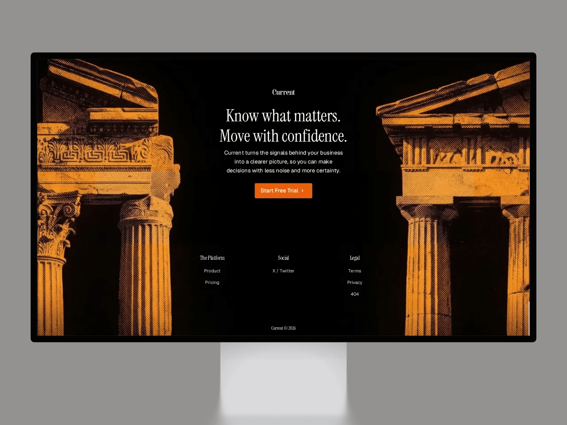
exploring the call to action section of my @Framer template #5
A SaaS product doesn't always need another dashboard screenshot.
For Current, I wanted the first product explanation to be built around three questions:
What's moving.
What's needs you.
What's coming.
The interface can come later.
First, make the product understandable.
Most investment websites don't have an information problem.
They have a hierarchy problem.
Strategy, portfolio, people, and insights all compete for attention,
so the site feels heavier than the firm itself.
For Stills, I built the structure around the order investors actually need
to understand a firm.
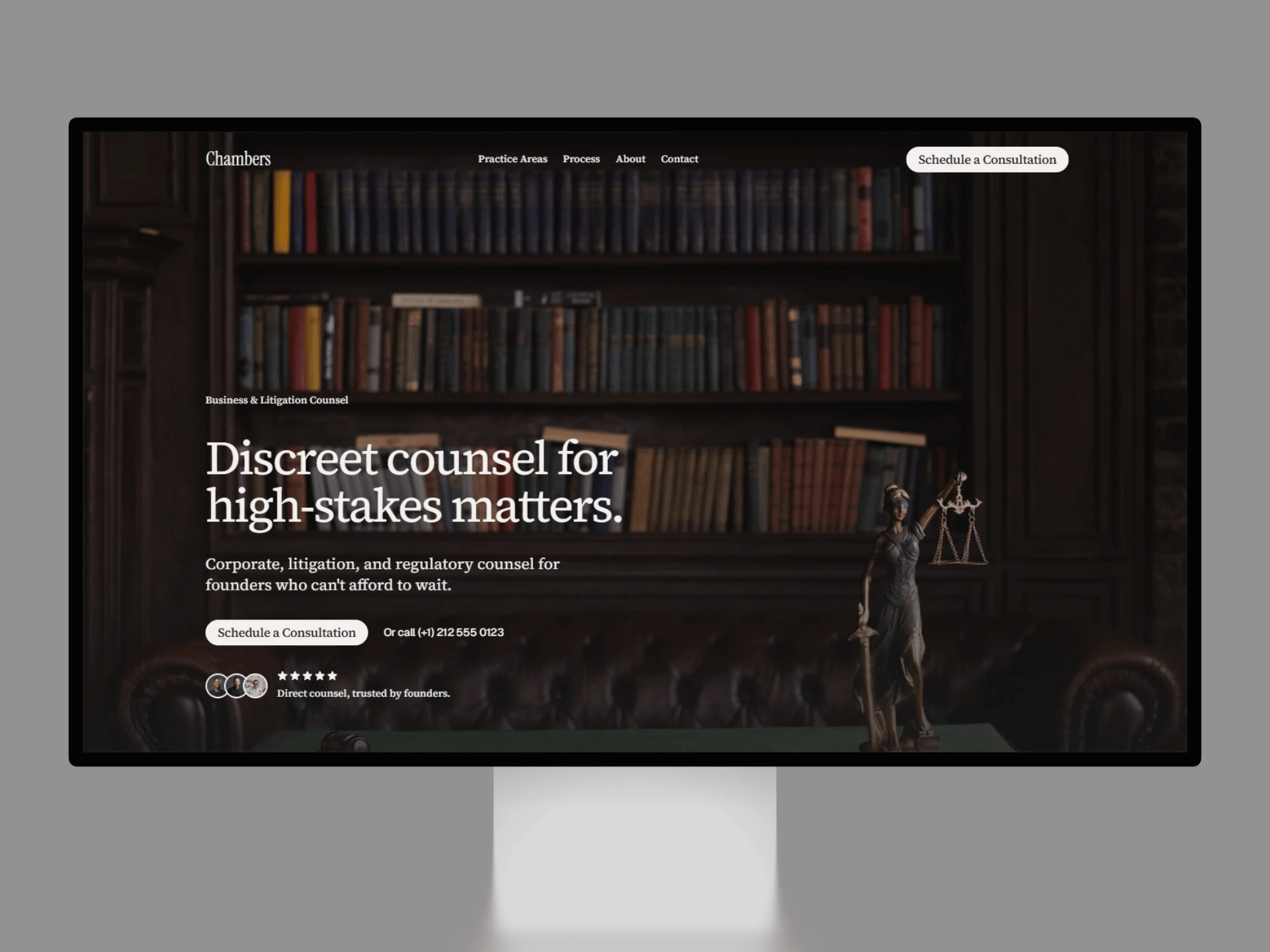
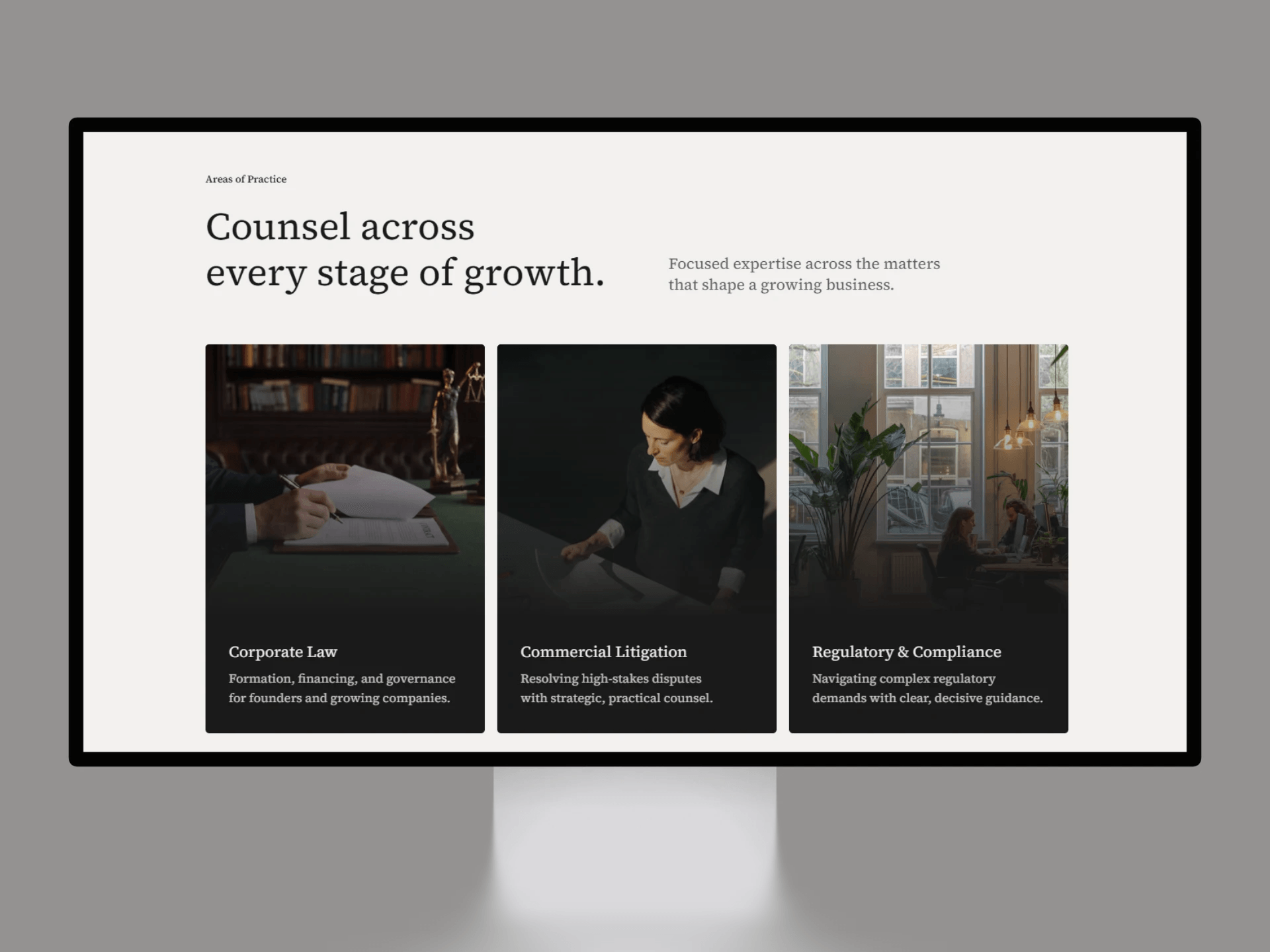
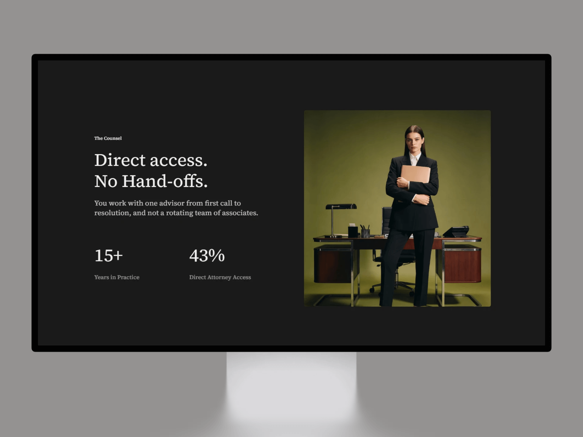
Introducing Chambers™.
A premium @Framer web template for solo attorneys, boutique law practices, and legal consultants who want one focused page that converts, not a website they'll never finish building.
on to upcoming @Framer template #5
Figma Sites has come a long way since launch.
But is it actually ready for serious websites in 2026?
I took a closer look at the CMS, SEO, responsive design, templates, interactions, and how it compares to Framer.
if your law firm's website still routes people to a contact form
instead of just letting them book a call, you're losing clients before you ever talk to them.
chambers fixes that, one page, cal.com built in, live today.
rate my @framer templates store website.
do I change it to white or keep it dark?
Chambers has a working Cal.com booking flow built in, no separate contact page, no redirect, click Schedule a Consultation and the calendar opens right on top of the page.
built for solo attorneys and boutique practices who want visitors booking a call, not filling out a form and waiting.
if you're checking it out, a like or comment on the template page actually helps it get seen, appreciate it.
Introducing Chambers™.
A premium Framer landing page for solo attorneys, boutique law practices, and legal consultants who want one focused page that converts, not a website they'll never finish building.