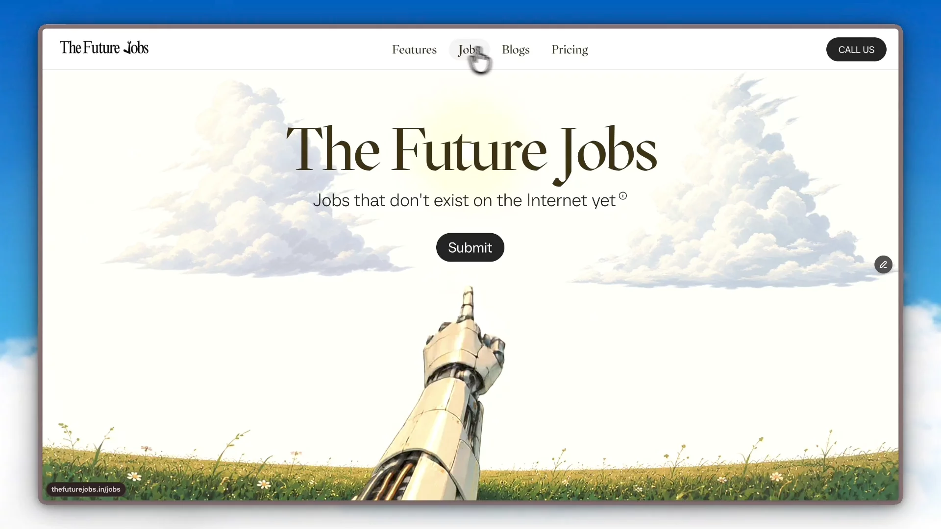
About The Future Jobs
The Challenge
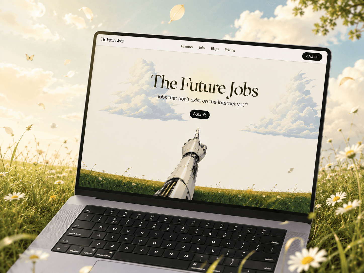
The Future Jobs needed a website that could sell insider access. The product surfaces startup roles before they hit LinkedIn, but the earlier drafts of the story read like every other job board. My job was to make the site itself feel like the unfair advantage the product promises.
My Design Approach
I moved the design away from the standard job portal template and gave it an editorial, intel-report aesthetic. Bold statement typography leads every section, so the site reads like a briefing, not a brochure.
I designed the hero around a scrolling marquee of live role cards, putting the product in motion within the first second instead of hiding it below the fold.
For the problem section, I led with a single stat, "1,247 applicants per role. You're number 1,248." Making the pain the headline made the pitch land before a single feature was mentioned.
I turned the boring data sources list into an orbiting logo animation, converting a throwaway section into the most-watched moment on the page.
I structured the process as numbered steps with scroll reveals, so the value of the service unfolds at reading pace instead of dumping everything at once.
Execution
Built entirely in Framer: marquee animations, scroll reveals, the orbit interaction, a 3-tier pricing layout, FAQ, and fully responsive breakpoints across desktop, tablet, and mobile.
The Impact
The design gave the brand a voice that matches its promise. Visitors now experience the product's core idea, getting there before everyone else, in the first scroll. Sections that were previously skipped, like data sources, became engagement points, and the blunt, confident tone carried through every screen turned a job platform into something that feels like privileged access.