


About Totipotent VC
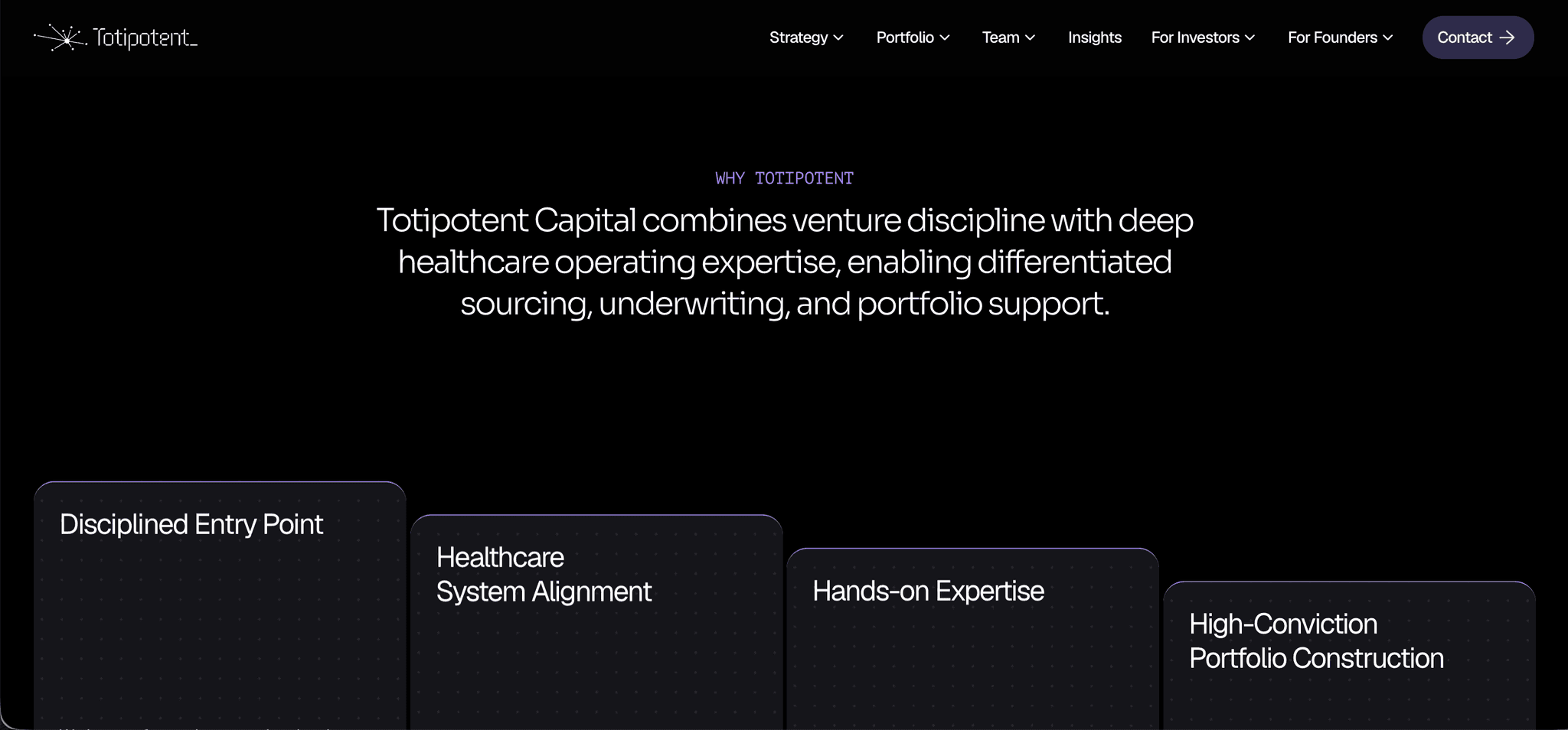
Totipotent Capital’s logo is a map of its portfolio. A central hub connects to eight nodes, and the spokes are unequal because the companies are on different trajectories.
We designed the identity for the fund’s $50M Fund II raise, focused on Series A and B healthcare and health-tech companies. The website and investor newsletter use the same system, so investors meet one firm on every channel.
Logo and brand identity
The logotype draws on cell division. Its indigo-violet accent recalls the stains used to reveal cell structure, and it appears sparingly against near-black.
Logomark, wordmark and horizontal lockups
Full-colour, reversed and single-ink versions, plus a favicon set
Usage rules documented in a brand masterbook
A website the portfolio can grow into
On the Framer site, Sora headings sit over Geist body text. Portfolio companies live in a CMS grid, each logo linking to the company’s own site, so new Fund II deals go in without layout changes. One contact page splits into separate paths for investors and founders. The site records a 17% portfolio click-through rate.
Open the brand identity masterbook, or read the full Totipotent Capital case study.