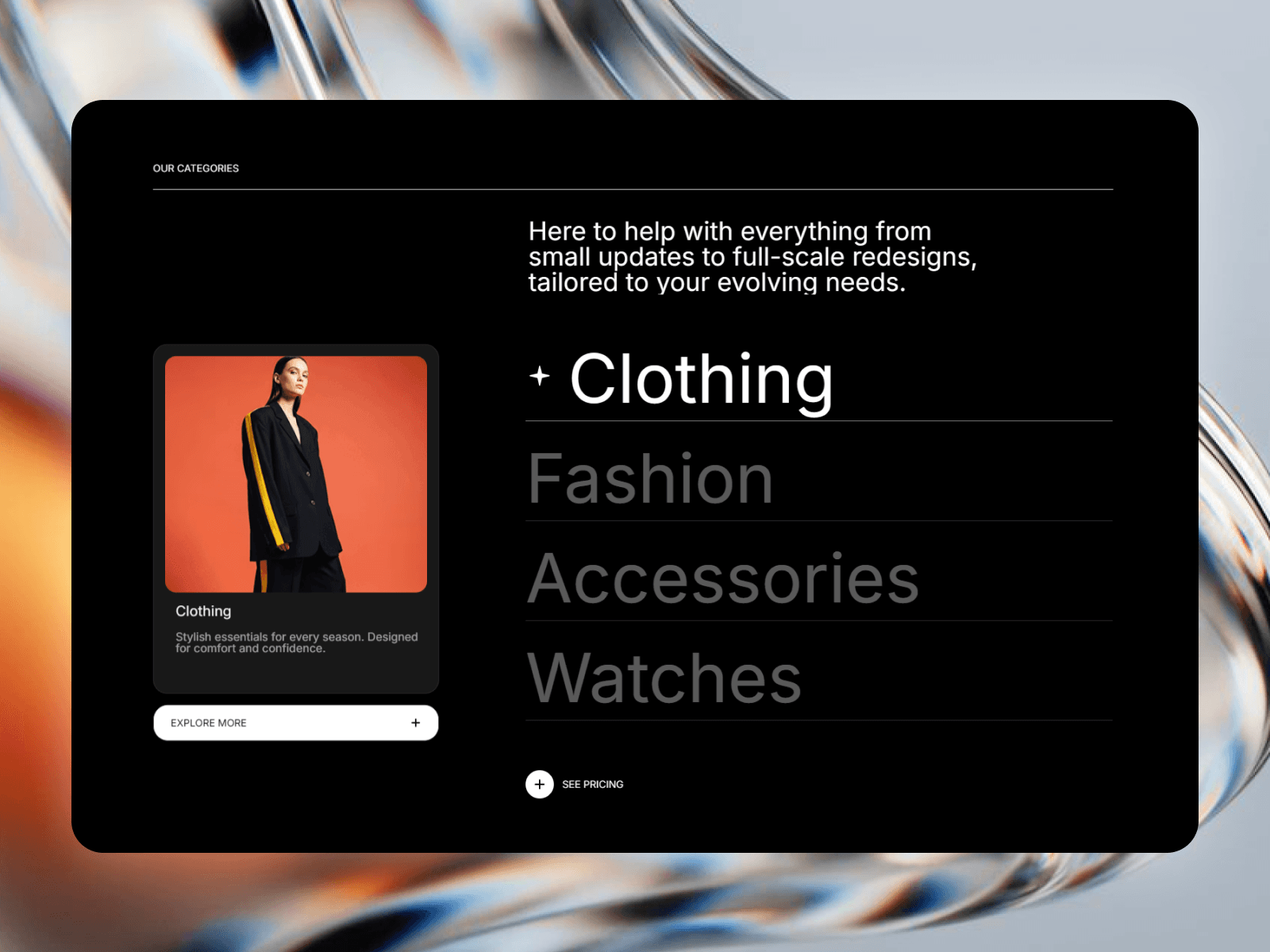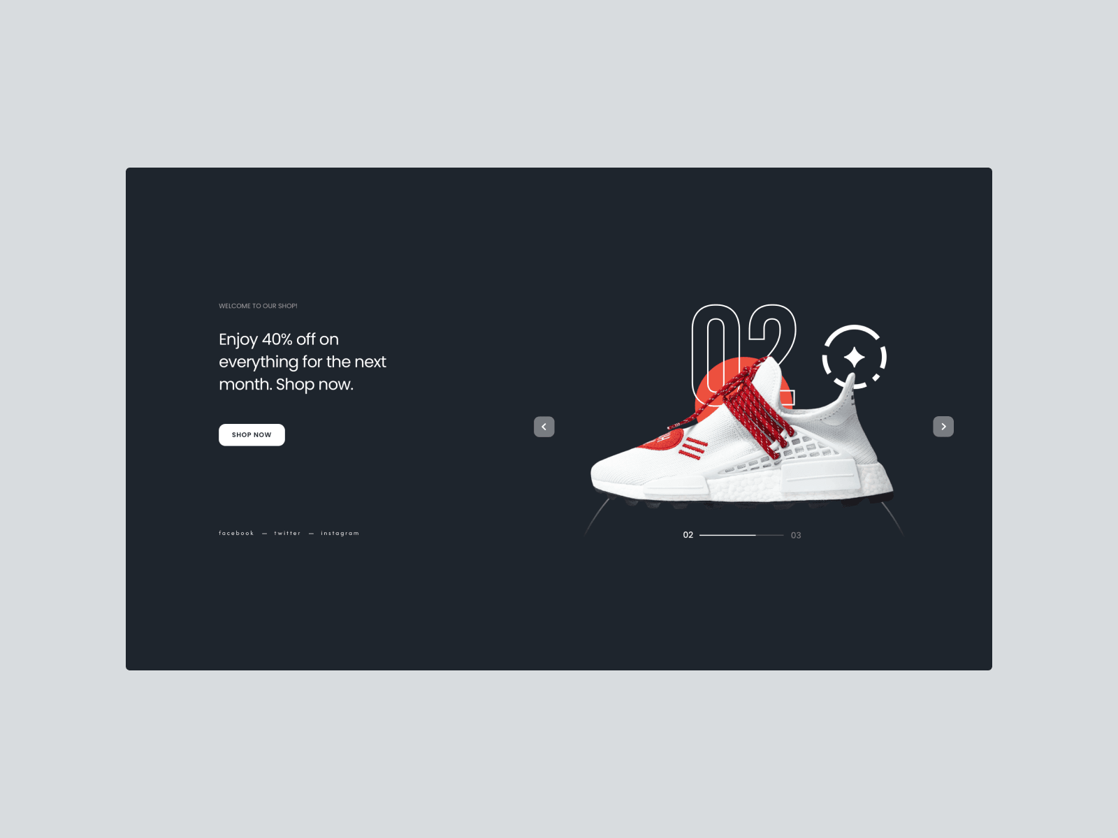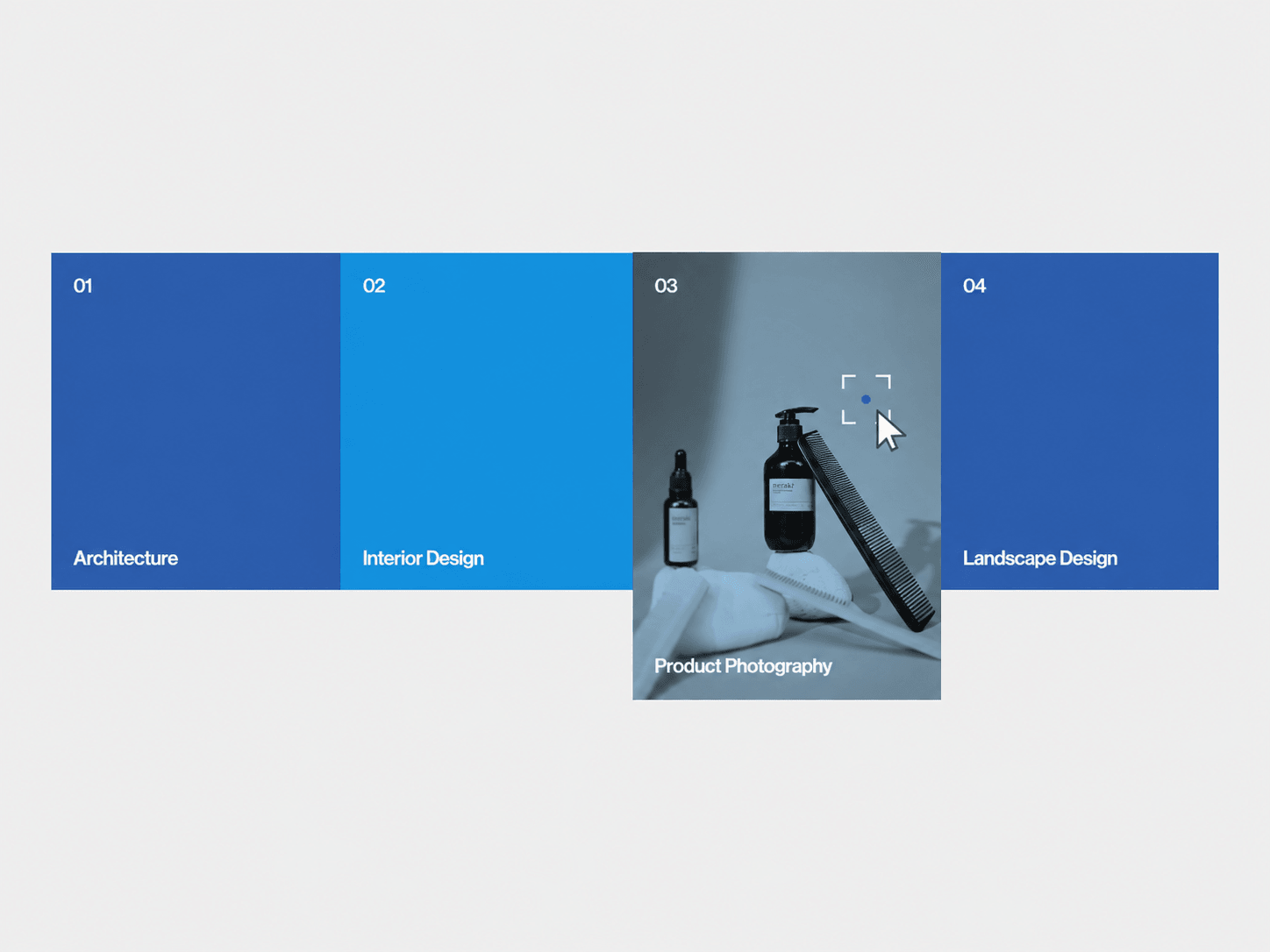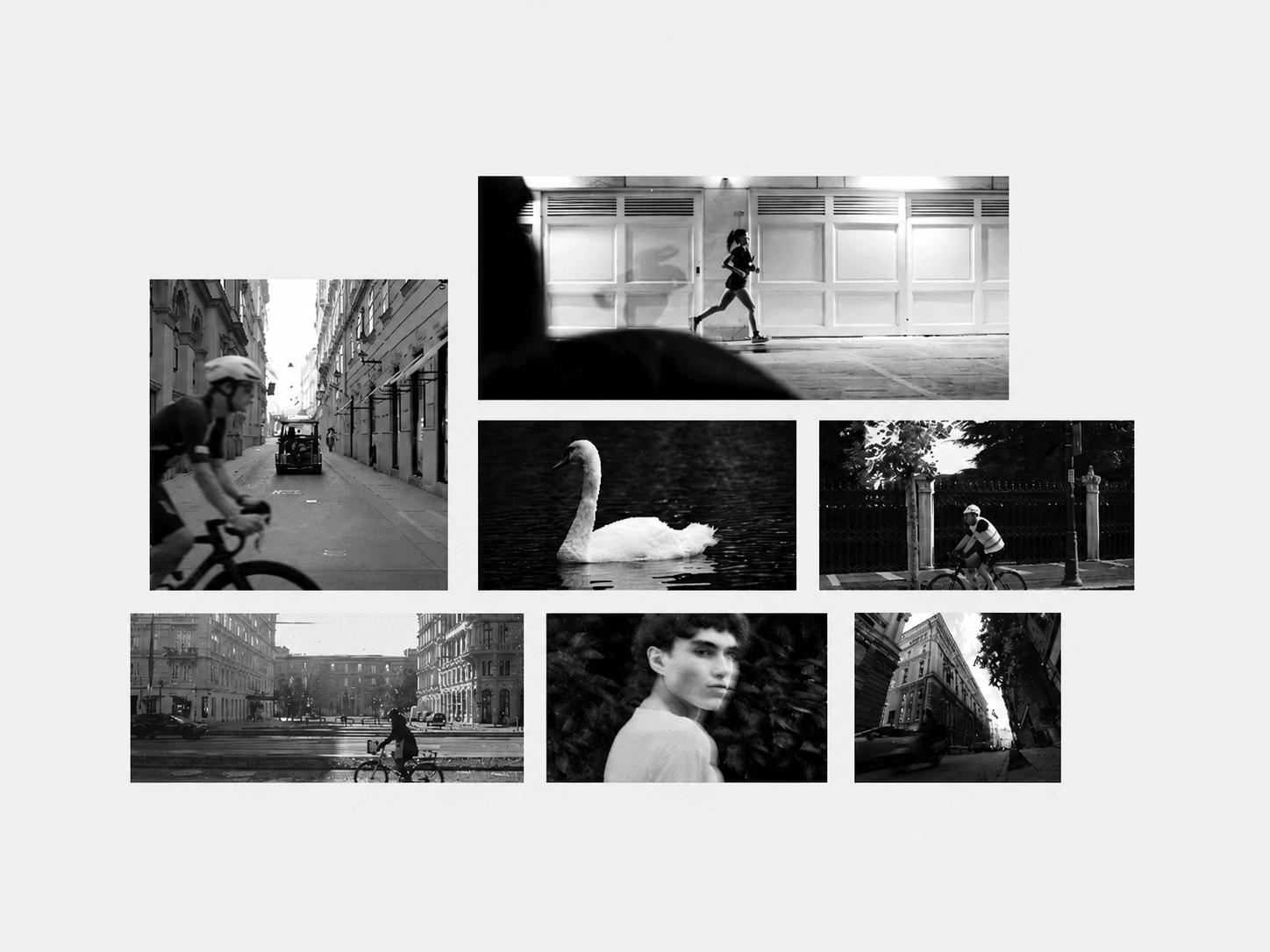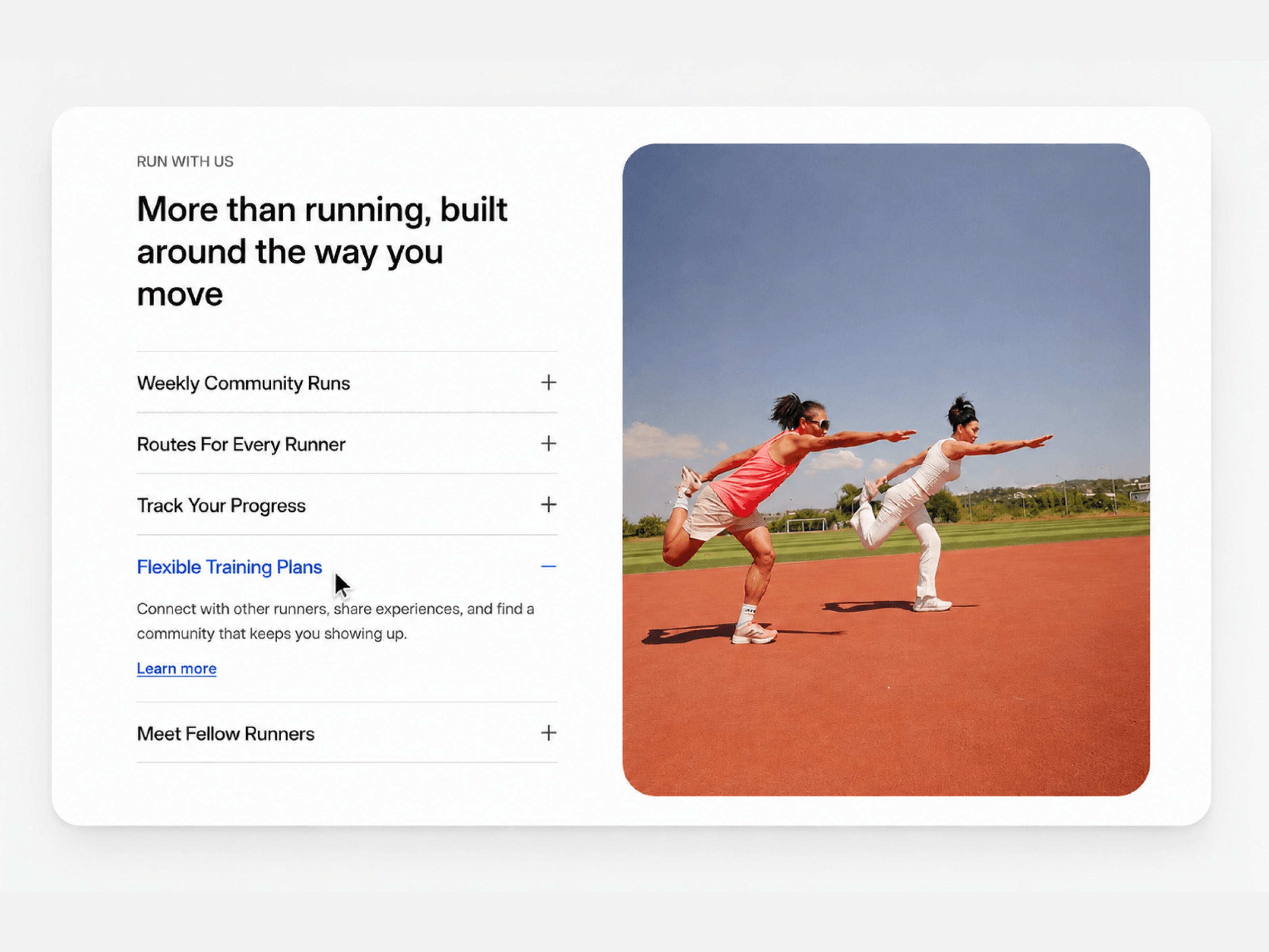
A flexible Framer component for pairing detailed content with visuals in a compact, interactive layout. Visitors click each panel to reveal its description while a matching image or video updates on the other side — all while the rest of the list stays neatly collapsed. Use it for features, services, products, portfolios, processes, or any section where text and visuals need to work together without overwhelming the page.
Click a panel to expand its description and swap the paired image or video.
Smooth, spring-based opening, closing, and crossfade animations.
Optional caption overlay on the image side.
Add an image, a looping video, or fall back to a solid color per panel.
Switch between a side-by-side desktop layout and a stacked mobile layout.
Ideal for features, services, product tours, FAQs, and portfolios.
Split Accordion includes Framer property controls for customizing content, typography, colors, spacing, shape, and icon size — so it can be fully matched to your site's design without touching code.
Panels — Add, remove, and reorder panels, each with its own title, description, link, image, video, or fallback color.
Header — Show or hide the eyebrow and heading together; when hidden, both the stack and the image auto-center.
Typography — Customize fonts, sizes, and weights for the heading, row titles, body copy, and captions, with a max-width control for the heading.
Colors — One consolidated palette control for background, accent, ink, muted, and divider colors, plus the image panel's background.
Animation — Choose smooth, snappy, bouncy, or fully custom spring settings.
The component displays a list of collapsible panels next to a floating image or video card. When a visitor clicks a panel, its description expands while the paired media crossfades into view — and on mobile, the media stacks directly above whichever row is open.