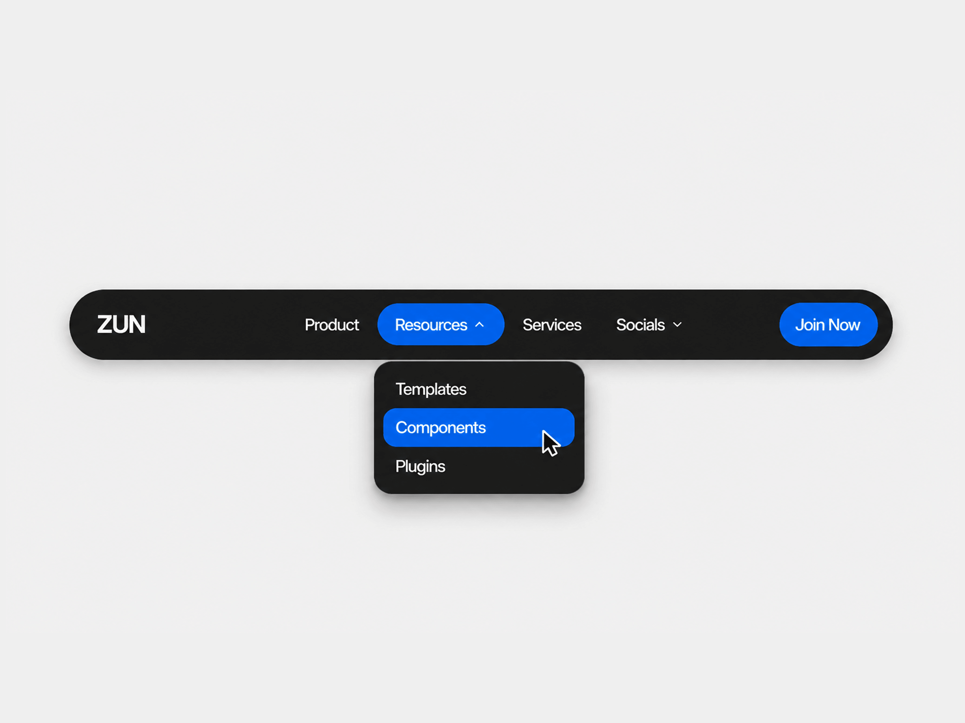
Mega Navigation is a responsive navigation component for Framer that helps you build polished SaaS style menus with multi column dropdowns, featured cards, and smooth GSAP powered animations. It combines desktop and mobile navigation into a single, fully customizable component with no code changes required.
Features
• Responsive Navigation — Optimized desktop mega menu and fullscreen mobile navigation. • Multi Column Dropdowns — Create dropdowns with up to four configurable columns. • Featured Cards — Add promotional cards with images, titles, descriptions, and CTA buttons. • GSAP Animations — Smooth dropdown, hover, and mobile menu transitions. • Animated Hover Indicator — Fluid highlight follows hovered navigation items. • Adaptive Dropdown Height — Automatically resizes between different menu layouts. • Flexible Routing — Supports Framer pages, anchors, external links, email, and phone links. • Connected Buttons — Use built in buttons or connect your own Framer button components. • Custom Branding — Replace the default logo with any connected logo component. • Fully Customizable Styling — Control colors, typography, borders, backgrounds, and spacing. • Optional Backdrop — Focus attention on open dropdown menus with a customizable overlay.
Property Controls
• Navigation links and dropdown structure • Featured cards with optional images • Logo component • Connected or built in CTA buttons • Colors and typography • Border radius • Dropdown styling • Backdrop visibility and color
How to Use
Place Mega Navigation at the top of your page.
Configure your navigation links and dropdown content.
Customize the branding, colors, typography, and buttons.
Publish your site and enjoy fully animated desktop and mobile navigation.
Ideal for SaaS products, startups, agencies, AI tools, documentation sites, enterprise platforms, and any website that needs a modern, flexible mega menu.