About Shader Tabs
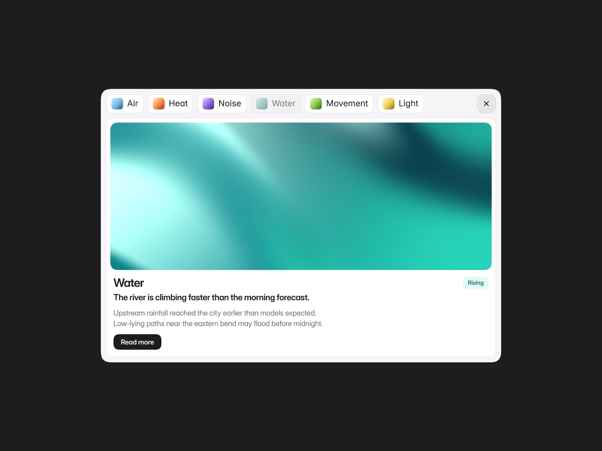
Shader Tabs is a compact interactive component for turning a set of visual categories into focused content cards. It starts as a row of shader-led pills, then opens the selected item into a detailed card with a shader, heading, supporting copy, tag, body text, and CTA.
How It Works
Select any tab to dim the active pill and reveal its matching card below. The component expands as needed for the selected content, while the close control returns it to the compact tab state. Selecting another tab updates the active card without resetting the whole component.
Use up to six tabs. Leave a tab label empty and that pill is automatically removed, keeping the layout intentional for smaller sets of content.
Design and Motion
Shader Tabs uses restrained motion and a clear visual hierarchy: compact pills, a faint surface, and a single content card. Inter typography, tight spacing, soft borders, and 60% squircle corners give it a precise, Apple-inspired feel.
Each card carries its own shader palette and matching tinted tag treatment, so the visual identity stays connected as visitors move between topics.
Responsiveness
Desktop and tablet keep the tab row compact and centered. On phone, tabs wrap into balanced rows while the surface hugs the available content width. Cards, shader height, text scale, and spacing adapt for smaller screens without sacrificing readability.
Customization
Shader Tabs uses Framer variables for the content and core interface styling:
Tab labels, tags, supporting text, body copy, and button label
Surface, tab, card, button, and close-control colors
Heading, supporting, body, tab, button, and close-icon colors
Button tap event
Great For
Feature explanations, product categories, portfolios, editorial themes, resource collections, service breakdowns, creative case studies, and any section where a small set of ideas benefits from deeper context.