I didn't expect a sidebar update to teach me anything.
Then Framer split their navigation in two.
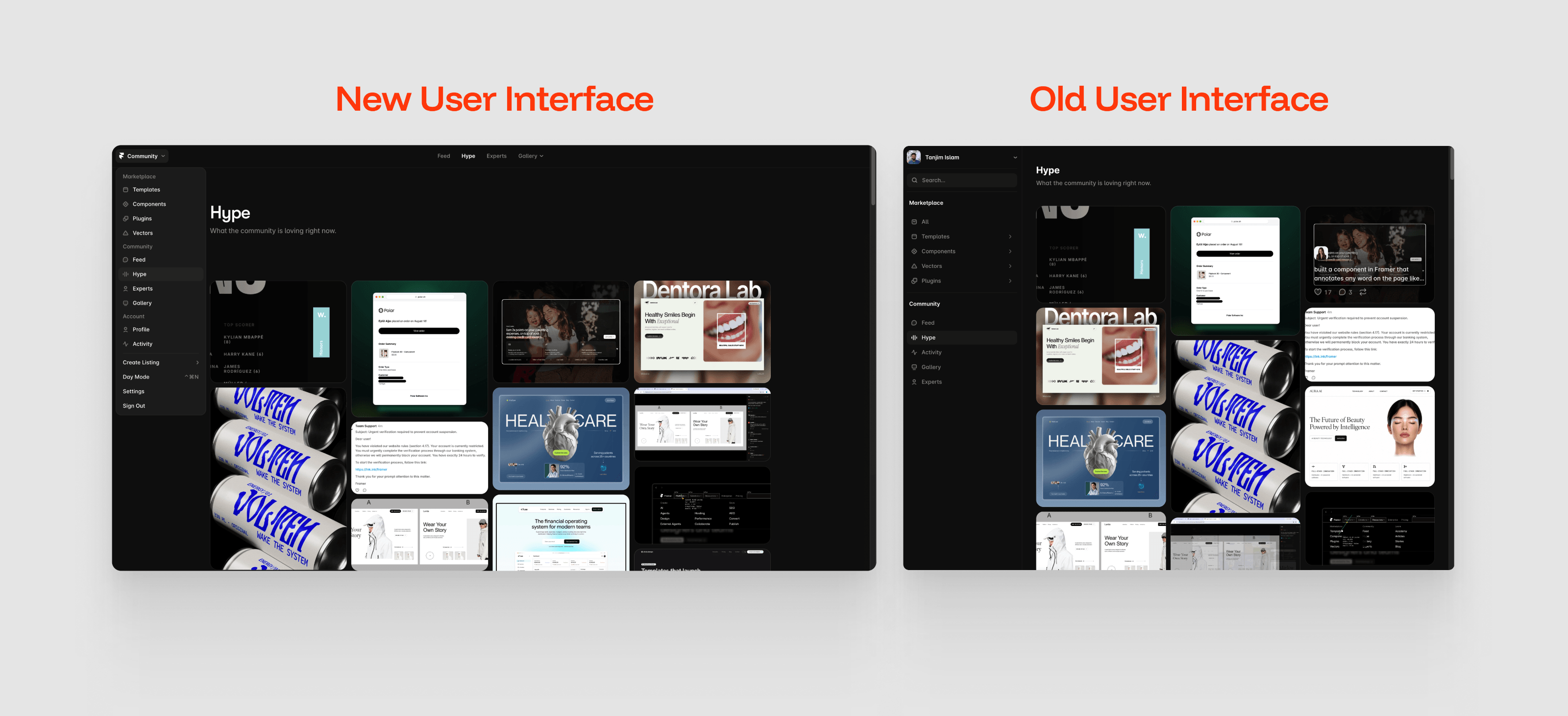
Old version: everything lived in one sidebar. Marketplace links, Feed, Hype, Gallery, your account settings - all stacked in a single column, competing for the same visual weight.
New version: two systems.
→ Left rail holds structure. Where you go.
→ Top bar holds content. What you browse.
Marketplace and Account don't move. Feed, Hype, and Gallery do.
That's the whole trick. Separate what stays from what changes, and give each one its own space.
Most crowded UIs aren't crowded because there's too much in them. They're crowded because everything is fighting for the same row.
Split the fixed from the flexible, and the crowd disappears on its own.