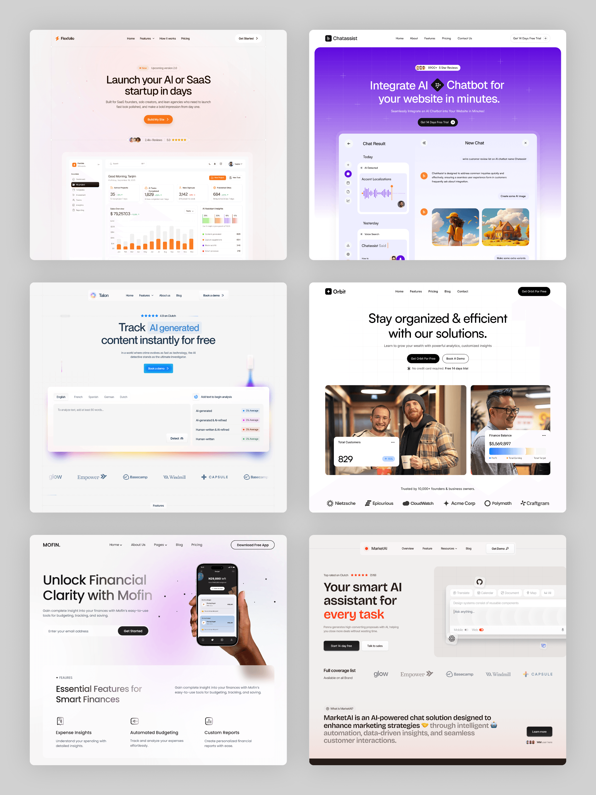
What do six completely different SaaS hero sections have in common?
Purple gradient. Clean white. Financial app. AI chatbot. Different colors, different products, same bones.
→ One headline that says what the product does, not what it "empowers."
→ One primary CTA. Never two competing for the same click.
→ Proof right under the headline - reviews, user count, trusted-by logos.
→ A product screenshot doing the convincing, not a paragraph.
Six templates, one formula.
The style changes. The structure never does.
All free to remix if you want to study how each one builds it differently.
Which hero section style pulls you in first?
If you wanna take these free remixes, go here 👉 Click me