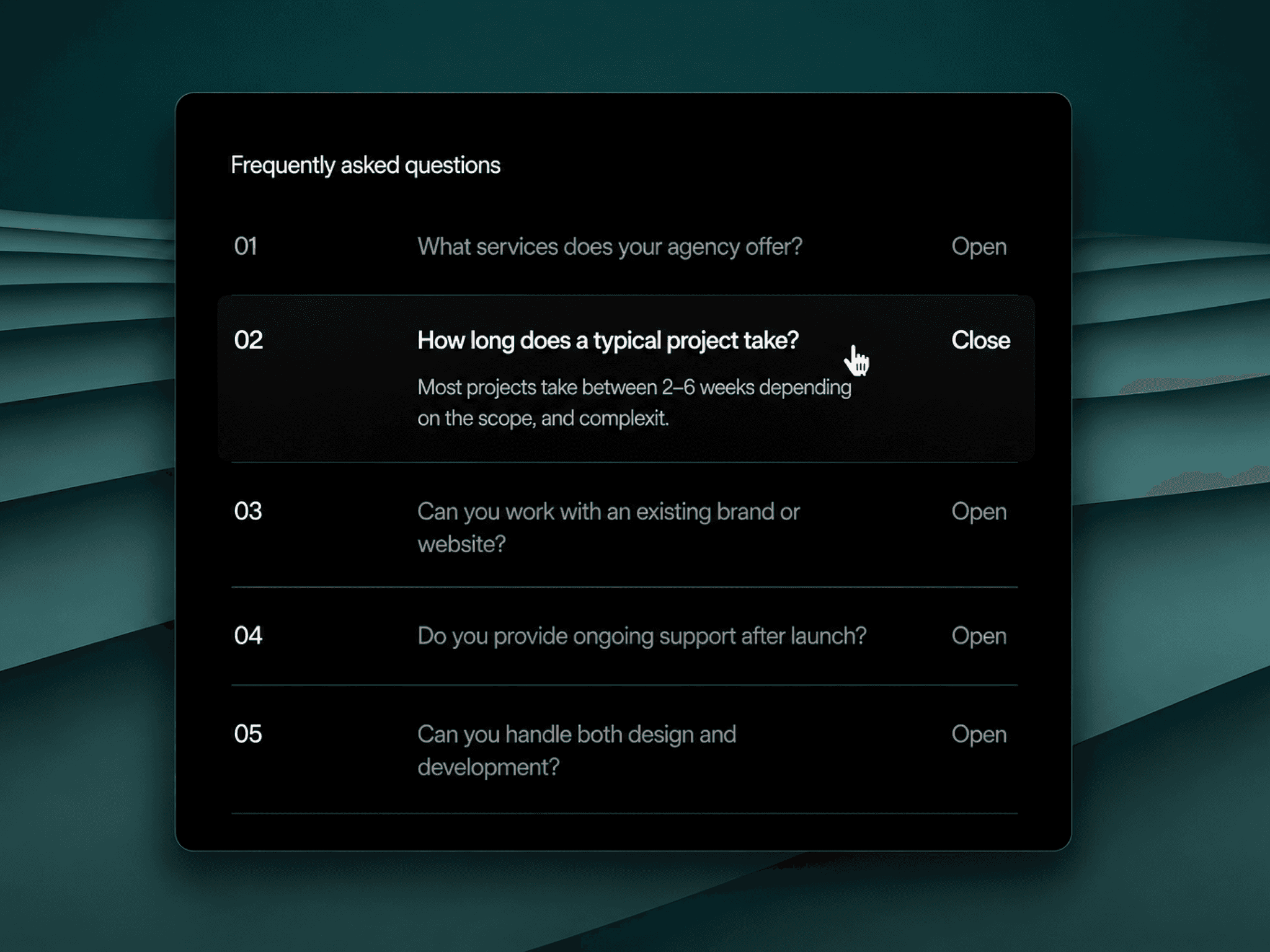
About Accordion Stack
Perfect for editorial, portfolio, and high-end landing pages.
This component adds clarity, personality, and motion without sacrificing usability.
Update v3 Changelog (Mar 23, 2026)
📈 Improvements (1)
Added support for line breaks and whitespaces inside the dropdown content, enabling you to add customised content, including bullet lists (•), arrow lists (→), etc.
Update v2 Changelog (Mar 09, 2026)
📈 Improvements (1)
Fixed the component not reacting to the layout contraints properly.
Demo
Features
Overlapping title layout with customizable overlap amount
Smooth expand/collapse transitions with cubic-bezier easing
Optional serial numbering for each accordion item
Hover interactions with adjustable colour styles
Control which item is open by default
Responsive by default — adapts to any layout or width
Separate styling for active vs inactive states
Text transform options for both titles and content
Customizations
Title font, colour, active colour, hover colour, padding, and text transform
Content font, colour, padding, and text transform
Serial number toggle + individual font styling
Border colour between accordion items
Enable/disable the overlap effect
Adjustable overlap distance
Custom items, including title, description, and default open state
Set up
1. Add the Accordion Stack component to your Framer canvas
2. Set the number of items using the Items property
3. Add a Title and Content for each accordion item
4. Done!
After completing your purchase, you will receive a link to the component.
Copy the URL and paste it into your Framer project to import it.