About Expand Image Cards
✦ Make every audience feel seen.
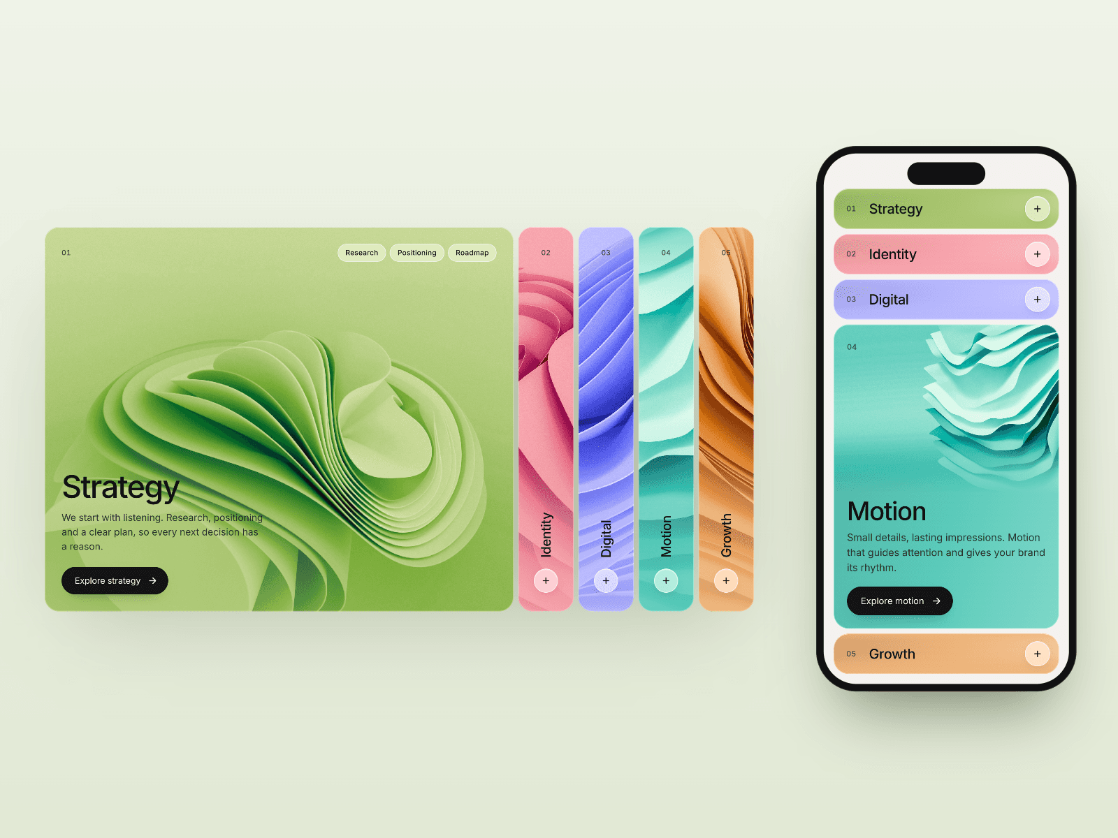
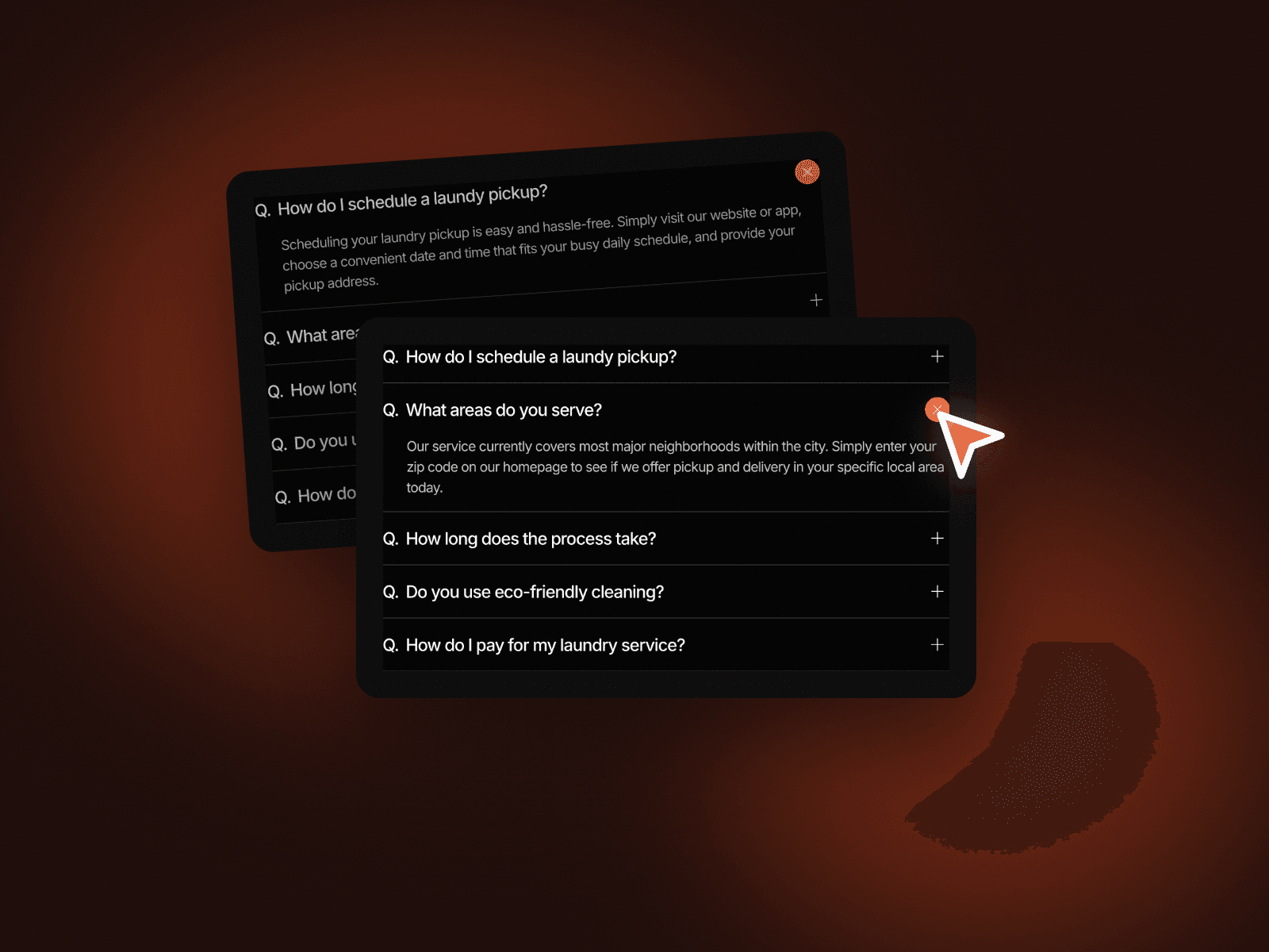
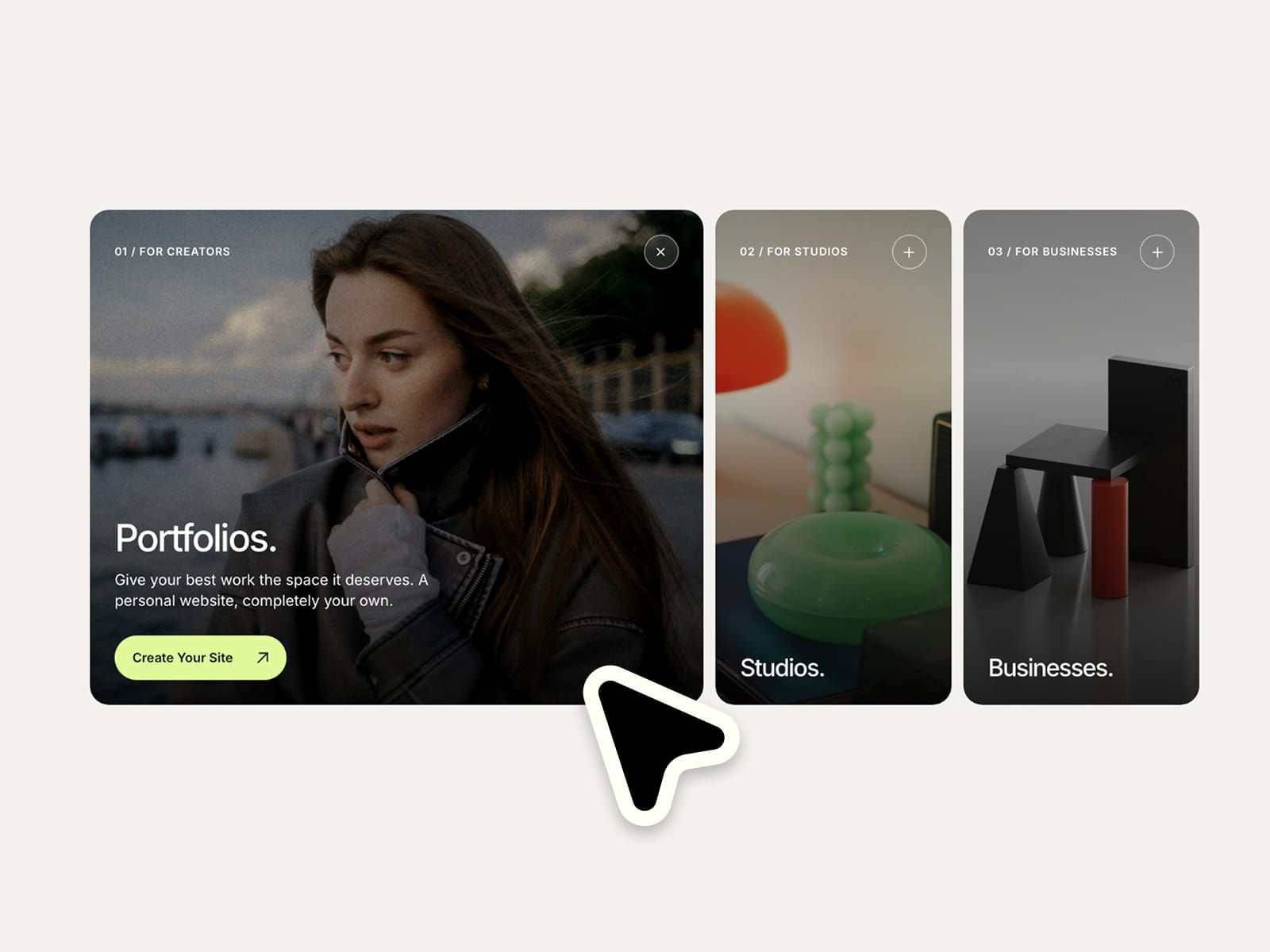
A compact, image-led card component that helps visitors discover the right path for them. Select a card and watch it expand to reveal more details and a clear call to action. Make it completely your own with flexible controls for layout, styling and motion :)
⚙ What you can customize
Easily adapt every part of the component to match your own brand and style.
Images ✦ Image positioning ✦ Categories ✦ Headlines ✦ Descriptions ✦ CTA labels ✦ Links ✦ Individual image tints ✦ Active card width ✦ Card heights ✦ Spacing ✦ Corner radius ✦ Typography ✦ Colors ✦ Animation speed ✦ Image zoom
🎯 Perfect for
Agency websites ✦ Creative portfolios ✦ SaaS websites ✦ Audience selection ✦ Service presentations ✦ Studio websites ✦ Landing pages ✦ Business websites
📱 Responsive by default
A horizontal expanding card layout on larger screens transforms into a compact vertical accordion on mobile, adapting to the available container width.
🖱 Included interactions
Expanding card selection ✦ Full-card navigation when linked ✦ Animated image zoom ✦ Smooth transitions ✦ Keyboard focus states ✦ Touch-friendly selection ✦ Reduced-motion support
🔗 Live Preview
https://audienceexpandcards.framer.website
––––––––
❤ Thank you so much for your support! I genuinely appreciate every download. I hope you have fun customizing this component and making it your own. Happy building!