About Aura Flow Button
Explore more components here →
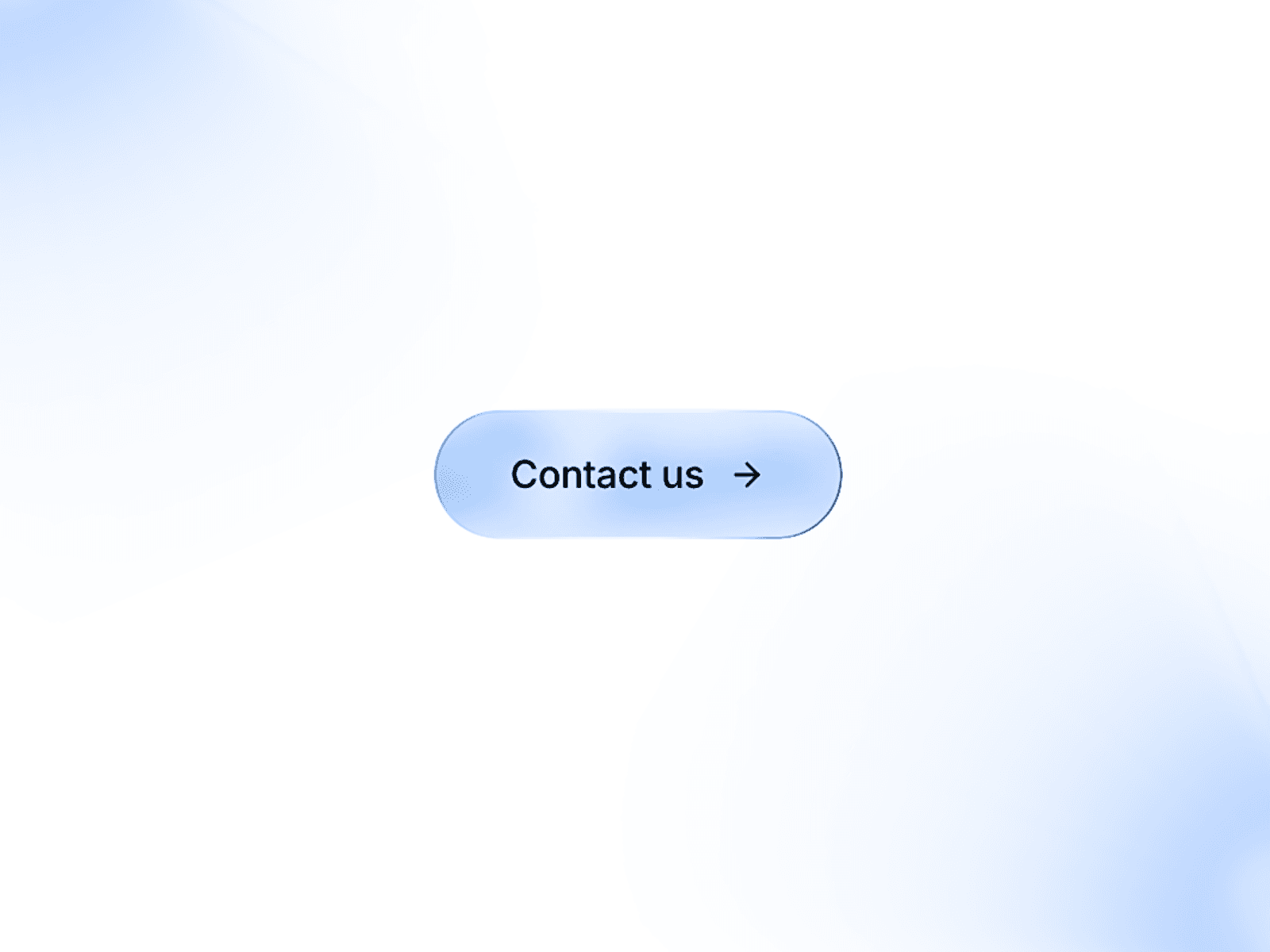
Give your calls to action a smooth, expressive finish with Aura Flow Button - A customizable Framer component with flowing gradients and coordinated hover effects.
Its animated gradient fill creates subtle movement, while a pointer-responsive border adds shifting highlights. On hover, the text rolls upward, the arrow redraws, and a soft glow appears beneath the button.
Customize the design directly in Framer:
Gradient colors: Adjust the base and six animated wave colors.
Border colors: Fine-tune each gradient stop.
Text and glow: Set colors to match your brand.
Typography: Choose your font, size, weight, spacing, and alignment.
Padding and radius: Create anything from a compact rounded rectangle to a spacious pill.
Links: Add a destination and choose whether it opens in a new tab.
The button fits its content automatically and includes keyboard focus styling and reduced-motion support. Animation stays static on the canvas and during export, then plays in preview and on your published site.
Available in a soft blue palette by default, Aura Flow Button works beautifully across landing pages, portfolios, product websites, and contact sections.
Made by Zelo Studio 💙