About Bento Image Grid
About this Component
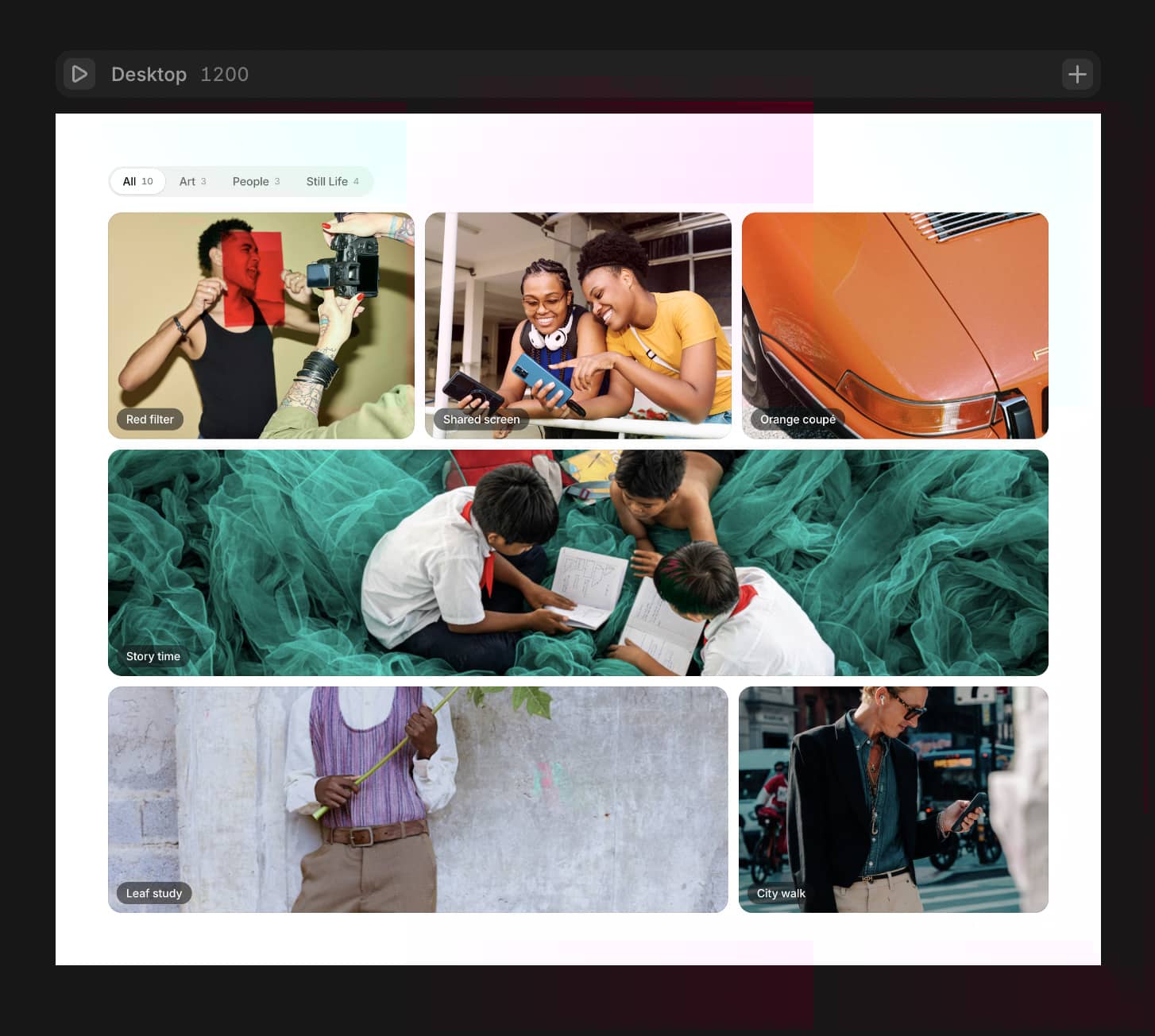
Bento Image Grid gives you 30 ready-to-use layout presets across 6 different item counts (3 to 8 images). Pick a preset, connect your images, done. No layout math, no manual spanning.
What's inside
30 desktop presets, 5 per item count (3-8 images)
Built-in Lightbox - one toggle, no extra setup
Hover scale on every cell, clipped cleanly inside the border radius
Dedicated mobile layout mode (alternating 1-col or 2-col rhythm)
Gap, corner radius, border width, border color, and cell background controls
8 CMS-bindable image slots with per-slot position control
Setup
Drop the component, set a fixed width and height
Set Items (3-8) and pick a Preset (1-5)
Connect images to the slots
Test lightbox in Preview
Lightbox controls
Toggle it on and get: nav arrows, keyboard shortcuts (arrow keys + Escape), image counter, backdrop color, max width cap, and 3 open animation styles (Spring, Ease, Linear).
When not to use this
If your bento grid mixes images with text cards, stat blocks, or icon tiles, this is not the right fit. It is purpose-built for image-only layouts.
What you get
Full TypeScript source, 30 presets, built-in lightbox, mobile layout engine, 18 customizable properties. For support contact design@vikramuiux.com and I'll get back to you.