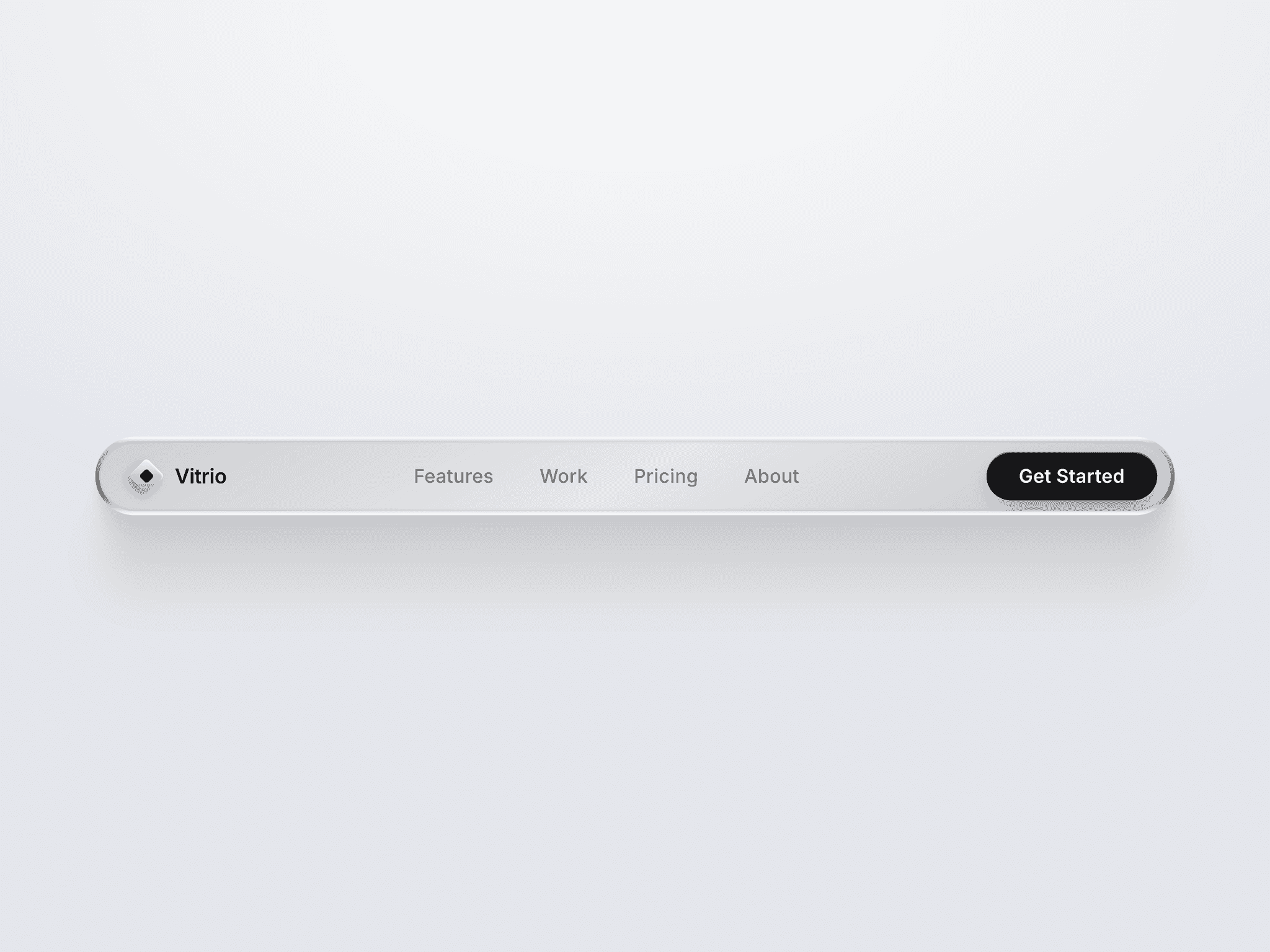
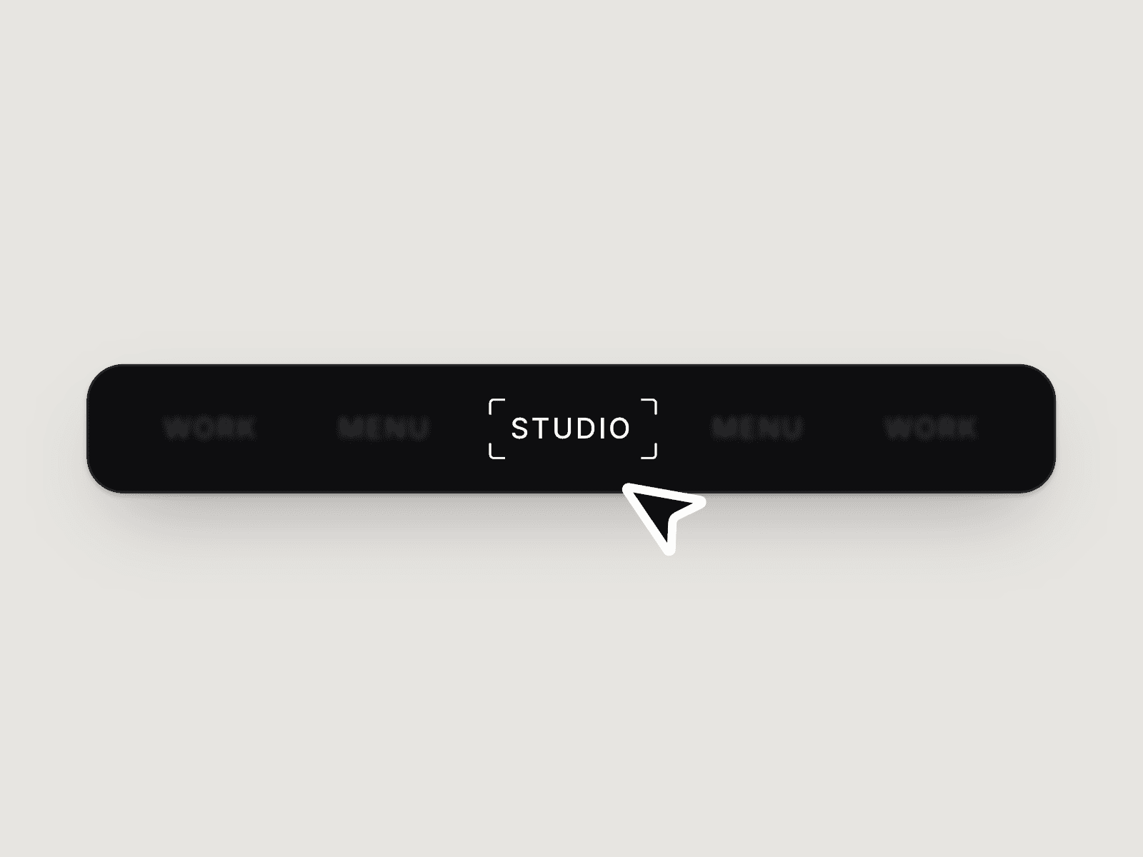
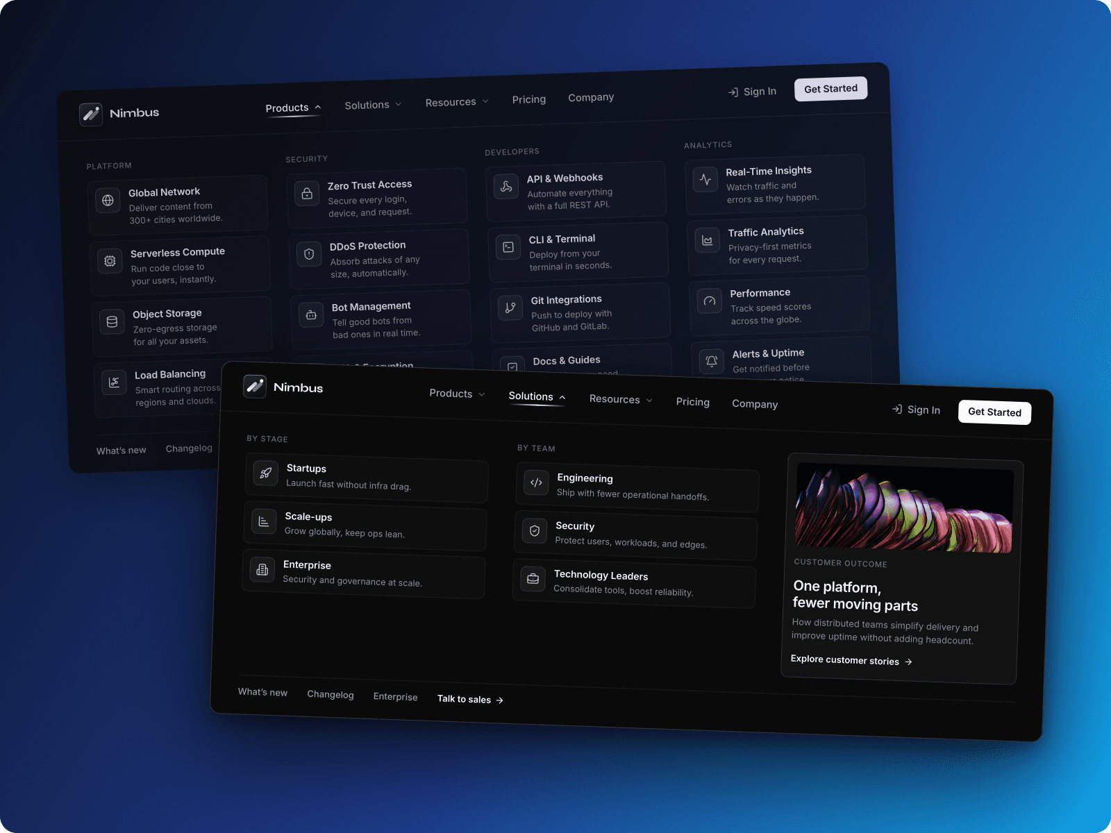
About Breadcrumb Nav
Stop building breadcrumbs manually on every page. This intelligent breadcrumb navigation component automatically generates your entire breadcrumb trail from the URL path - just copy, paste once, and forget about it. Unlike basic breadcrumb setups that require page-by-page configuration, this modern breadcrumb works across your entire site with zero manual setup.
What makes it different from a typical site navigation breadcrumb? Most are static and limited. This is a complete, interactive breadcrumb system built for real projects, with animations, dropdown behavior, SEO support, and deep customization.
Key highlights:
Individual icons per breadcrumb level (true breadcrumb with icons support)
Flexible home button (text only, icon only, or both)
Smart ellipsis with dropdown or expand modes for compact breadcrumb layouts
Built-in entrance animations for an animated breadcrumb
Automatic SEO schema injection
Full accessibility compliance
60+ style controls for every visual state
The component reads your URL structure and builds a correct hierarchical navigation trail automatically - no repeated manual work.
Instructions
Getting Started (3 Steps):
Copy & paste the Breadcrumb Navigation component into your Framer project
That's it - it automatically generates breadcrumbs from the URL path
Optionally customize styling and behavior from the property panel
Auto-Generation Behavior:
Add it to a CMS Post or hierarchical page.
Generates breadcrumb items dynamically
Works as expandable breadcrumb navigation for deep paths
Updates automatically when users navigate
No per-page configuration required
Advanced Customization:
Configure Home Button: enable/disable, text/icon/both
Visibility Mode: show all or use compact breadcrumb mode
Style Items: customize default, hover, and active states
Add Icons: assign unique icons per breadcrumb level
Configure Animations: enable animated breadcrumb entrance effects
Preview Dropdown: style the dropdown breadcrumb in canvas
RTL Support: built-in RTL breadcrumb direction support
Pro tip: SEO schema and accessibility settings are enabled by default. The component detects canvas vs preview mode and shows mock data for easier styling.
How It Works
The Modern Breadcrumb Navigation component features 60+ granular controls organized into intuitive sections:
Properties Control
Core Layout & Behavior
Display Mode: show all or compact (under dropdown)
Visible Items count for compact mode
Spacing between items
Alignment (left, center, right)
Typography & Colors
Full typography control
Separate colors for default, hover, and active
Item Appearance
Padding and radius
Background per state
Border and shadow controls
Text transform options
Animated underline on hover (multiple styles)
Underline thickness and offset
Smooth transitions
Home Button
Show/hide
Custom label
Clickable or static
Text / icon / both
SVG or image icon
Size and gap control
Dividers / Separators
Enable/disable
Character or SVG icon
Custom symbol support
Color and size control
Item Icons
Per-item icon support
Separate active item icon
Size and spacing control
Multiple icon array support
Ellipsis & Dropdown
Enable ellipsis for long paths
Expand inline or dropdown breadcrumb mode
Ellipsis styling
Canvas preview toggle
Dropdown alignment
Dropdown background, padding, radius, shadow
Dropdown item hover states
Supports both expandable breadcrumb and dropdown breadcrumb.
Text Options
Enable truncation
Character limits
Animation
Enable animated breadcrumb entrance
Slide direction
Stagger effects
Timing and physics controls
Advanced
LTR / RTL breadcrumb direction
Accessibility labels
SEO schema toggle
Key Features & What Makes It Unique
1. Flexible Icon System
Supports true breadcrumb with icons per level instead of a single repeated icon. Great for visual site navigation and category-based paths.
2. Smart Home Button
Flexible display modes for desktop and mobile layouts.
Intelligent Ellipsis Modes
Handles long paths with:
Dropdown reveal mode
Inline expand mode
Canvas preview styling
Ideal for compact breadcrumb and deep hierarchical navigation.
3. Entrance Animations
Built-in animated breadcrumb transitions with direction and stagger control.
4. Built-in SEO Schema
Automatically injects BreadcrumbList structured data to improve multilingual SEO and search result appearance. No setup required.
5. Accessibility First
WCAG 2.2 ready with ARIA labels, keyboard navigation, and screen reader support.
6. Complete Style Control
Per-state styling
Animated underline variants
Borders, shadows, spacing
Truncation controls
Dropdown alignment
7. Responsive & Ready
Works across screen sizes
Touch-friendly targets
RTL direction support
8. Performance Optimized
Efficient React hooks usage
Minimal re-renders
Lightweight animation handling
Use Cases
E-commerce Websites:Perfect for product category navigation. Add custom icons per category (e.g., 🏠 > 👕 > 👔 > Oxford Shirts), use compact mode for deep hierarchies, and benefit from SEO schema for better product discovery.
Documentation SitesHelp users navigate complex documentation structures. Use entrance animations for engaging UX, enable text truncation for long page titles, and leverage built-in accessibility for inclusive access.
News & Media Portals:Guide readers through article categories. Compact mode keeps navigation clean, dropdown reveals full path when needed, and schema markup improves article discoverability in search results.
Corporate Websites:Navigate department pages and resources. Customize colors to match brand guidelines, add subtle entrance animations, and maintain professional appearance with full style control.
Educational Platforms:Help students navigate course materials. Use descriptive icons per section, expand mode for transparency, and screen reader support for accessibility compliance.
Real Estate Portals:Guide users through location > property type > listings. Truncate long location names, use dropdown for complex paths, and benefit from SEO for local search visibility.
Made with ❤️ by Soyeb
Refund Policy: Due to the digital nature of these components, all sales are final, and once delivered they cannot be returned or refunded. Please review product details and demos before purchasing, and feel free to reach out if anything is unclear.
Have questions or need a custom Framer component? Reach out at heysoyebali@gmail.com