About Button Pack: Fill
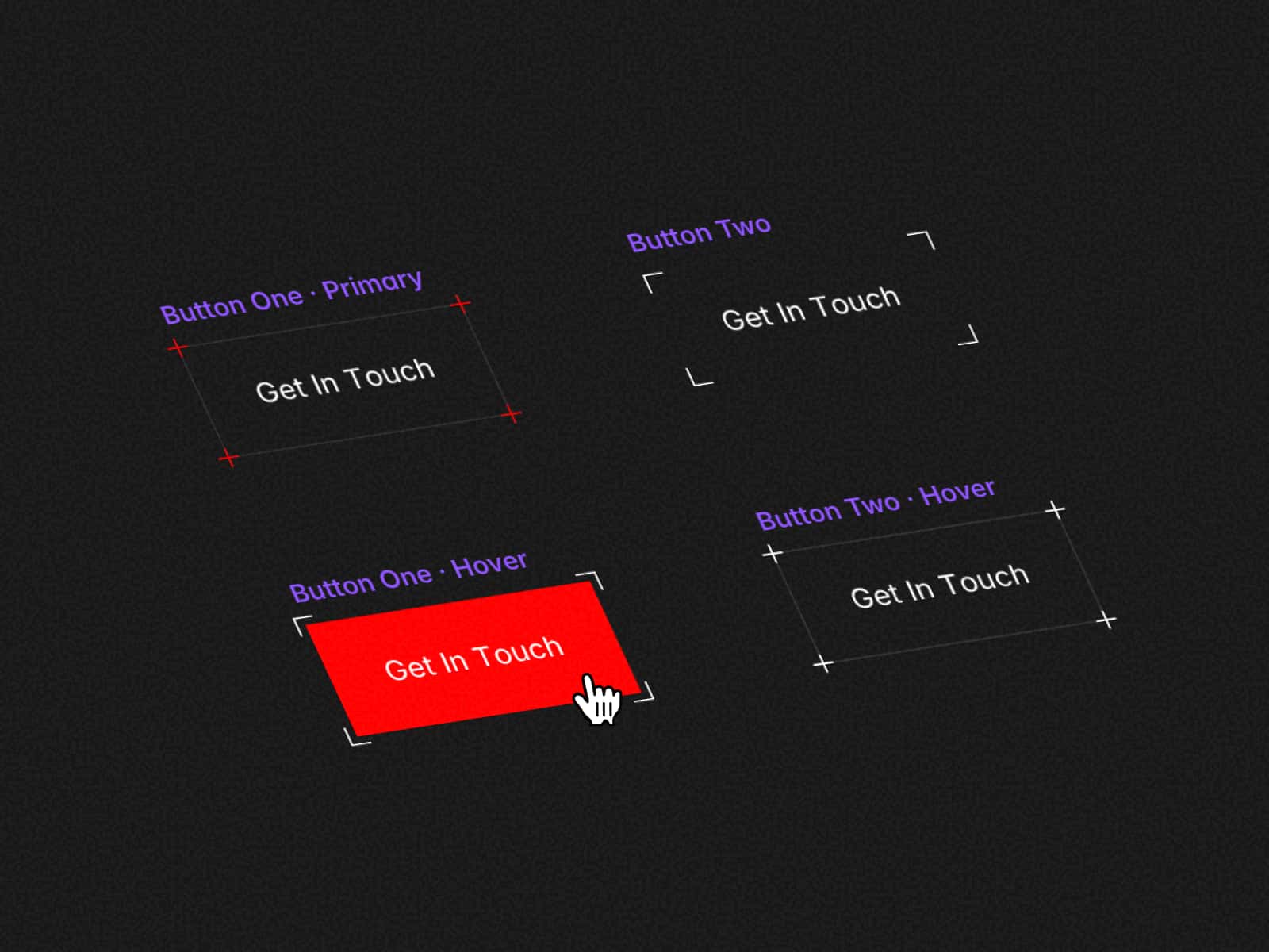
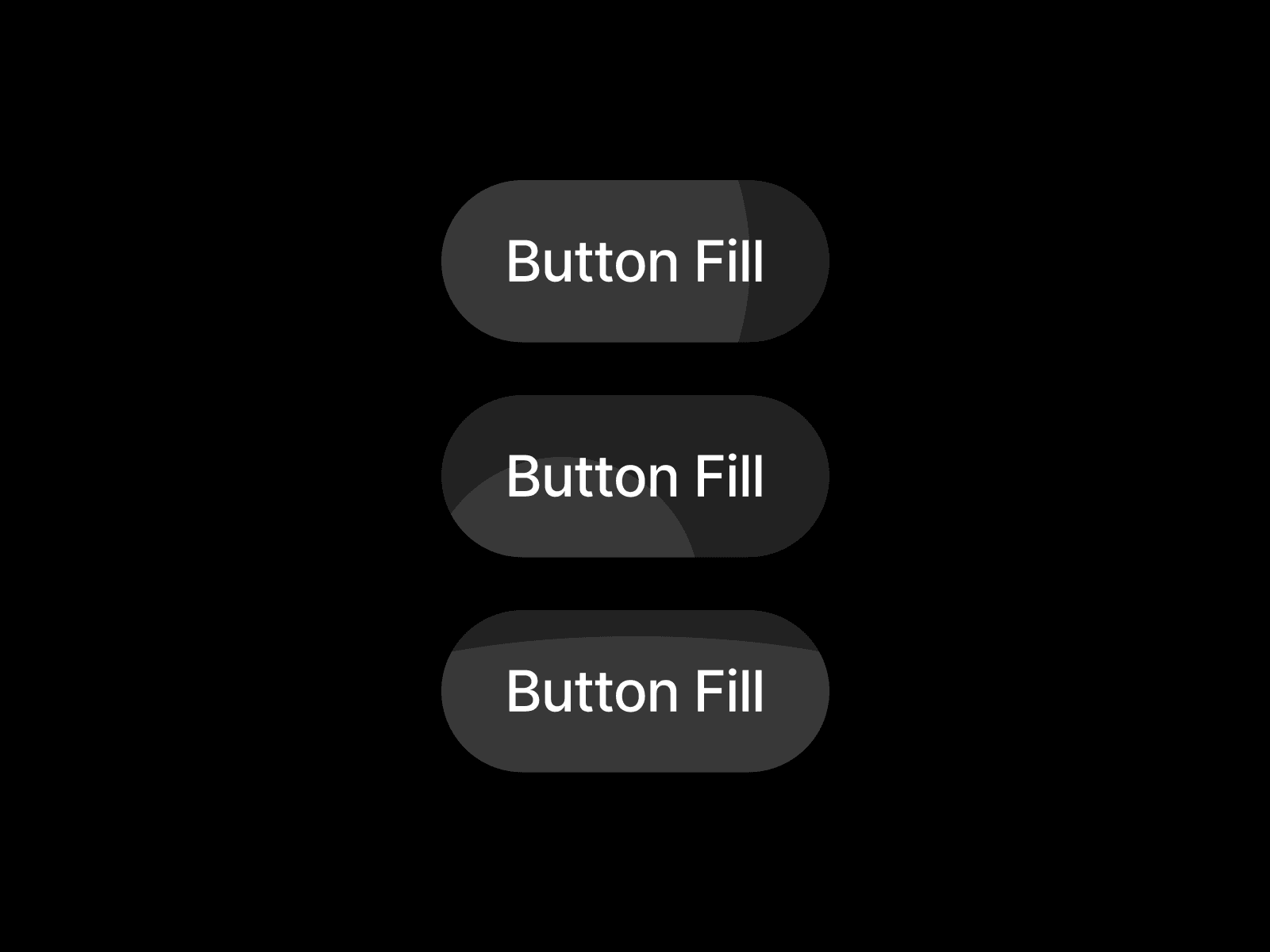
Button Fill is a button component with six hover effects that bring a plate in under the label.
Sweep crosses from one side, Shutter opens from the centre, Ink fill spreads from where the pointer entered, Stepped fill rises in six columns, Directional fill enters from the edge you crossed, and Takes turns uses a new edge each time.
Pick Outline, Filled or Link, set Label and Link, and type the effect into Effect Key: sweep, shutter, inkfill, stepped, dirfill or takesturns.
Signature adds swell, squash or roll on top. Six colour controls, Default Border to Focus Ring, take colour styles.
Keyboard focus plays the same effect behind a focus ring, and reduced motion makes it instant.
Questions? Email granqvistsanna@gmail.com.