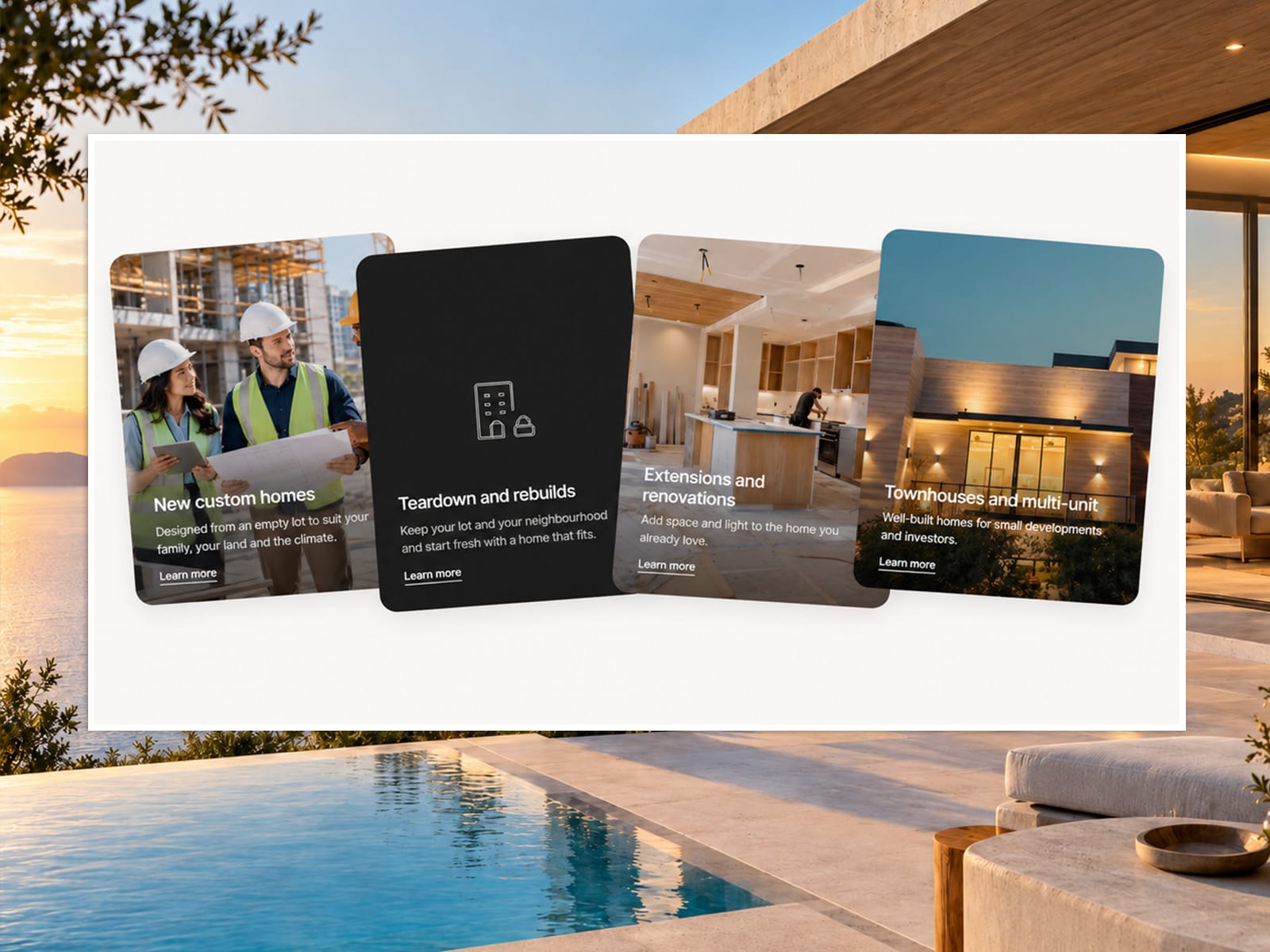
About Card Stack Showcase
Card Stack Showcase
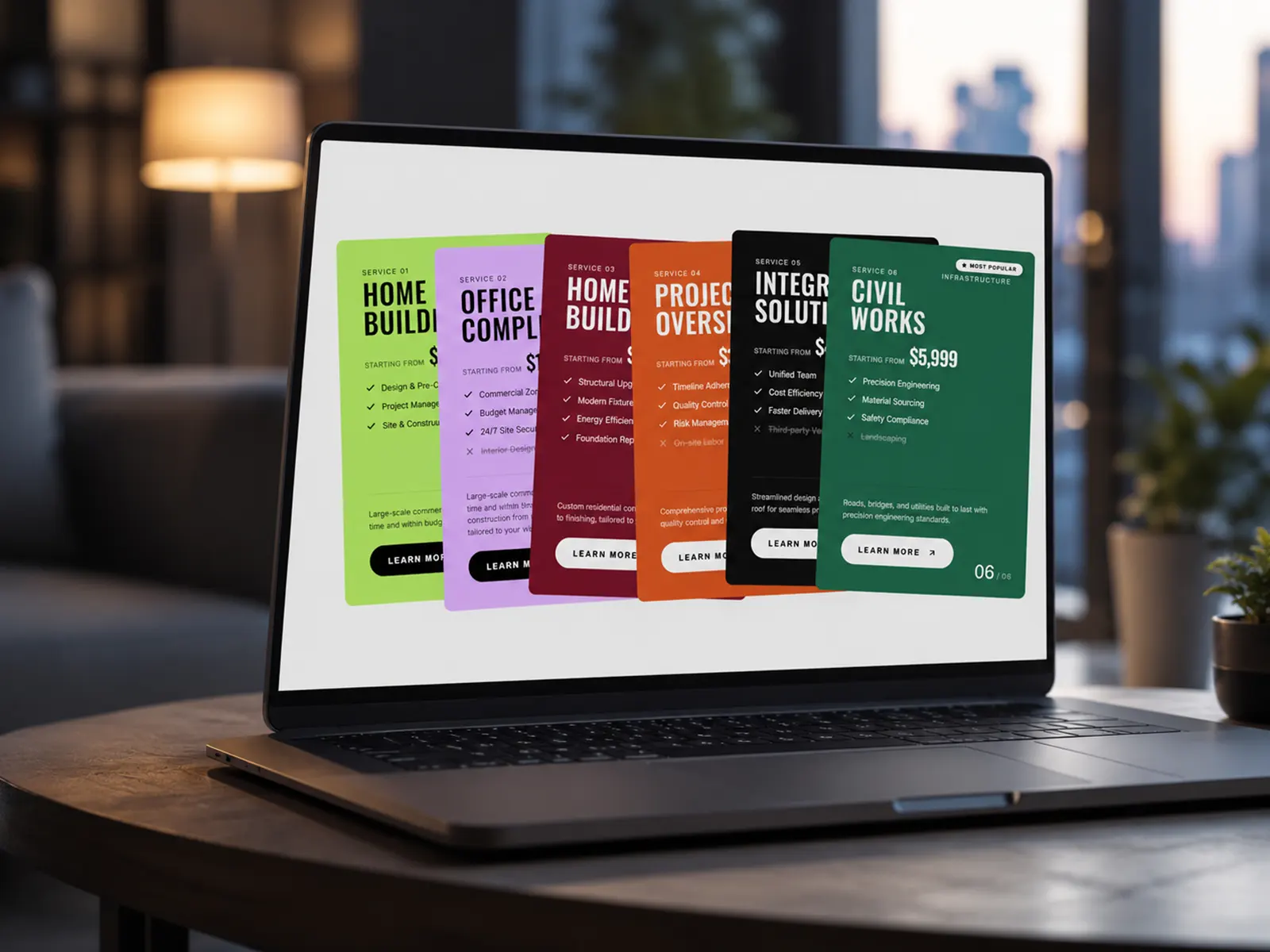
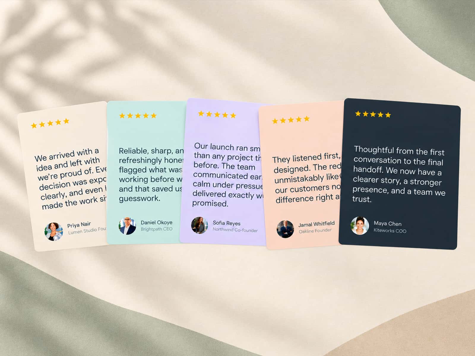
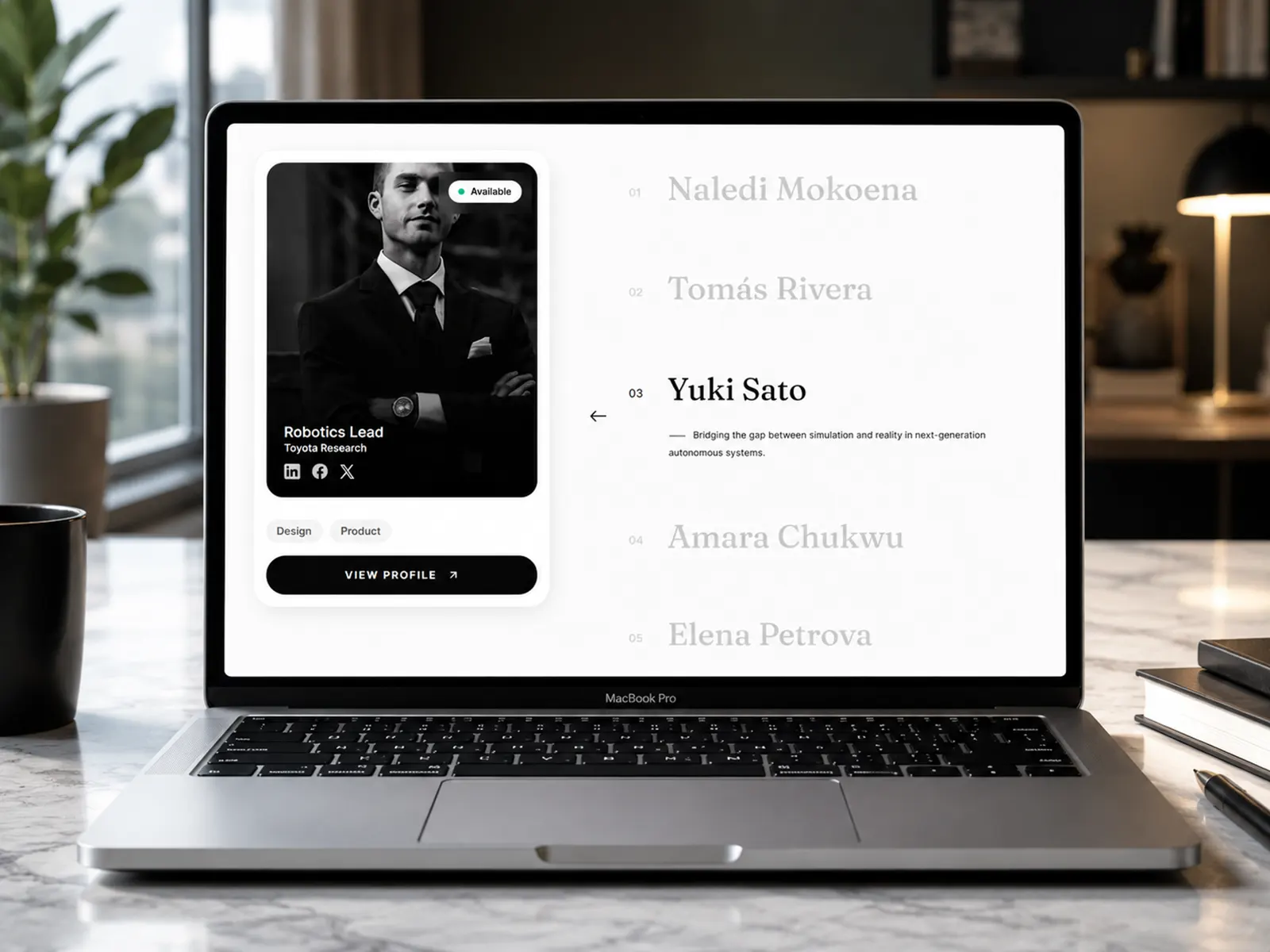
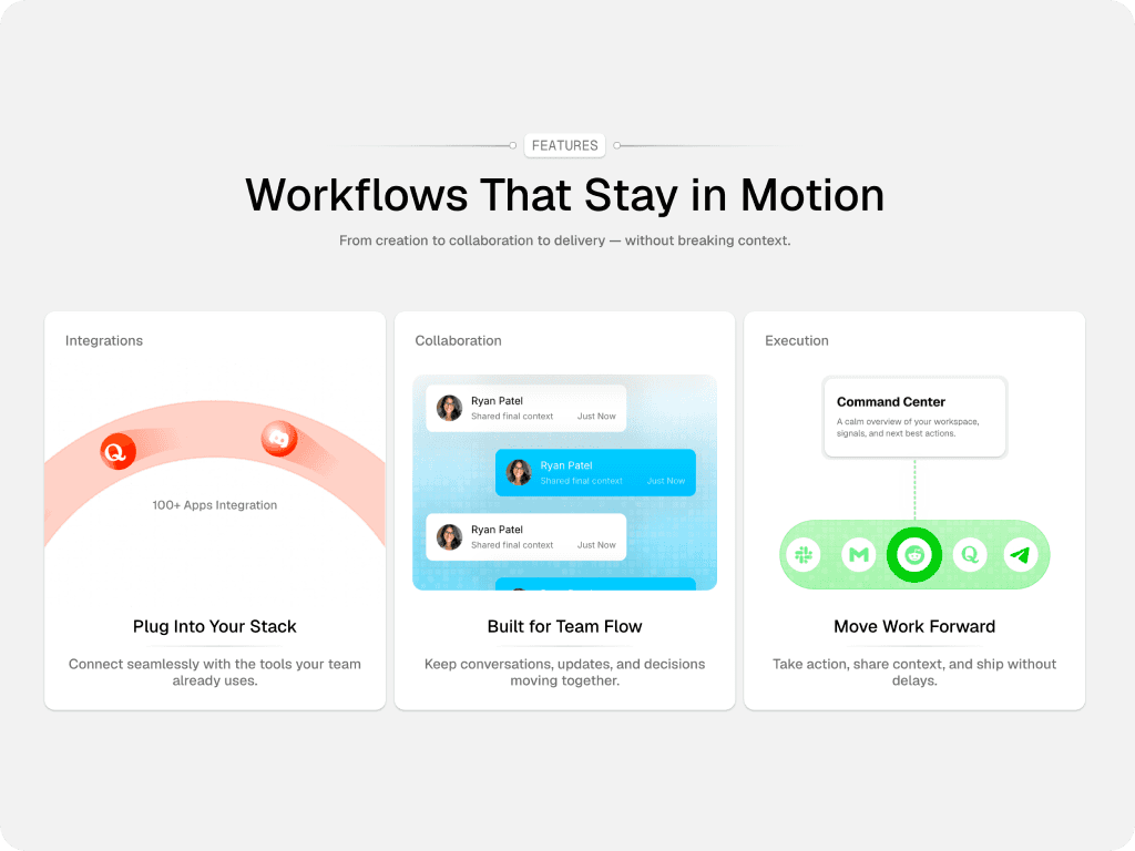
Create a bold, interactive card presentation for services, projects, portfolios, case studies, or featured content. Card Stack Showcase combines layered card layouts, smooth GSAP animations, responsive behavior, and flexible media support in one highly customizable Framer component.
Key Features
Animated Card Entrance
Cards animate into position when they enter the viewport. Choose from Bottom, Top, Left, Right, Alternate, Sides, or Center entrance animations with adjustable duration, easing, stagger, and animation order.
Multiple Deck Layouts
Choose from Flat, Fan, Arch, Cascade, Zigzag, Wave, Scatter, or Custom layouts to create different card arrangements and visual styles.
Interactive Hover Effects
Cards can lift on hover or push neighboring cards apart for a more dynamic interaction. Customize hover colors, movement, scale, and spacing.
Image & Video Cards
Use standard text cards or transform individual cards into image/video cards. Videos support autoplay or hover playback, posters, overlays, and cover/contain fitting.
Responsive Mobile Layout
The component automatically measures its available width and switches to a mobile-friendly stacked layout when necessary. Customize mobile spacing and padding.
Complete Visual Control
Customize card size, radius, padding, shadows, colors, counters, typography, icons, tilt, vertical positioning, backgrounds, and more.
Flexible Links
Make the entire card clickable or display a dedicated Learn More button/link.
Performance Optimized
Media uses lazy loading near the viewport, while videos only play when appropriate. This helps reduce unnecessary loading and playback.
Accessibility Friendly
Includes keyboard navigation, visible focus states, touch interaction support, and an option to respect users' reduced-motion preferences.
Perfect for creative agencies, architecture studios, real estate, construction, portfolios, SaaS websites, service sections, and modern landing pages.