About Cover Flow Gallery
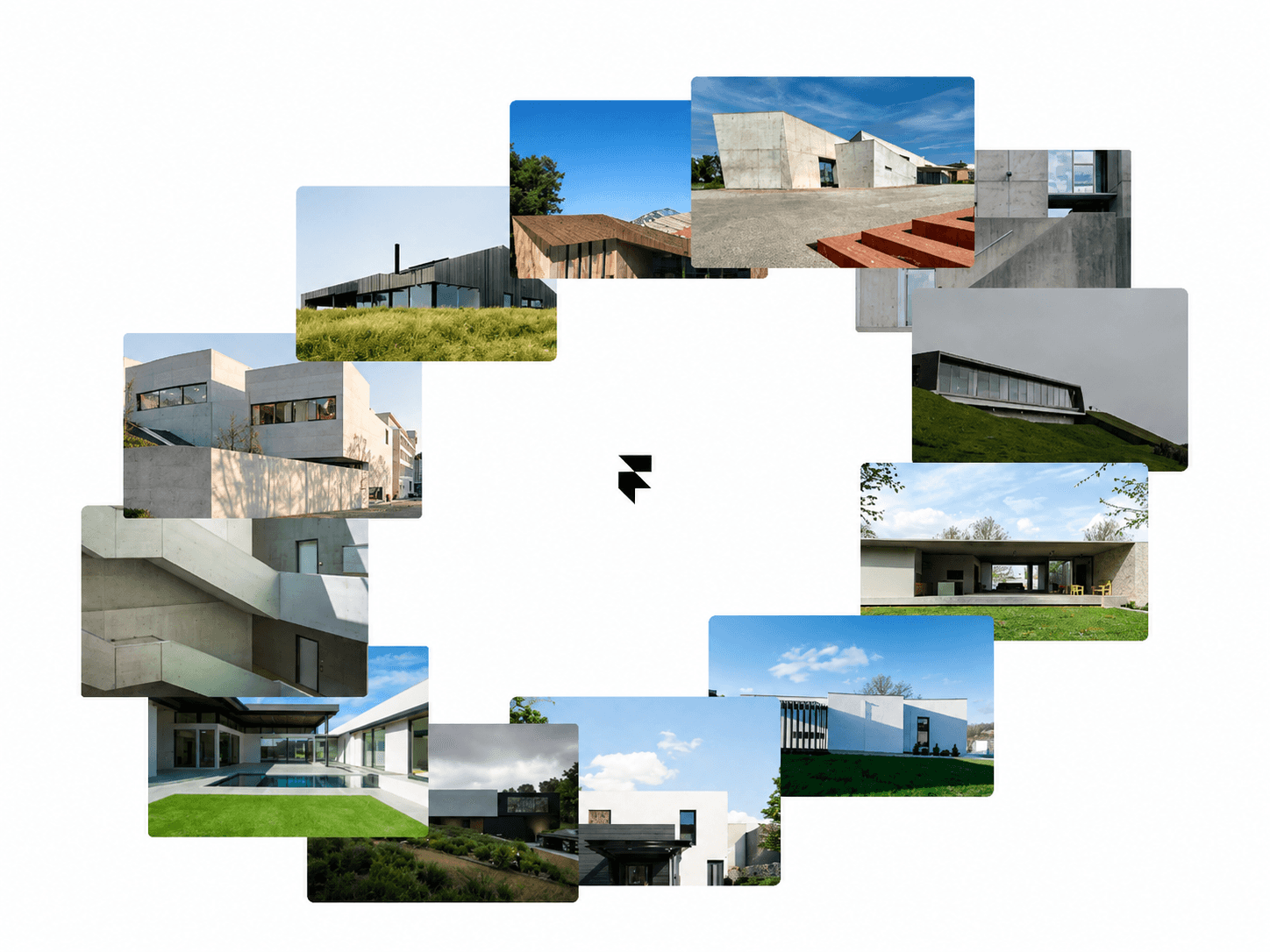
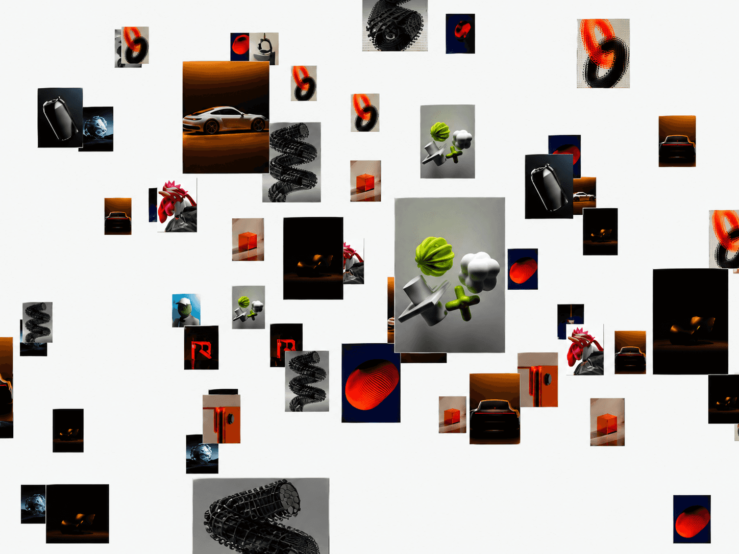
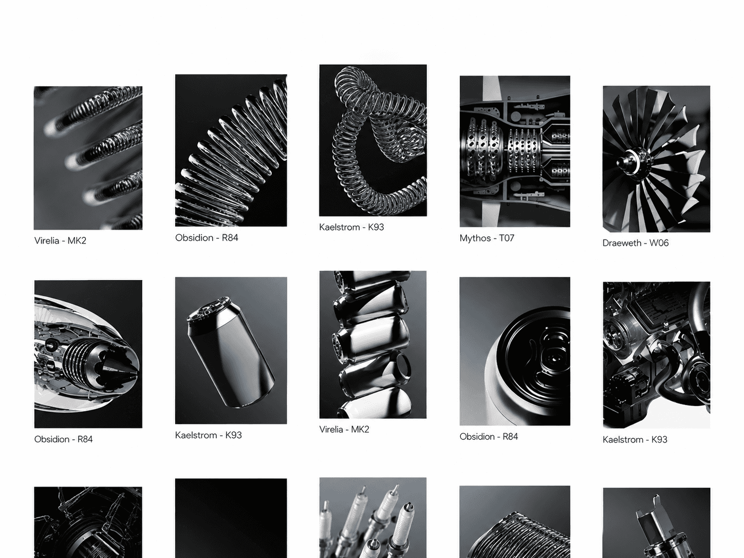
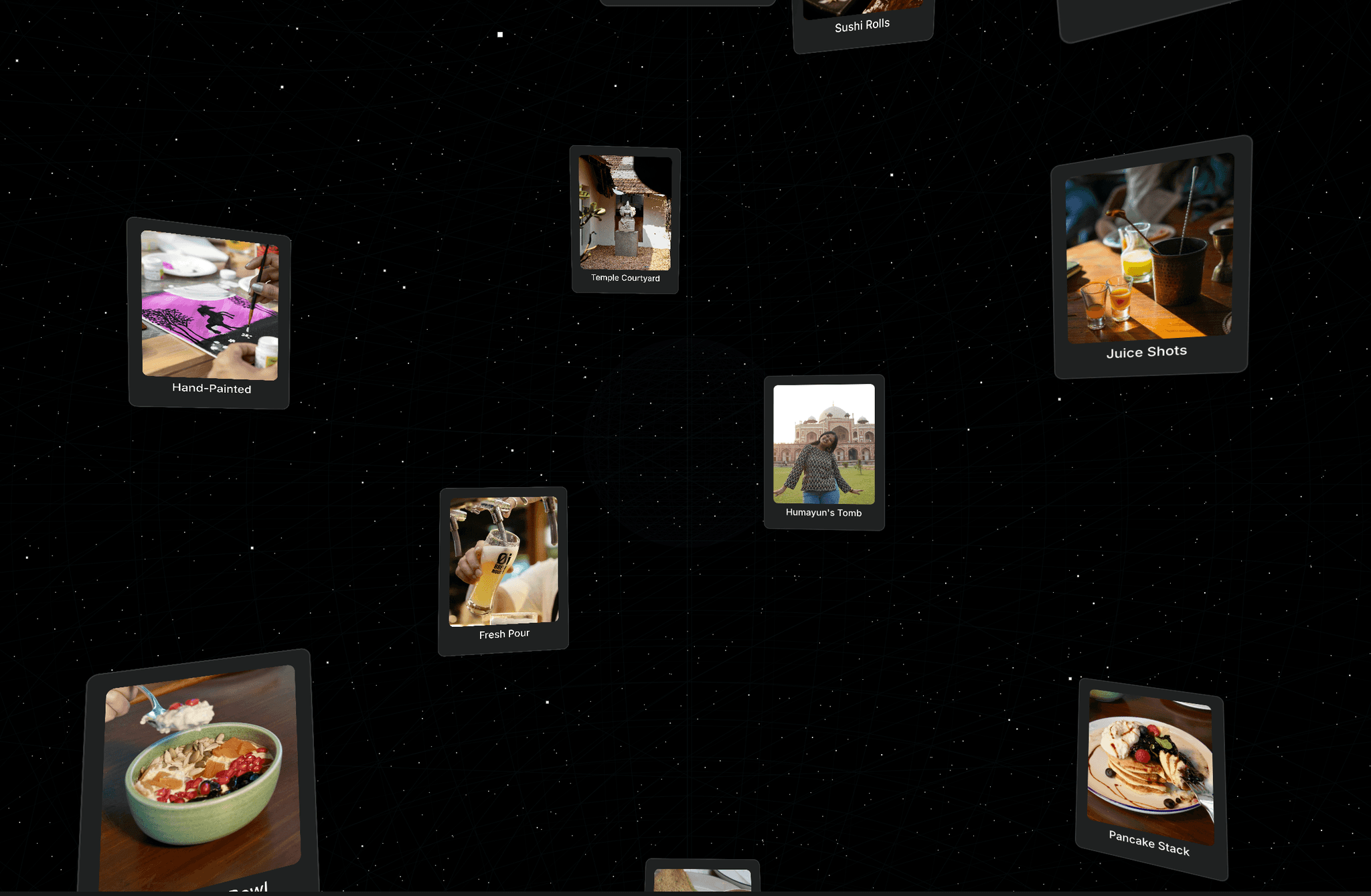
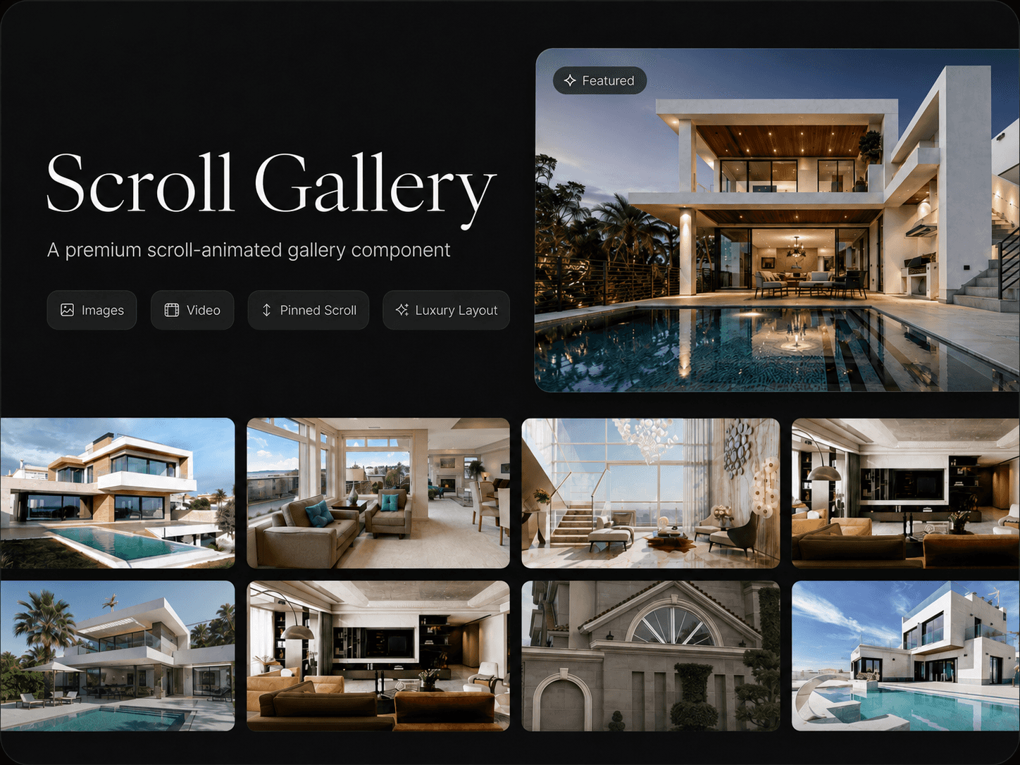
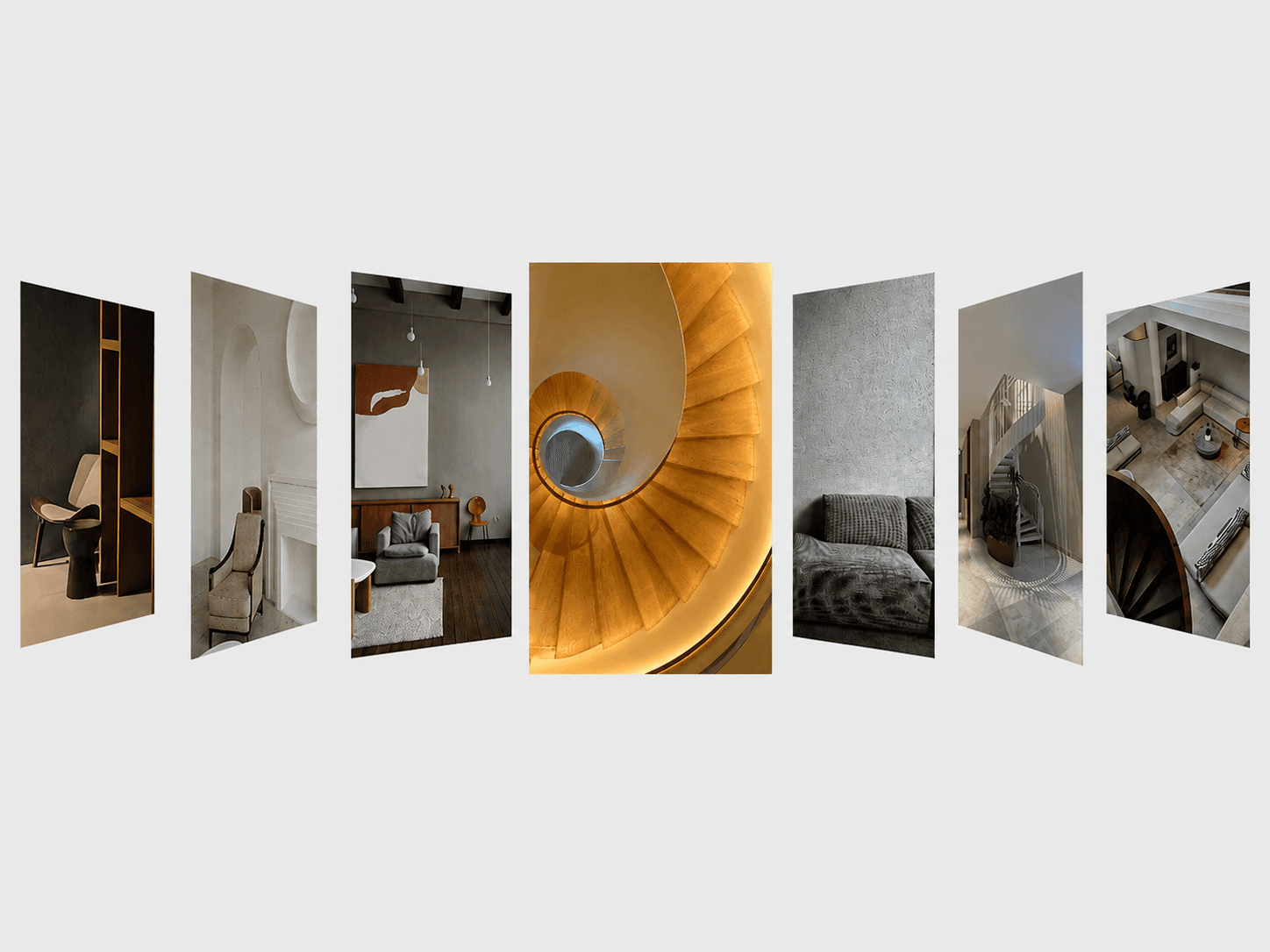
Framer component for showcasing projects, collections, products, or visual content through an interactive horizontal gallery. As visitors scroll, each item expands into focus while the others collapse into compact labels, creating a smooth, editorial-style browsing experience. The active item stays centered and adapts automatically across screen sizes.
Interactive Gallery
Scroll through items with smooth transitions.
Active item expands to reveal its image.
Inactive items collapse into compact labels.
Active content stays centered in the viewport.
Responsive behavior optimized for smaller screens.
Ideal for portfolios, collections, projects, products, and visual stories.
Fully Customizable
FlowGallery includes Framer property controls for customizing gallery content, sizing, spacing, typography, colors, borders, imagery, and animation behavior.
Customize
Items — Add, remove, and reorder gallery items.
Content — Edit labels and years.
Images — Add a unique image to every item.
Colors — Customize background, text, active text, and divider colors.
Typography — Adjust label and date fonts.
Sizing — Control collapsed and expanded widths.
Spacing — Adjust container padding and row spacing.
Image — Control image height and corner radius.
Animation — Customize the opening transition.
Responsive — Set safe margins for smaller screens.
How It Works
FlowGallery turns a collection of images into a scroll-driven visual journey. As the user moves through the section, the active item smoothly opens while the surrounding items fold into the background. The gallery automatically keeps the active image in view, creating a focused browsing experience without losing the context of the full collection.