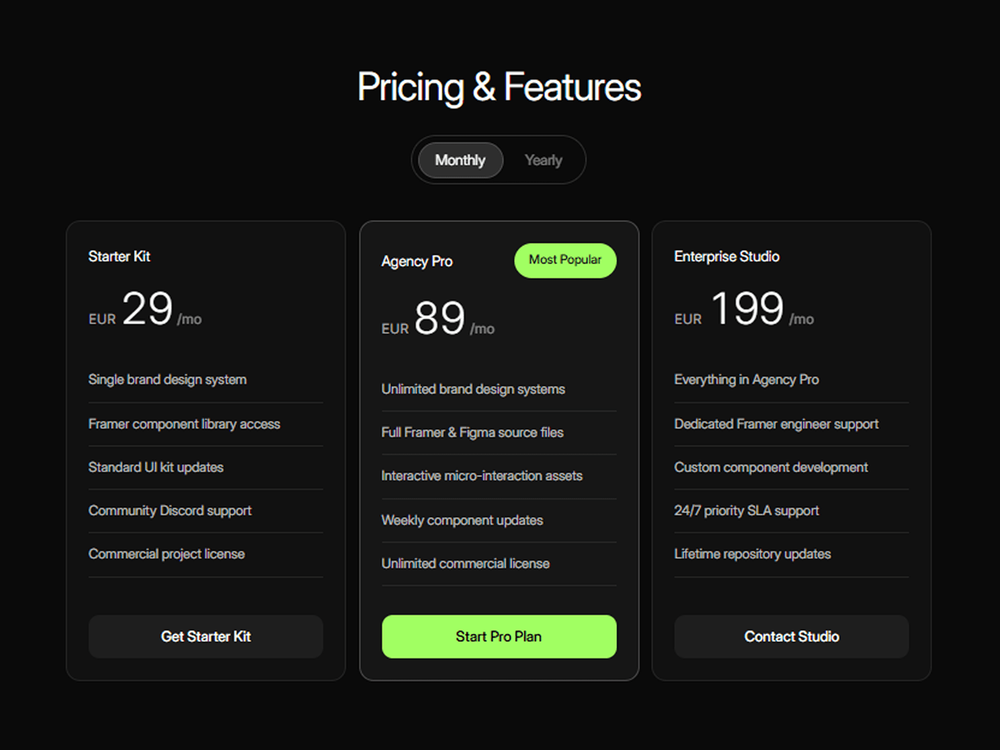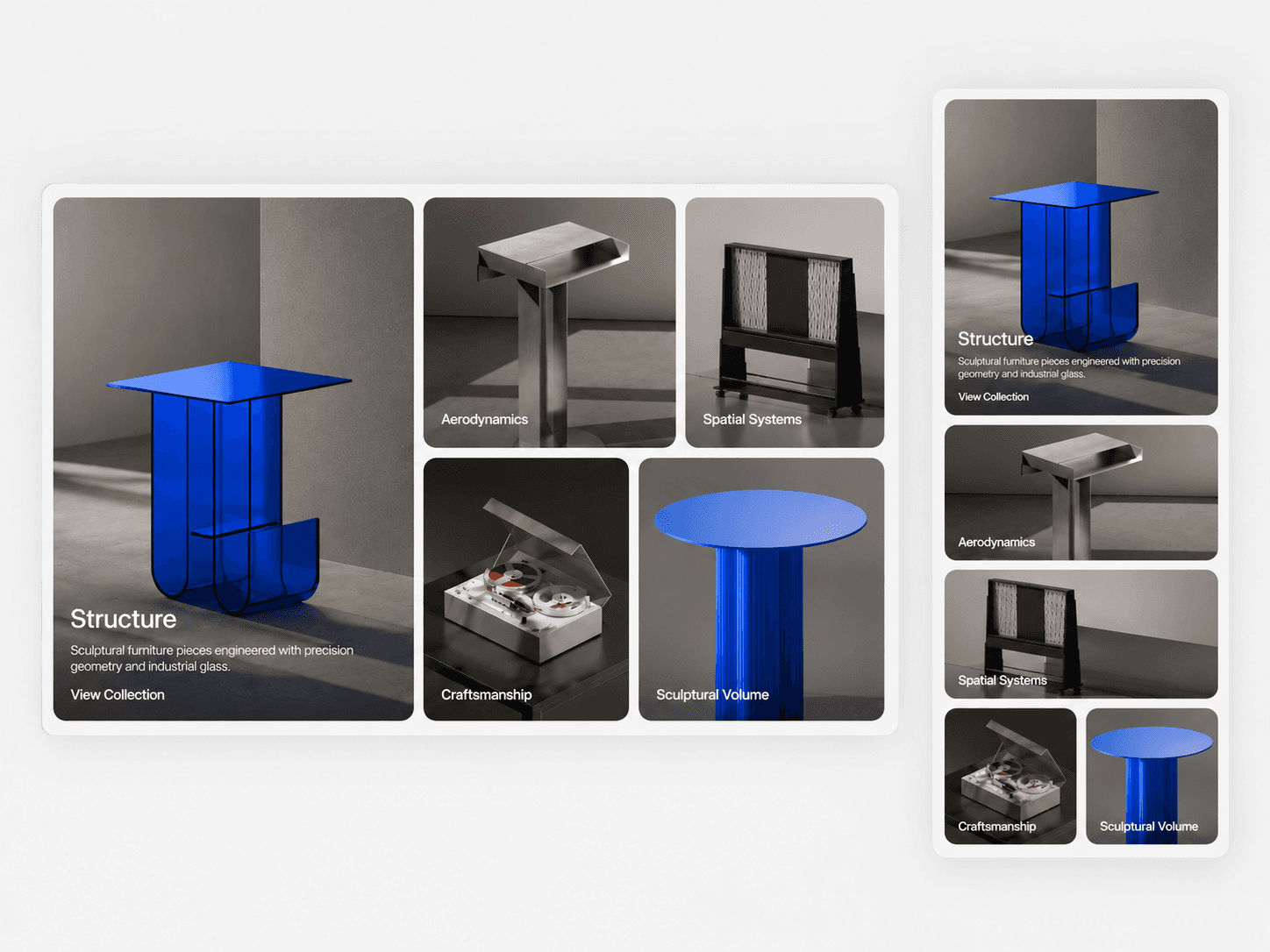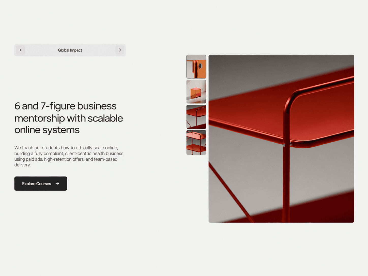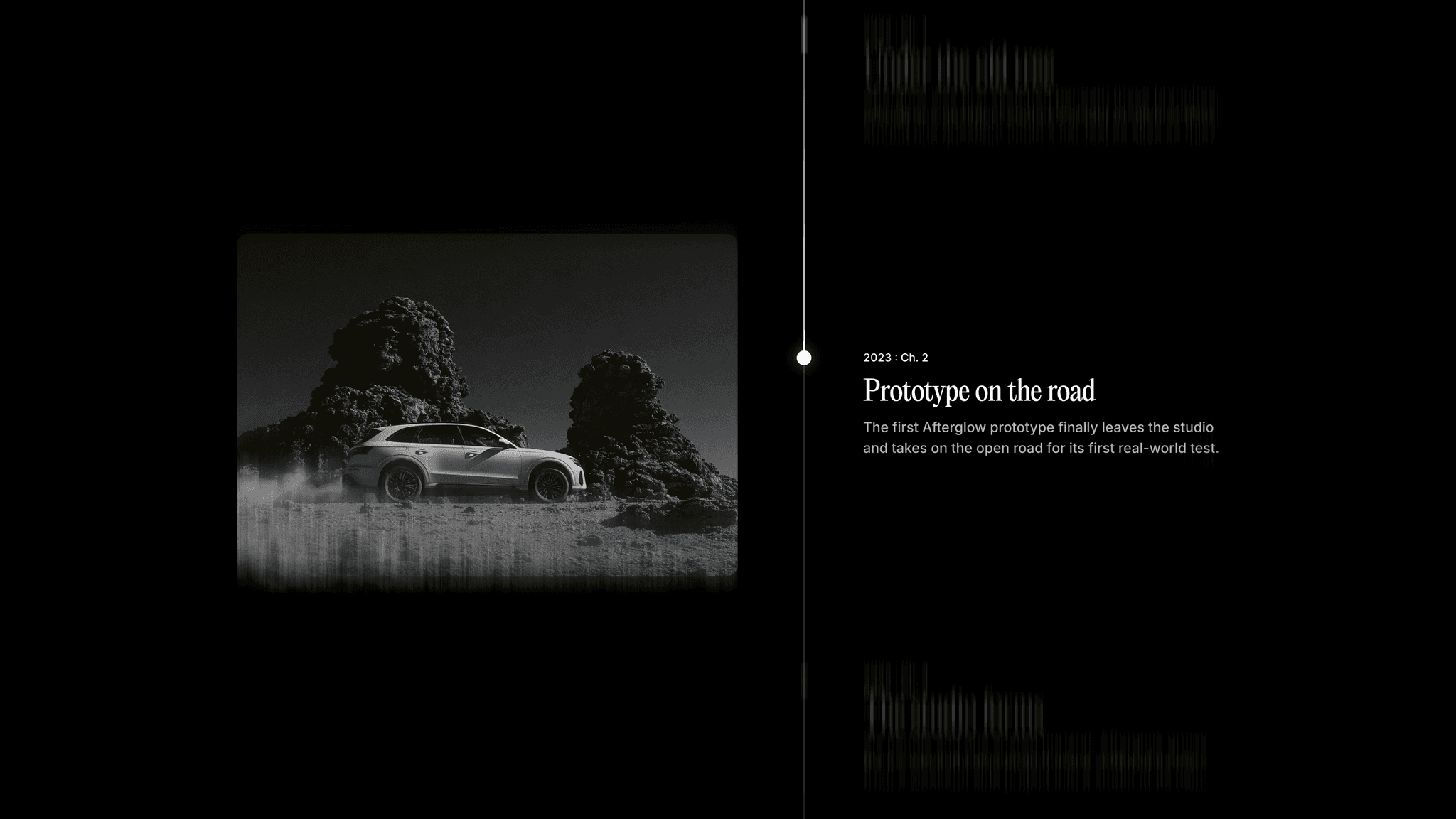
About feature tabs slider
Feature Tabs Slider – Auto-Playing Image & Content Tabs
An interactive feature slider that combines large image cards with dynamic text content and animated navigation tabs. Each tab reveals a different feature with its own image, heading, description, background color, and call-to-action link.
What you get
Direct component URL to paste into your canvas
Framer component with editable property controls
Auto-playing feature slider with customizable tab navigation
Smooth image transitions with zoom and blur reveal effects
Animated text, background color, and progress indicators
Customizable images, headings, descriptions, colors, and CTA links
Responsive layout with automatic mobile stacking
Support for up to 8 customizable feature items
Customizable
Content: add up to 8 feature items, customize tab labels, headings, descriptions, and image alt text
Images: upload custom responsive images for each tab or use fallback gradient backgrounds
Colors: customize individual card backgrounds and text colors for every feature
Call to Action: change CTA labels, add destination links, and choose whether links open in a new tab
Layout: adjust card padding, corner radius, card gap, tab spacing, content spacing, and image-to-text ratio
Good to know
Code component for Framer, not a standalone download
Supports up to 8 individual feature slides
Automatically cycles through tabs while the component is visible
Autoplay pauses when the component is off-screen or a tab receives keyboard focus
License: Unlimited personal and client projects. No resale or redistribution.
Refunds: Due to the digital nature of this product, all sales are final, and refunds will not be issued. Please ensure you review all product details carefully before purchasing. If you have any questions or need further clarification, feel free to reach out before completing your purchase.
Questions? support@russetsupply.com