About Floating Info Cards
What is Floating Info Cards?
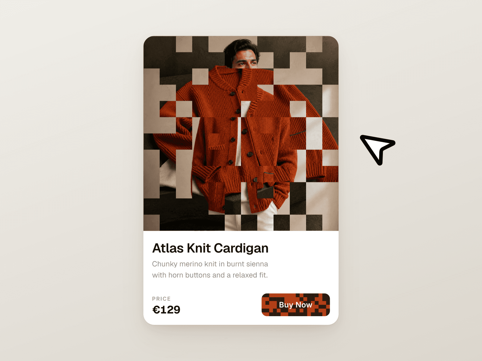
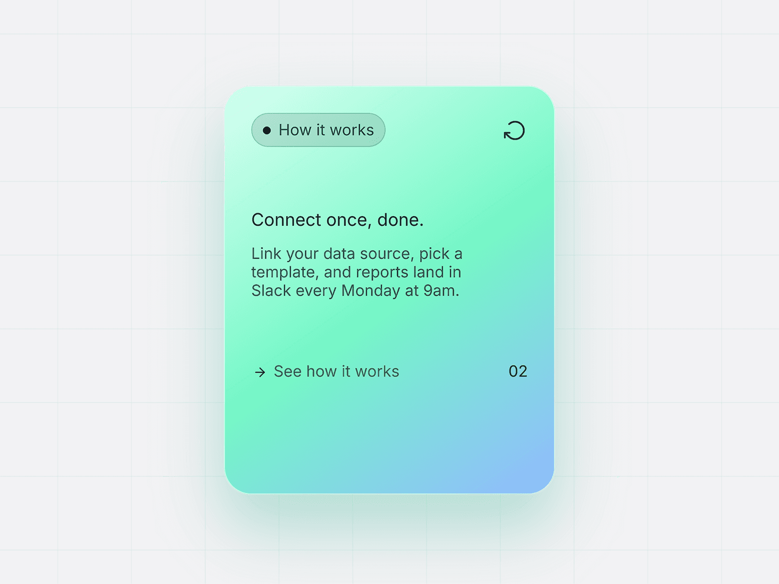
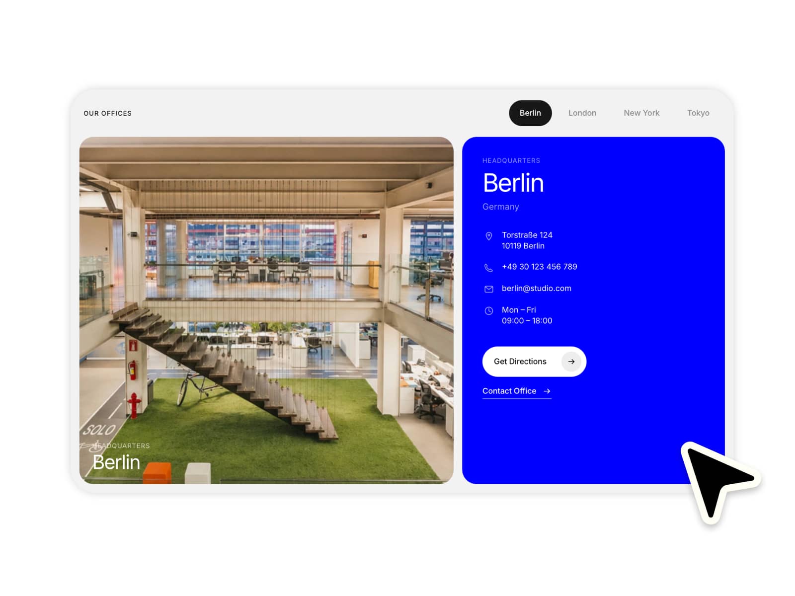
Floating Info Cards is a premium interactive component designed to make your features, pricing plans, and services stand out. It brings a modern, polished aesthetic to your Framer projects with built-in physics-based animations, dynamic lighting, and responsive layouts. Perfect for highlighting key value propositions, showcasing products, or creating engaging grid layouts that capture user attention instantly.
Core Features
Physics-based 3D tilt and ambient float animations
Dynamic shine effects that react to mouse movement
Five premium built-in color themes plus full custom color support
Auto-scaling typography and responsive layouts
Fully customizable content including icons, feature lists, badges, and CTA buttons
Controls inside Framer
Content
Icon selection (10 built-in or custom image)
Badge toggle and text
Heading and Body text
Feature list with custom marker styles (Check, Dot, Dash)
CTA toggle, text, and link
Colors
Theme preset selection (Carbon, Midnight, Pearl, Ember, Ocean)
Custom card background and text colors
Custom accent and border color overrides
Typography
Dedicated font pickers for Heading, Body, Feature, CTA, and Badge
Card Style
Corner radius adjustment
Custom shadow and gradient glow border toggles
Padding and max width sizing
Animation
3D Tilt toggle and angle intensity
Shine effect toggle
Scroll entrance animation and stagger delay
Idle float toggle and intensity
Best use cases
SaaS feature highlights and benefit grids
Modern pricing tier cards
Agency service offerings and portfolio showcases
High-converting call-to-action sections
Give your site the ultimate polish it deserves. Increase user engagement and perceived value with interactive elements that feel truly premium and bespoke.
Questions or custom requests?
We design and build custom Framer components. Get in touch at contact@teampixel.com.au.