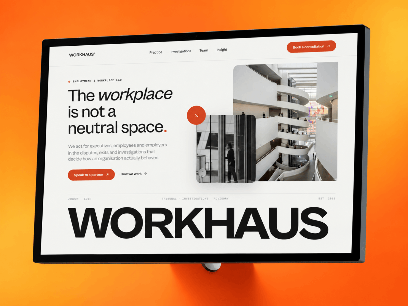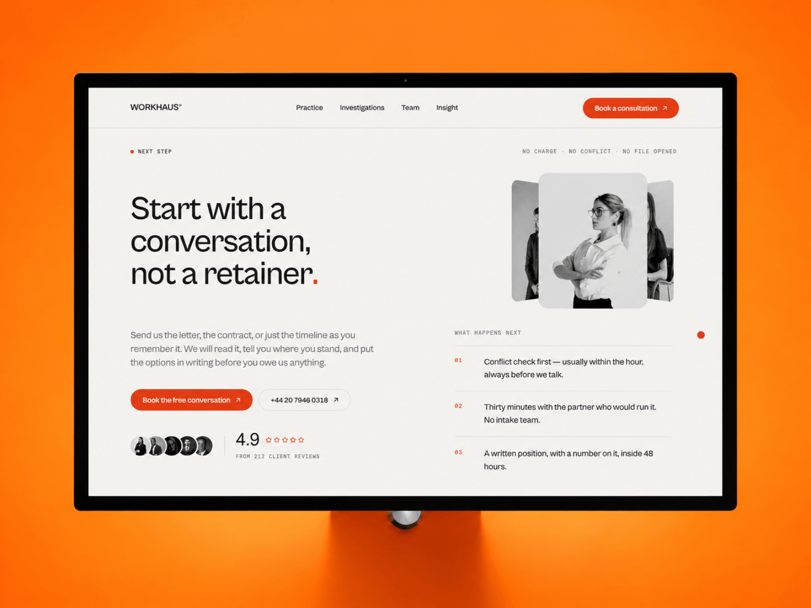
Most law firm sites hide their fees behind "contact us for a quote".
Workhaus puts them on the page: three fee models, tap to open, no form in the way.
Paper ground, one vermillion accent, scroll-driven investigation stages, CMS journal.

Helping businesses and designers build better with Framer. I create premium plugins, UI components, and custom websites. Melbourne-based founder of Team Pixel.
Most law firm sites hide their fees behind "contact us for a quote".
Workhaus puts them on the page: three fee models, tap to open, no form in the way.
Paper ground, one vermillion accent, scroll-driven investigation stages, CMS journal.
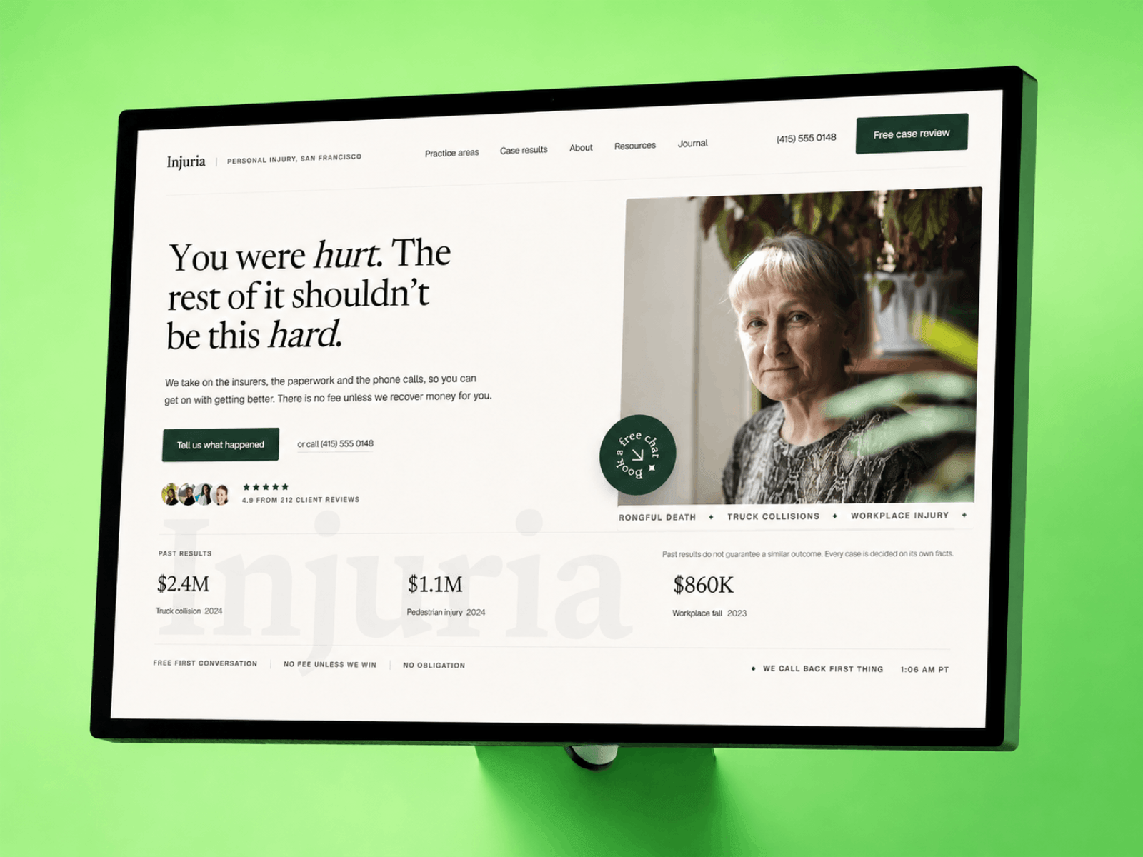
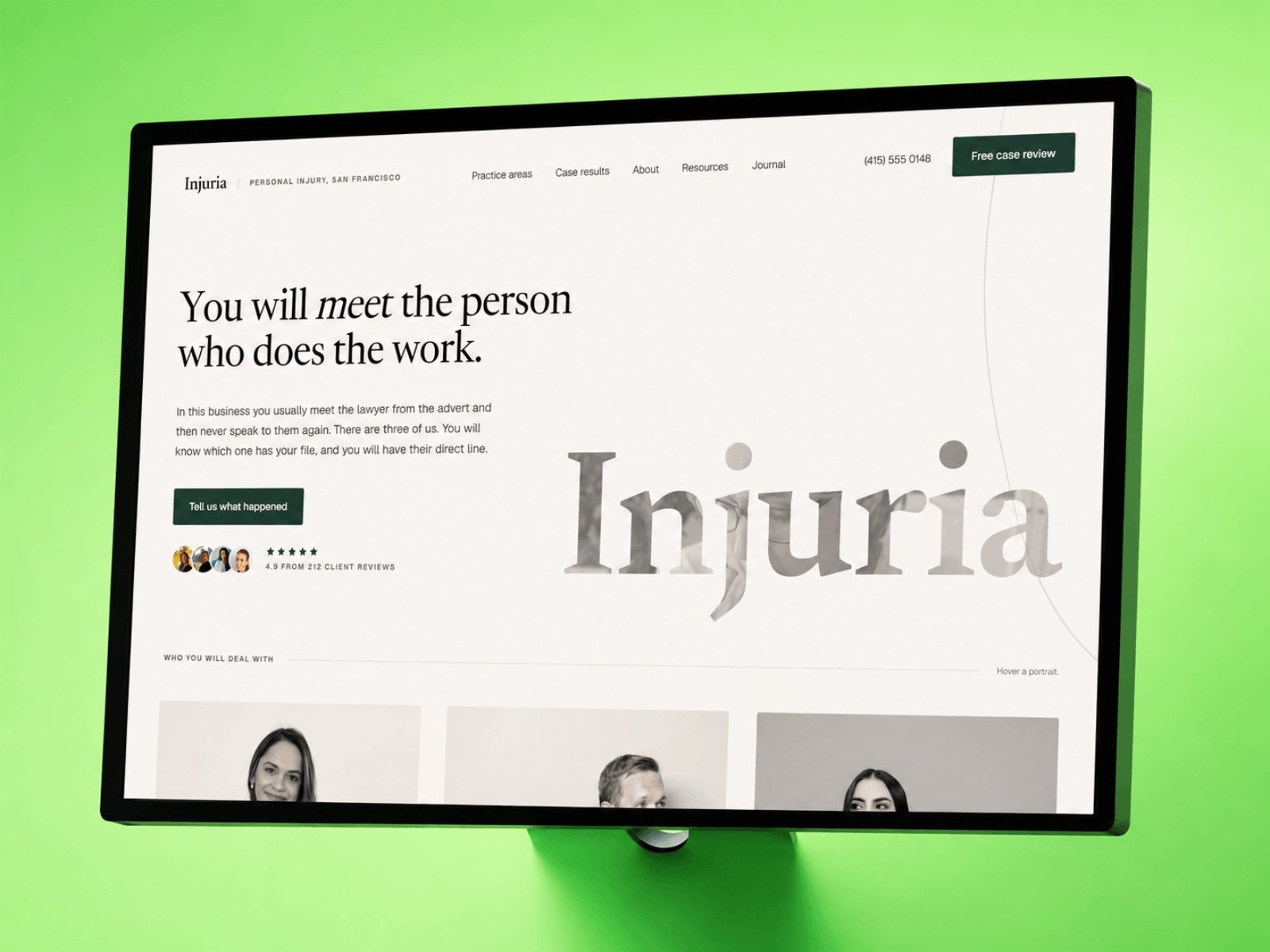
Most personal injury sites look like a billboard: stock gavel, yellow, all caps.
Injuria takes the opposite bet — the firm that doesn't shout reads as the one that wins.
Paper, ink and verdant. A CMS case ledger in the hero, and a settlement bar showing where the money goes.
I'm working on a new Framer template for Personal Injury law firms.
Check out the hero section for the template - I'd love to hear your thoughts. 🙌
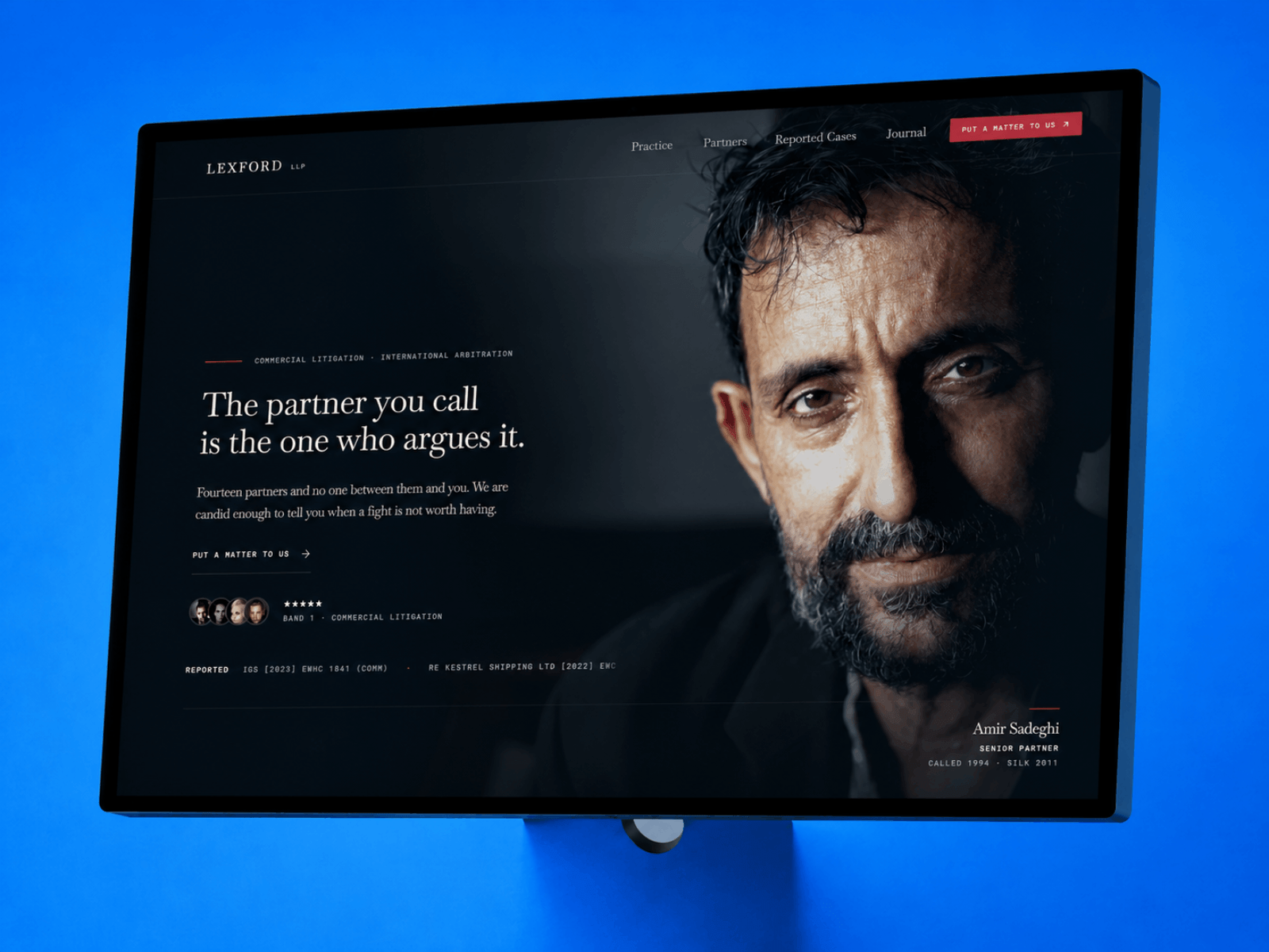
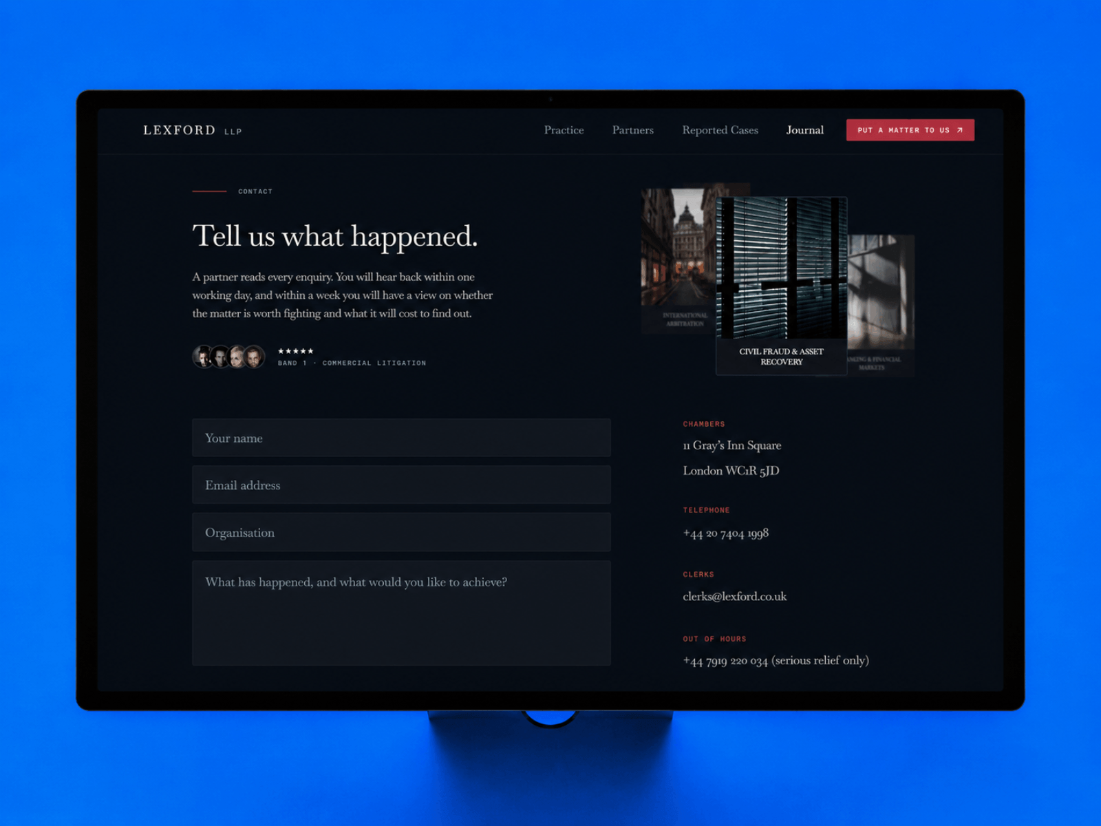
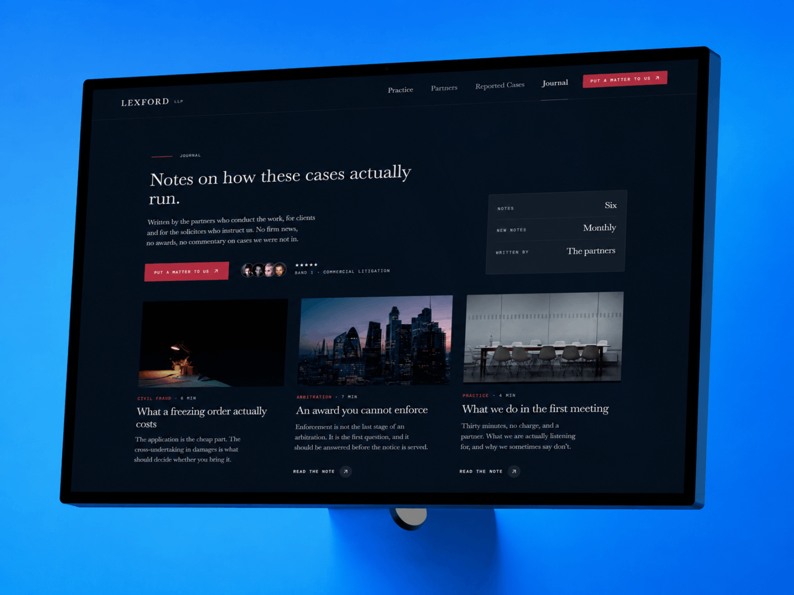
Every law firm site says "results driven". Almost none of them show you a single result.
Lexford is built around the work. Reported cases with the court, the citation and the client. Practice areas that link to the decisions behind them. Partners tied to the matters they ran. Four CMS collections, all cross-referenced, so adding one case puts it on three pages at once.
Near-black navy, Baskervville, one oxblood rule. Custom cursors as the user hovers on judgments, articles, and more.
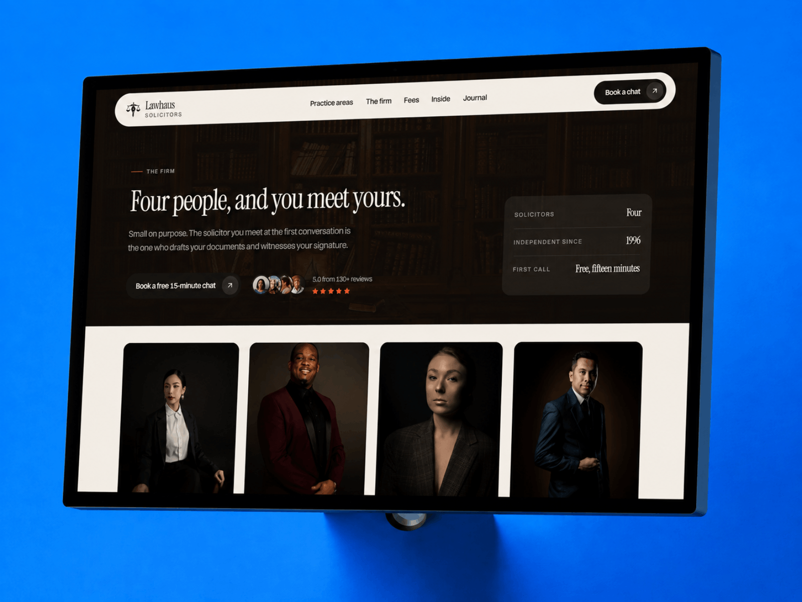
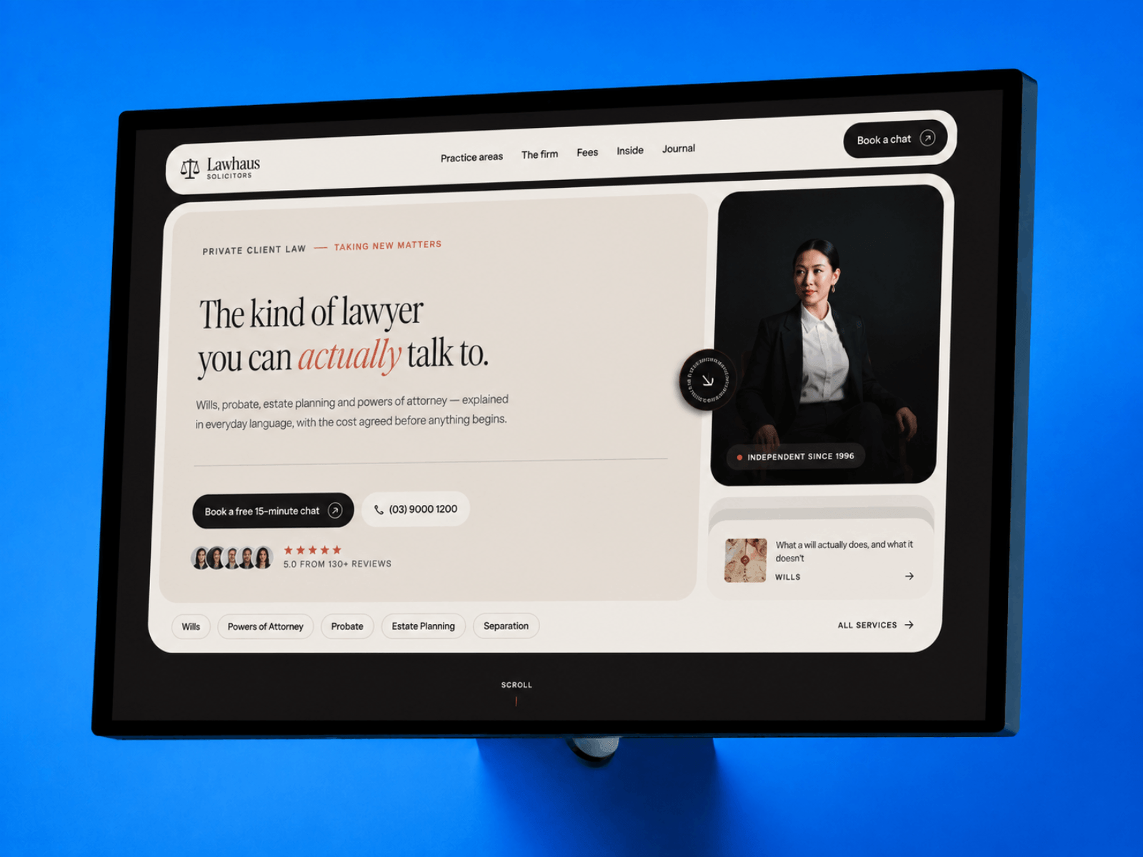
Every law firm website says the same thing. Contact us for a quote.
Lawhaus puts the number on the page instead. Six matters, fixed fees, set out like a fee schedule. Hover a line and it shows you what the fee covers.
Wills, probate, powers of attorney, in plain English.
The booking page tells people what happens after they send the form, which is the part most firms leave out.
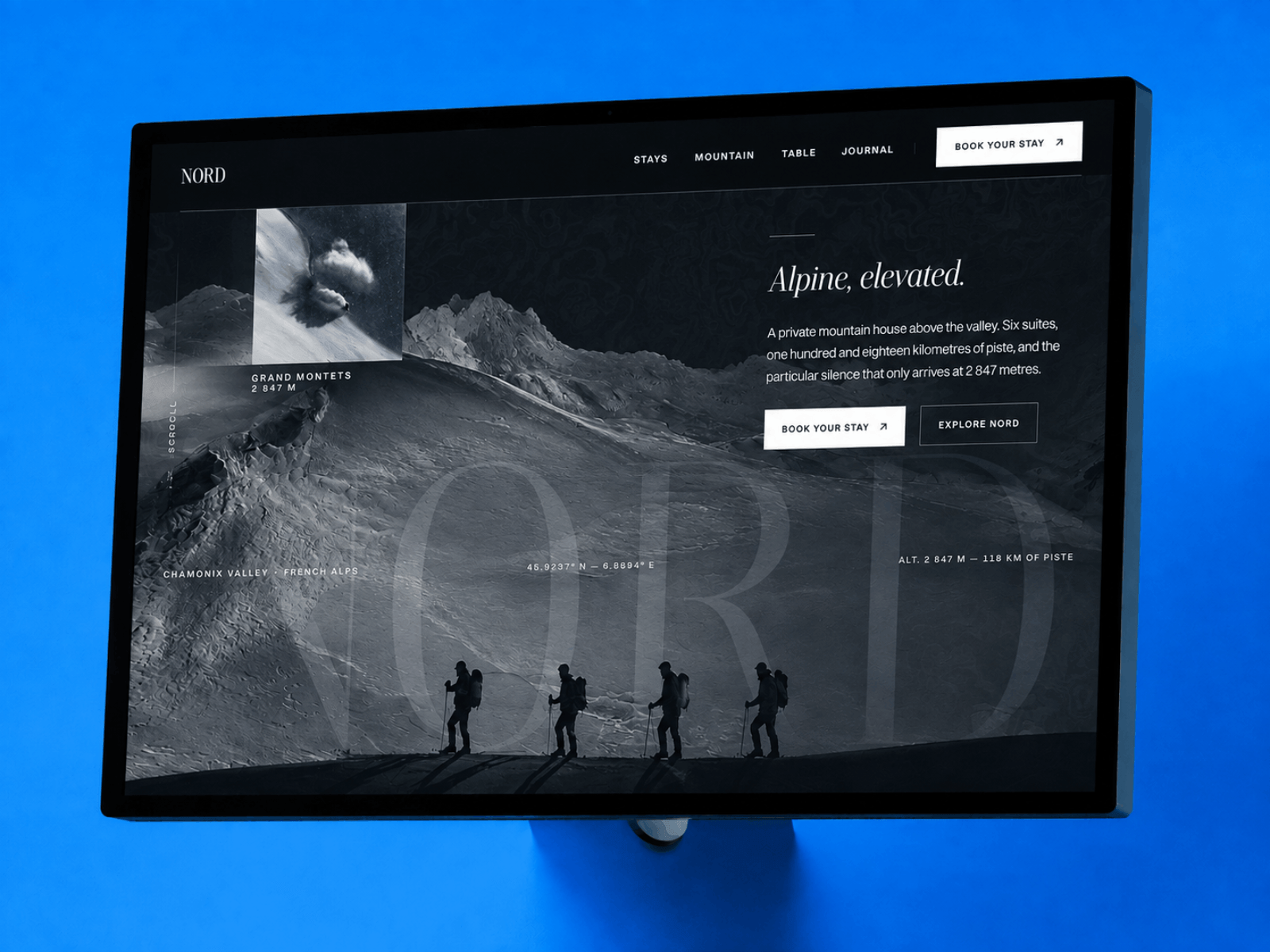
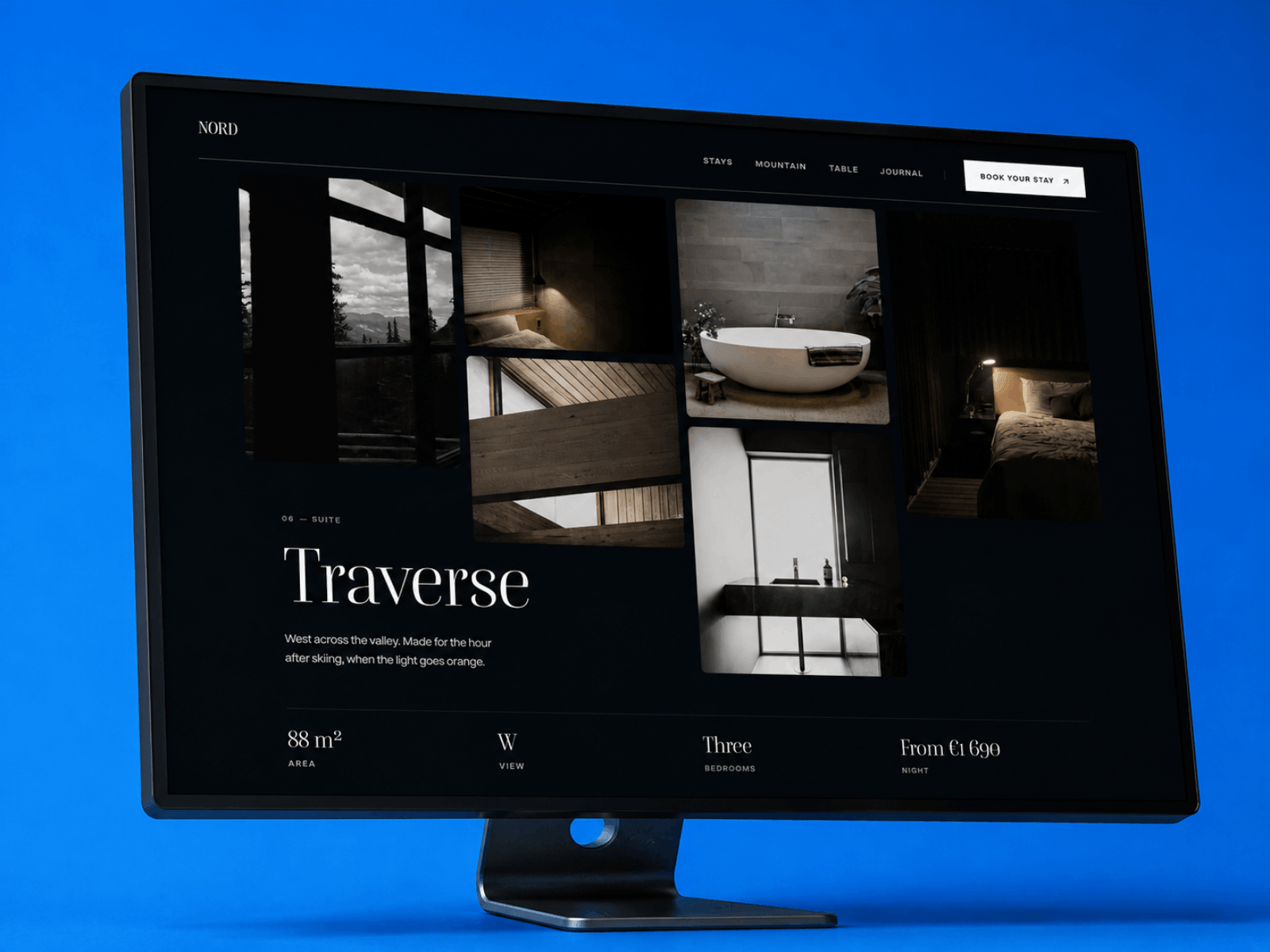
Nordhaus opens with a mountain and makes you wait a beat before it tells you anything.
It's built for the small end of hospitality. Rooms, terrain and journal entries all run off the CMS.
Twelve pages, and every one of them has a responsive layout.
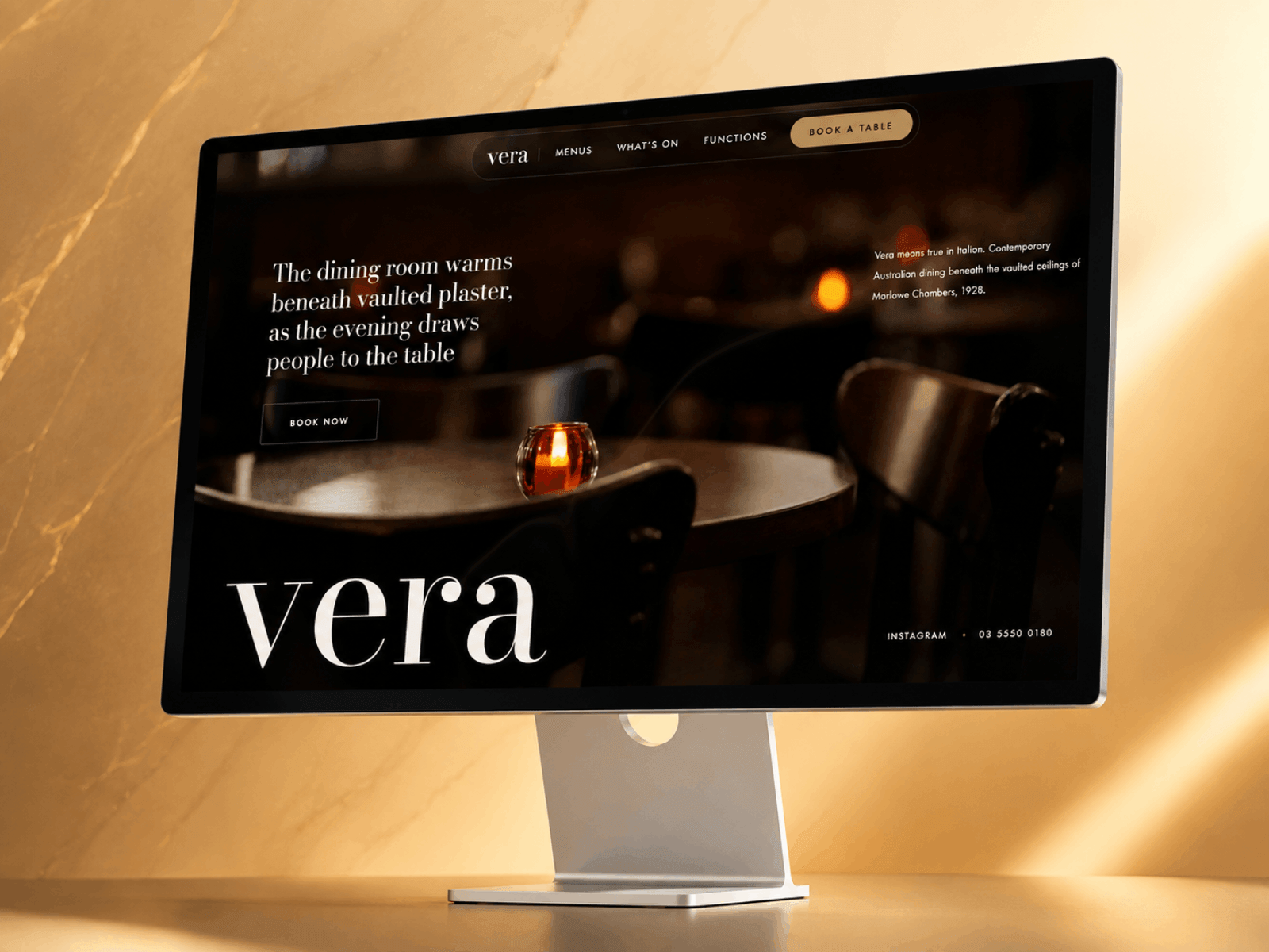
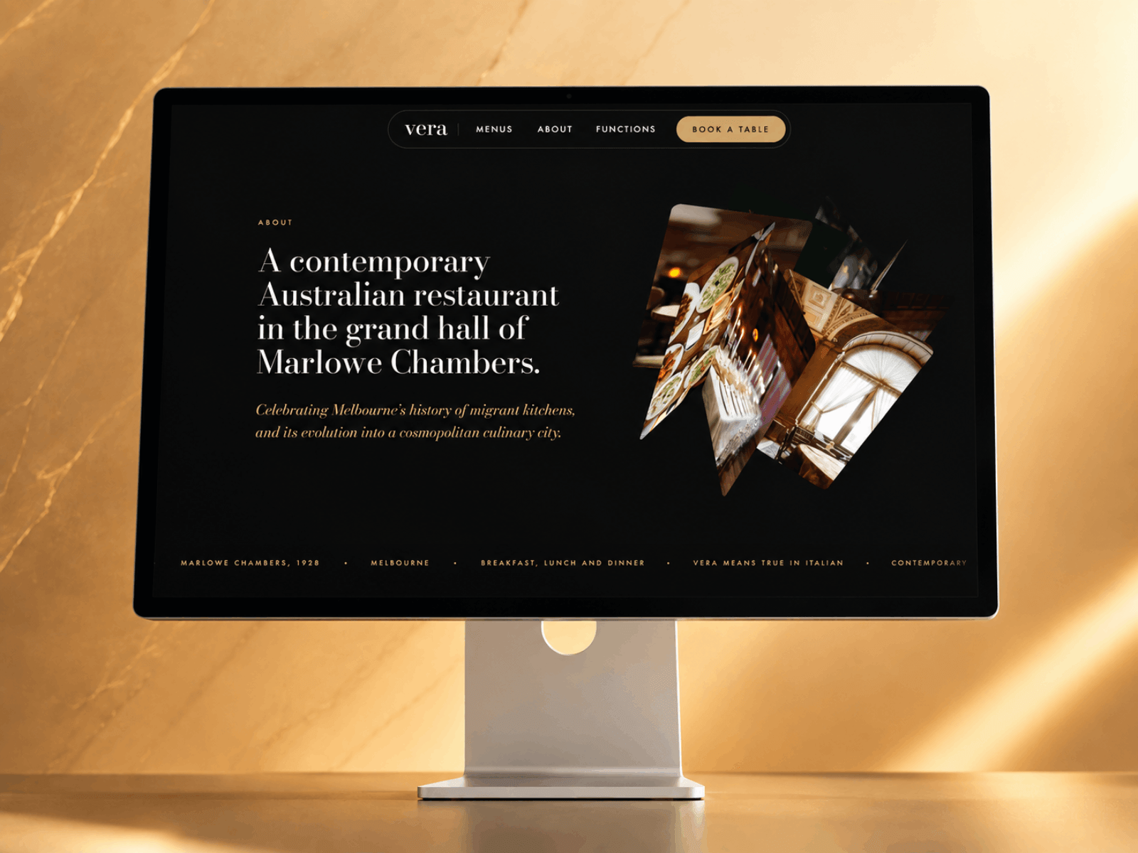
Most restaurants make more from private events than they let on, then give it one page and a contact form.
Vera treats the room as the product. Same dining room at three scales: thirty around the long table, a hundred and thirty seated, two hundred and fifty standing.
Menu sits in the CMS as well, split across breakfast, lunch and dinner.
Dark, brass, Bodoni. Built for heritage rooms.
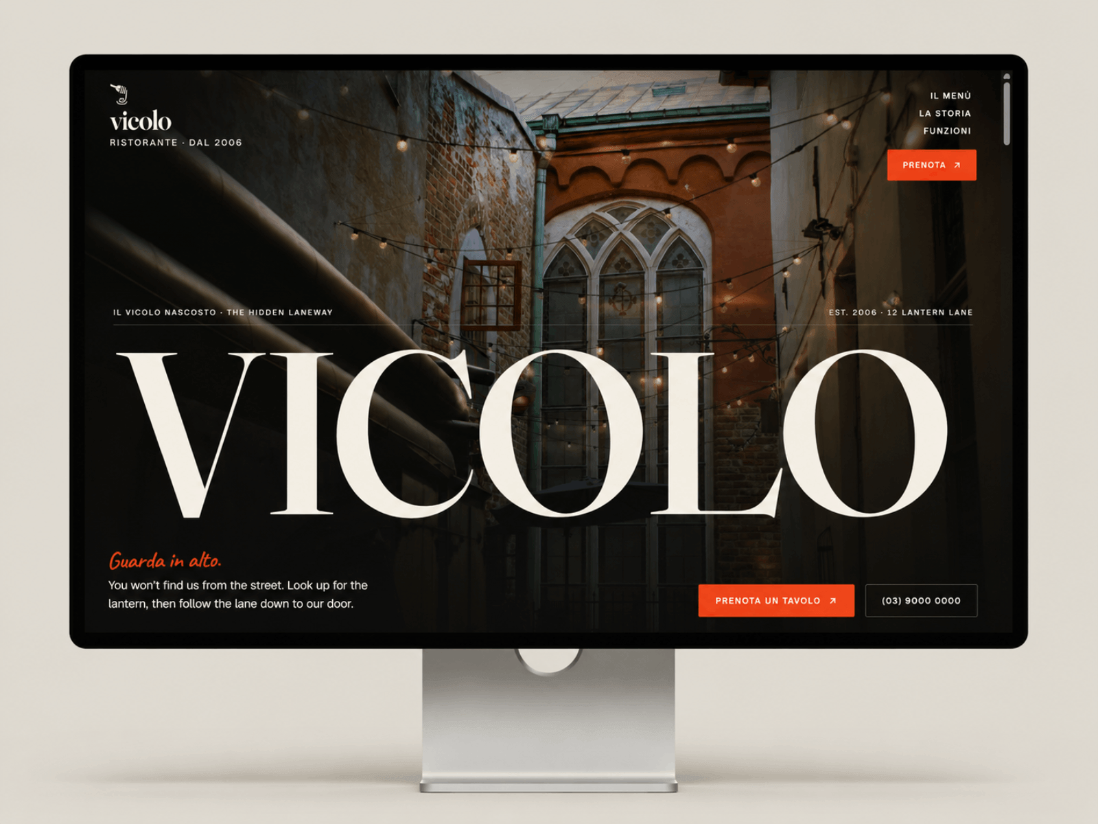
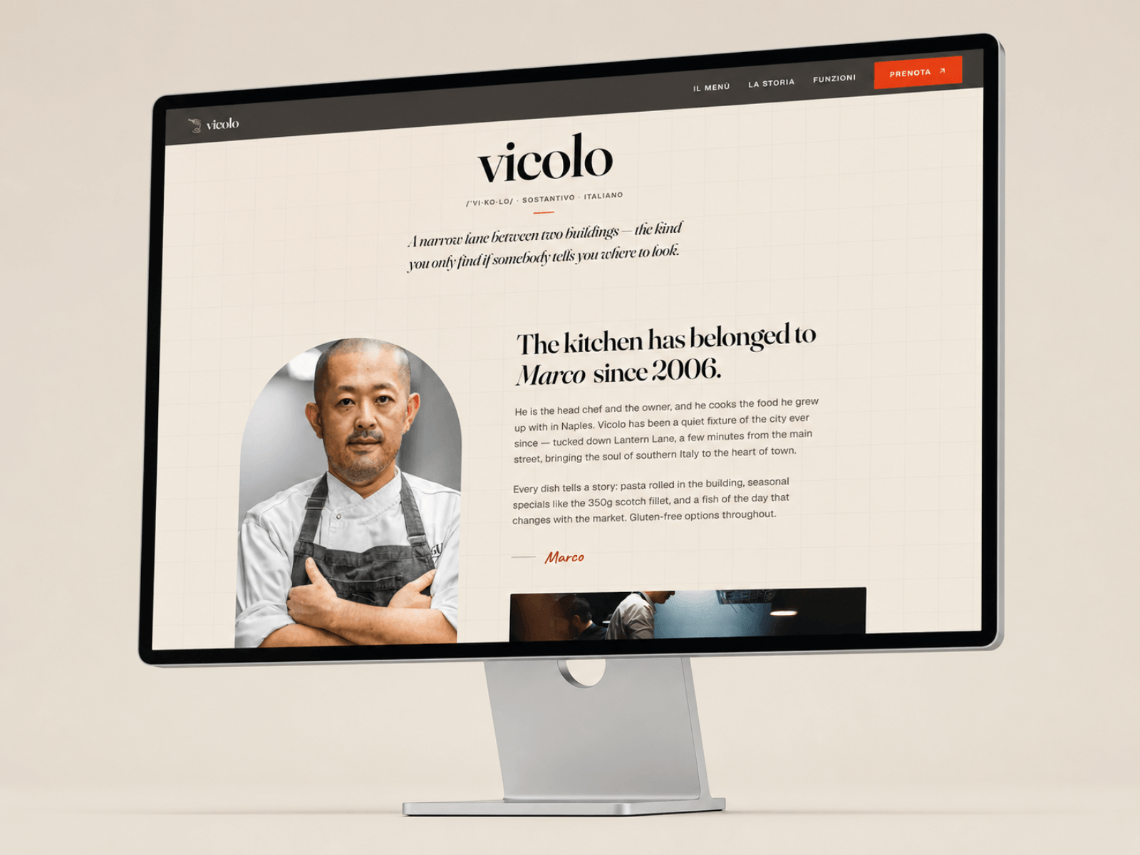
Most restaurant templates are a hero photo, a menu grid, and a booking button.
Vicolo is built around a story instead: a place you can't find from the street. The whole site is a walk down the lane. The wordmark wipes up out of a mask, the doorway photo scales as you scroll toward it, and the menu reads like a printed carta with dotted leaders, not a product listing.
Thirty dishes run off the CMS across five courses, so changing a price takes about ten seconds. There's a functions page for long tables and a hands-on masterclass, and a 404 that's actually part of the story.
Italian headlines, English underneath. Swap the photos and it's your room.
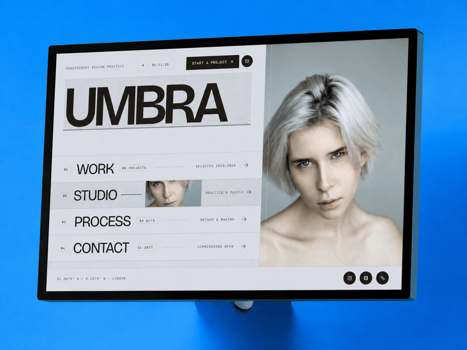
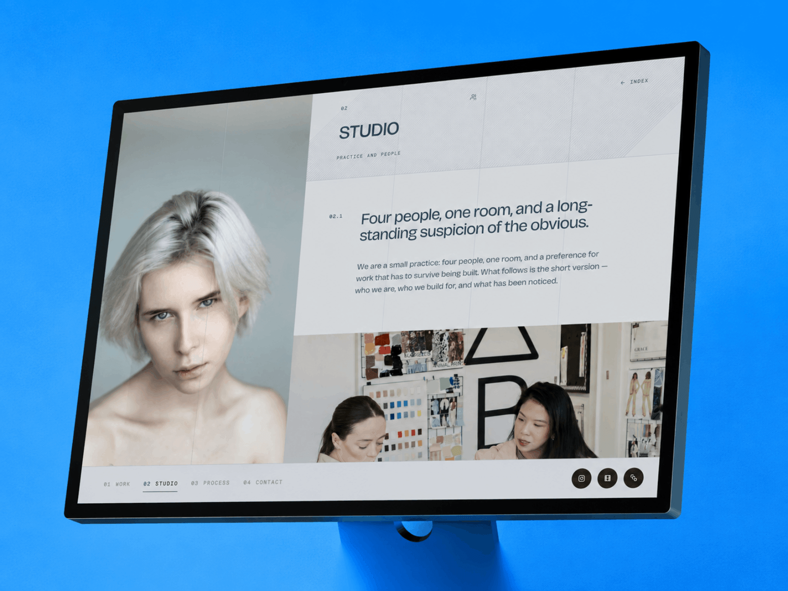
Every design studio portfolio is the same scroll. Big hero, project grid, an about paragraph, a contact form at the bottom.
Umbrall doesn't scroll at all. The whole site is one screen that never moves.
You click Work, Studio, Process or Contact and the section swaps in place while the entire interface changes colour around it.
Real URLs, working back button, but nothing ever reloads — it's a layout template that persists, so the interface never remounts.
Live preview below.
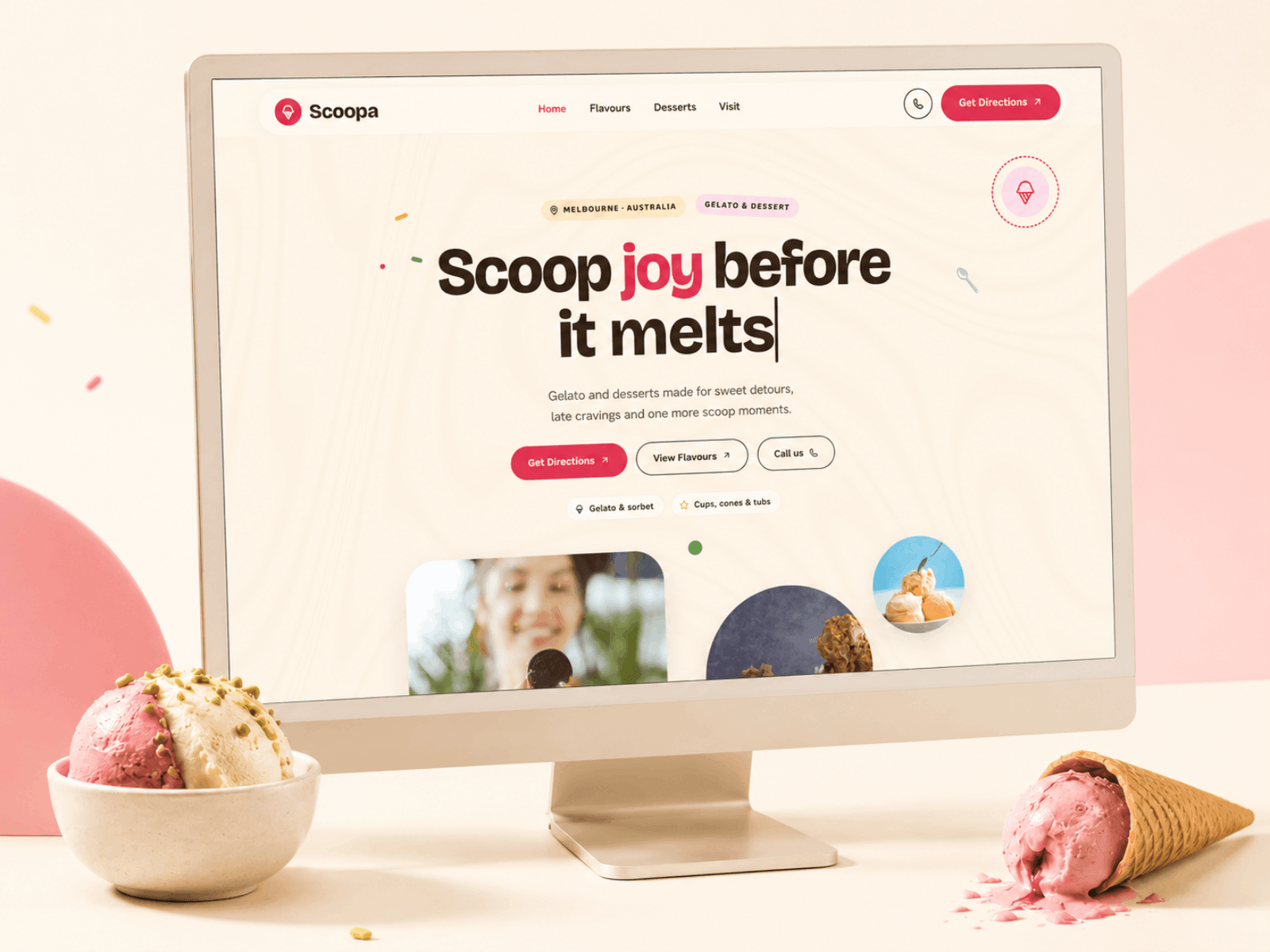
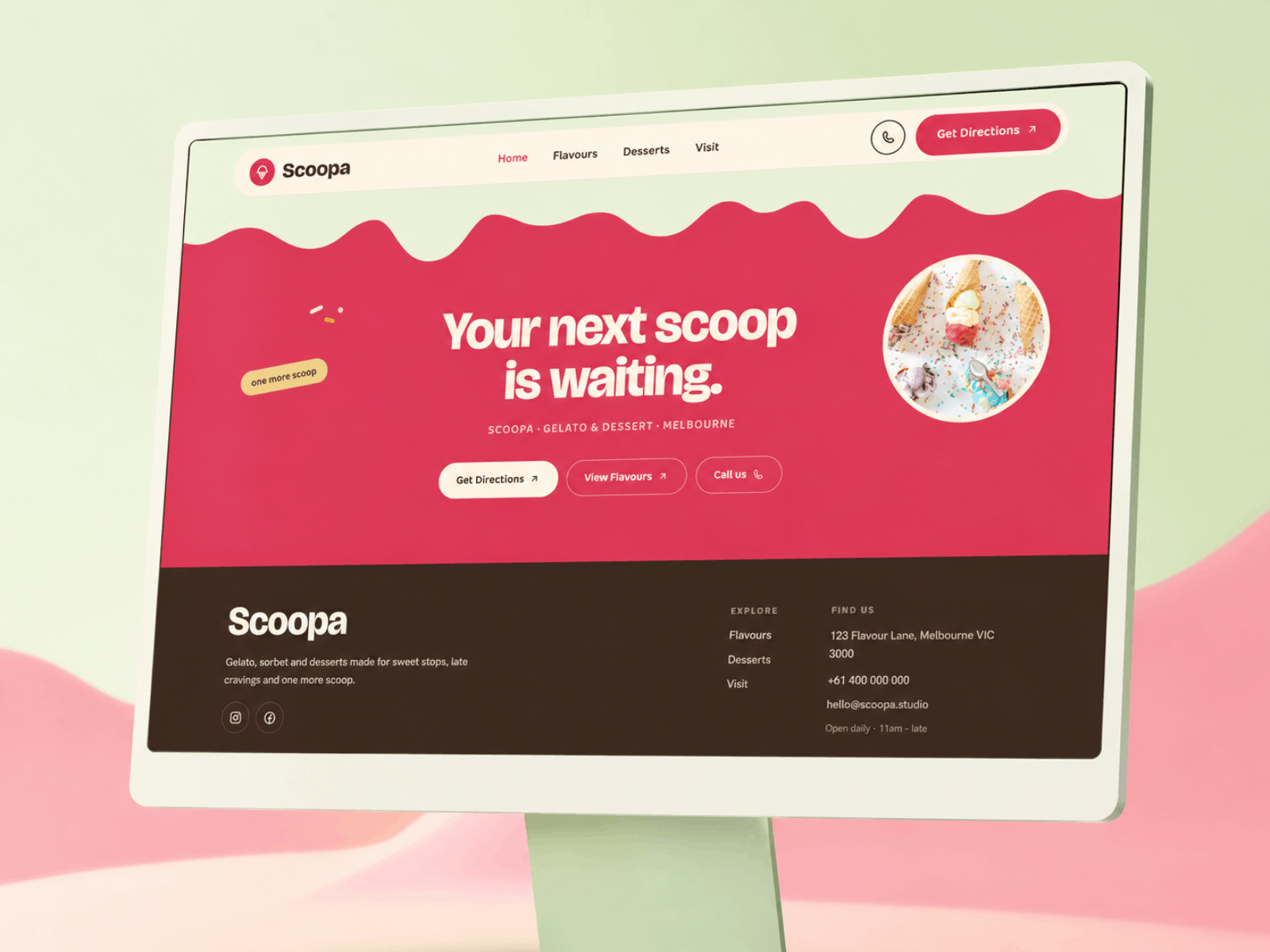
Just published Scoopa, a colourful Framer template for gelato shops, dessert bars and ice cream brands.
Built with playful motion, flavour-led pages, bold product sections and a polished local-business flow for directions, calls and visits.
Designed for sweet brands that want a site with personality!
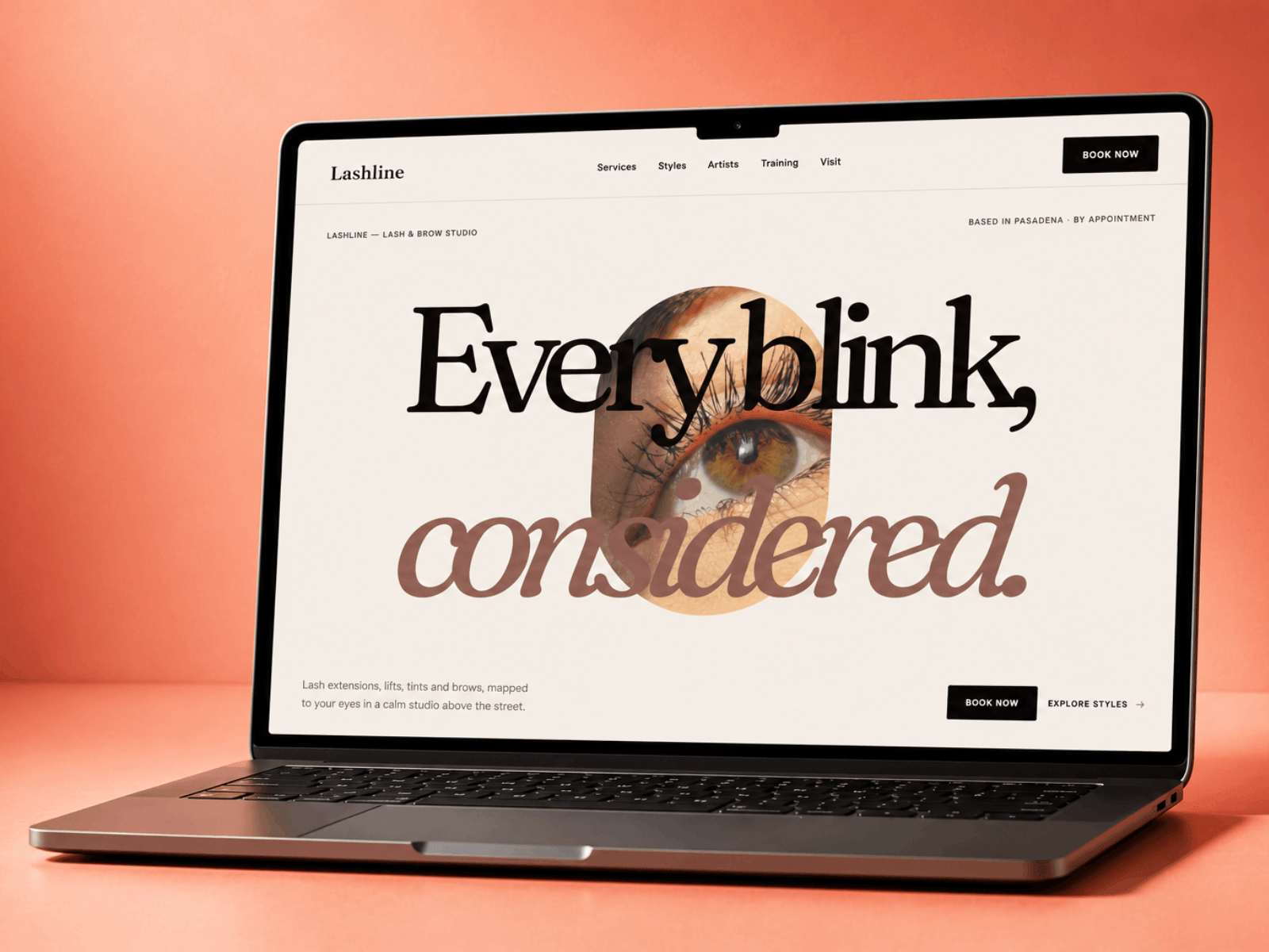
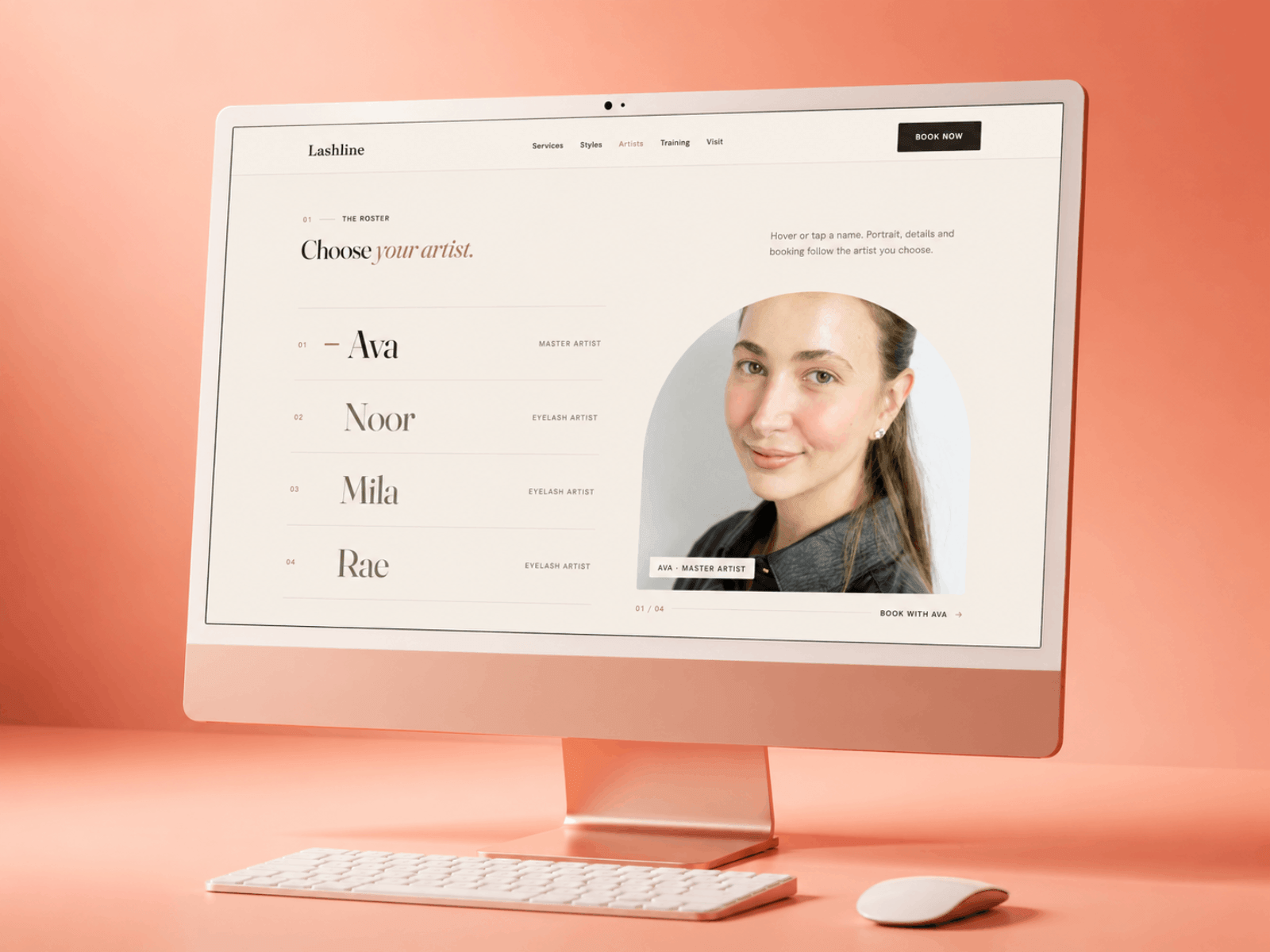
Every lash studio site I looked at was pink, script fonts, and a stock photo of a closed eye.
Lashline goes the other way. Warm neutrals, proper editorial type, and the interactions do the selling: a service finder that asks a couple of questions and lands you on the right treatment, plus a style guide people can browse.
Artists and services run off the CMS, so adding someone new takes about a minute.
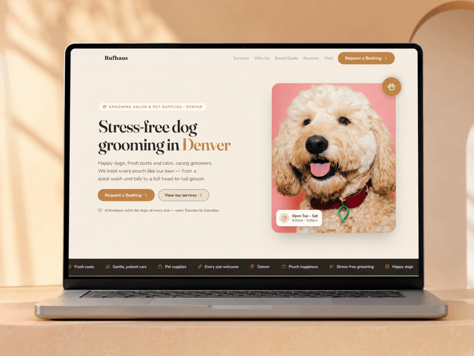
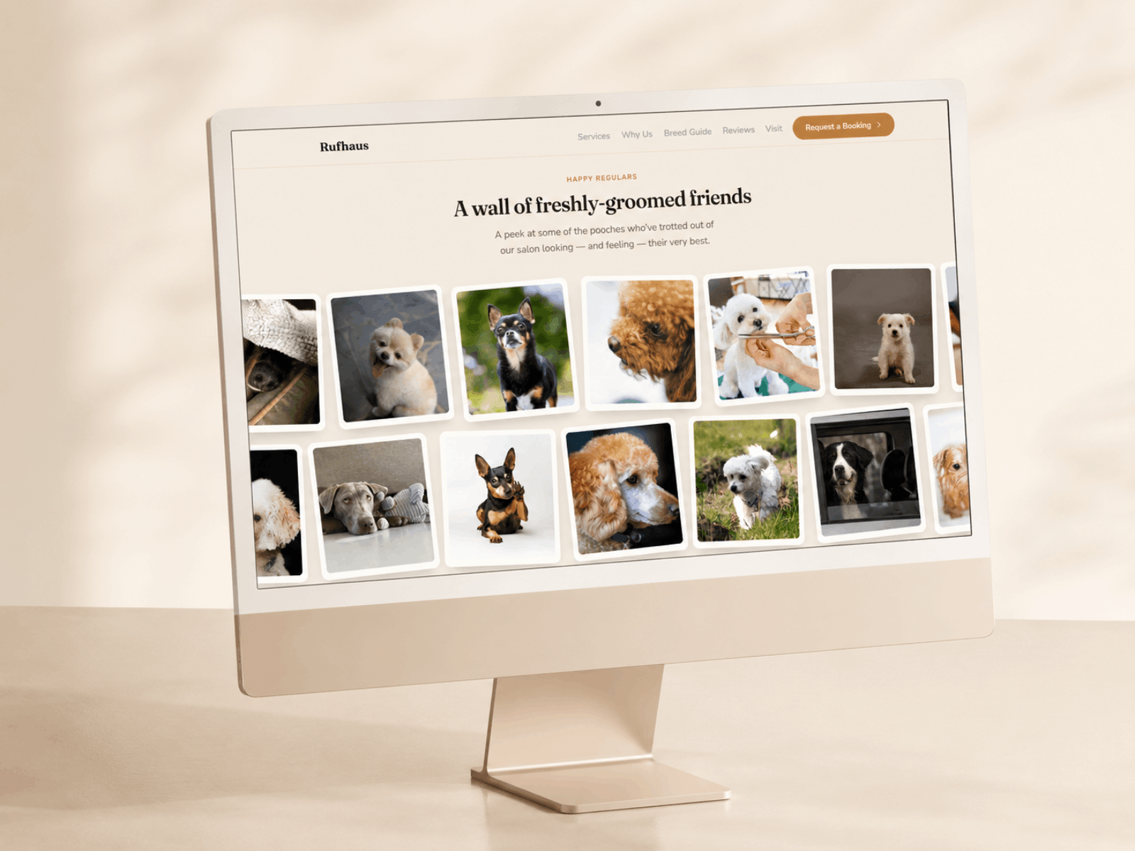
Most dog groomers I know are still taking bookings through Instagram DMs.
Rufhaus does the answering for them. There's a breed and size guide that maps a dog to a size and a starting price, plus service pages, reviews and a booking request form.
Warm and friendly without going cartoonish.
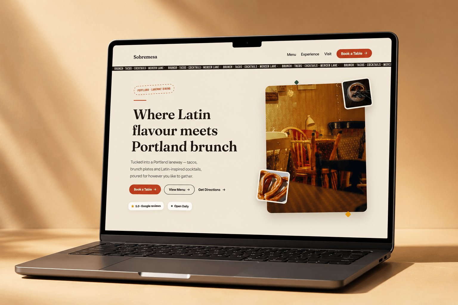
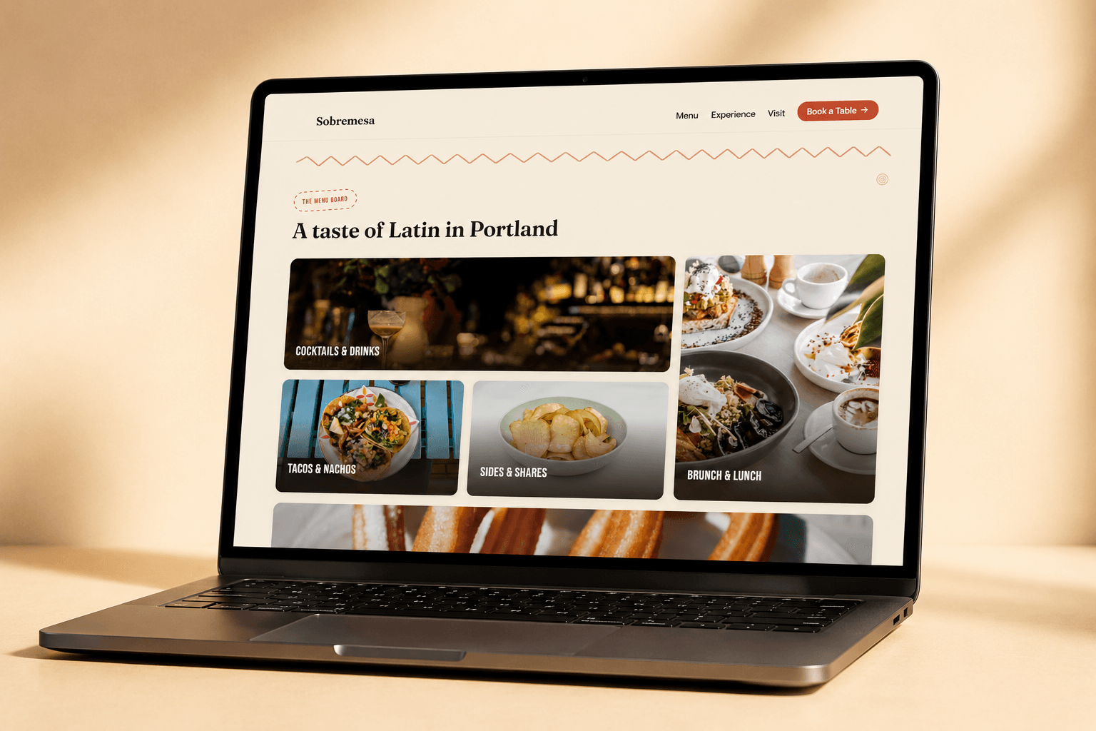
Restaurant templates have gone very beige lately.
Sobremesa is the opposite. Terracotta, loud type, and a menu that filters by category on the spot.
Made for taquerias, brunch spots and cocktail bars. Anywhere with a bit of noise to it.
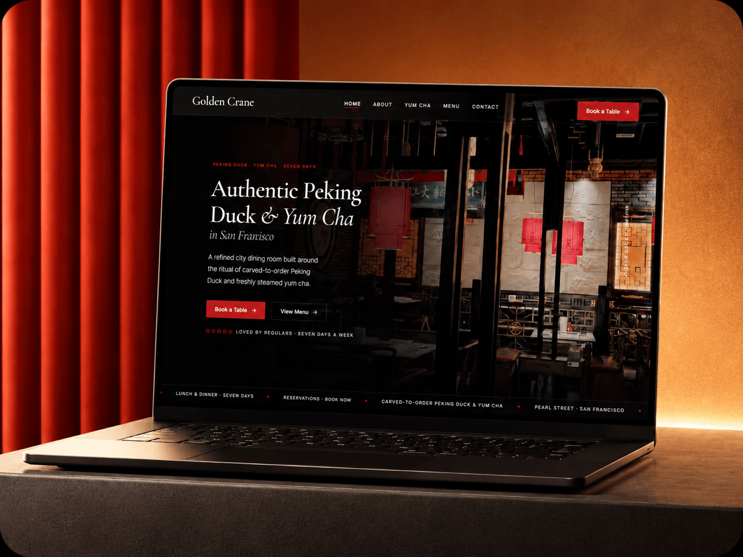
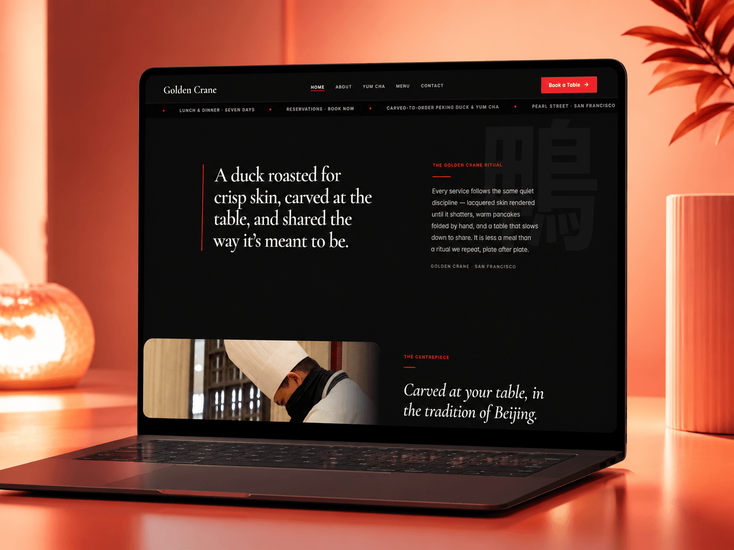
A lot of Chinese restaurants still link a PDF menu on their website. In 2026.
Golden Crane puts the whole thing in the CMS instead. Around 100 dishes, sorted by course, English and Chinese on every item.
Dark room, red accents, Cormorant headings. Built for duck houses and yum cha, but it'll carry any restaurant with a big menu.
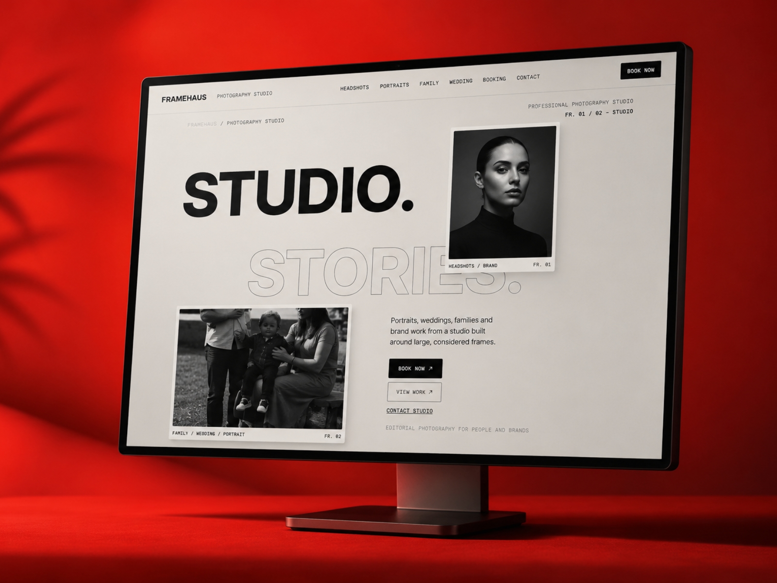
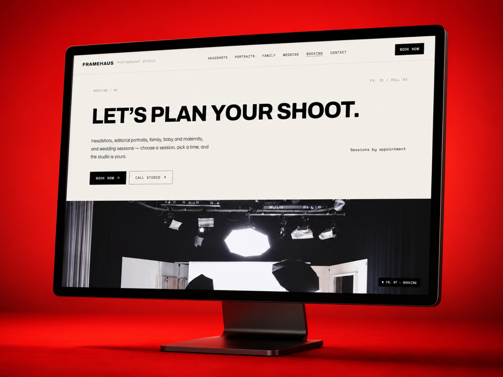
Most photographer portfolios are a logo, a grid, and a contact form.
Framehaus is built around the split every studio actually has: the client work that pays, and the personal work that keeps you sane.
Big type, framing guides drawn over the photos, and separate pages for headshots, portraits, family and weddings so you're not cramming four different audiences into one grid.
Check out the live preview below!
HANSANG is a Framer template shaped around atmosphere, menu and reservation flow.
Designed for modern Korean restaurants, BBQ venues and intimate dining rooms, with dark editorial layouts, warm gold details, private dining sections and a polished responsive build.