About Gilt Navbar
About Gilt Navbar
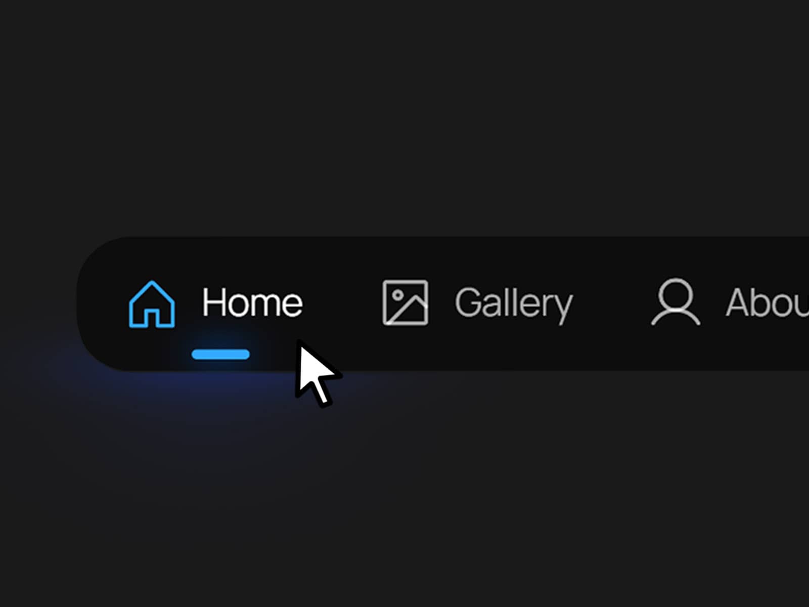
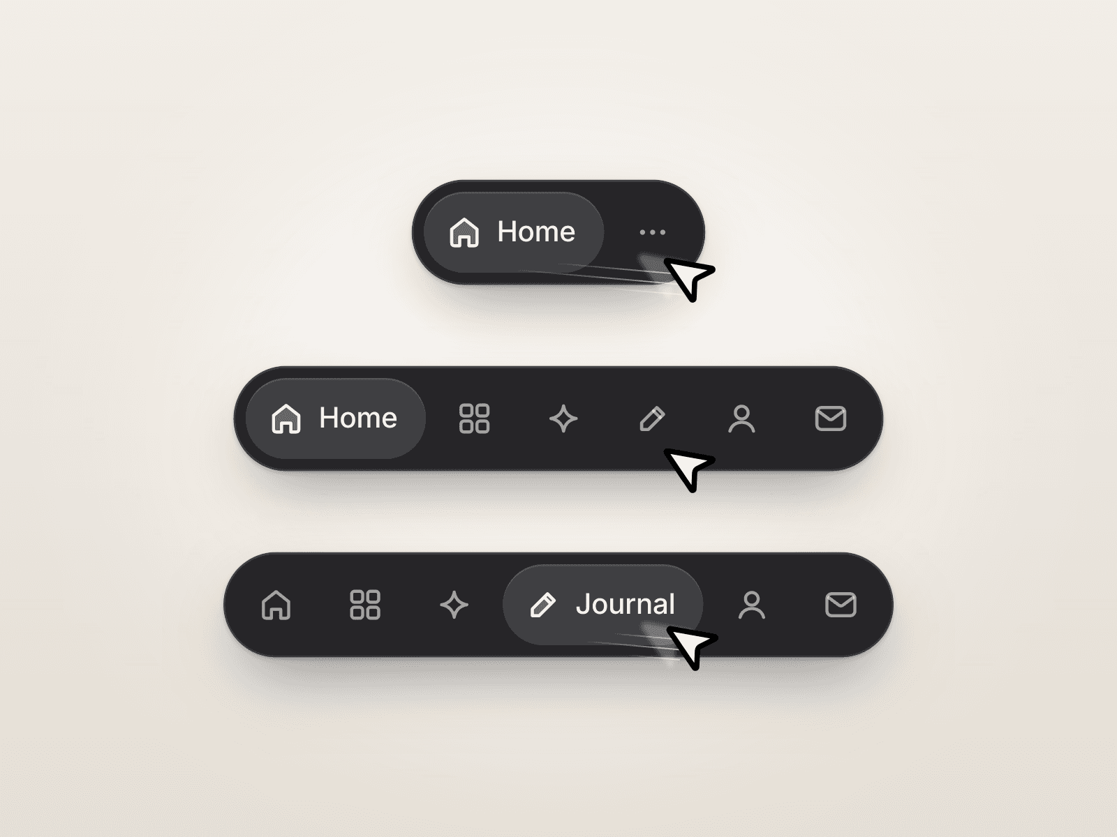
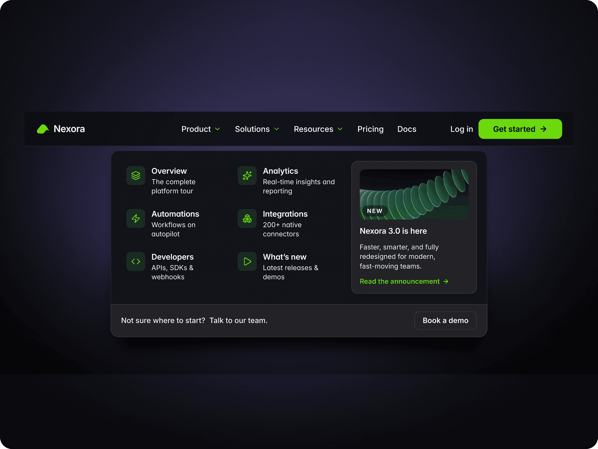
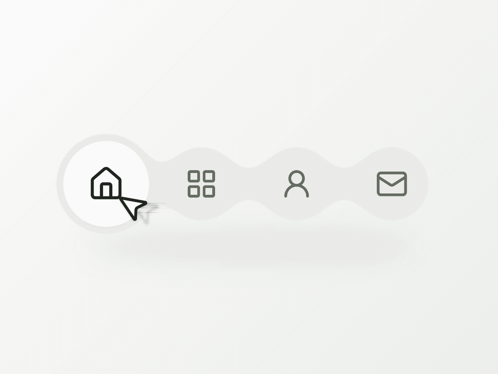
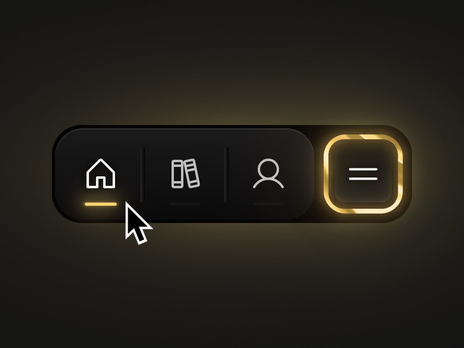
Gilt Navbar adapts to the device it's on: a clean text navbar on desktop, and a floating icon capsule with an expandable menu on mobile. Its signature is the gilded liquid-gradient border — a subtly animated gold edge that marks the CTA on desktop and the hamburger on mobile, giving the primary action a premium, tactile finish.
Key Features
* Adaptive Layout: Text navbar on desktop, floating icon capsule on mobile.
* Gilded Border: Animated liquid-gradient gold edge highlights the CTA and hamburger.
* Expandable Mobile Menu: The hamburger opens a vertical panel listing every link with icon and label, then morphs into a close (X) button.
* Built-in Social Links: Add up to 3 social icons (X, Framer, Instagram, or any other) inside the mobile panel.
* Active Link Indicator: A variable marks which link shows as currently selected.
Properties
* Variant: Choose between Desktop and Mobile layouts.
* Trigger: Set what opens the mobile menu.
* Active Link: Determines which link appears selected in the component.
* Number of Links: Sets how many links show in the desktop variant's link group (Mobile always uses all 4 plus the CTA).
* Icon 1–5, Title 1–5, Link 1–5: Set the icon, label, and destination for each nav item.
Social Links
* Social Logo 1–3, Social Link 1–3: Set the icon and URL for each social link shown in the mobile panel (X, Framer, Instagram, or any platform you choose).
Best Practices
* Keep Titles Short: 1–2 word labels preserve the compact, floating look on mobile.
* Reserve the CTA: Use Link 5 for your single most important action — it stays visible in both layouts.
* Fill Every Aria Label: Since social links are icon-only, a clear Aria Label keeps the component accessible.
Support & Assistance
If you have any questions, need help using the component, or encounter any issues, you can reach out to me at danielgrafix12@gmail.com. I'll get back to you as soon as possible.