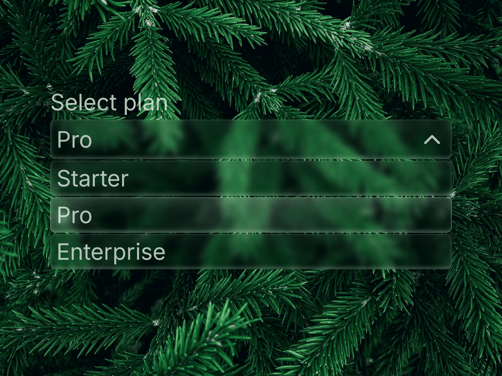
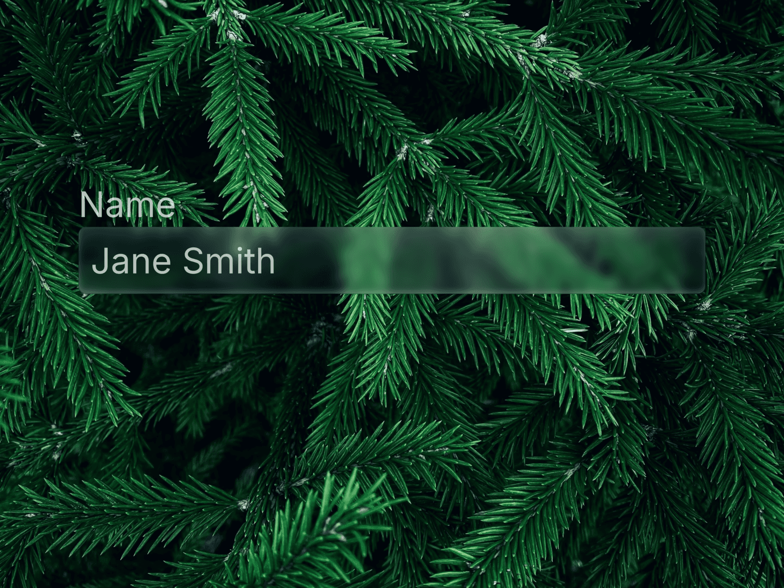
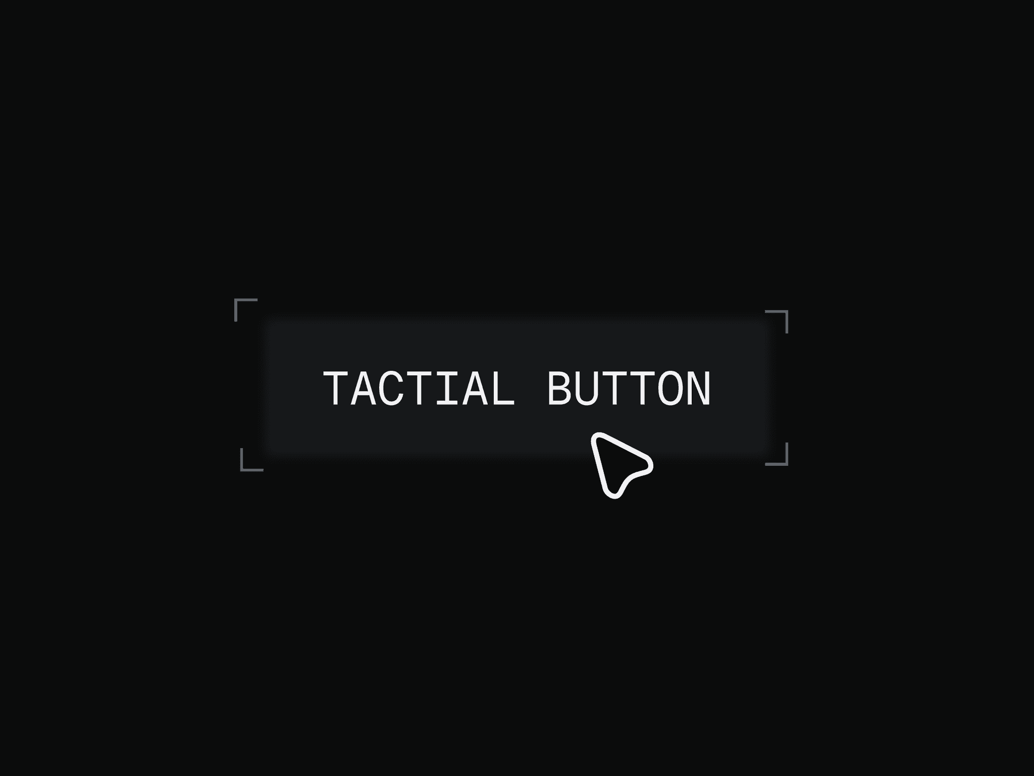
About Glassdrop Buttons
✦ What's included
5 Liquid Glass button variants inspired by Apple, Linear, and Raycast. Each features smooth hover and press animations with glassmorphism effects and full customization via Framer Variables.
🧩 Variants
Primary — main CTA with indigo glow and glass fill
Secondary — subtle ghost button that comes alive on hover
Destructive — warm red glass for delete and cancel actions
Icon Only — compact circular glass button for toolbars
Disabled — muted state with reduced opacity
✦ Animations
Hover activates a subtle magnetic pull toward the cursor with intensified glow. Press snaps back fast for a physical, tactile feel. Timing: 200ms ease for hover, 100ms for press.
🎨 Customization
Every button exposes these properties directly in Framer:
Button Text — custom label
Button Accent Color — changes fill
Button Padding — adjust spacing
Button Font Size — scales the label
Button Icon Visible — show or hide the icon
Icon Size — independent icon sizing
Material Icon Name — any icon name from Material Symbols
🔍 Finding icons
Browse thousands of icons at fonts.google.com/icons — search for what you need, click on it and copy the name. Example icon names: arrow_forward, star, download, mail, play_arrow, delete, settings.
🚀 How to use
Purchase and open the Framer remix link
Copy the component to your project
Customize accent color and icon via Variables
Drop into any frame and connect interactions
⚙ Requirements
Framer — any plan. No plugins needed.