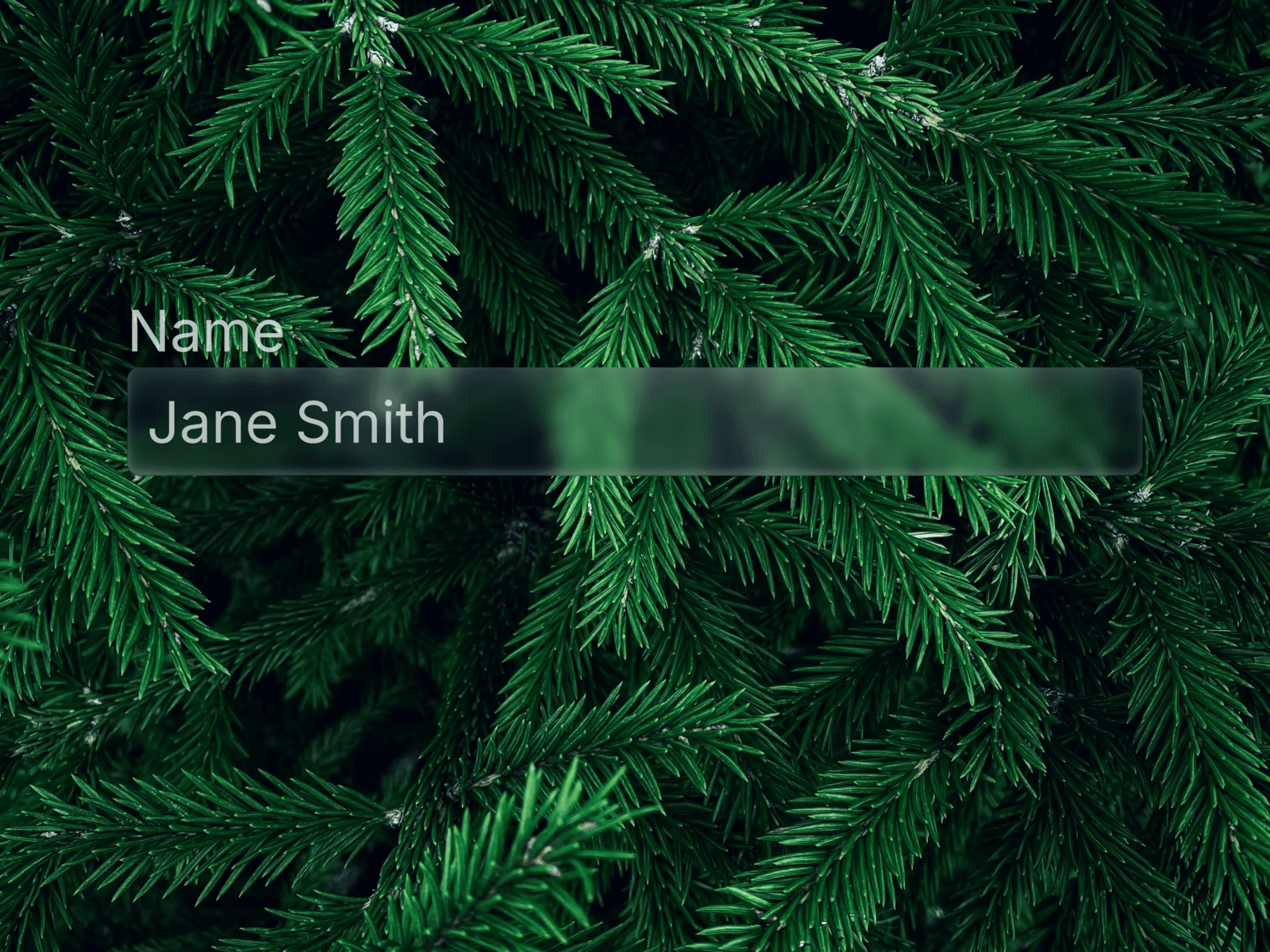
About Glassdrop Input
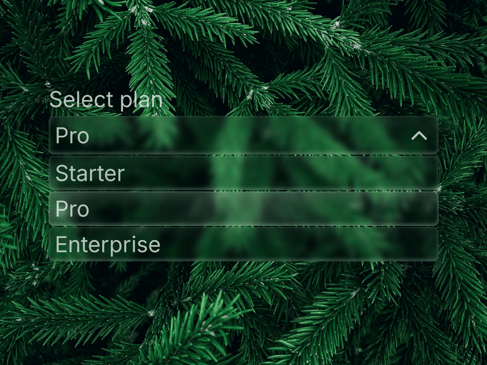
✦ What's included A Liquid Glass Input component in the same visual system as Glassdrop Buttons and Select — glass fill, backdrop blur, and the signature magnetic glow. Built as a native Framer Code Component with full keyboard and browser autofill support.
🧩 Features
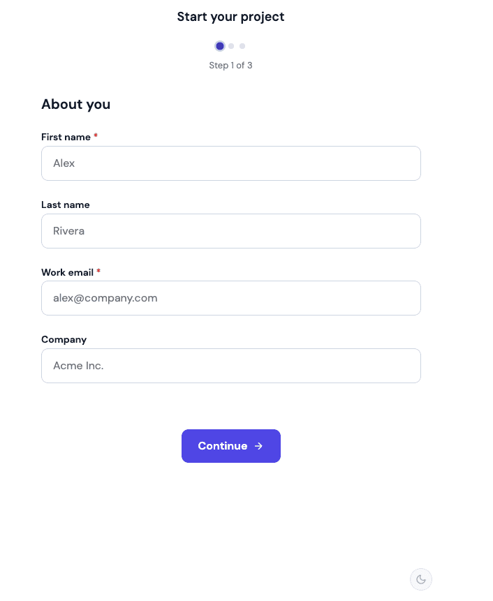
Four field types — Text, Email, Password, Number
Built-in icon picker — Mail, Lock, User, Search, or None
Password visibility toggle — accessible, keyboard-reachable eye icon
Disabled state — muted, non-interactive appearance
Icon size scales automatically with your chosen font size
✦ Animations Same magnetic glow and shine as the rest of the Glassdrop system — a soft radial glow follows the cursor, plus a specular highlight and subtle moving shimmer. Disabled fields skip the animation entirely for a clear, inert look.
🎨 Customization Label, Type, Icon, Placeholder, Name, Required, Disabled, Font, Color, Placeholder Color, Fill, Padding — all editable directly from the properties panel.
🚀 How to use
After purchase, copy the Component URL from your confirmation
Paste it directly onto your Framer canvas — the component installs automatically
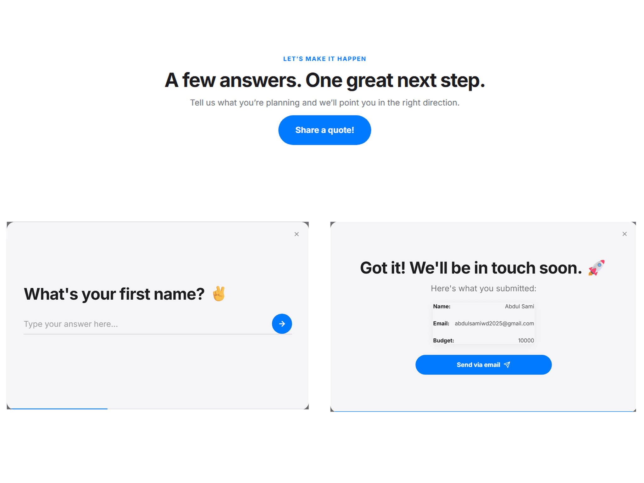
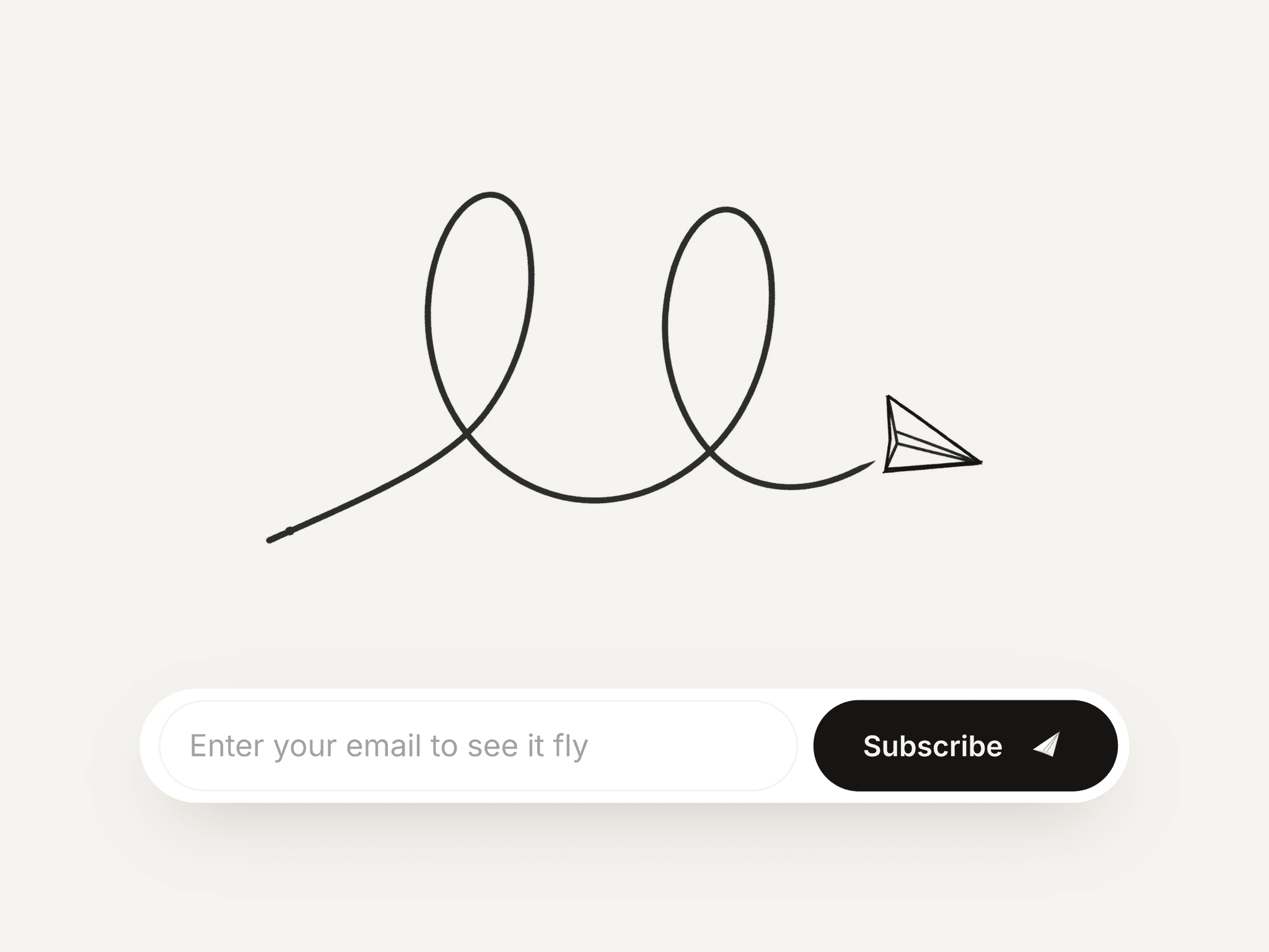
Drop it inside any native Framer Form
Edit label, type, icon, and styling from the properties panel — no code needed
Connect your form's submit action as usual
⚙ Requirements Framer, any plan. Native Code Component — behaves like a built-in Framer element. No plugins needed.