About Glassdrop Select
✦ What's included
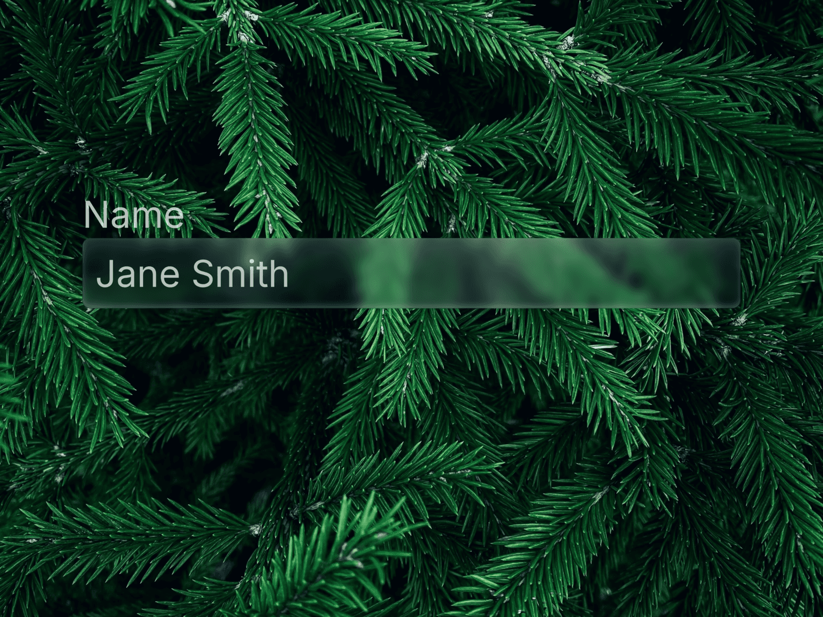
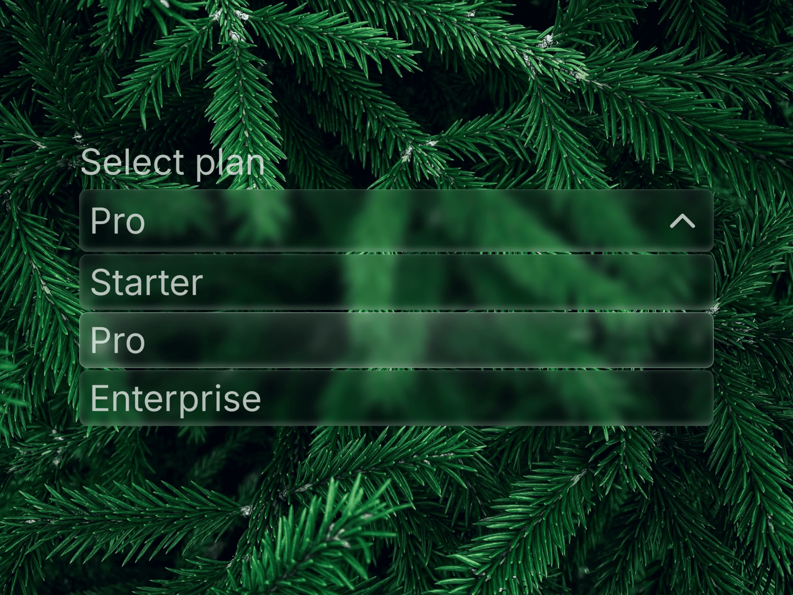
A Liquid Glass Select / Dropdown component in the same visual system as Glassdrop Buttons and Cards — glass fill, backdrop blur, and the signature magnetic glow. Built as a native Framer Code Component, fully keyboard accessible and wired to submit correctly inside Framer's native forms.
🧩 Features
Full keyboard navigation — Arrow keys, Enter, Space, Escape, Tab
Real form submission — hidden native
<select>stays in sync, so Framer's form actions (email, Google Sheets) pick up the value automaticallyDrop-in replacement for a native select — same behavior, glass look
Default option support — mark any option as pre-selected
Staggered spring animation when the dropdown opens
Focus-visible ring — clean keyboard-only outline
✦ Animations Same magnetic glow and shine as the rest of the Glassdrop system — radial glow follows the cursor, specular highlight, subtle moving shimmer. Opening the dropdown triggers a spring stagger across the options.
🎨 Customization Label, Options (label/value/default per row), Placeholder, Name, Required, Font, Color, Fill, Padding (trigger + options, independent)
🚀 How to use
After purchase, copy the Component URL from your confirmation
Paste it directly onto your Framer canvas — the component installs automatically
Drop it inside any native Framer Form
Edit label, options, and styling from the properties panel — no code needed
Connect your form's submit action as usual — the selected value is included automatically
⚙ Requirements Framer, any plan. Native Code Component — behaves like a built-in Framer element. No plugins needed.