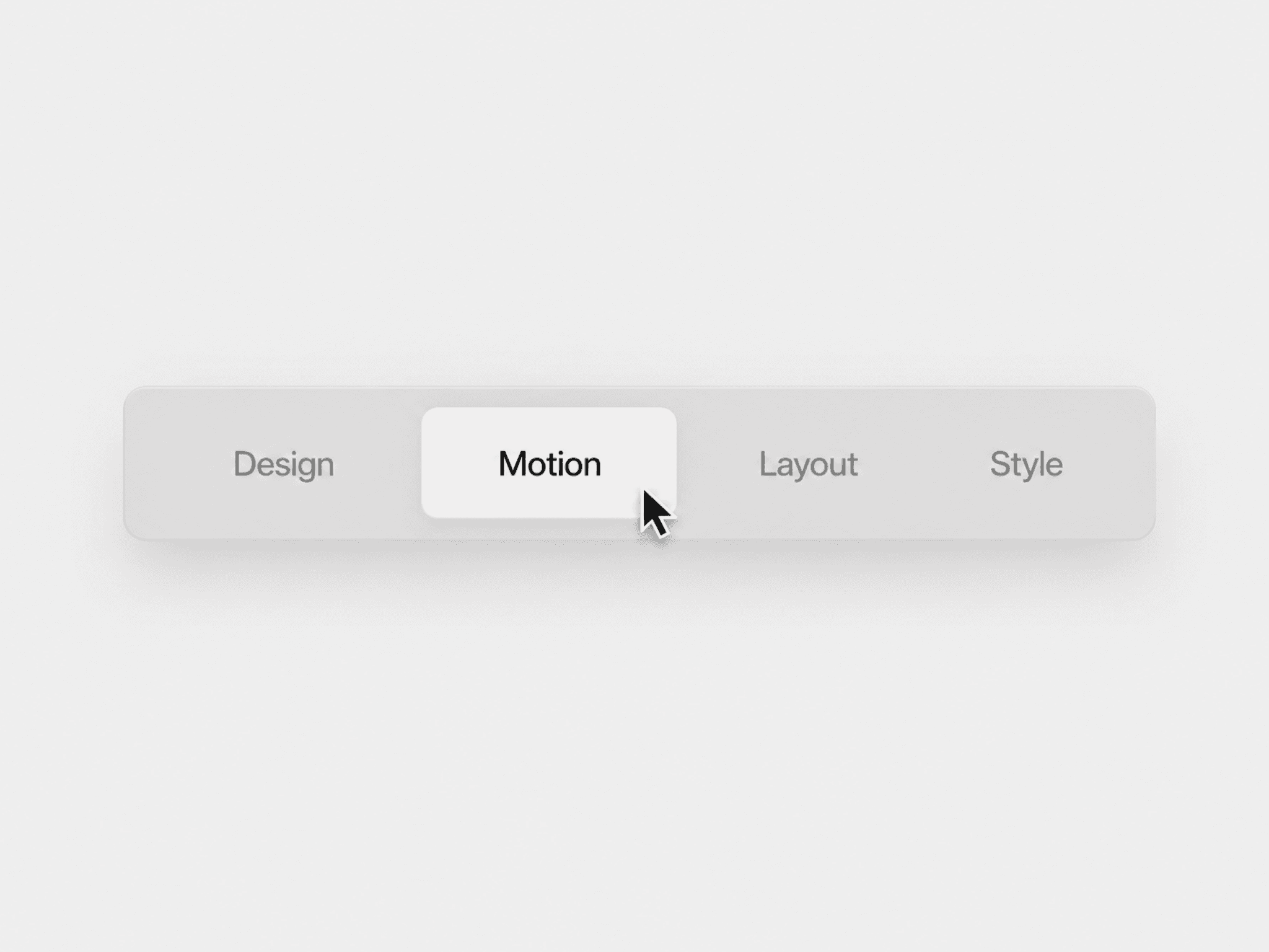
About Glossy Button
Overview
A CTA button featuring a glossy surface with layered depth and smooth state transitions. Built to enhance interaction clarity while maintaining a polished and modern visual style.
Getting Started
Copy and paste the component into your Framer canvas
Select the button and update the text from the right panel
Adjust colors and styling to match your design system
Preview the interaction to test hover and pressed states
Customization
Change background and text colors
Adjust stroke and highlight appearance
Control text selection behavior
Property Controls
Use Cases
Primary call-to-action buttons
Landing pages and hero sections
Product or service highlights
Conversion-focused interfaces
Notes
Built using native Framer properties
Includes hover and pressed states
Maintains consistent spacing and proportions
Designed for clear visual feedback
Support
If you have any questions, need clarification, or run into any issues, feel free to reach out at s.senthil2206@gmail.com