About Hologram Lanyards
Full description
Make your team section something people want to touch.
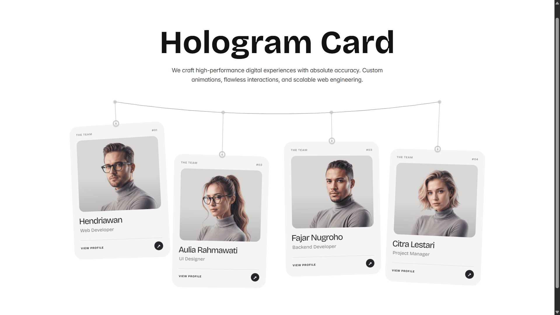
Hologram Lanyards hangs each team member from a rope like a conference lanyard. The cards sway gently, swing when your cursor brushes past, and flip on hover to reveal a bio, selected projects, contact details and a QR code. A holographic layer follows the card’s tilt and automatically adapts to light or dark card colors.
Add as many people as you need, upload photos (or use the built-in illustrated fallback), link each card to a profile page, and drag the rail to browse. Everything is controlled from the Framer property panel. No dependencies, no setup.
Key features
Physics-based motion: spring and damping swing, a subtle idle breeze, and cards that react to your cursor and to dragging.
Flip to reveal: flip on hover (desktop) or on tap (touch). Esc flips back for keyboard users.
Adaptive holographic effect: automatically picks a blend style for light or dark cards, with an intensity slider. On touch devices it lights up while touching and while a card is flipped.
Drag to scroll: mouse drag with inertia, native swipe on touch. Dragging the rail makes the cards swing.
Fits any container: the Width prop sets how many cards fit across the container. Cards scale to fill it, from 1 to 8 items, with 5 as the default.
Unlimited cards: each card has name, role, location, bio, up to 3 projects, email, photo, profile link and QR image.
Per-card links: link every card to a team member’s profile, in the same tab or a new one, with a pointer cursor on linked cards.
Rope controls: show or hide the rope, set its color, width and sag, and style the wires and hooks.
Full styling: any font, background, card and text colors, with a one-click reset to defaults.
Overflow control: visible (default) or hidden.
Built responsibly: respects prefers-reduced-motion, pauses off-screen, supports keyboard use, and is static-renderer safe (no animation on the Framer canvas or in exports).