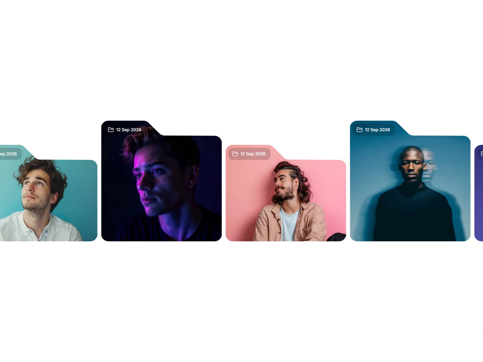
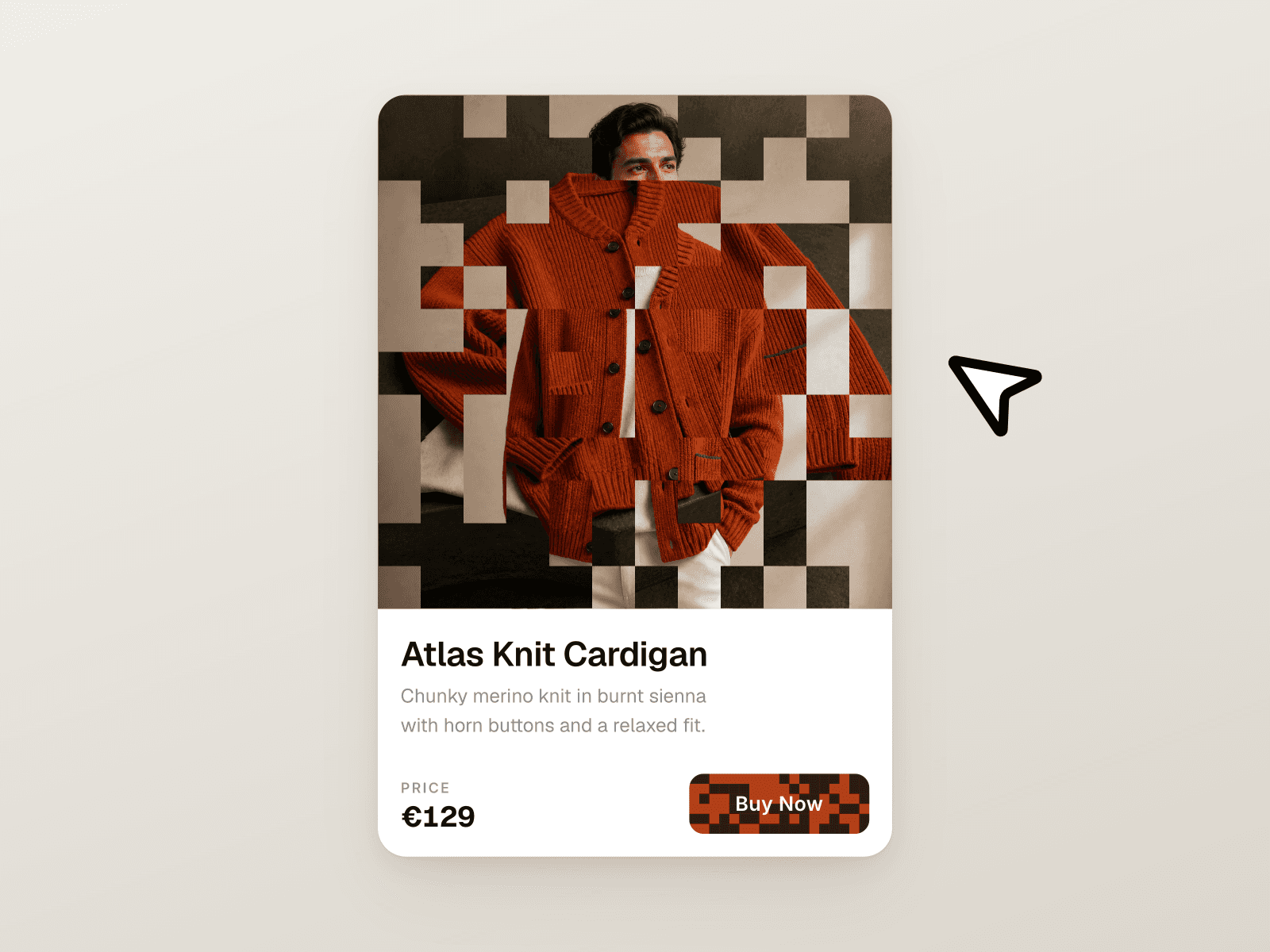
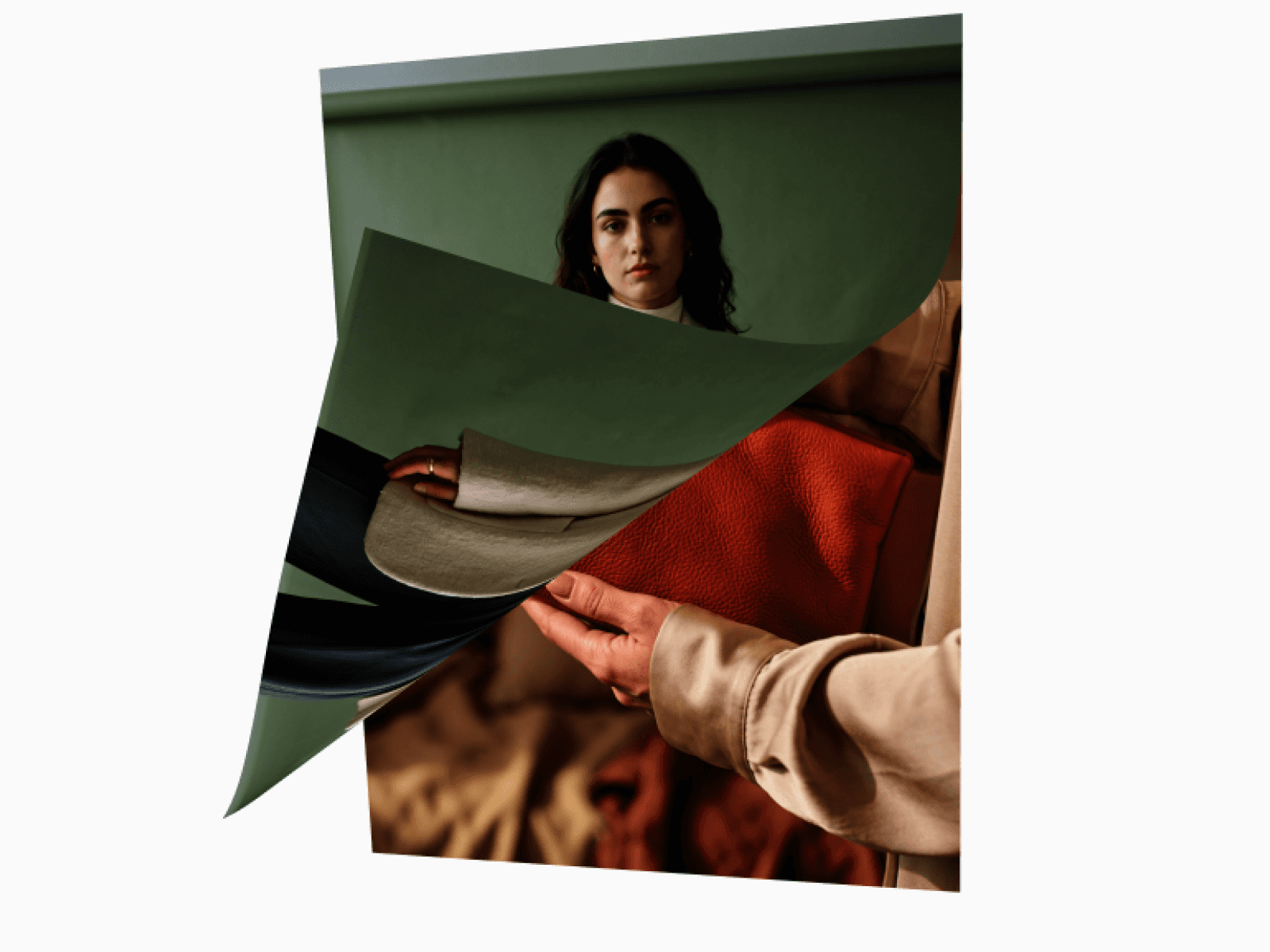
About Hover Cards 3D
What is Hover Cards 3D?
Hover Cards 3D is a premium interaction component that transforms a row of feature cards into an overlapping, perspective-driven 3D fan when the user hovers over the container. Each card rotates on the Y-axis, shifts in depth, and scales dynamically to create a natural deck-of-cards effect. Ideal for SaaS feature sections, agency portfolios, product benefit breakdowns, and any layout where static cards fall flat.
Core Features
Five built-in theme presets — Clean, Midnight, Ocean, Ember, and Frost — with a Custom mode for full colour control
3D perspective fan effect with configurable rotation, spread, depth, and center scale
Per-card CTA buttons with a premium slide-fill hover animation and individual text and link controls
Responsive scaling that automatically adjusts the 3D effect intensity based on container width
Smooth, performant CSS transitions with three speed modes and three easing curves
Controls inside Framer
Theme
Theme preset selector — Clean, Midnight, Ocean, Ember, Frost, or Custom
Cards
Up to 5 cards, each with title, description, image, button text, and button link
Layout
Gap between cards
Border radius
Card padding
Colors (Custom theme only)
Card background
Title colour
Description colour
Shadow colour
3D Effect
Rotation — Y-axis tilt angle for side cards
Spread — horizontal offset that controls overlap intensity
Depth — Z-axis separation between center and side cards
Center Scale — scale multiplier for the focused center card
Animation
Speed — Fast, Medium, or Slow
Easing — Smooth, Snappy, or Bouncy
CTA Button
Show or hide buttons globally
Button colour and text colour
Typography
Font family and weight
Best use cases
SaaS and startup landing pages to showcase three to five key product features with depth and motion
Agency and portfolio sites to present service offerings or case study categories with a premium interaction
Product and pricing pages to highlight plan benefits or feature tiers in a visually engaging layout
Marketing microsites where a single hero interaction needs to communicate value within seconds
Drop HoverCards3D into any section and turn a flat feature grid into a dimensional, interactive showcase that holds attention and drives clicks.
Questions or custom requests?
We design and build custom Framer components. Get in touch at contact@teampixel.com.au.