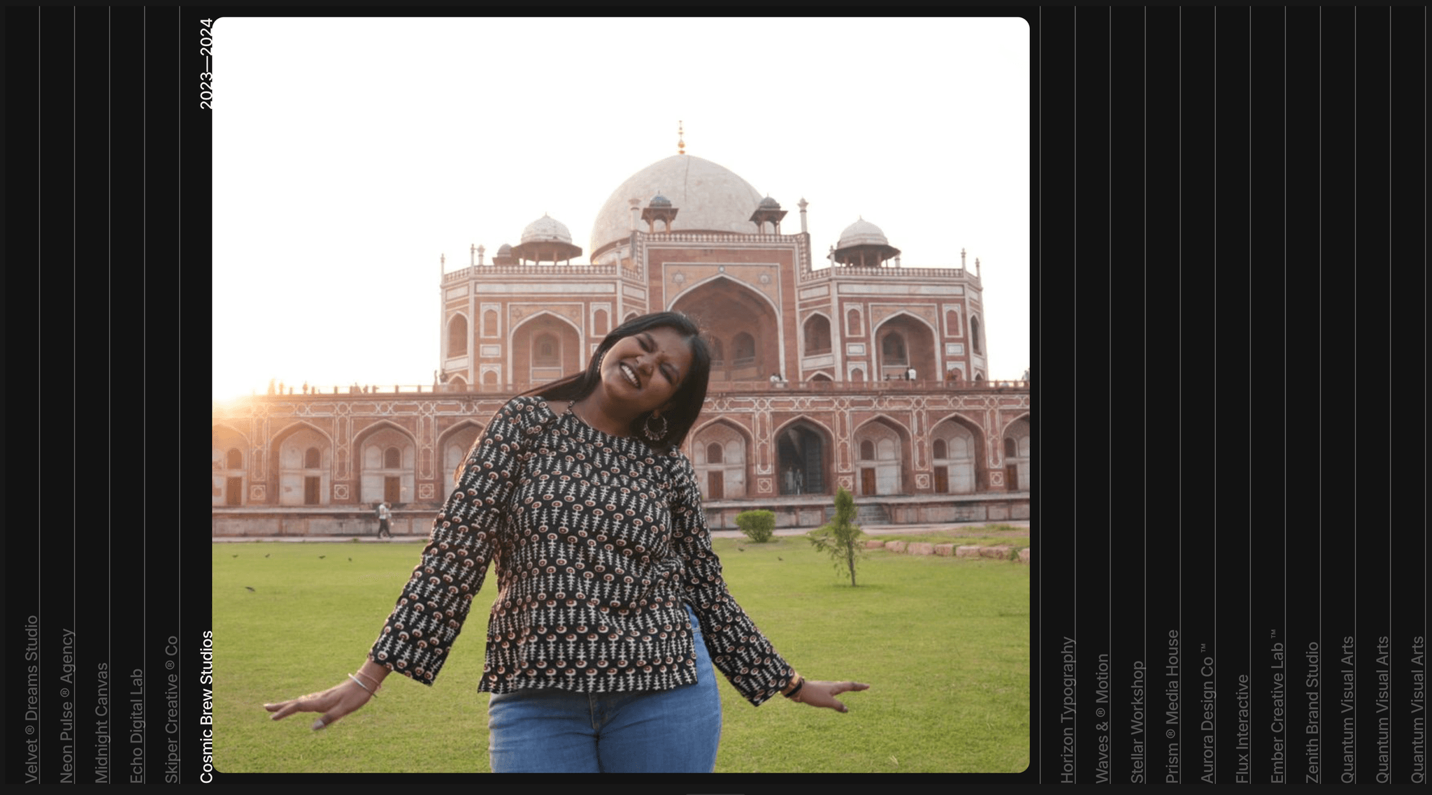
About Hover Expand Gallery
Description: Hover Expand Gallery turns a set of images into a bold full-height accordion. Each panel sits as a thin vertical strip with its title running up the side. Hover one and it springs open to show the photo, while its title brightens and its year fades in. The last panel you hovered stays open, so the layout never snaps back to empty.
It's built with Framer's own layers, variants and variables, so you can restyle everything on the canvas. Swap photos, titles and years right from the instance panel, and choose which panel opens first. On phones it becomes a vertical tap-to-open list.
Features:
Hover to expand on desktop, tap to expand on mobile
17 panels, each with editable Image, Title and Year
"Active Panel" control sets which panel opens first
Four responsive layouts: Desktop, Laptop, Tablet and Phone
The open panel stretches to fill wide screens
Spring animation, a title that fades from dim to bright, and a year that fades in
Built from native Framer layers and variants, plus one small width override
Dark, minimal styling that's easy to recolor
How to use:
Drop the Hover Expand component into your page and set its height to 100vh.
Pick the variant that matches each breakpoint (Desktop, Laptop, Tablet or Phone).
Replace the photos, titles and years in the right-hand panel.
Set "Active Panel" to the panel you want open on load.
Replacement demo titles: Northlight Studio, Atlas Creative, Monochrome Lab, Field Notes, Parallel Works, Quiet Hours, Open Frame, Signal & Noise, Halftone House, Common Ground, Slow Form, Kinetic Type, Low Tide, Paper Moon, Studio Meridian, Golden Hour, After Dark
Category: Components, or Sections (Gallery / Portfolio)
Tags: accordion, gallery, hover, expand, portfolio, showcase, interactive, dark, responsive, image reveal