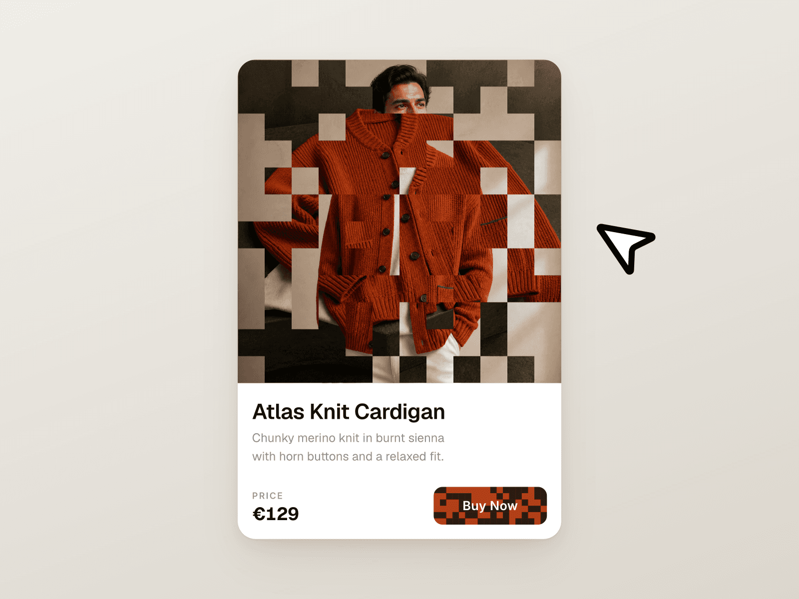
About Multi Items Card
What you get:
Two display modes: a compact collapsed card (shows 1 item with a subtle peek of neighbors) and an expanded grid with multiple items per row.
Smooth shared‑layout expand: the card stays centered and scales from the center.
Transition Type (collapsed): Slide or Fade.
Collapsed Adjacent Opacity — control how visible the neighboring items are (0..1).
Edge navigation (collapsed): invisible left/right zones for previous/next; center click opens the current item link.
Expanded view: configurable products per row (1–6), dedicated typography for titles/subtitles, optional auto‑pagination.
Navigation & playback: page dots with progress, drag/swipe, auto‑rotate with pause on hover.
Motion & depth: cursor‑based 3D tilt, perspective, hover scale, spring animations.
Content: up to 10 items; each item has an image, two text lines, link and target control.
Styling: image size, corner radius, card padding, image/text gaps, background, independent fonts and colors.
Key features:
Conversion‑ready: compact teaser + one‑tap expand to explore all items.
Blazing‑fast UX: GPU‑friendly transitions, spring motion, and clean geometry changes.
Built to fit any brand: granular typography and spacing controls for both modes.
Click economics: edge controls reduce misclicks on neighbor items and boost navigation.
Editor‑friendly: every important behavior is a property you can tune in seconds.