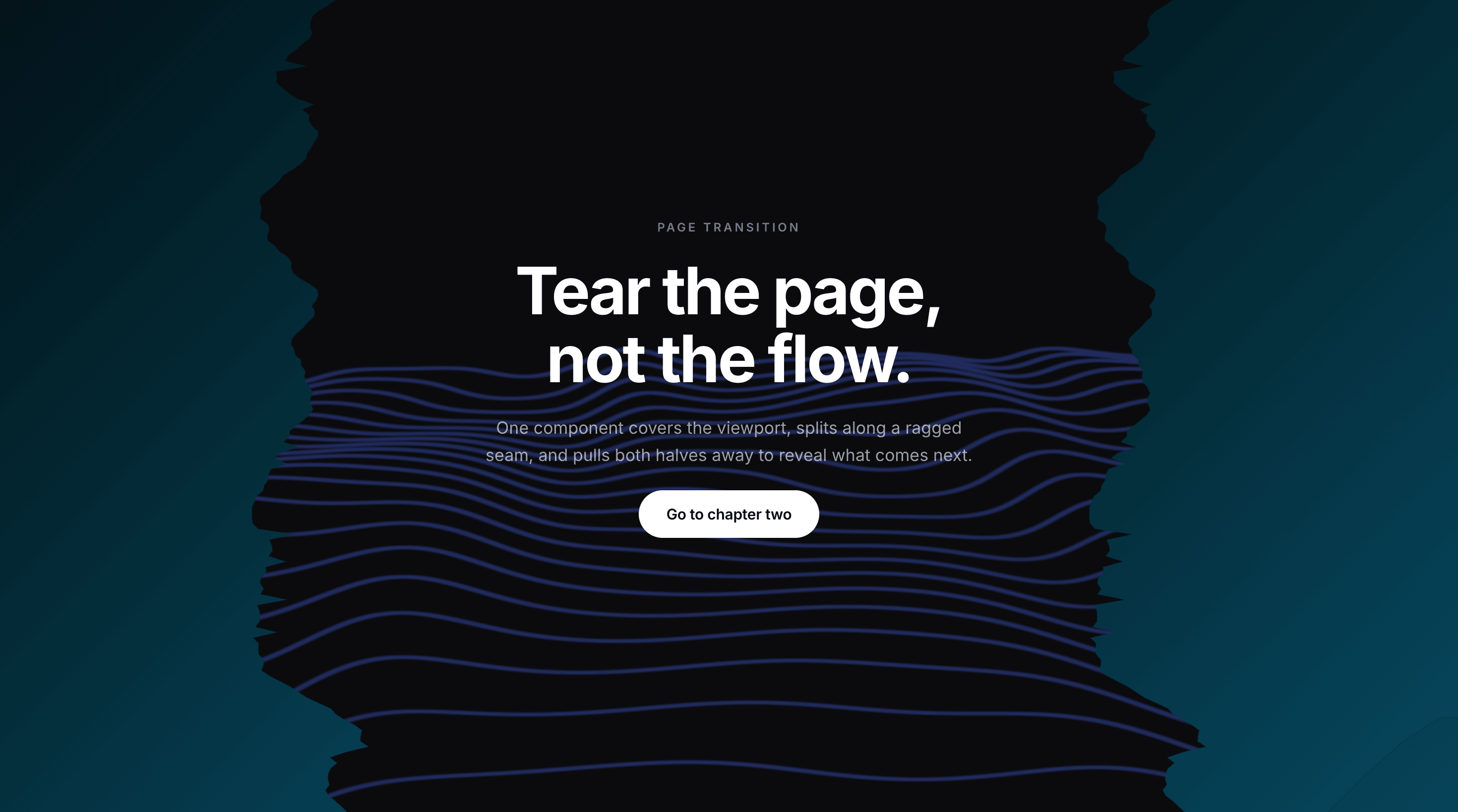
About Page Tear Transition
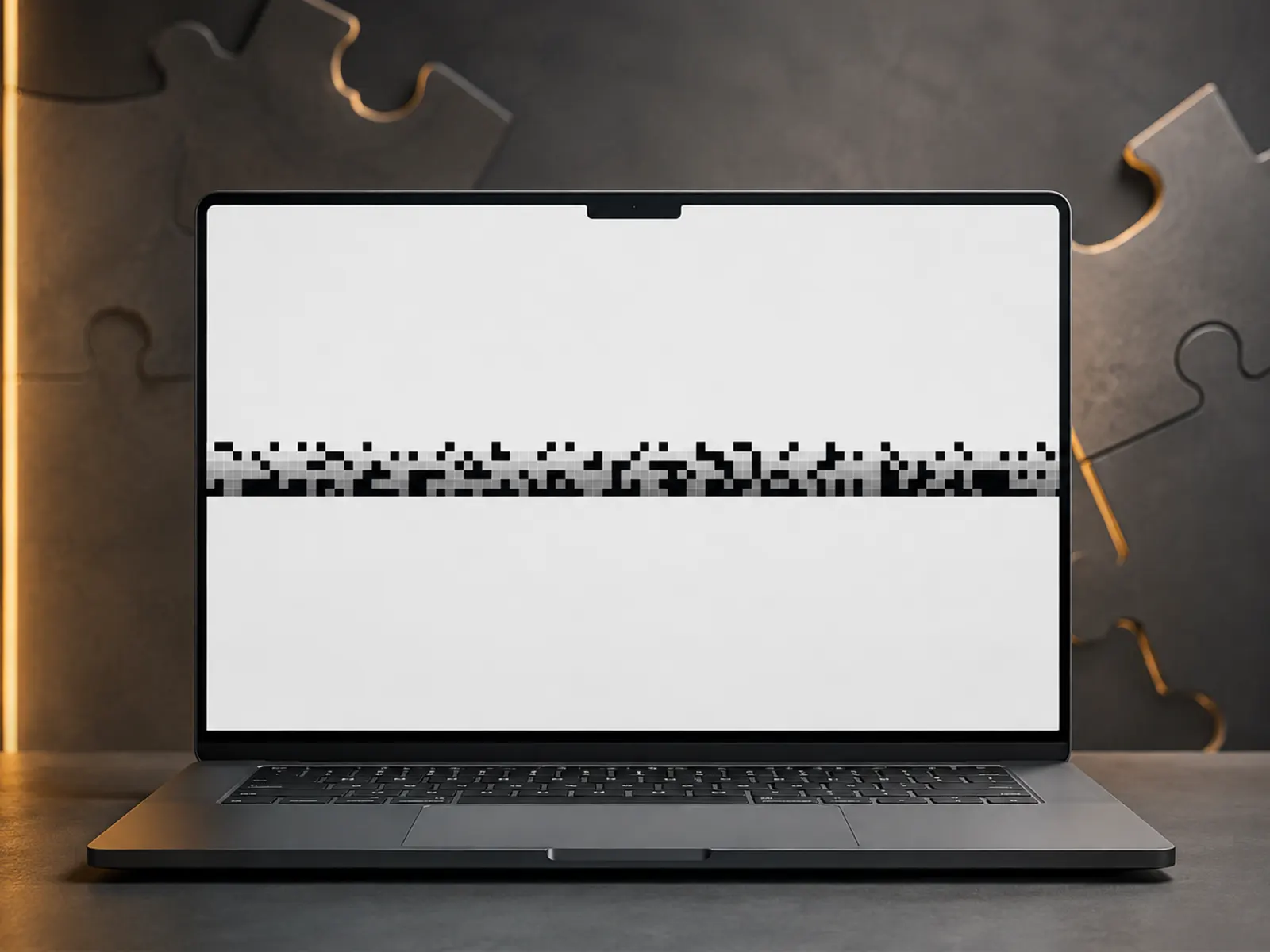
Every navigation starts with the screen covered, then it tears down the middle and both halves pull away to reveal the page underneath.
The seam is a real tear, not a straight split. The edge is generated as a correlated walk, so it wanders and frays like torn paper, and the two halves interlock exactly. No gap, no visible join. Change the Seed and you get a completely different tear, so no two sites look alike.
HOW TO USE
Drop it on a page. It covers the viewport and plays on mount, so it runs on every navigation to that page. Add it to a Layout Template to cover a whole site at once, or place it per page to control exactly where it appears. Nothing to wire up.
CONTROLS
Fill. Solid colour, a two stop gradient with angle, or an image set to fill the screen or tile. The background spans the full viewport and is anchored per half, so gradients and images stay continuous across the tear instead of restarting in each panel.
Tear. Sideways or up and down.
Depth. How far the tear wanders across the screen.
Roughness. From a clean split to heavy fraying.
Detail. Points along the edge, up to 400 for a finely frayed seam.
Seed. Reroll the tear shape.
Duration, Delay and Easing. From a fast snap to a slow, deliberate rip, with an optional hold before it opens.
BUILT TO BEHAVE
No screenshots, no canvas capture, no WebGL, no click interception. It is two fixed elements with a generated clip path, animated once on mount. It never touches your links or your routing, so navigation behaves exactly as it did before.
Fully responsive. Every dimension is relative, so the tear lands the same on a phone as it does on a 4K display, and it respects the page it reveals.
Note: the tear plays on the page it is placed on. Add it to each page you want it on, or use a Layout Template to cover them all.