About Photo Hotspots
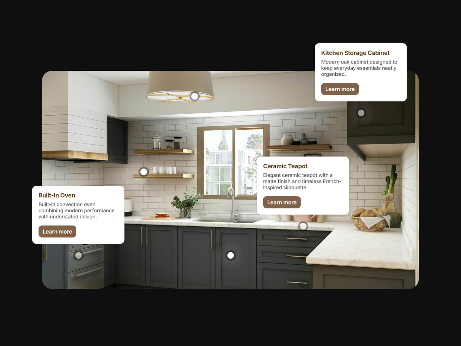
Photo Hotspots turns any image into a clickable diagram. Place markers anywhere on a photo, product shot, map or floor plan, and each opens a titled card with a description and an optional link or button — great for feature call-outs, shoppable images and step-by-steps.
Markers sit on X / Y percentages, so they stay put as the image scales, and almost every part — dot, rings, card, type and links — is a native Framer control, styled like everything else in Framer.
Show labels Always, on Hover or on Click, keep several open with Keep Open, and give each hotspot its own link: a page, a section anchor or a URL, shown as the whole card or a styled CTA button. Inside a CMS collection, CMS mode gives 10 position and text slots to bind to fields.
Key Features
Manual mode: unlimited markers by X / Y %. CMS mode: 10 bindable slots
Title, subtitle, per-hotspot link and button label; empty hotspots are hidden
Label Always / Hover / Click, click-outside to dismiss, optional Keep Open
Card position Top / Bottom / Left / Right, with align and offsets
Card fill, frosted background blur, radius, border and shadow
Dot colour, hover colour, size, blur, border and shadow
One to three rings, filled disks or outlines, with optional sonar animation
Framer font picker for title and subtitle, plus line gap and a text-shadow
Whole-card link or a CTA button with full fill, text, hover and border styling
Static-friendly preview; pointer only on the dot and buttons; role + aria-label on link markers
How to Set Up
Drag Photo Hotspots onto your canvas and set its size
Choose your image — it fills the frame, so crop it first
Add hotspots and set each X / Y, title, subtitle and link
Pick Display (Always / Hover / Click) and the label position
Style the dot, rings, card, type and buttons
Publish
Refund Policy
All sales of digital products are final and non-refundable. Questions? Contact hellonostromostudio@gmail.com before purchasing. Enjoy!